A Foreword from Director, Penny Macbeth
I am delighted to welcome you to The Glasgow School of Art Graduate Showcase 2020. We hope you enjoy our creative response to mounting a physical degree show during the current pandemic. Our digital platform enables us to share the work of our hugely talented graduates at this important moment in their careers.
As a creative community we understand and value the significance of the physical public exhibition, and its importance to the individual practitioner and their audience. Once we are able to move beyond social distancing, the GSA is committed to assisting our graduates as they enter their creative careers, supporting them to develop physical exhibitions which showcase their work. Our support will manifest itself in sponsorship and access to exhibition spaces, and our dedicated team are developing a guidance framework for this next stage as I write. Glasgow as a city thrives on the quality and volume of its exhibition and cultural programming, it is essential that the GSA and its graduates continues to contribute to this going forward and we are committed to making this happen.
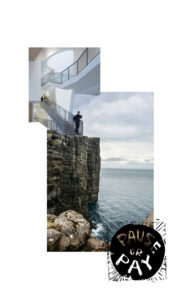
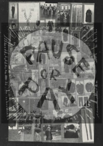
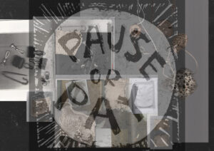
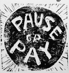
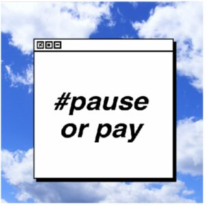
The work within this exciting digital showcase represents the culmination of a student’s time with us, their unique creative journeys and signals the start of their professional lives. You will notice as you scroll through the site exploring the work of our students, that a number of them have linked their work to the National Union of Students’ Pause or Pay campaign and a group of PGT students have chosen not to submit work at this time, the reasons for which are detailed within their personal statements. We hope that these students will in time submit work and the digital platform has been developed to allow this. All students can add new work as they complete it allowing them to share with you over the next 12 months the development of their practice as they transition from graduate to professional practitioner.
We invite you to join with us as we celebrate our students, view and engage with their work and reflect on the importance of creative people and creative education in complex and challenging times.
Penny Macbeth
Director