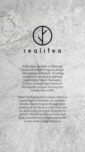
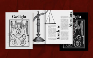
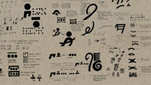
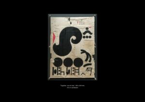
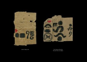
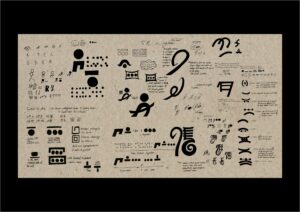
Unveiled
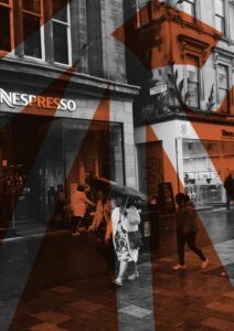
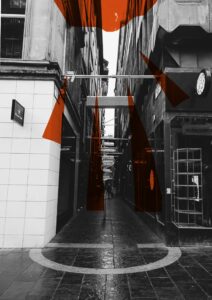
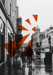
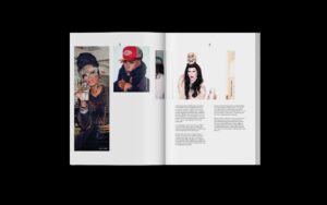
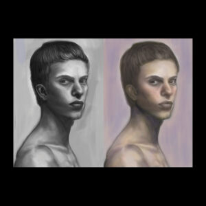
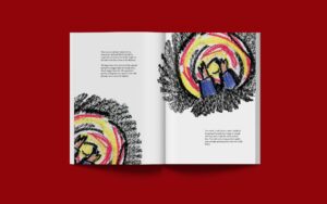
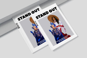
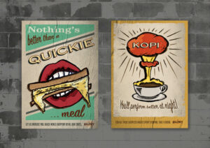
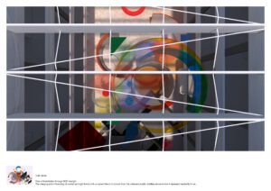
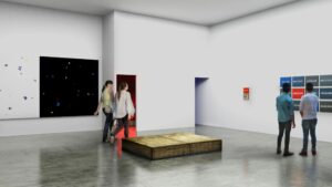
Context in the form of assumptions leads to mental bias. My project is about how the media frames the truth in a political context. I used a colour-based illusion designed to trick the brain into thinking the same colour is two different ones. Colour acts as a metaphor for context and the media and the optical illusions is essentially a parallel for the illusion you are put under by the media.
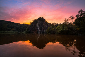
Utopia Is Death 01
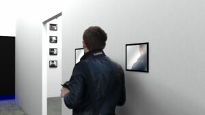
Utopia is Death is a series of photographs exploring the change of what we deem a ‘Landscape’ and how that change affects us as a species. The first image details the classic definition of a landscape; pristine nature untouched by man. Or so it seems. Unfortunately such a location does not exist within Singapore. This is a man-made quarry and is a pristine as nature gets here.
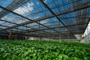
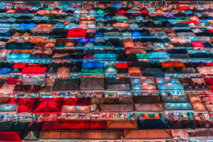
Utopia Is Death 02
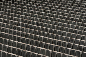
The purpose of the second image is to portray what mankind has done with nature. Our industrialization and almost automation of it. Which begets the question; is a tree planted by man part of nature or is it man made?
Utopia Is Death 03
Working in conjunction with image 3, these two images are a modernization of John B. Calhoun’s behavioral sink theory; as we continue to shape our landscape for efficiency, its utilitarian appearance is a breeding ground for socio-cultural chaos.
Utopia Is Death 04
I photographed and processed both images to make them look as though they are both the same place; however they are taken in different countries. Through the use of colour, my intention is evoke a pretense of harmony between these two images because of their colour and likeness while at the same thing creating dissonance because of their subject matter; one being geometrically ordered and the other a chaotic sprawl.
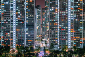
Utopia Is Death 05
A common sight and landscape of modern day Singapore. High rise flats built for space-efficiency is how majority of the population here lives. I composed the image ‘tightly’ in such a way so that the individual apartments appear as prison cells; uniform and almost voyeuristic.
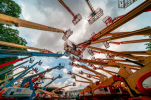
Utopia Is Death 06
Construction and its instruments are often used to depict progress. I took this image from a low angle at a crane yard to show the monstrous scale of our industrialization of the world. The photo was framed in a way to have a visible sky but blocked out and almost offensively obscured by the cranes. Reminiscent of how nature is still visible to us but only through a machine lens.
Utopia Is Death 07
My aim was to shoot tombstones to look like the typical close-up facade of a building. Bringing home the point that the continued mechanization of our landscape to construct a utopia will figuratively and literally result in death. Printed out and framed in A1, it has an effect of looking like something else completely from far and only from a close distance do viewers realize it is a graveyard.