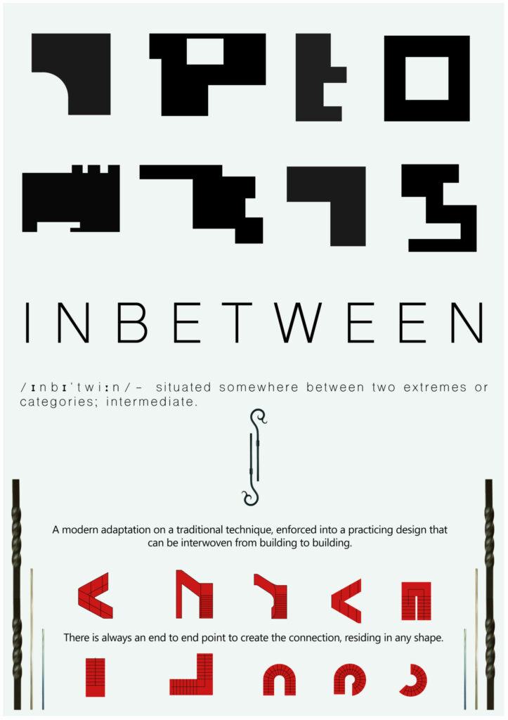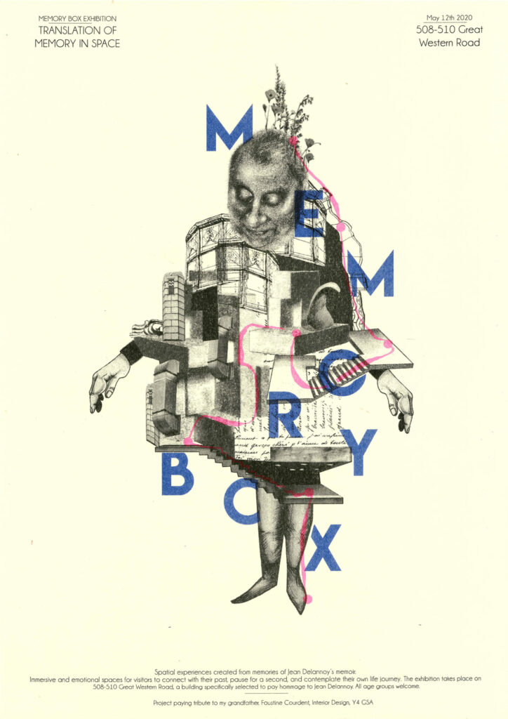
Memory Box poster
poster of my project
Memory Box
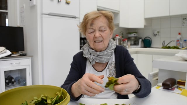
movie
Next event:
ERINN SAVAGE – Performance
Tomorrow 15:00 GMT
Welcome to Interior Design at The Glasgow School of Art
The work you’ll see here is a collection of individually authored projects developed and refined over the duration of students final year of study. The focus for each is close to the heart of their creators. In producing the resultant suite of interior proposals, each student advocates for the centrality of our subject in the creation, modification and adjustment of the spaces we enjoy and the spaces we need–or may not yet know we need–in the places we inhabit.
As we gradually emerge from lockdown, leaving our zooms and our rooms, we will return to cities and environments abruptly transformed. These will be abundant with spaces desperate for reimagining, where a different kind of healing is urgently required.
In these times, students emerging from intensive study of the subject of Interiors at GSA, are acutely sensitive to transformation and are ready to contribute to the important design dialogues of tomorrow.
Patrick Macklin–Head of Department, Interior Design
poster of my project
movie
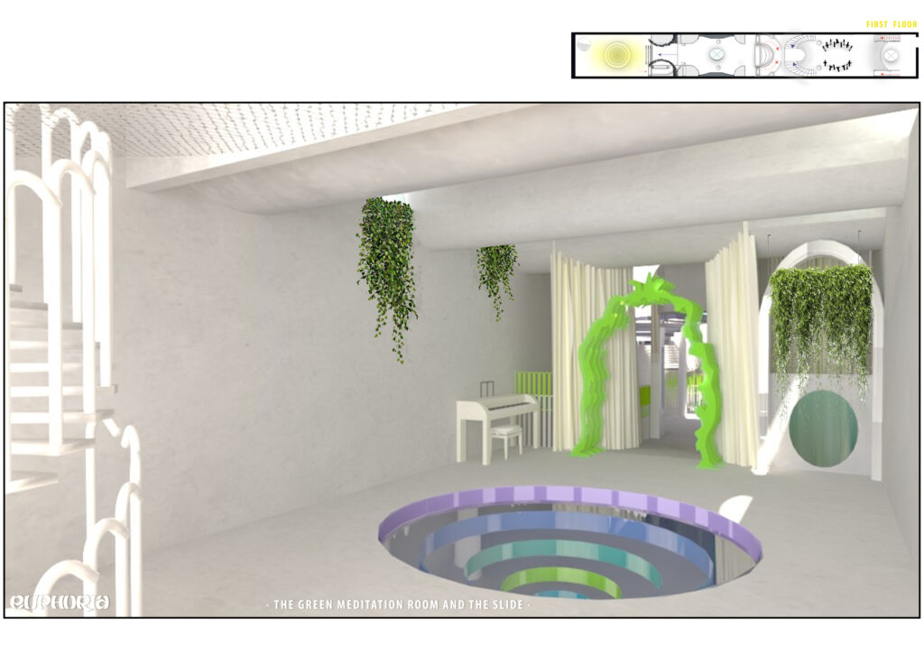
visual
video
video
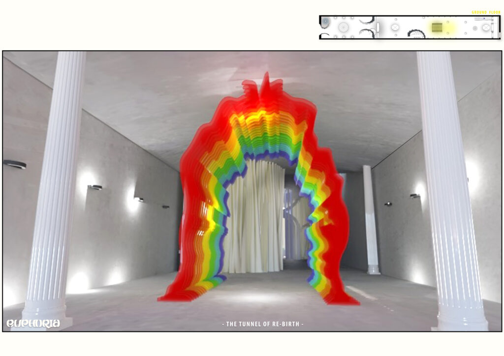
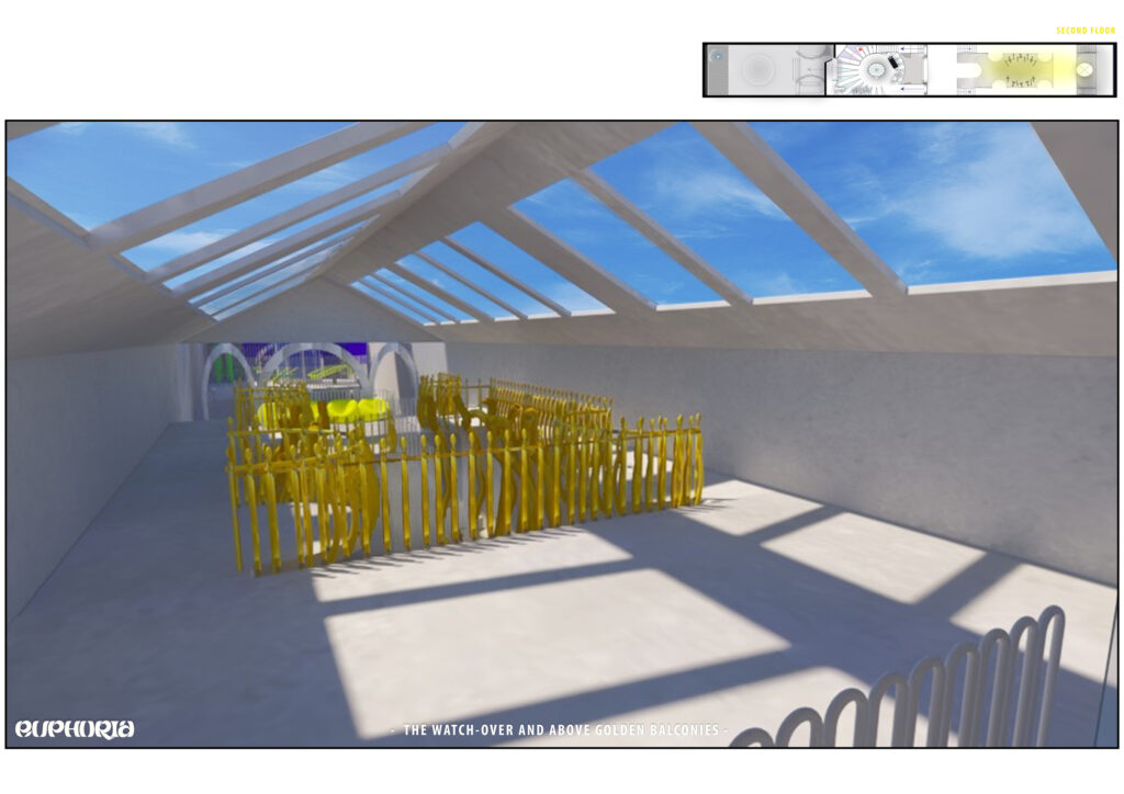
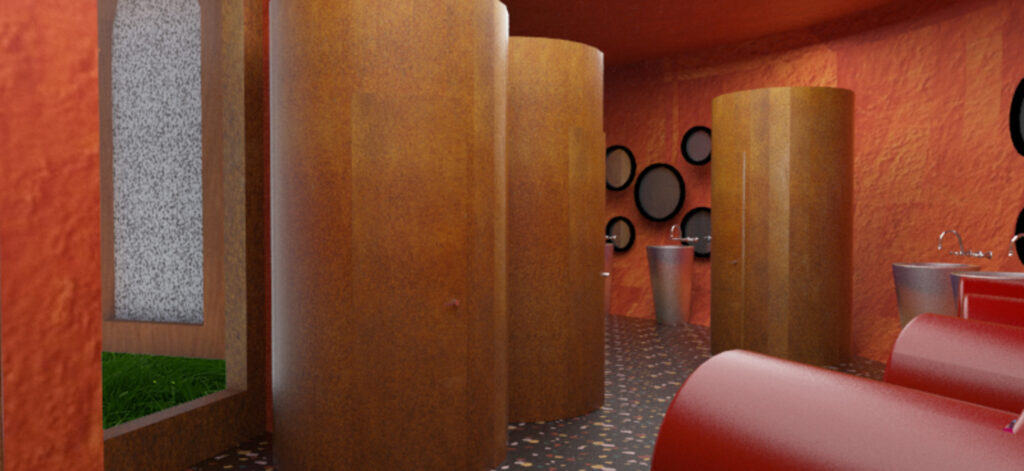
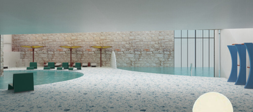
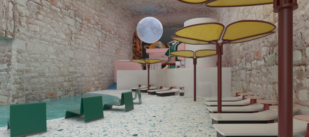
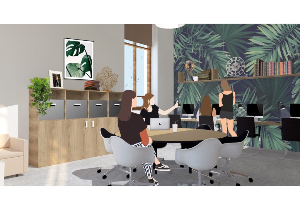
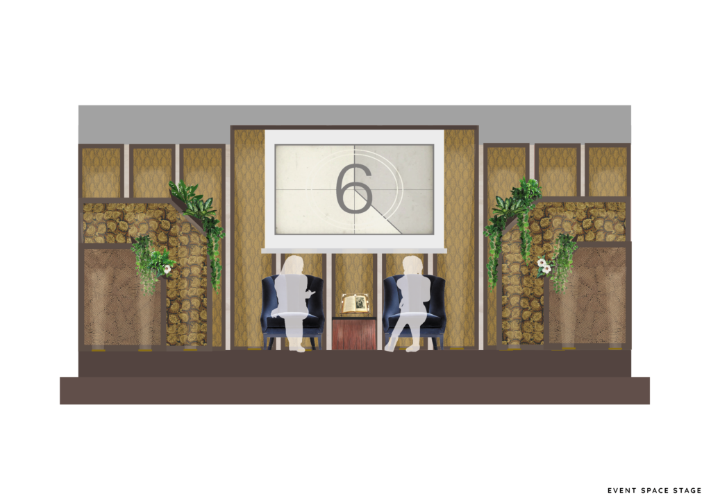
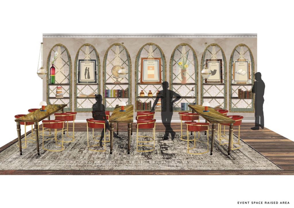
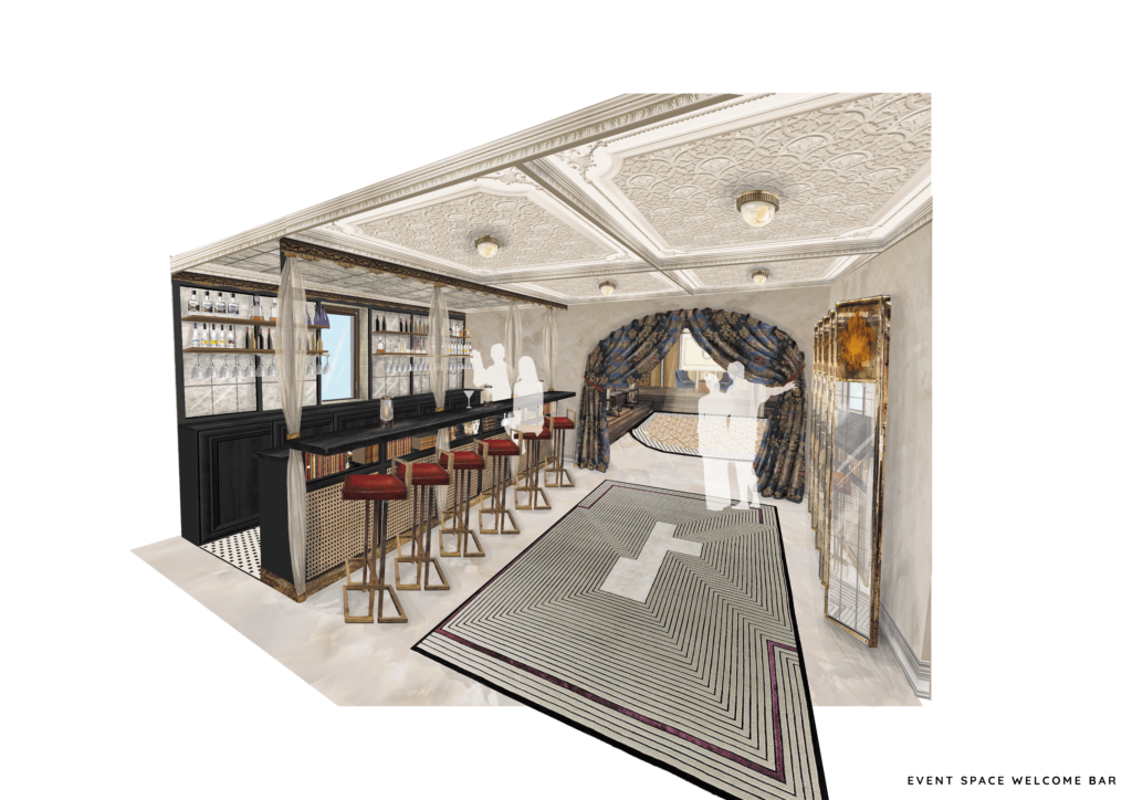
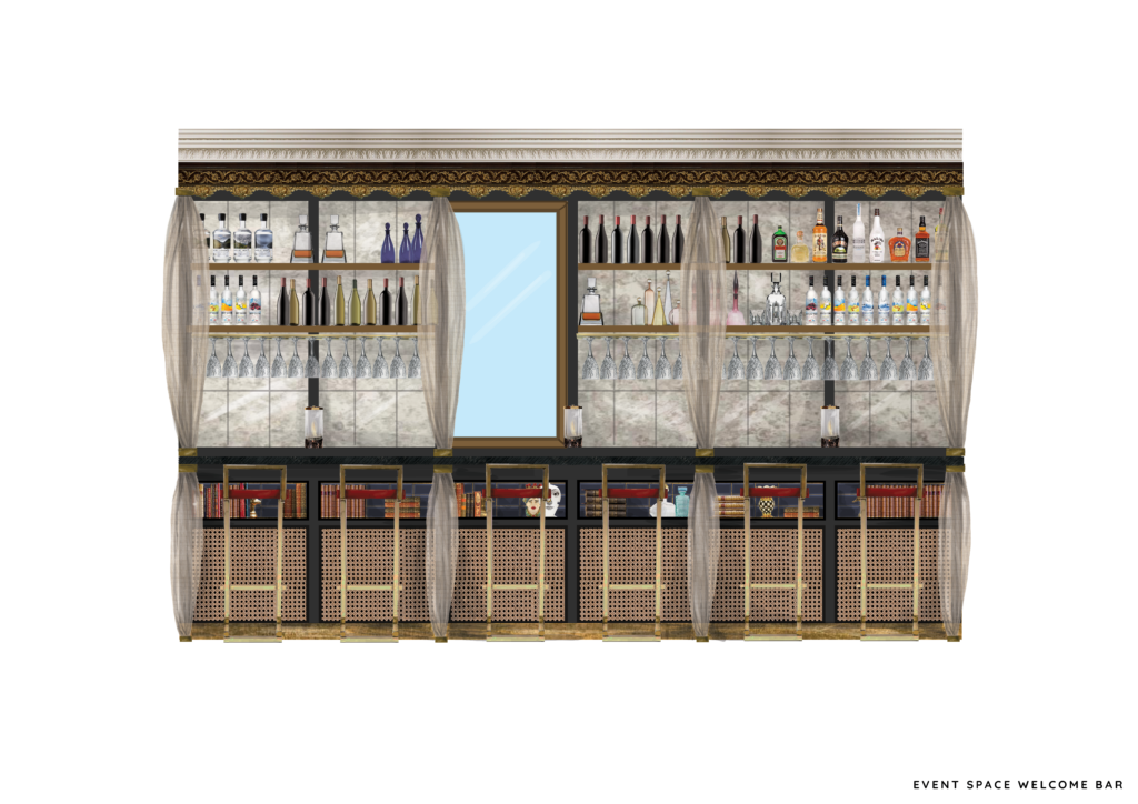
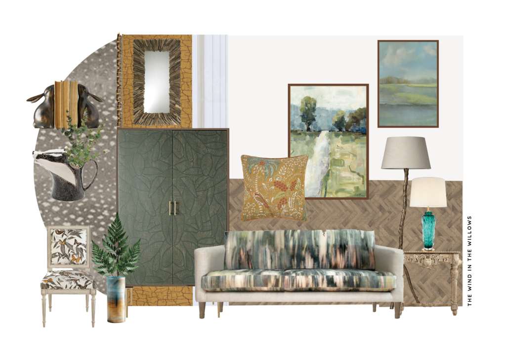
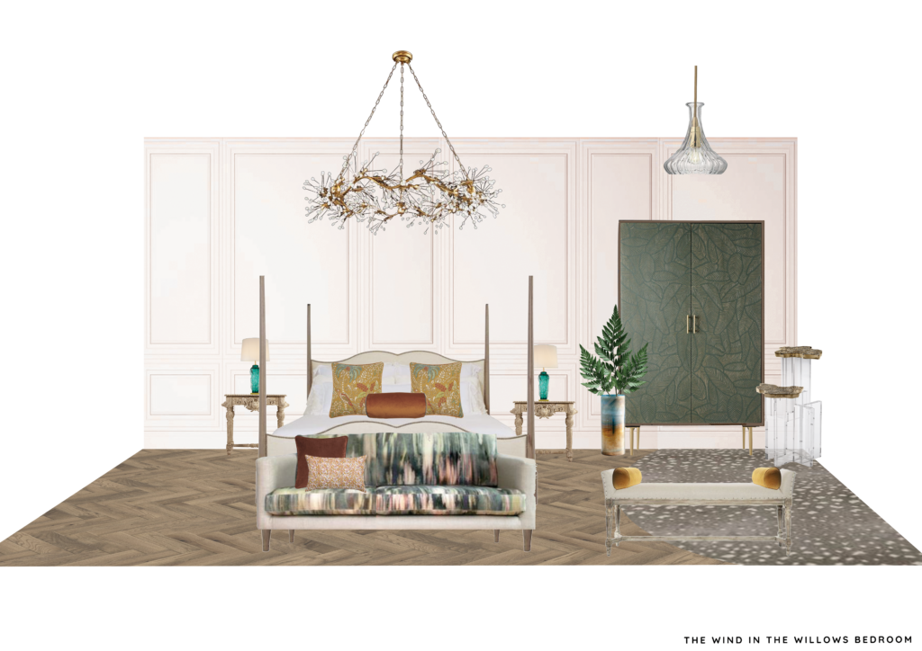
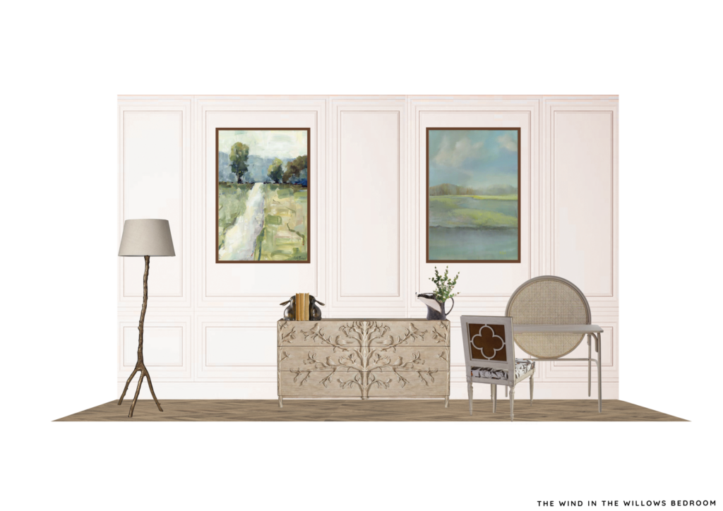
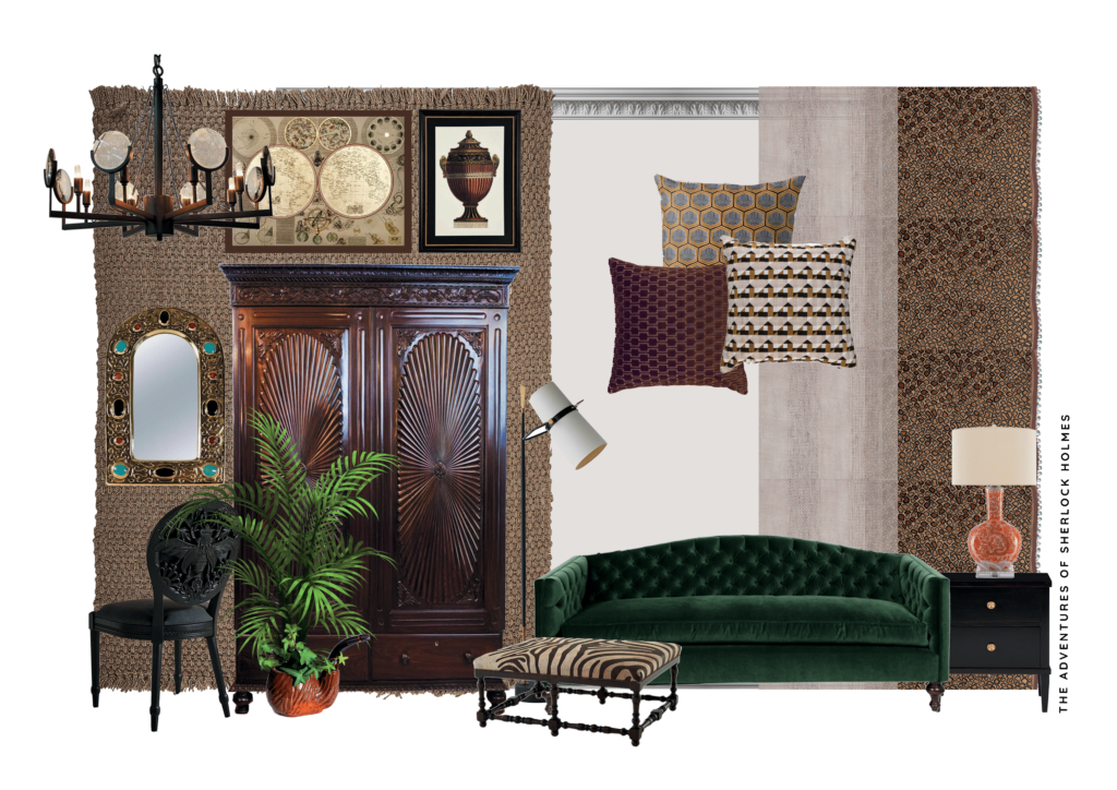
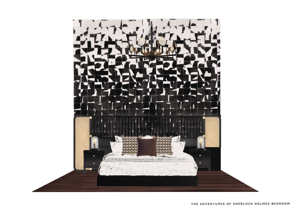
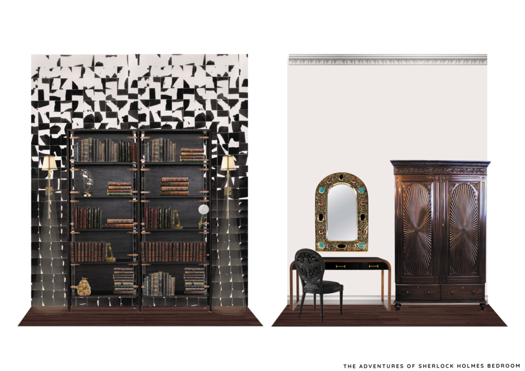
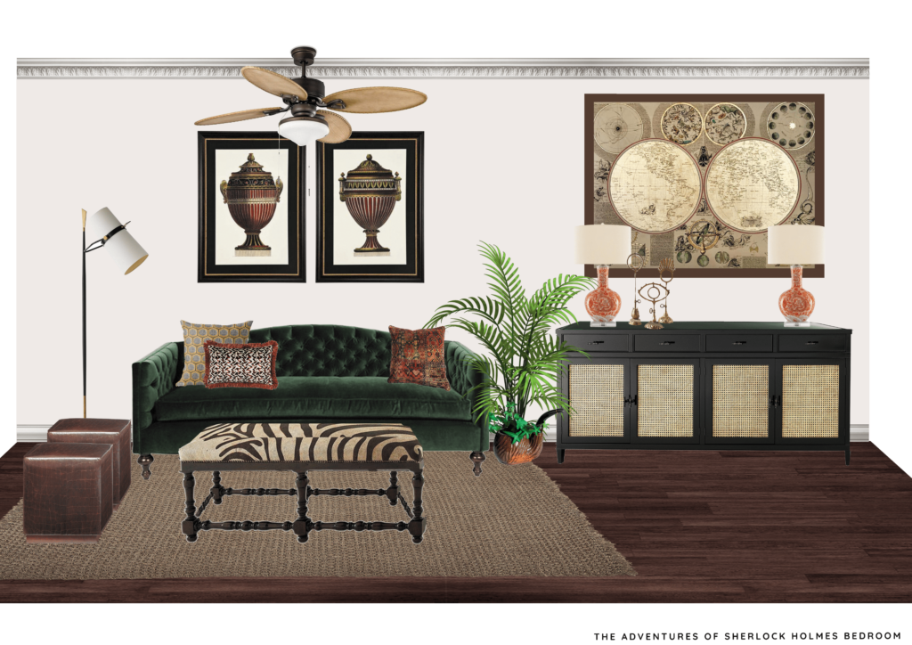
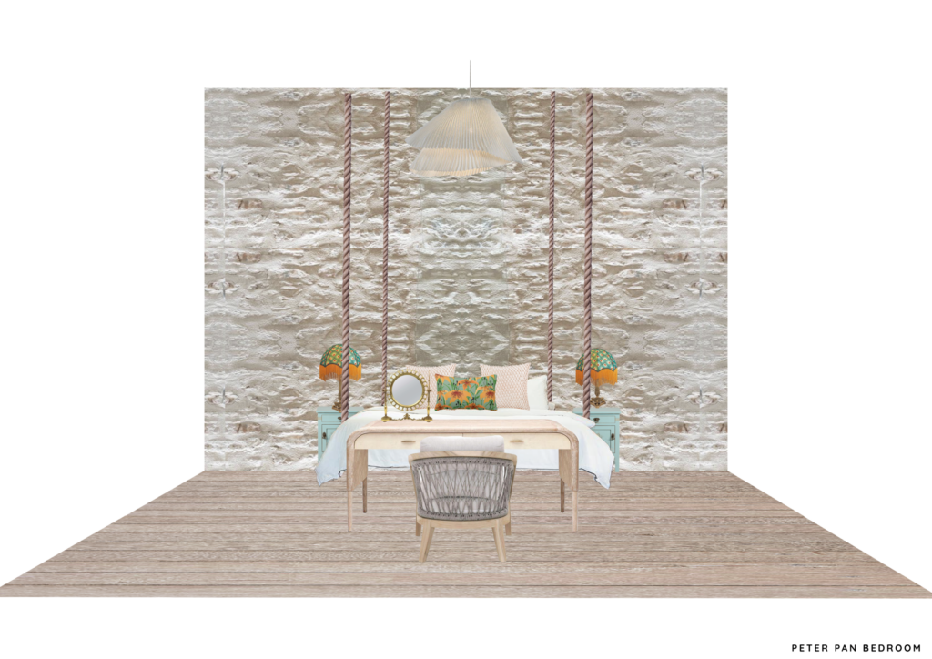
visual
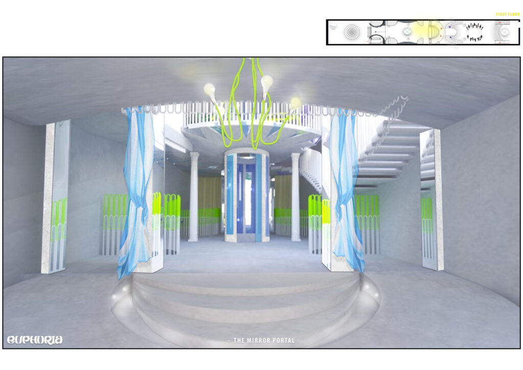
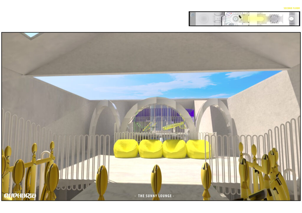
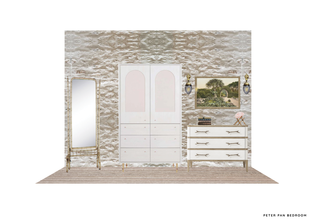
visual
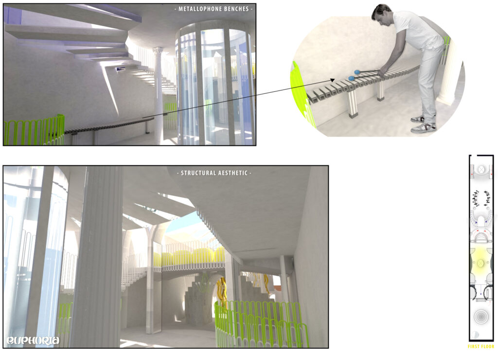
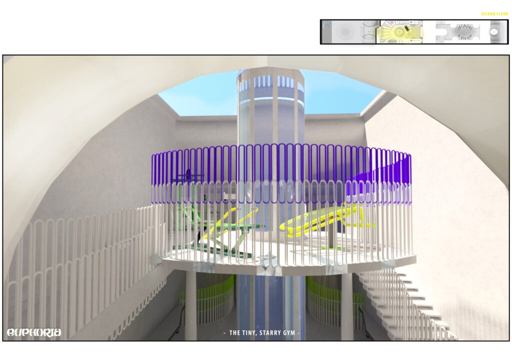
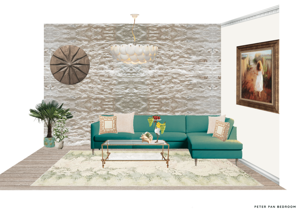
visual
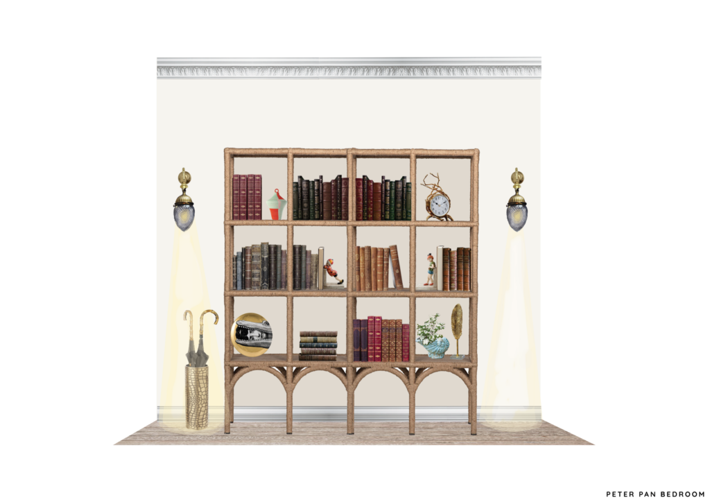
visual
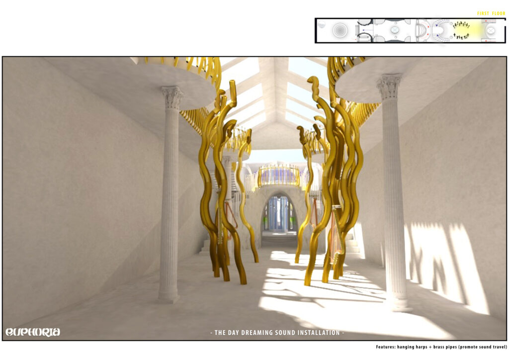
visual
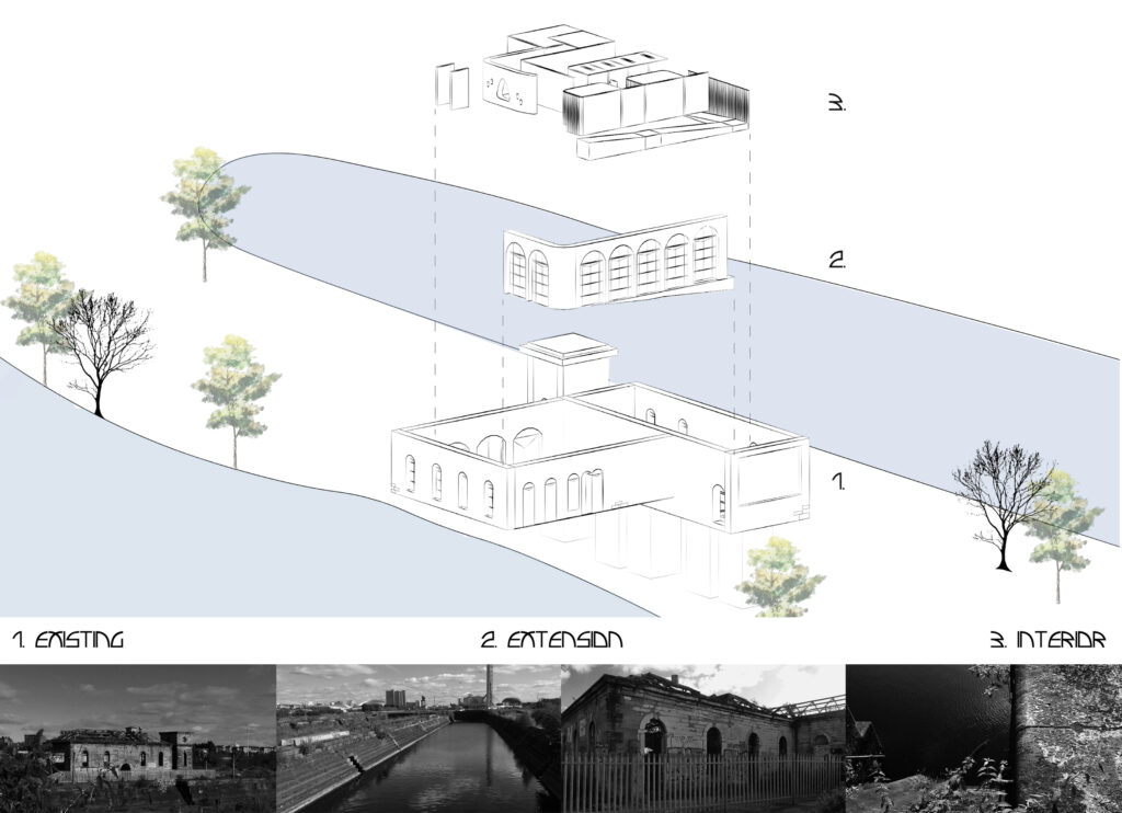
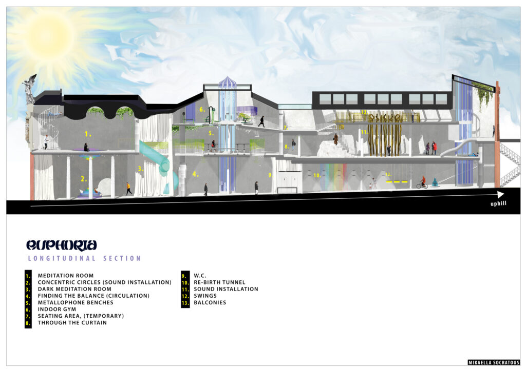
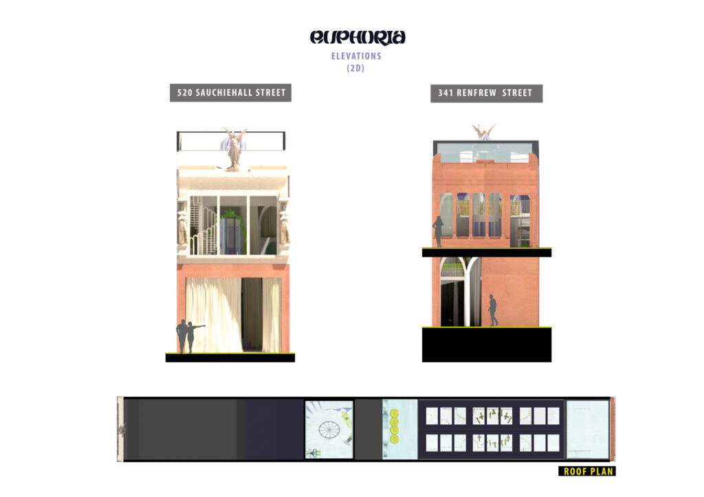
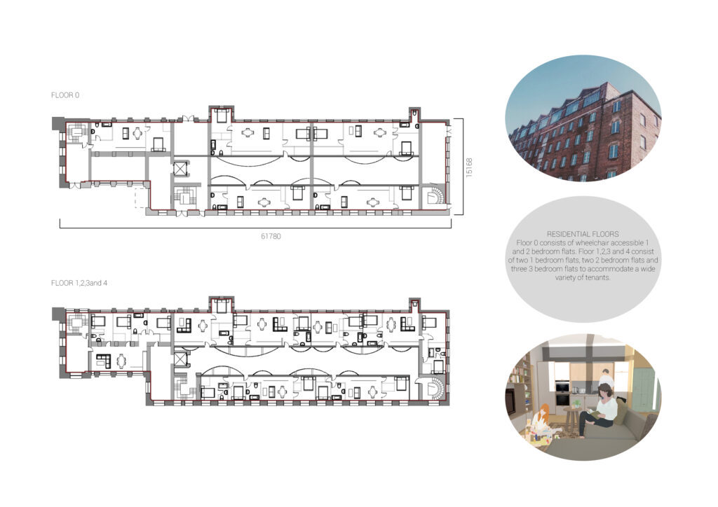
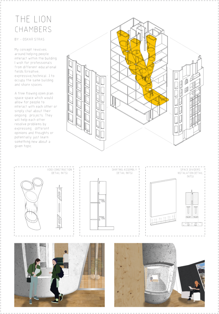
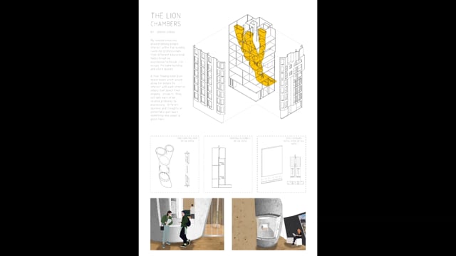
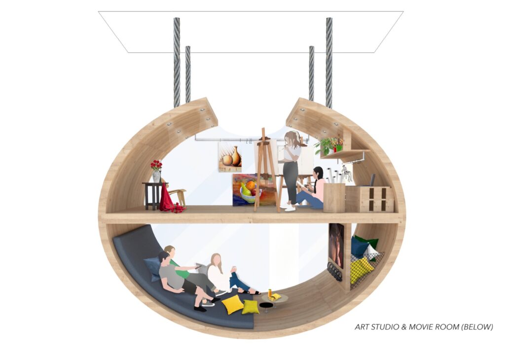
In this six storey building. The first five floors are dedicated to a range of sizes of flats to accommodate a variety of tenants.
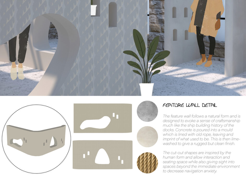
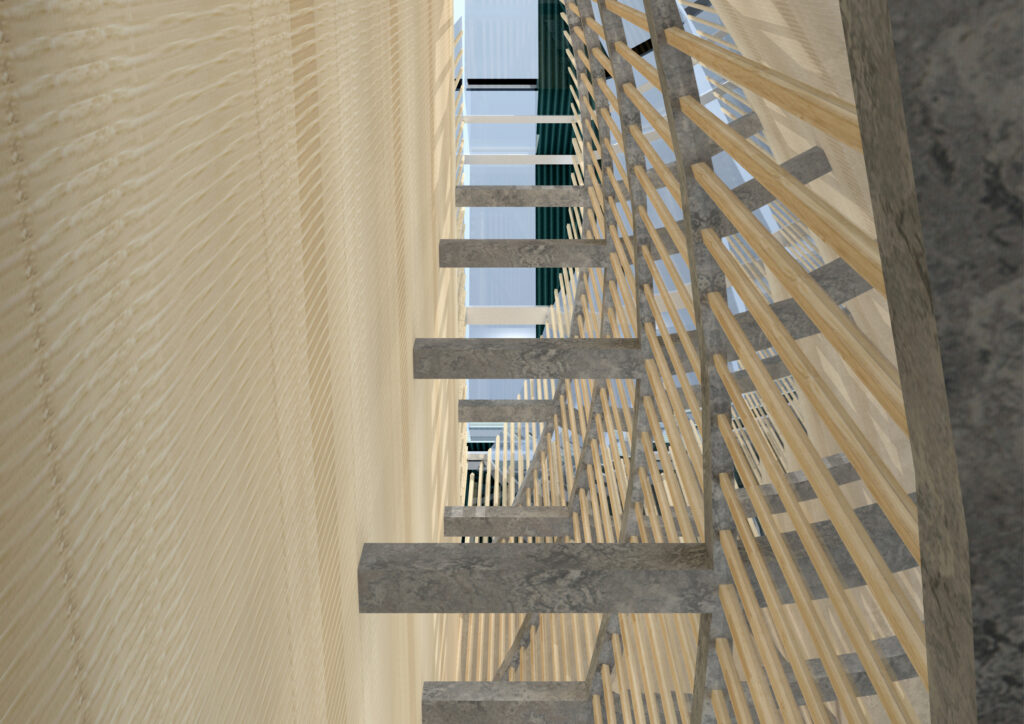
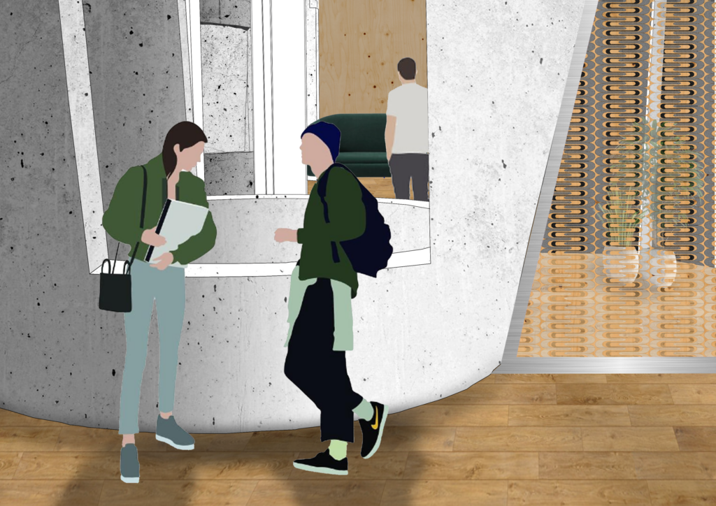
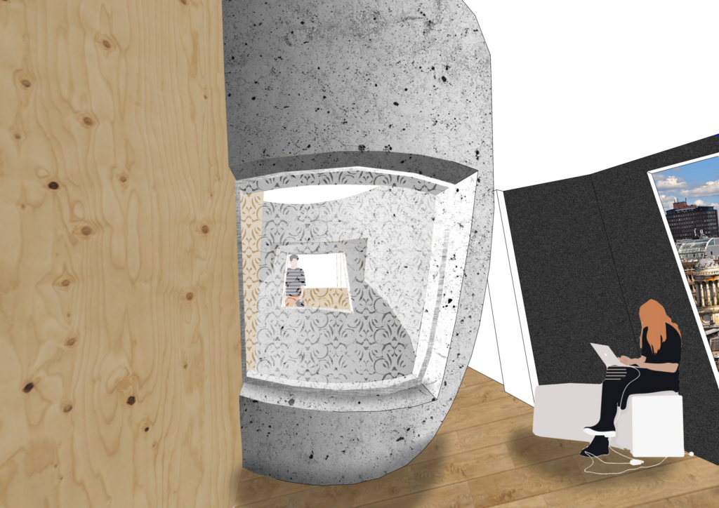
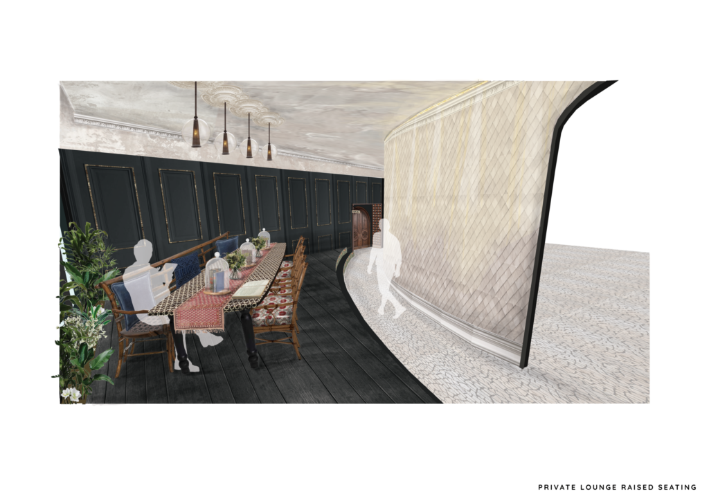
A main design feature throughout the shared spaces in my design is curved walls. Curved walls are softer on the eye and the doorways located between the light voids and the external storage acts as a natural boundary between public and private space and giving them a feeling of “indoor streets”
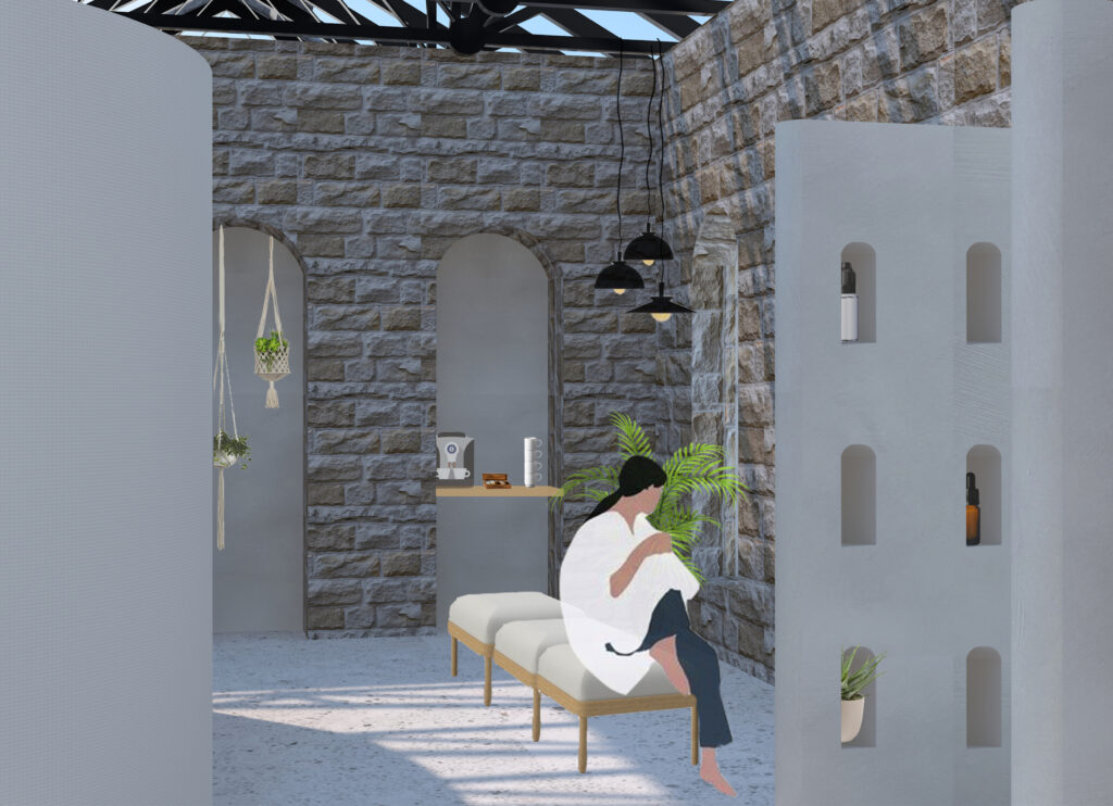
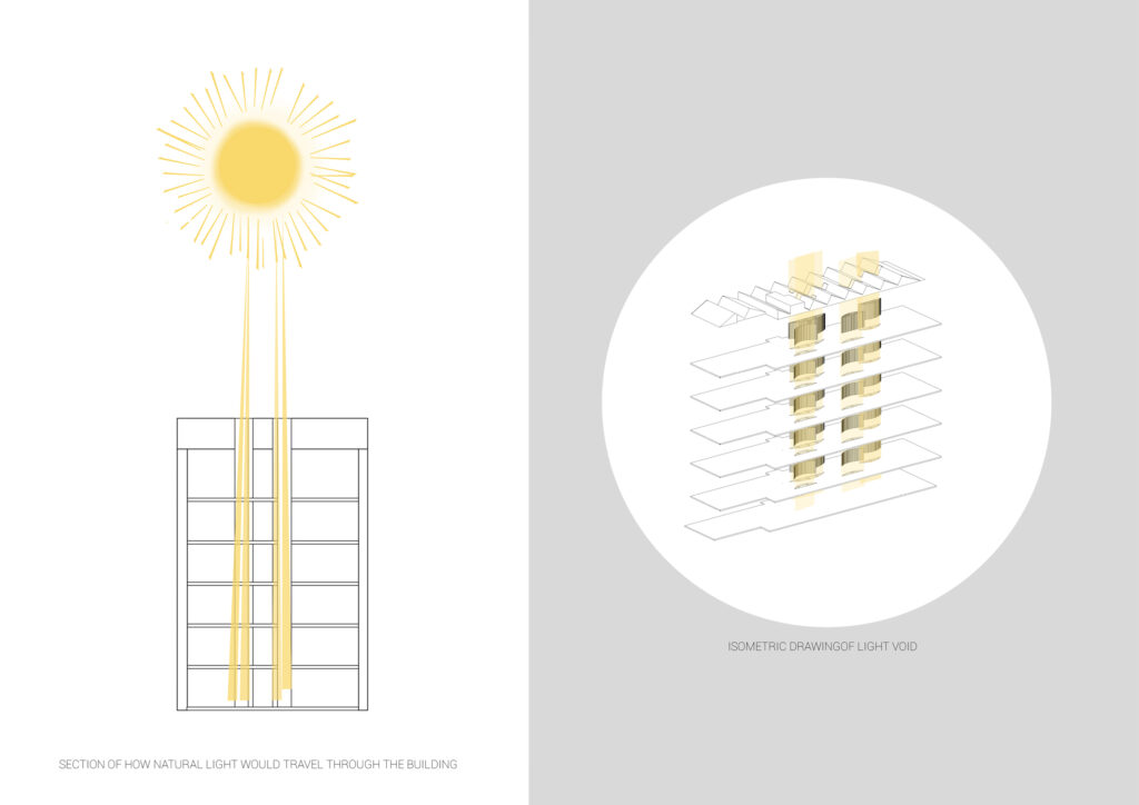
Natural light was an important factor when designing the layout of this building. I wanted to give more attention to spaces which are normally disregarded when designing residential buildings. Light voids down the centre of the building allows me to avoid having narrow dark corridors and gives the space more purpose rather than just being a pathway to get from A to B.
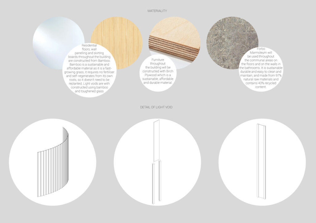
Choosing materials which are sustainable, durable and affordable was important when designing this space. After researching lots of examples of previous social housing in Glasgow, a common theme was poor material choices which lead the buildings to fall into disrepair. The materials used throughout the building are easily maintained, within a reasonable budget as well as being environmentally friendly.
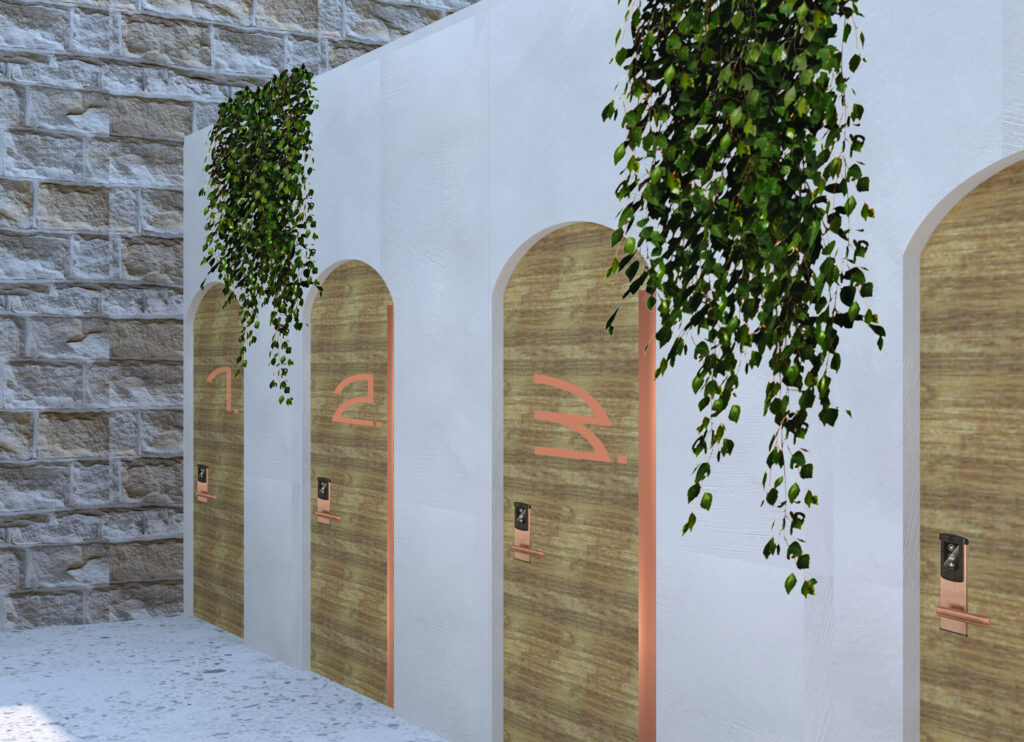
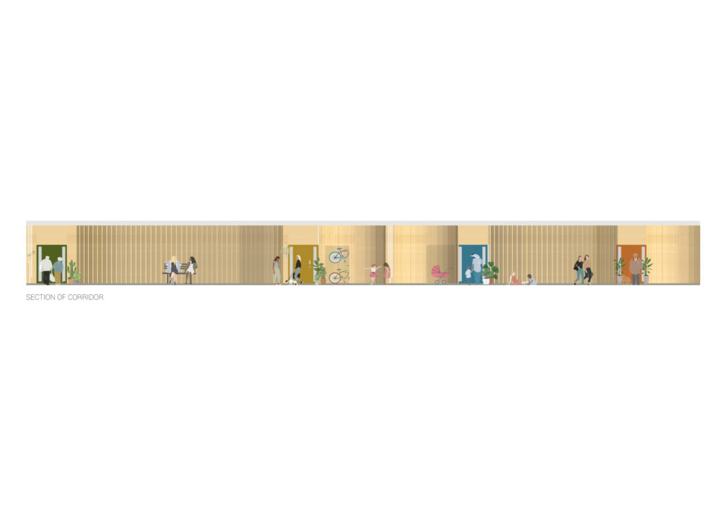
Often in new residential buildings, there is a lack of personality with every doorway only being distinguished by a number. To avoid this, and contribute to easy navigation of the building, I chose to incorporate different coloured doors as well as the curved design creating the opportunity to personalise your doorway personal belonging.
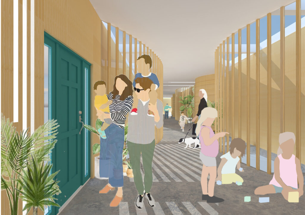
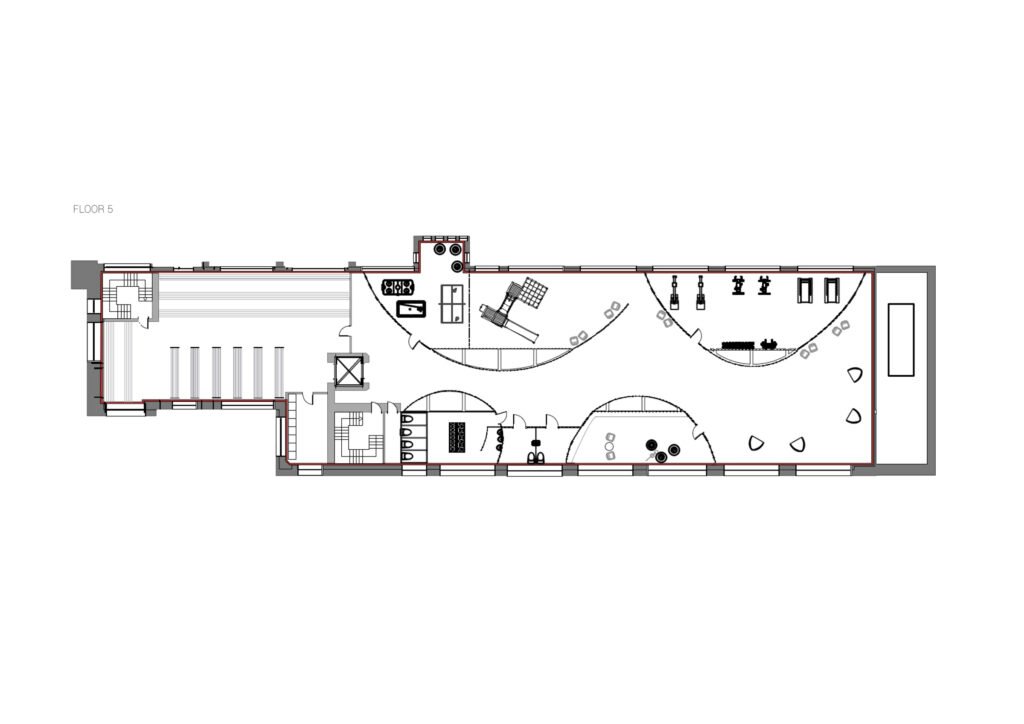
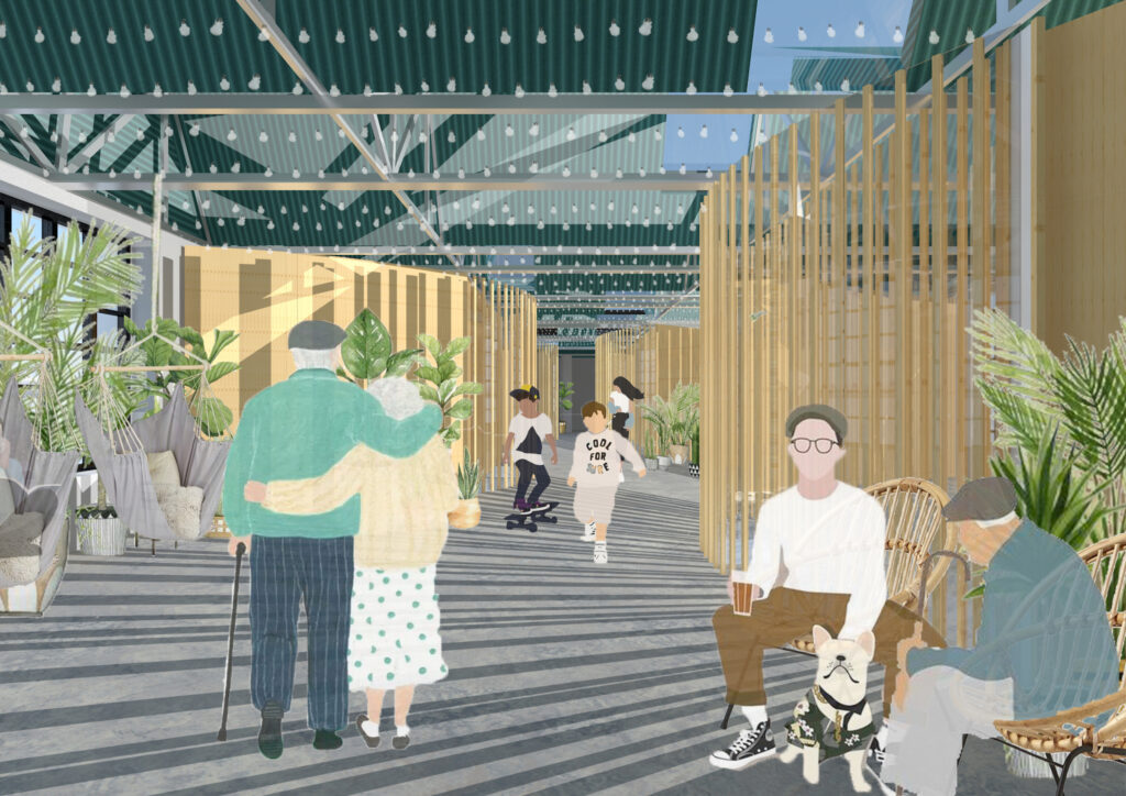
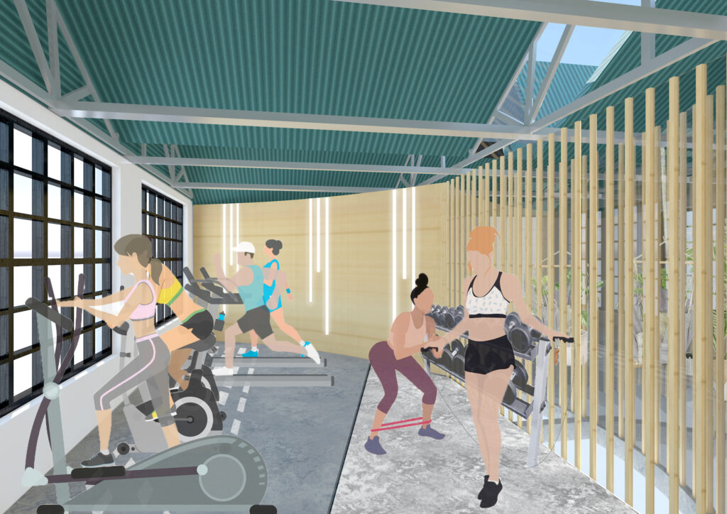
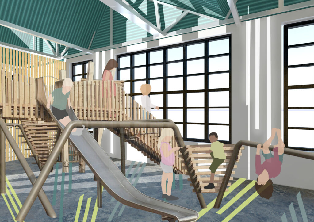
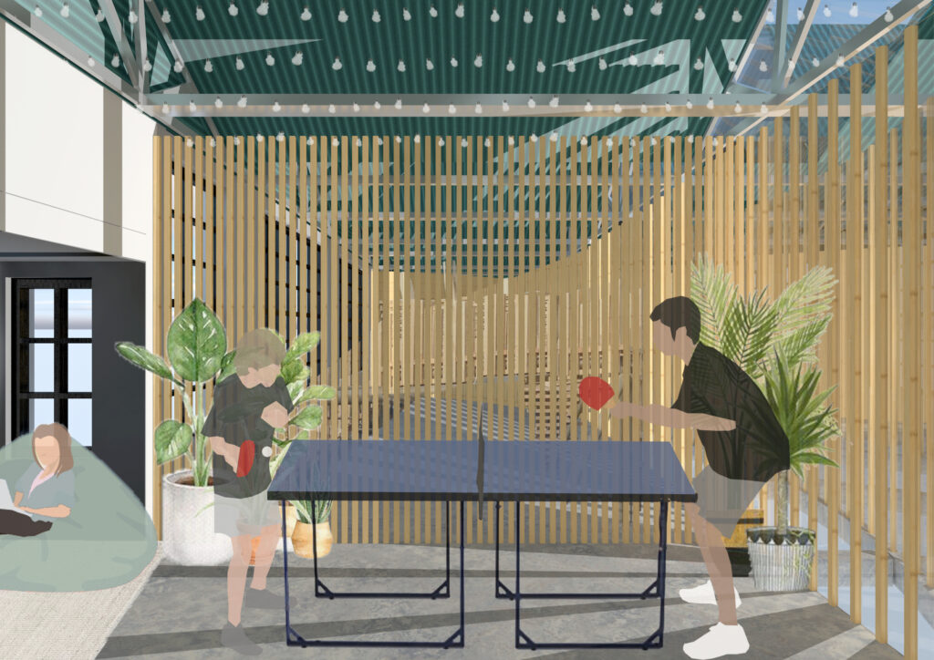
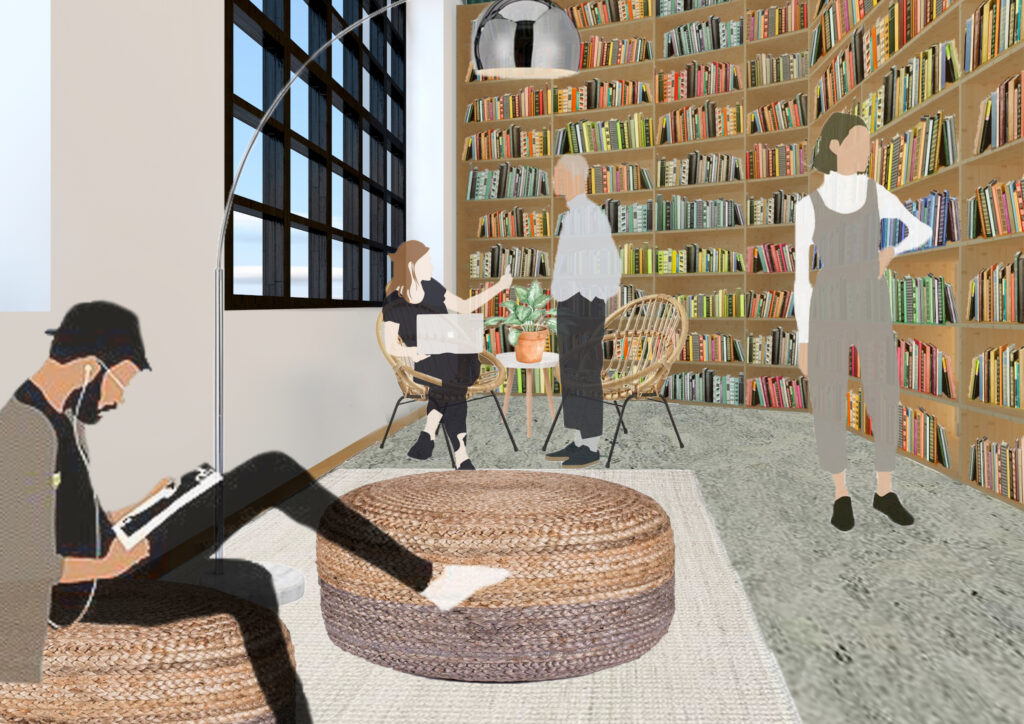
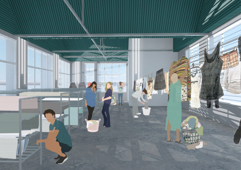
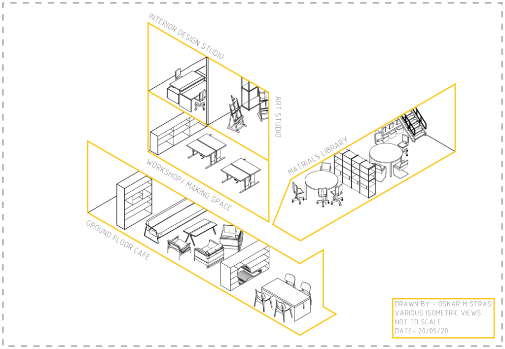
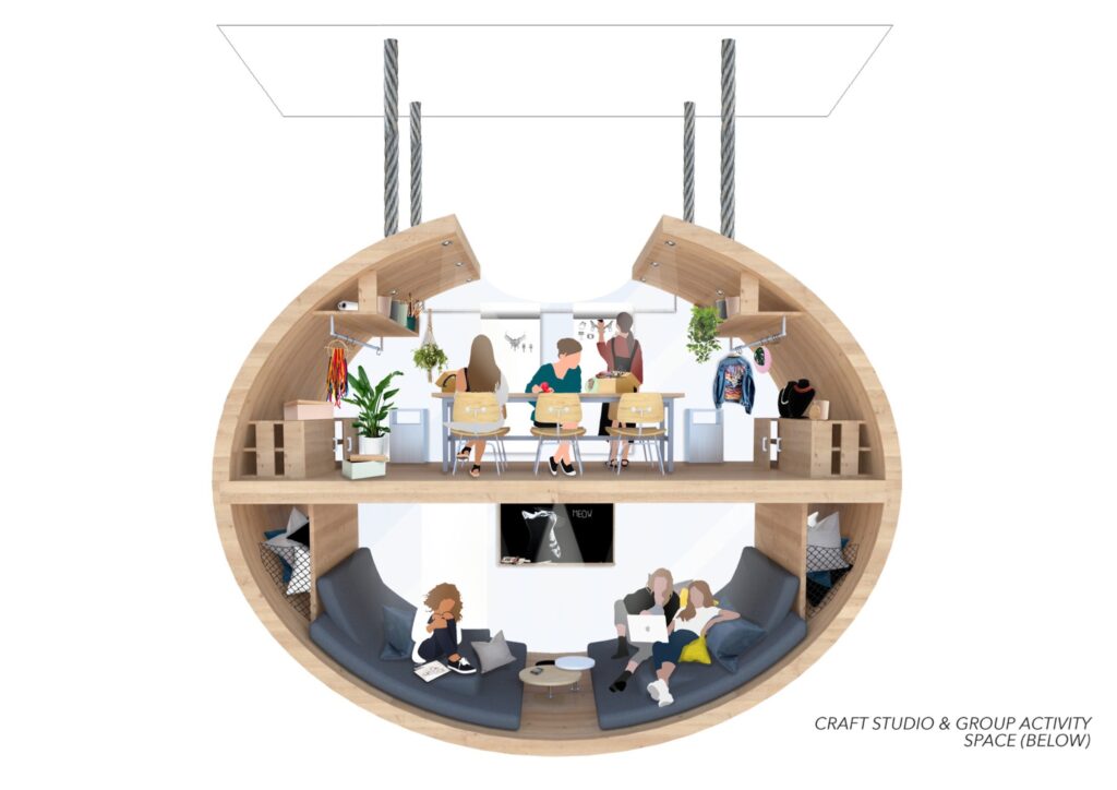
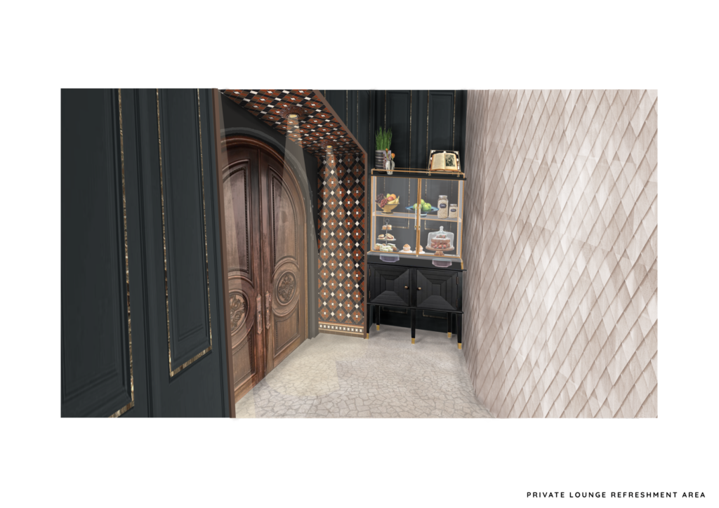
To encourage community living, the top floor of the building is a social space which provides entertainment for tenants of all ages. These facilities include a games room, a play area, a gym, a library, a communal laundry and an indoor walkway full of greenery and natural light.
This indoor walkway is a space for tenants to come and relax or take a walk when the weather isn’t so great. It is flooded with natural light from the large windows that surround the entire top floor and skylights in the roof.
As this housing scheme aims to provide people with a healthy life a gym in provided on the top floor to encourage tenants to keep fit and healthy.
Often in flats there is not enough space for young children to run around and play, which can often cause tensions to run high when living in a confined space. This open space with visibility from the walkway allows parents to socialise while keeping an eye on their children playing.
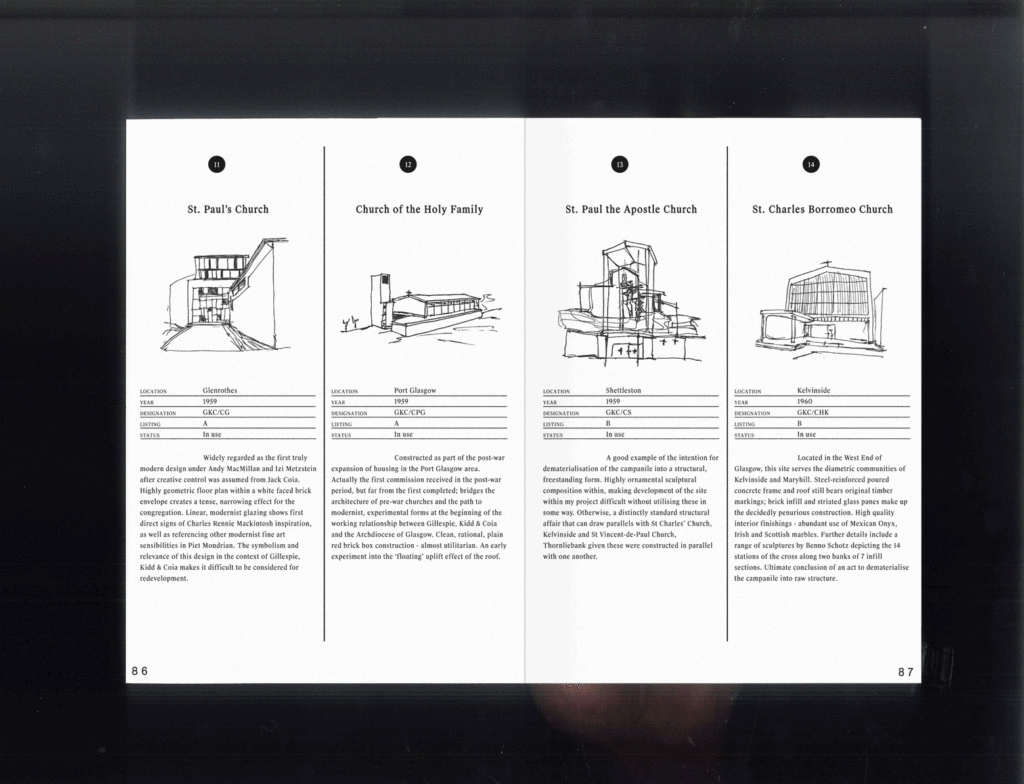
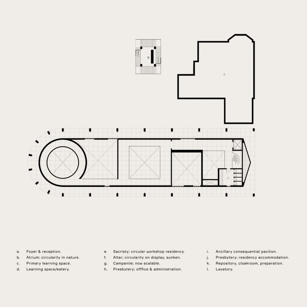
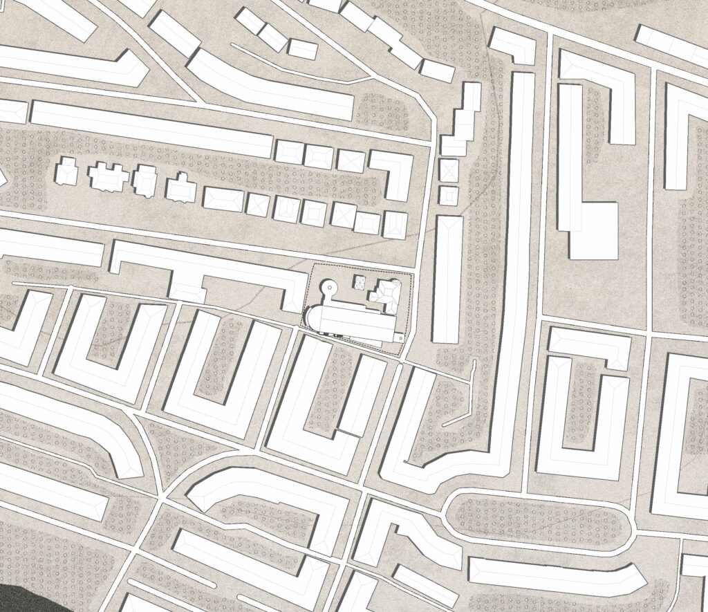
My developing research publication, Mass Extinction, discusses the decline of liturgical practice in Glasgow within the spatial context of Gillespie, Kidd & Coia's post-war ecclesiastic inventory. Driven by the reinvention of the Catholic Church in the wake of the Second Vatican Council, Modernist-influenced structures were generated as tangible examples of the reinvented liturgical dynamic. Their current status, however, is mostly as poorly maintained and somewhat dilapidated structures with a severe lack of public appreciation. A rejection of both religious activity and modernist technique has left nearly a quarter abandoned or destroyed with many more facing socio-economic difficulty.
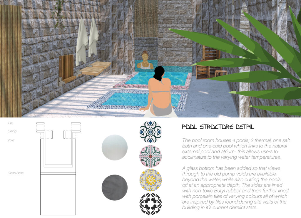
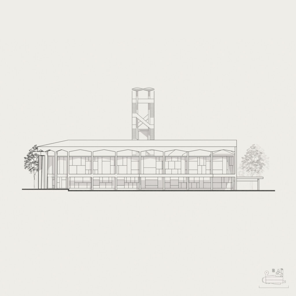
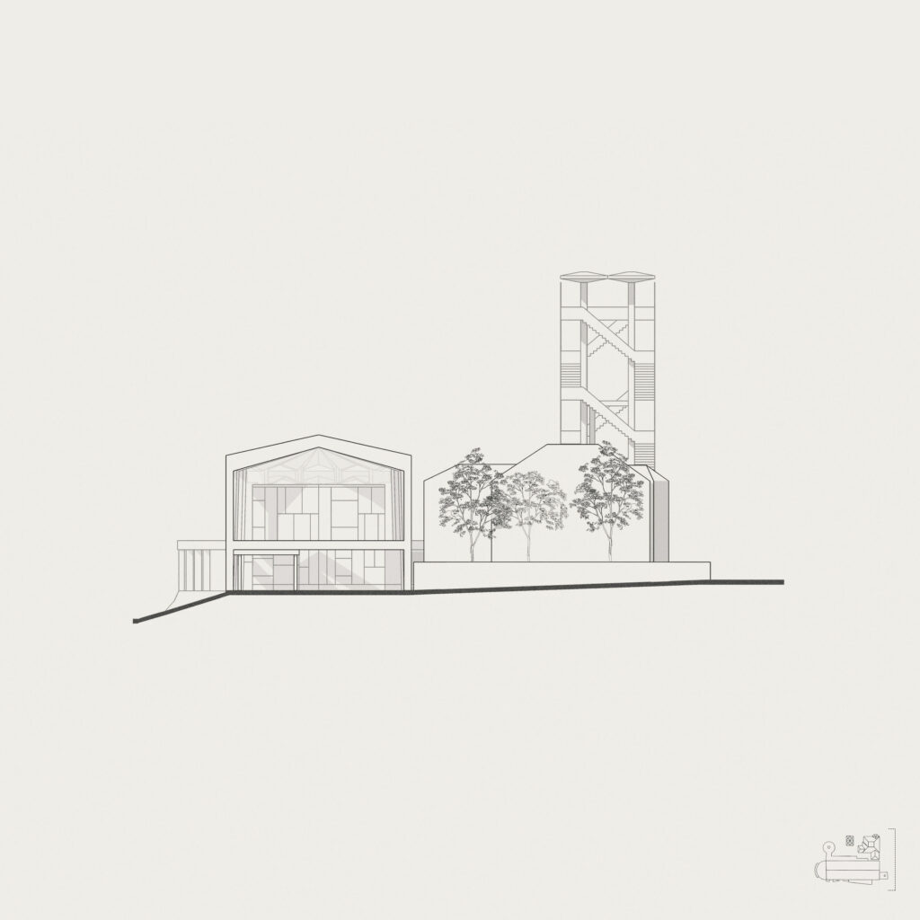
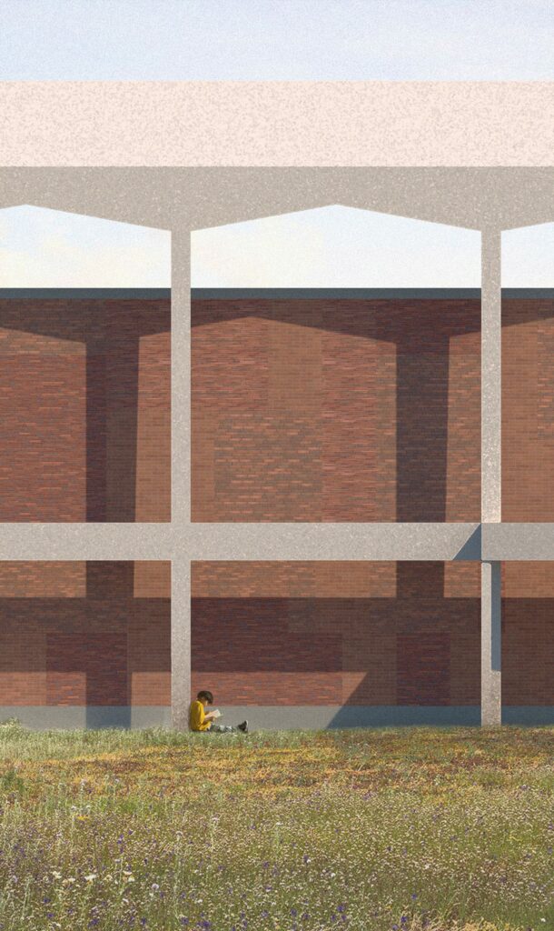
The [ongoing] design response is via adaptation of one such site, St. Charles Borromeo Church, into a learning centre for the circular economy. Structurally, adaptive reuse as itself a form of circularity; questioning every element of materiality through both reuse of the waste stream generated and any new, introduced material sourced from within the peri-urban region. Discussing circular principles applied to the existing material, concrete is the most challenging; hence, concrete becomes, in effect, 'consecrated' in situ, a defined rule that it must remain entirely without alteration. The infill brick masonry has been removed and regurgitated into a new internal structure - the threshold of interiority is redefined whilst creating spectacular visual permeability into an environment previously fraught with conformity and privacy. Yet, the form of the original construction is maintained. The new insertion is monolithic yet intimate - it distills a learning process for circularity into principles of education, application and fabrication allegorising with the tripartite existence of spirit, soul and body. To receive, to animate, to incarnate. Thus, the building becomes an incubation of it’s theory: a catalyst to promote, define and direct sustainable intervention. A project that decrees that liturgical intervention can be more unique, more aggressive. In fact, with the present situation, it has to be.
Footage of live renderings as a real scene.
Morning sun with a haze over the lights.
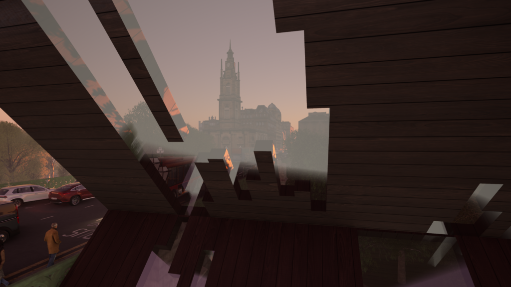
Through the glass onlooking the spire.
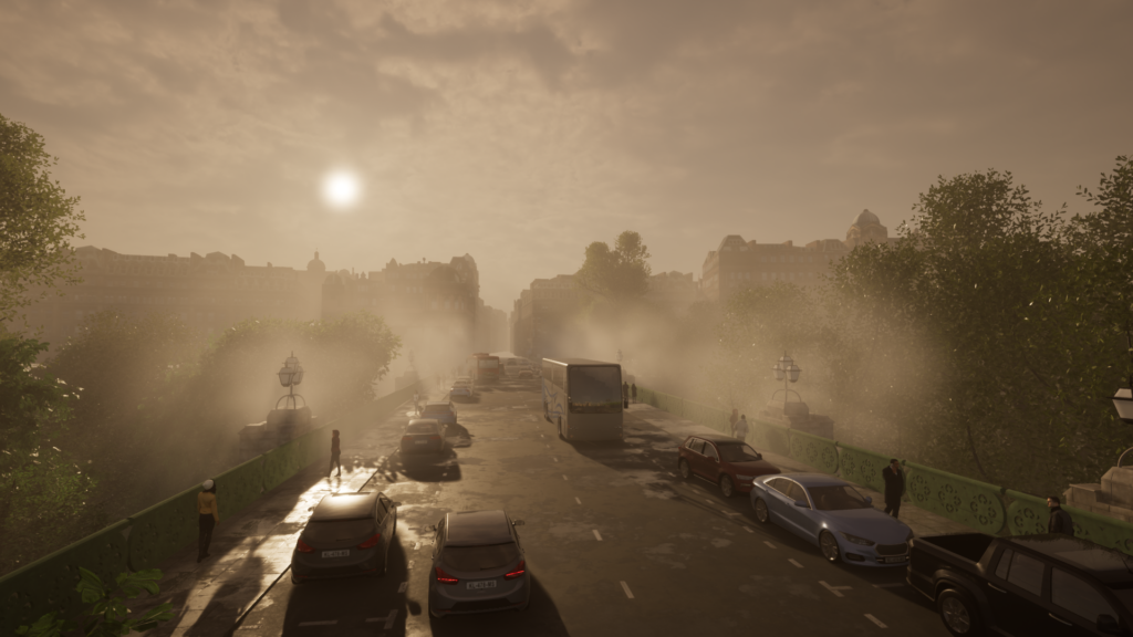
Kelvinbridge wide angle.
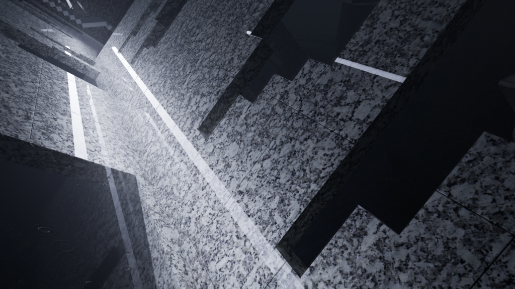
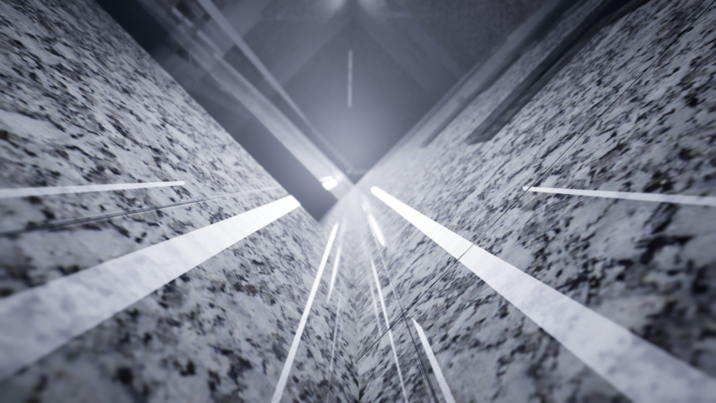
Design interior with a white marble finish.
Reflections of the neon lights.
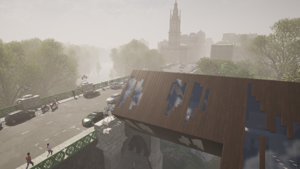
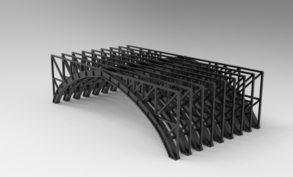
Kelvinbridge underside modelled.
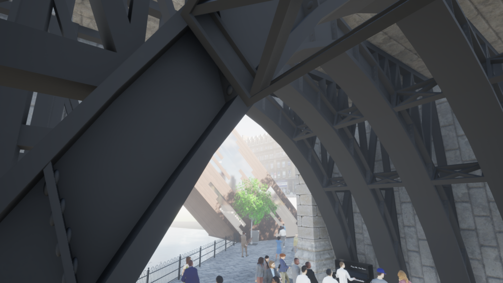
Pedestrian underside of Kelvinbridge with crowd.
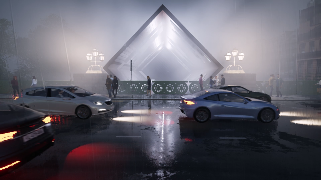
Late evening stormy weather with a busy street peering into structure.
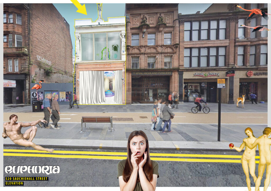
visual collage
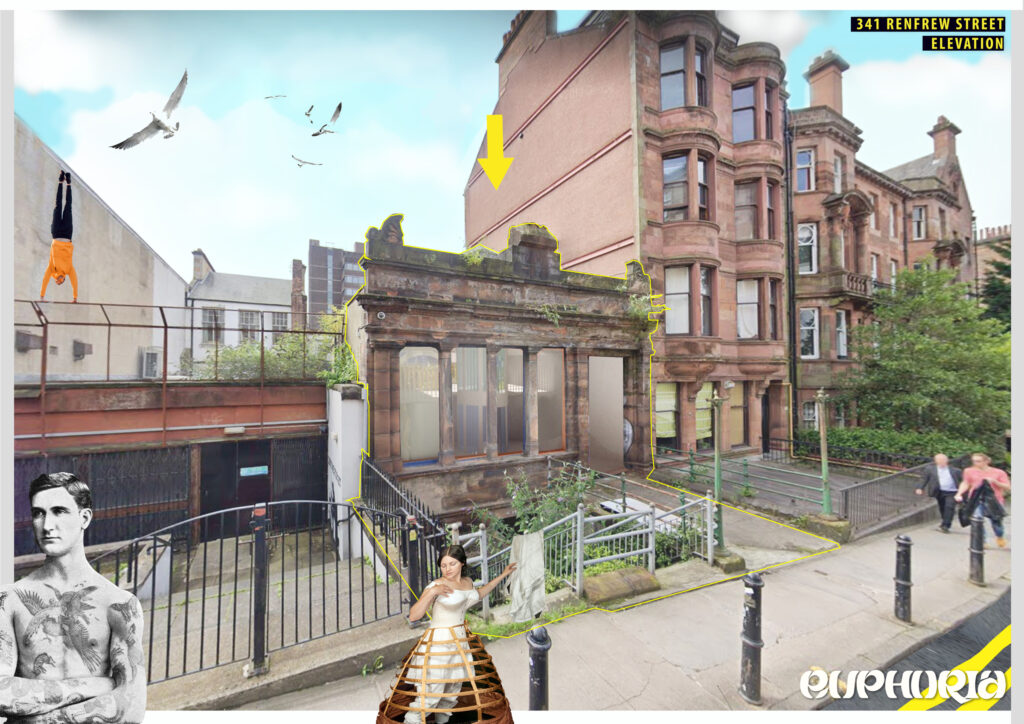
visual collage
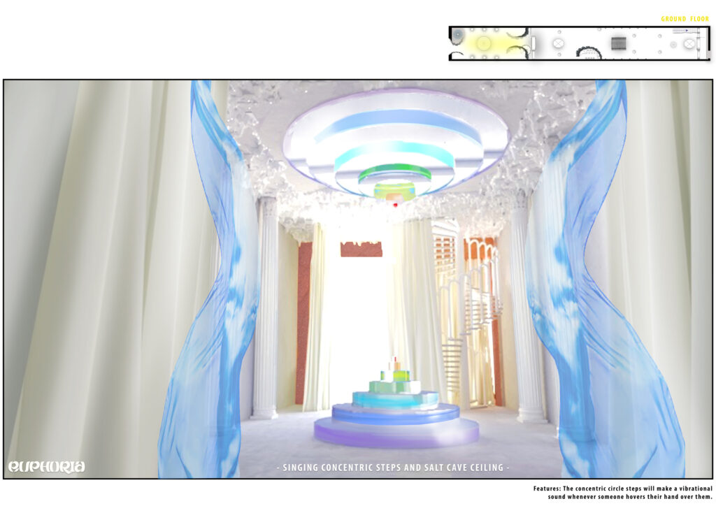
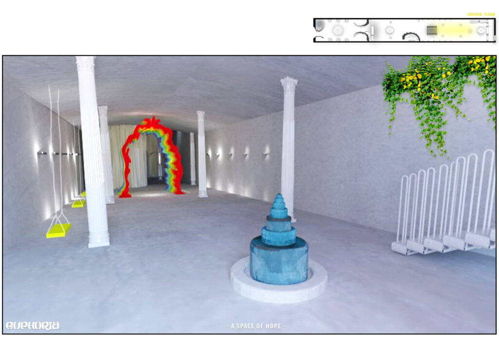
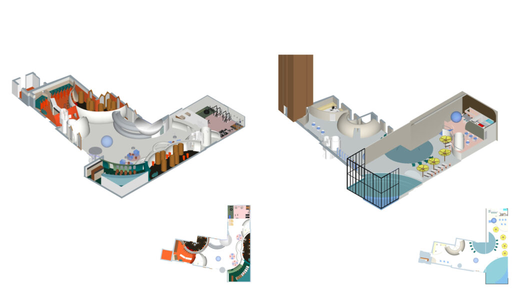
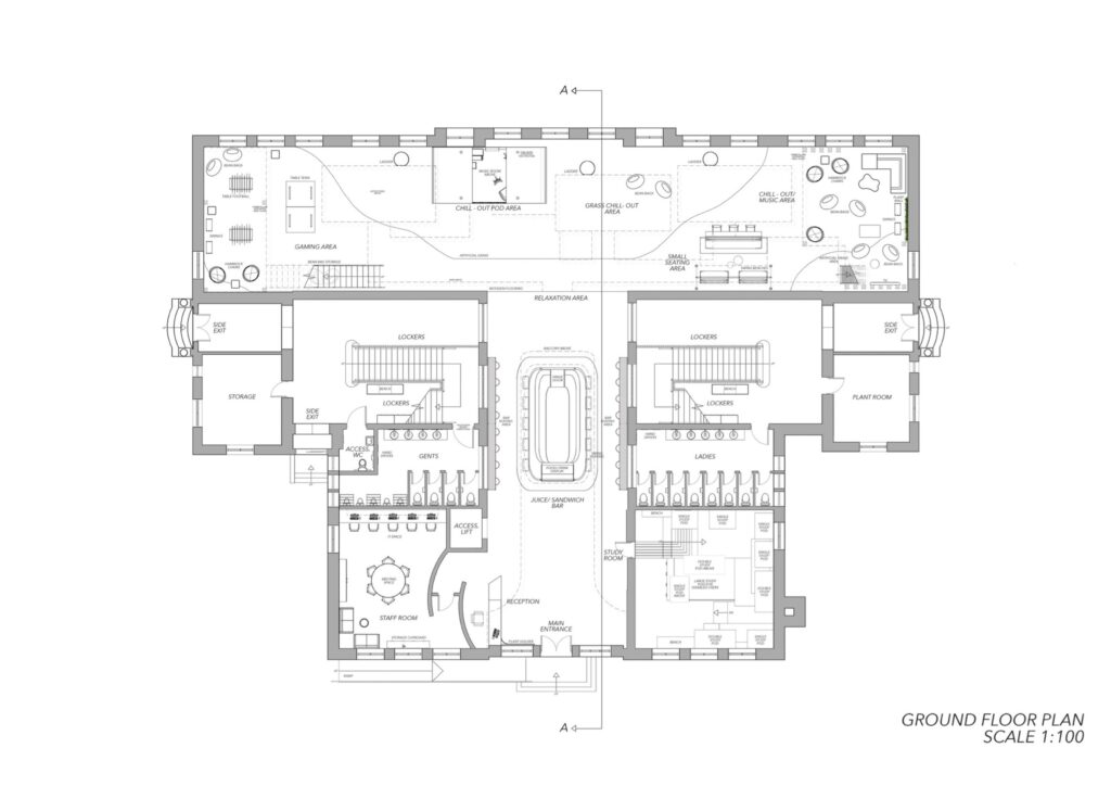
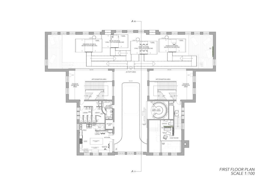
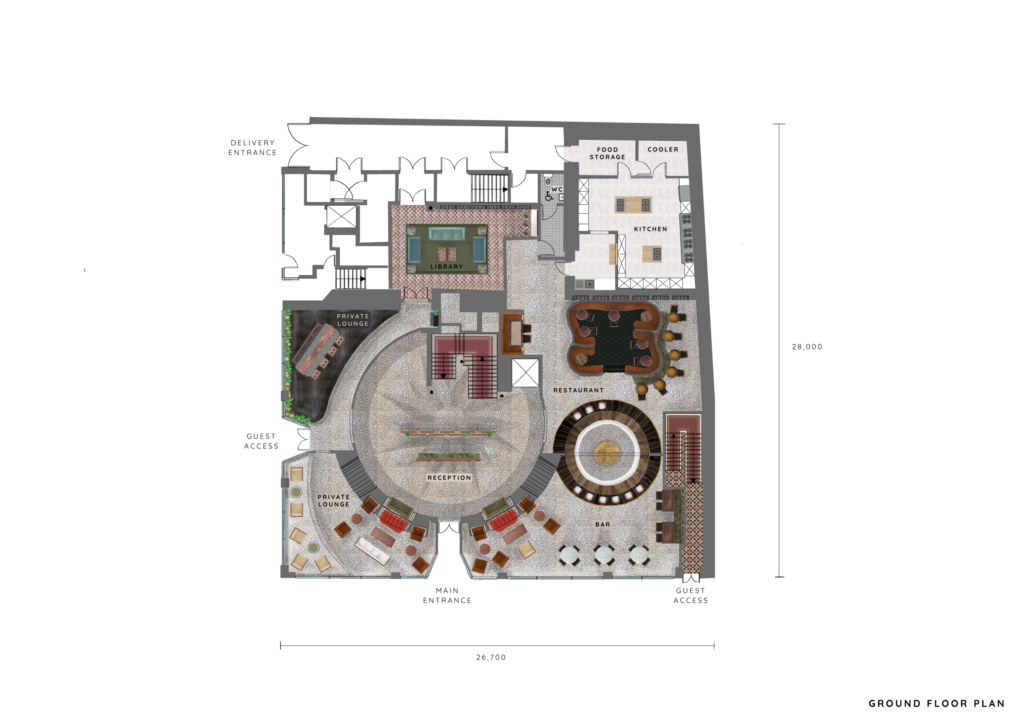
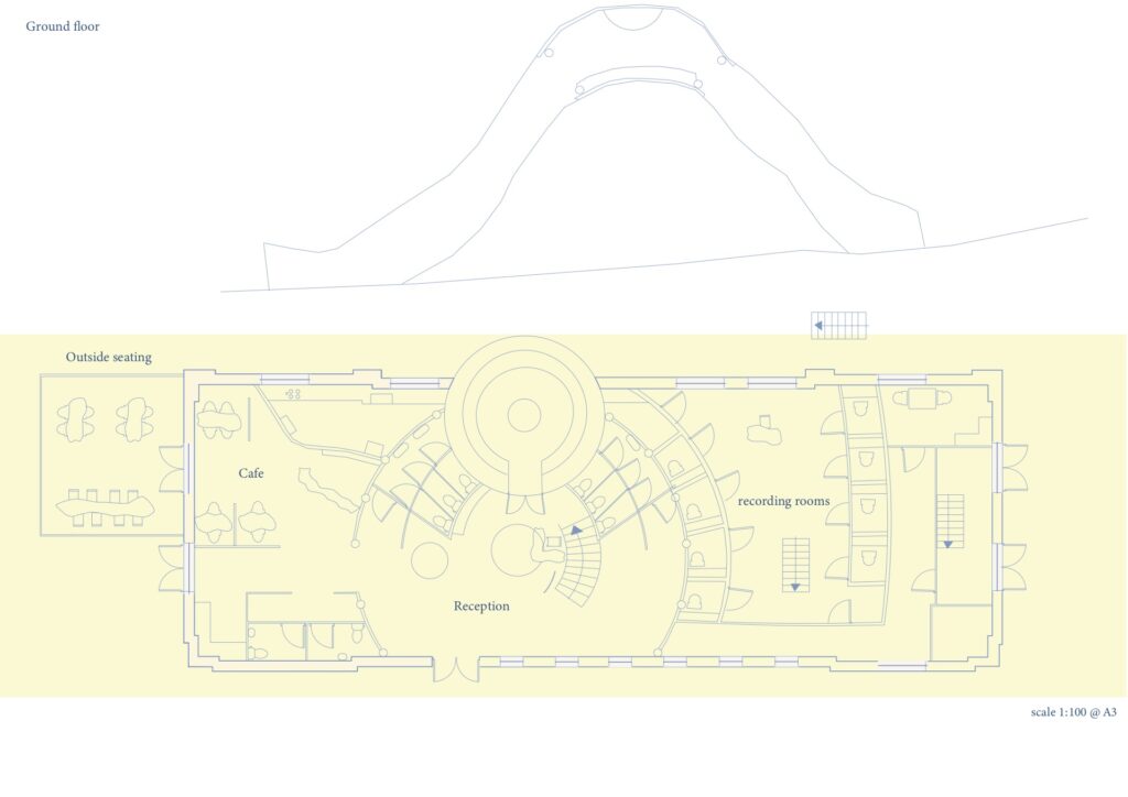
Ground Floor Plan
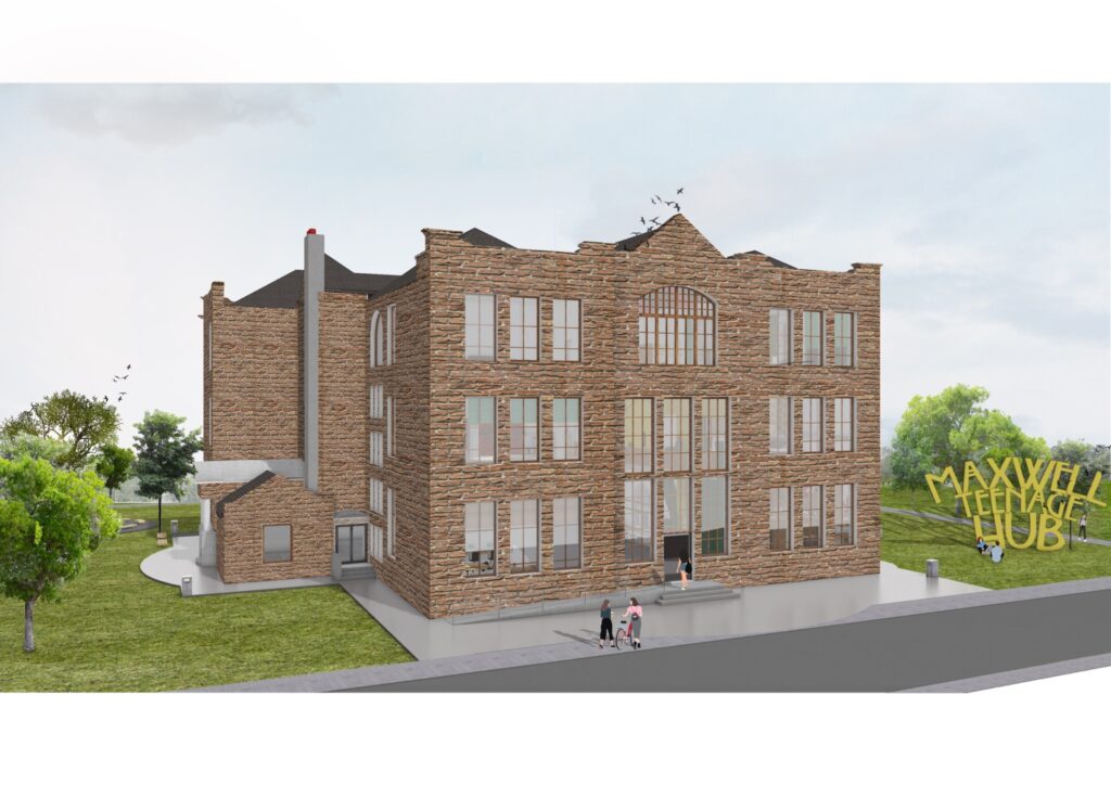
Formerly a primary school this building now houses the most cutting edge teenage hub in town. This iconic building in Polloshaws has been totally transformed and brought back to life to serve the younger generation once again.
This ground floor plan reveals the true size of the building which once served 500 pupils.
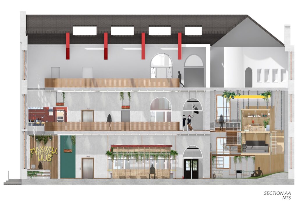
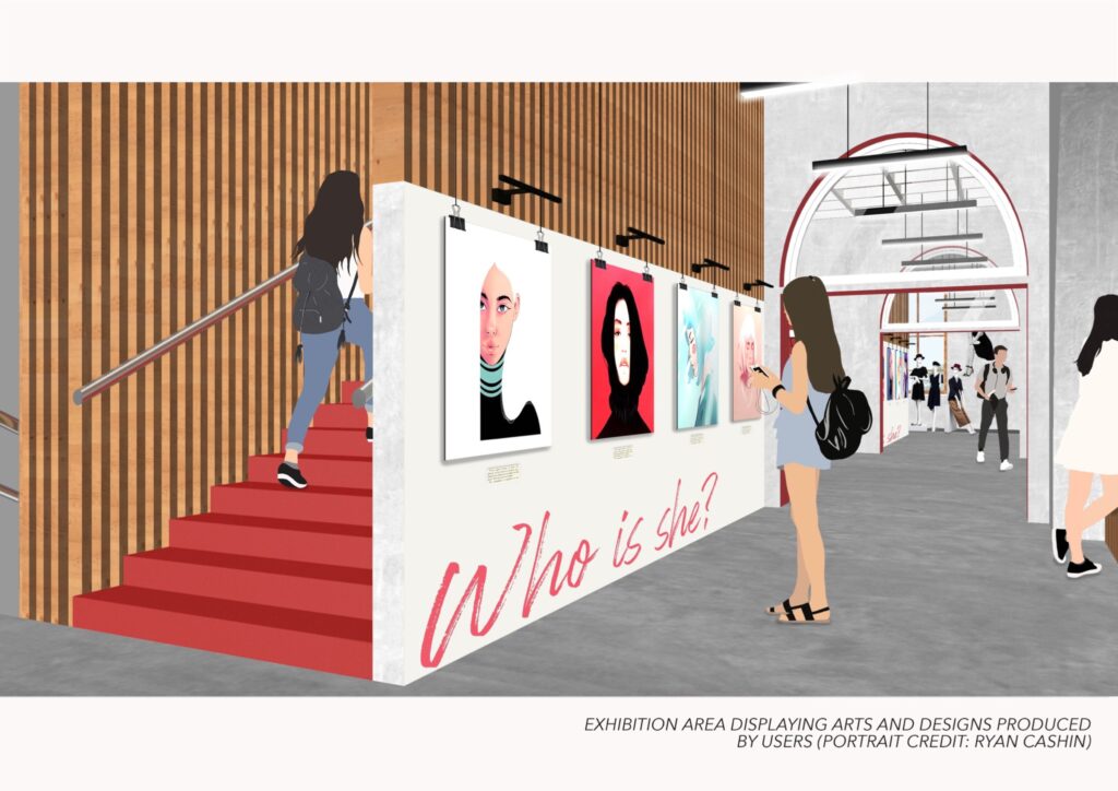
This section AA cut unfolds the first steps of the users journey. Entering the space they will be greeted by natural light in the atrium which will navigate the users through a dynamic open plan space leading onto different floors to their desired activity.
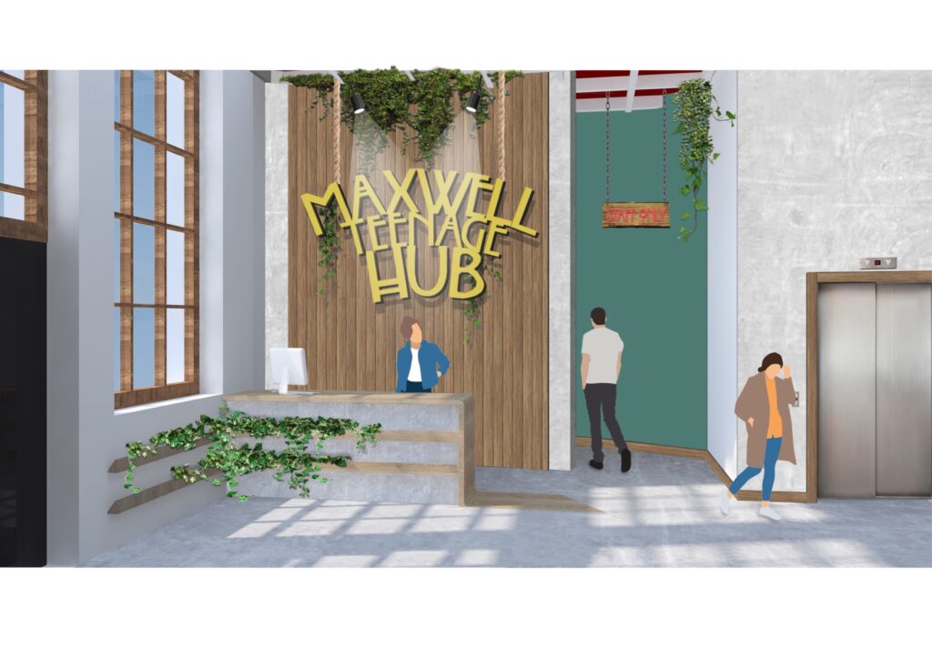
The atmosphere of the reception has been achieved by bringing the aspect of natural materials and light into the space, making a more welcoming and stylish environment for teenagers.
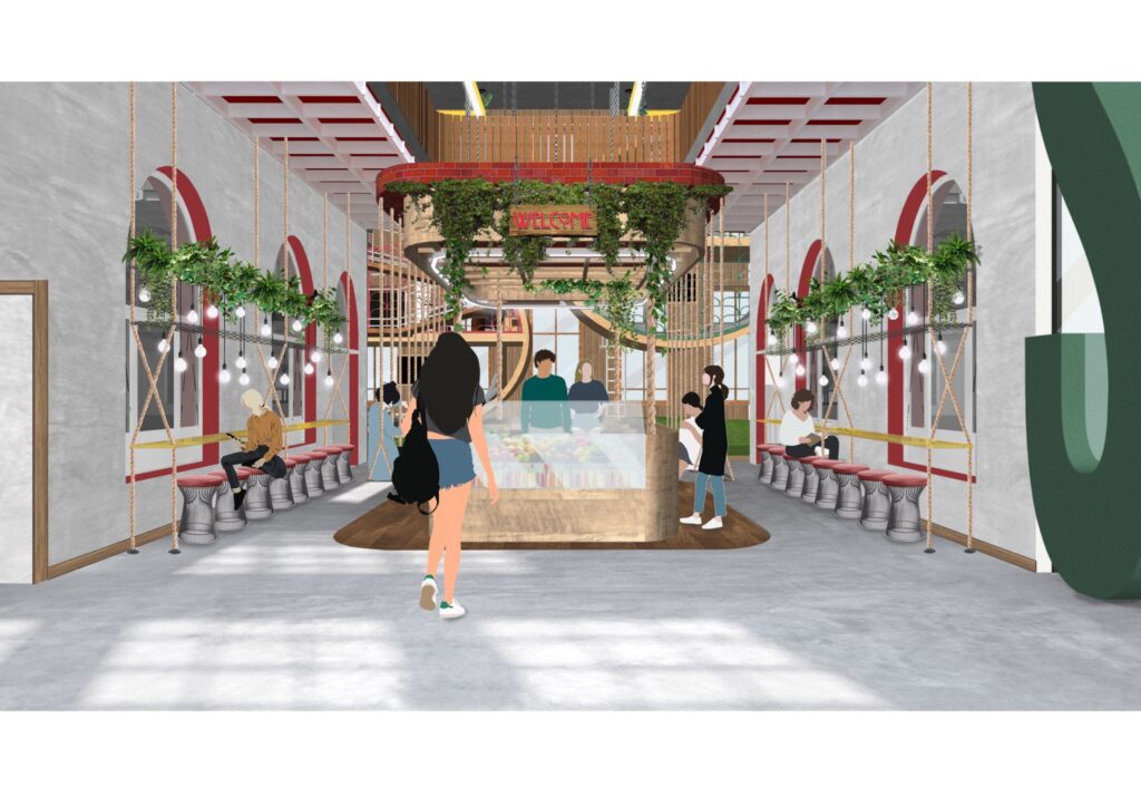
The design of this former assembly hall/dining space is inspired by the original features such as arch windows and red and white concrete grid ceiling. This space now serves the purpose for the users to meet new friends and enjoy a quick snack either to wait for their scheduled activity session or to just chill.
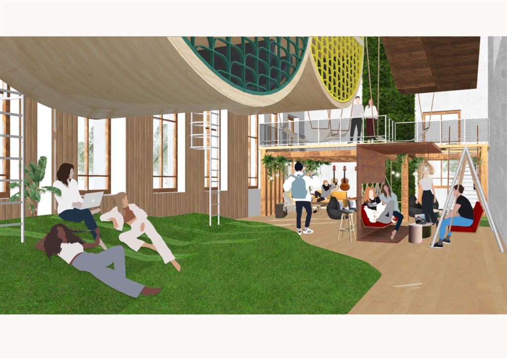
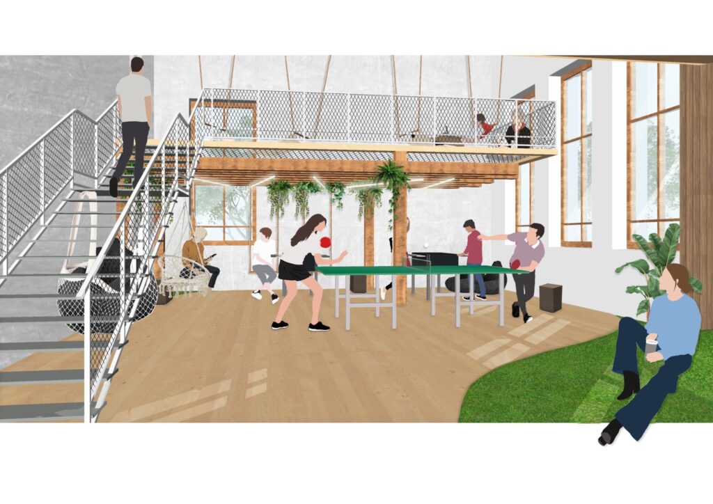
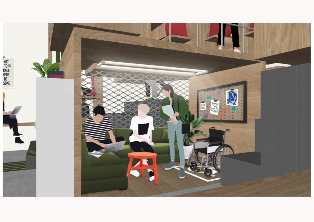
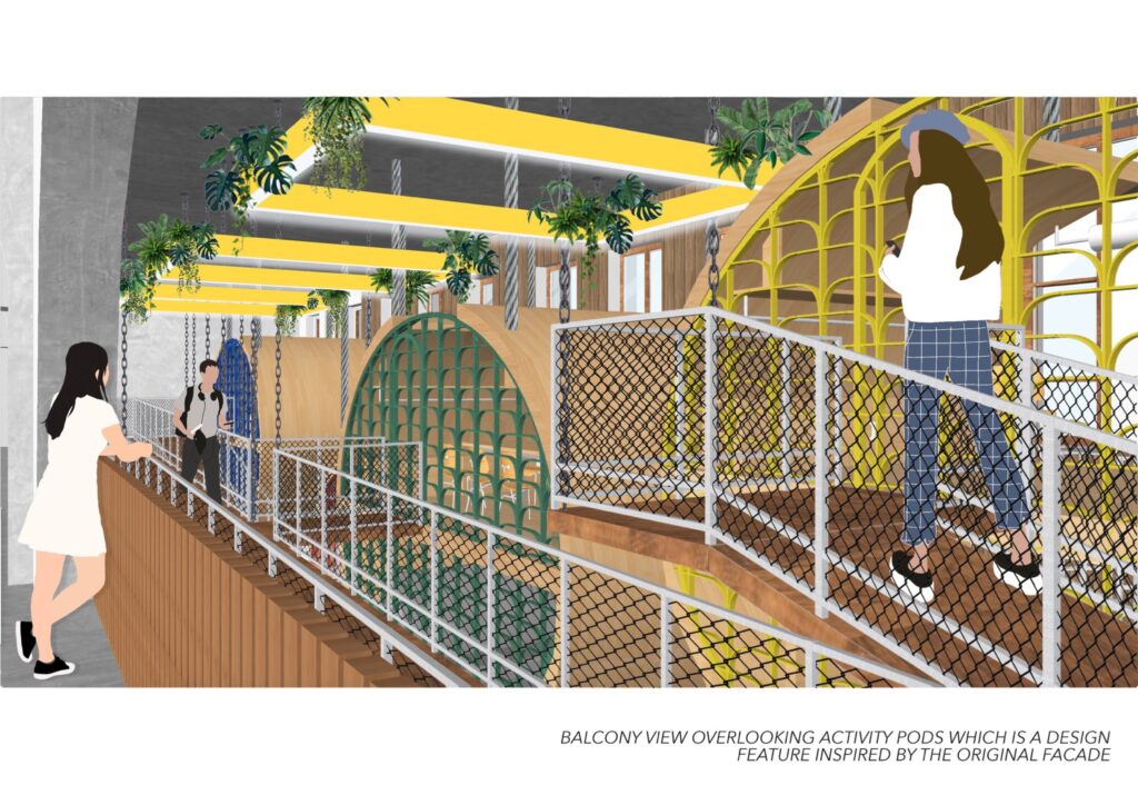
This space forms the heart of the building. The purpose of the design was to create the connection between all the users attending activity sessions and users just wishing to relax. This has been achieved by removing the first floor ceiling in order to enlarge the space to accommodate the activity pods which are accessed from the first floor.
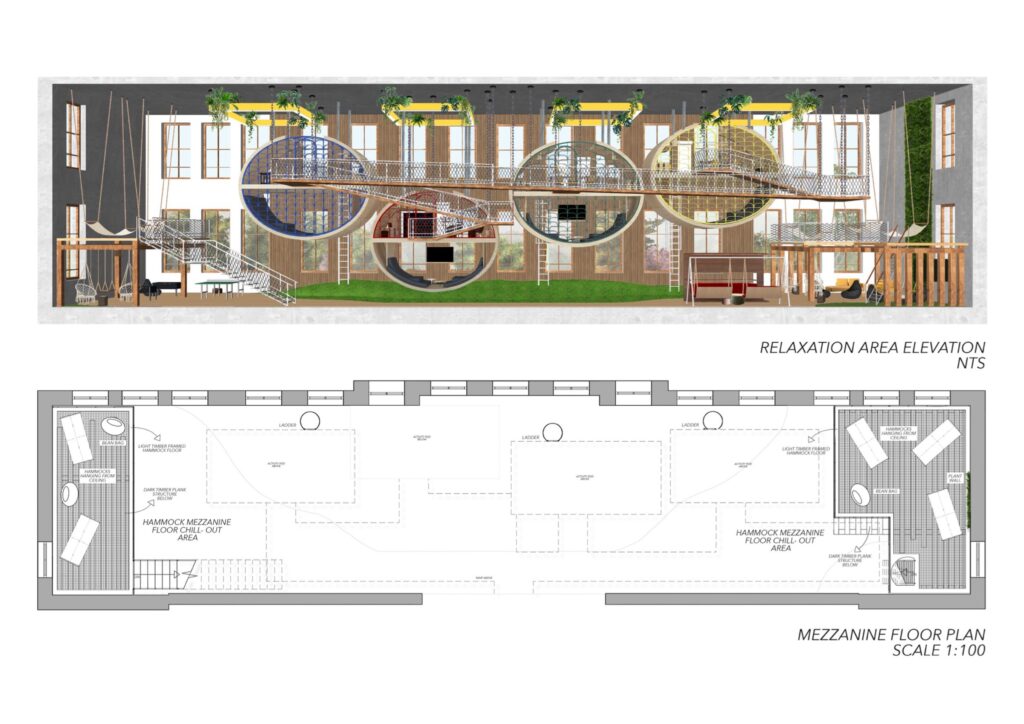
Along with the floating activity pods the raised grassy area forms one of the main features of this space. This area is designed to interpret the feeling of being outdoors offering different types of seating. Surrounding this area there are also swing seats, hammocks hanging from the ceiling and bean bags. This takes into account the different personalities and needs of each user.
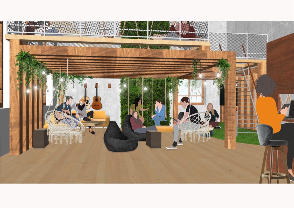
This area offers a comfortable and varied seating space accommodating larger groups. The users can either play instruments or simply listen and enjoy the atmosphere. The timber structure offers privacy from the hammock mezzanine floor above.
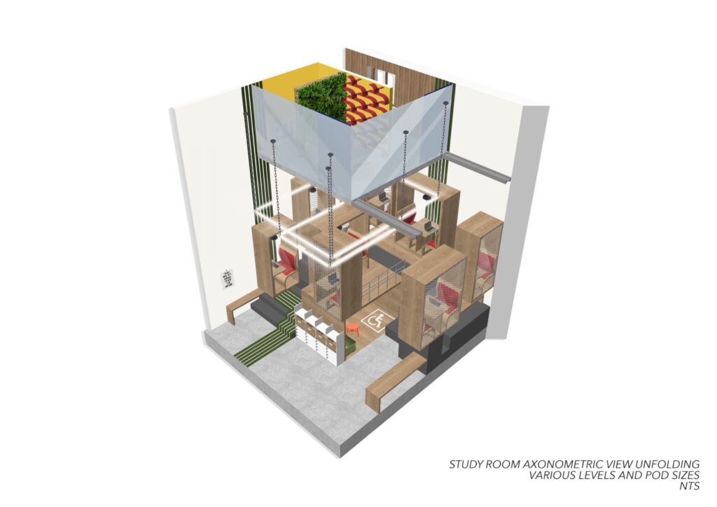
The design of this area compared to the rest of the space is more open to provide enough movement whilst playing various games. Bean bags are stored beneath the stairs for easy access for users who wish to take part or watch the games. The mezzanine above also provides a panoramic view taking in all the different dynamics of the floor below.
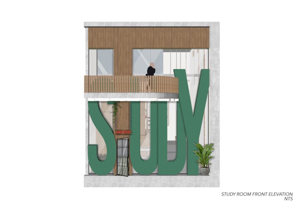
This front elevation reveals the double-height ceiling of the space and the bold and powerful design is to attract the users attention to encourage them to study.
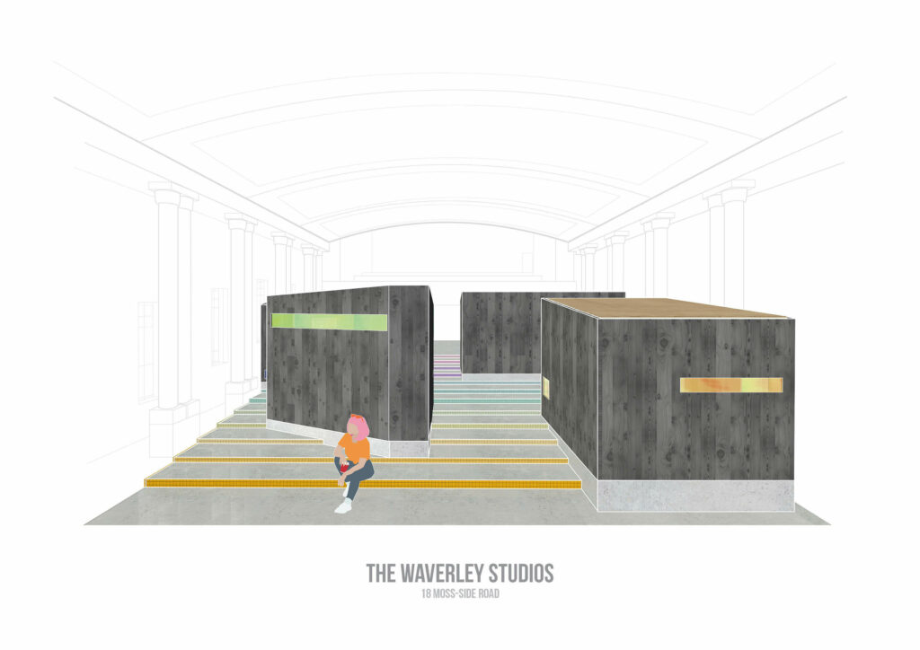
The Main Hall showcasing the Studios on the Stairs. Each step has a Mosaic Border Tile as a nod to the Victorian Era in which the building was constructed.
A section view inside three of the six studios that The Waverley has to offer. Each studio space is a different size and provide a unique working opportunity based upon their positioning on the staircase.
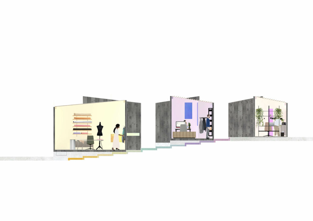
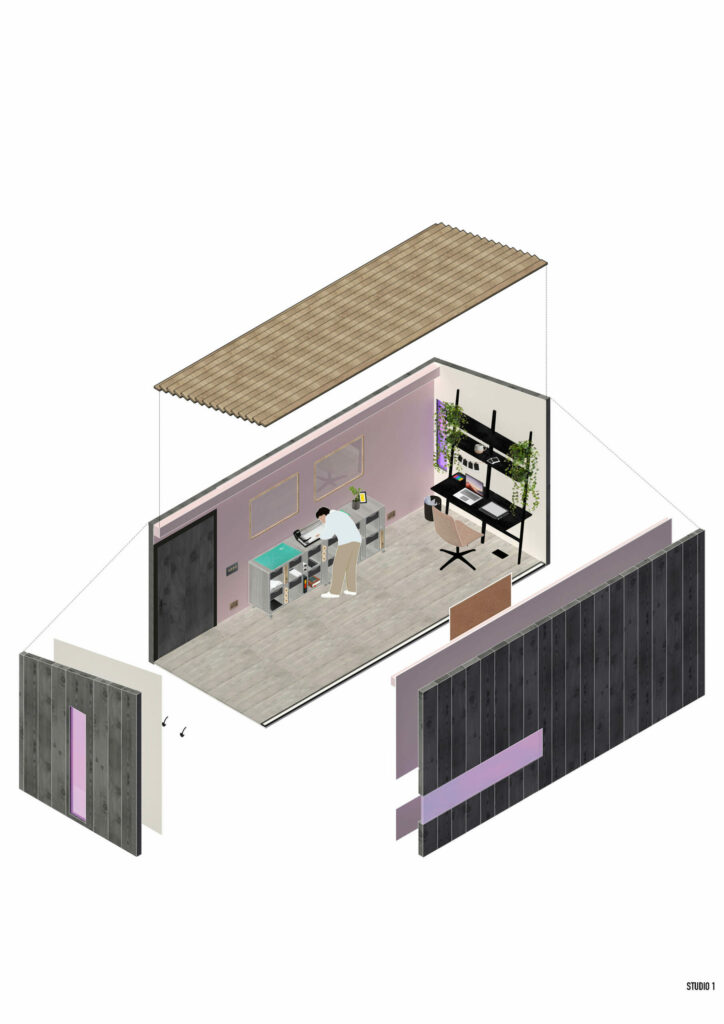
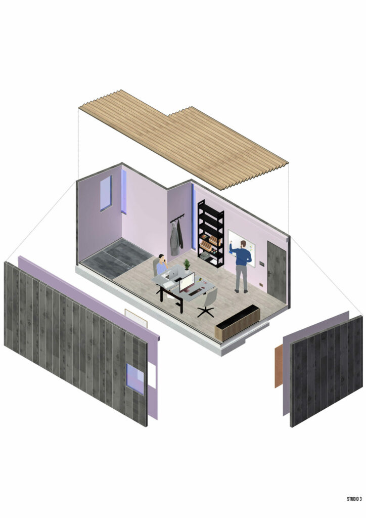
Studio 3. This Collab studio offers enough space for dual working, primarily for desk-based work such as Interior or Graphic design. It is also the first studio to offer underfloor storage. Highlighted internally by a darker wood stain, the hatch maximises the stairs and uses the gap to integrate needed storage space.
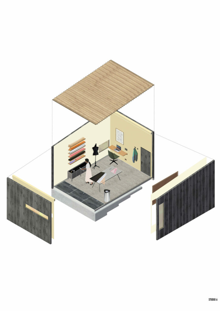
Studio 6. An interior to accommodate Fashion & Textile designers. The space offers two desks to keep tasks separate as well as shelving for fabric rolls and the deepest underfloor storage for additional samples.
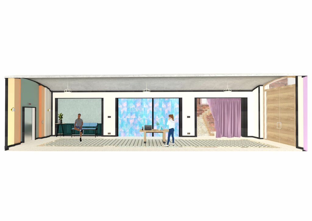
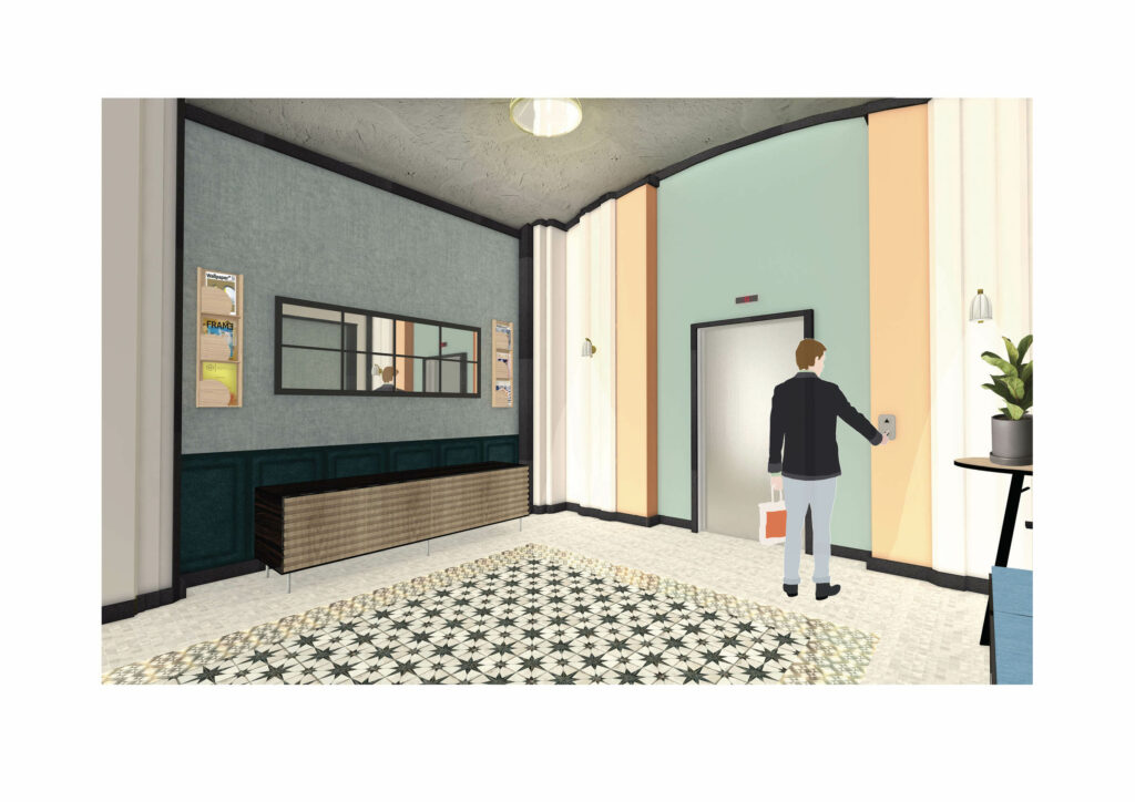
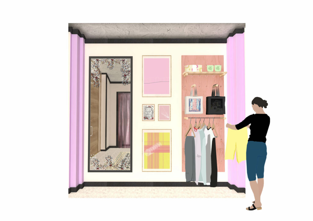
The Entrance Hallway mixes traditional Victorian Interior elements with modern finishes such as the Black MDF skirting that connects the space. There is soft reception as well as a waiting area, informal meeting room and retail space.
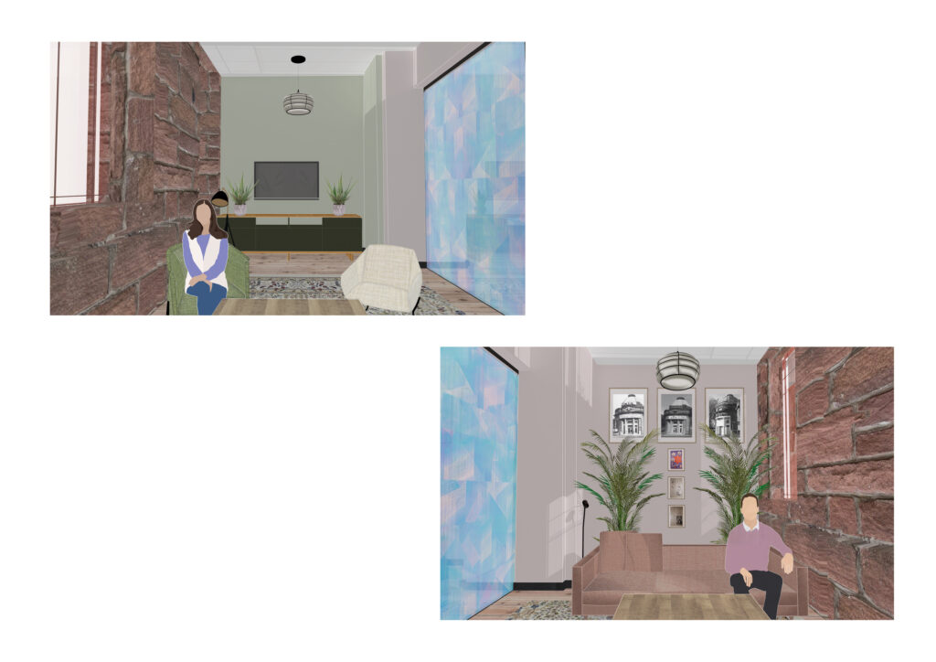
The Waiting Area combines traditional wall panelling with modern colour finishes and furnishing.
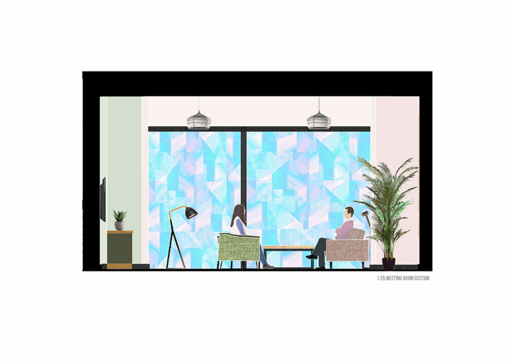
The Meeting Room is disguised from the hallway through the application of a Dichroic Film over the glass entranceway. This adds another layer of theatricality to the buildings experience as only distorted views and shadows are visible from inside and outside the meeting room.
The Interior of the Meeting Room makes use of the building’s Red Sandstone exterior as a feature wall, in addition to leaving the original windows clear from obstruction. An old Waverley leaflet advertising both the Cinema & Local Businesses is framed on the wall. A tribute to the building’s past & current occupation.
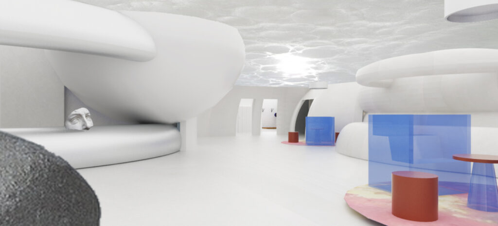
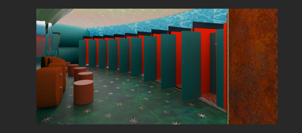
This is one of the 7 counselling rooms. This one in particular is used for one-on-one counselling, but group discussion rooms are also available. The walls will be lime washed with a pink terracotta paint over to create a rough atmospheric feel to the wall. The floor is finished with a poured concrete. To juxtapose this hard floor will be a soft embedded playground rubber material acting as a rug beneath the two soft chairs.
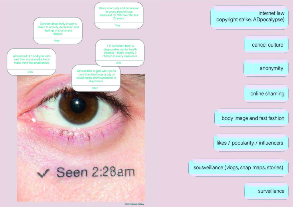
A section of the counselling rooms and waiting area. One of PLATFORM's main aims is to support and counsel people with mental health issues that have steamed or worsened by social media and the virtual world. Trained councillors will BE specifically trained within this field. Young people can get in contact with the PLATFORM themselves, referred to by a GP or encouraged to take a visit by a school. The acknowledgment that schools and GPs are struggling to help young people with such mental health issues and a need for a centre the specifies with the virtual world would not only help the young people but also lessen the demand on GPs and schools. “1 in 8 children have a diagnosable mental health disorder-that’s roughly 3 in every classroom.”
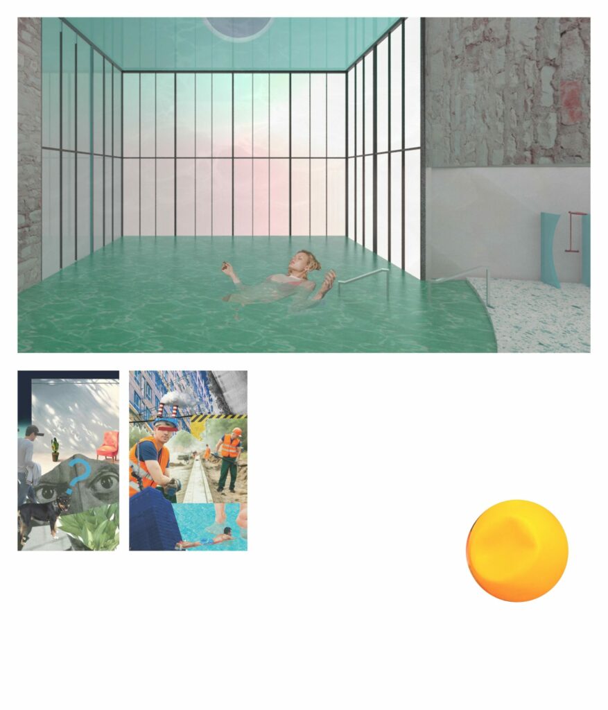
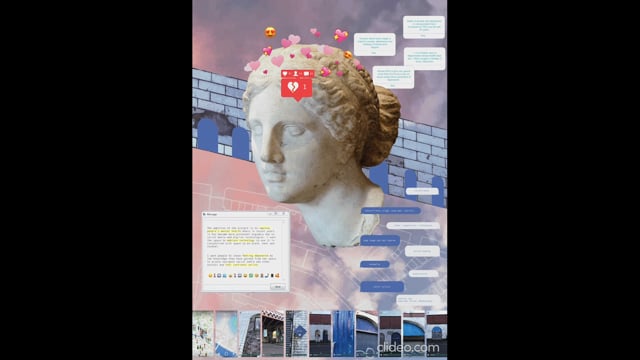
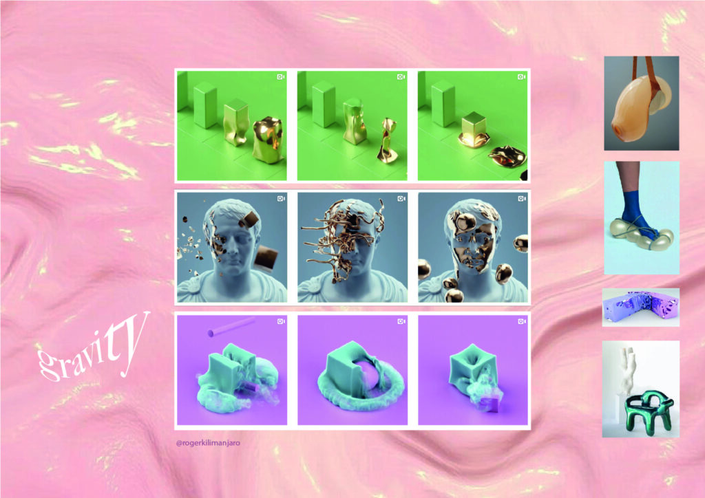
This poster visually symbolises my project's manifesto setting out my main aims and declaration for the year ahead. The internet chic and vaporwave aesthetic is something I want to capture throughout the entirety of my project. I want to explore the visual themes and trends of internet culture as well as the ethical and moral issues.
Exploring the social impact the digital world has on young people’s mental health, I hope to create a centre providing educational and counselling support. Seeking inspiration from online trends and issues such as surveillance and cancel culture. The centre remains unbiased and recognises the grey area that most of the internet lives in, the centre simply wished to educate people on issues so the users can use their technology more wisely and confidently.
Designers and artists create videos or pictures, hyper realistic rendering of a fake reality. They push the boundaries between our world and its constraints through software that has no boundaries. Personally I have always thought that such videos and images are created to challenge people's perceptions of reality, to catch people off guard when their subconcious is predicting how the materials will interact and they unexpectedly react in a way that seems impossible.
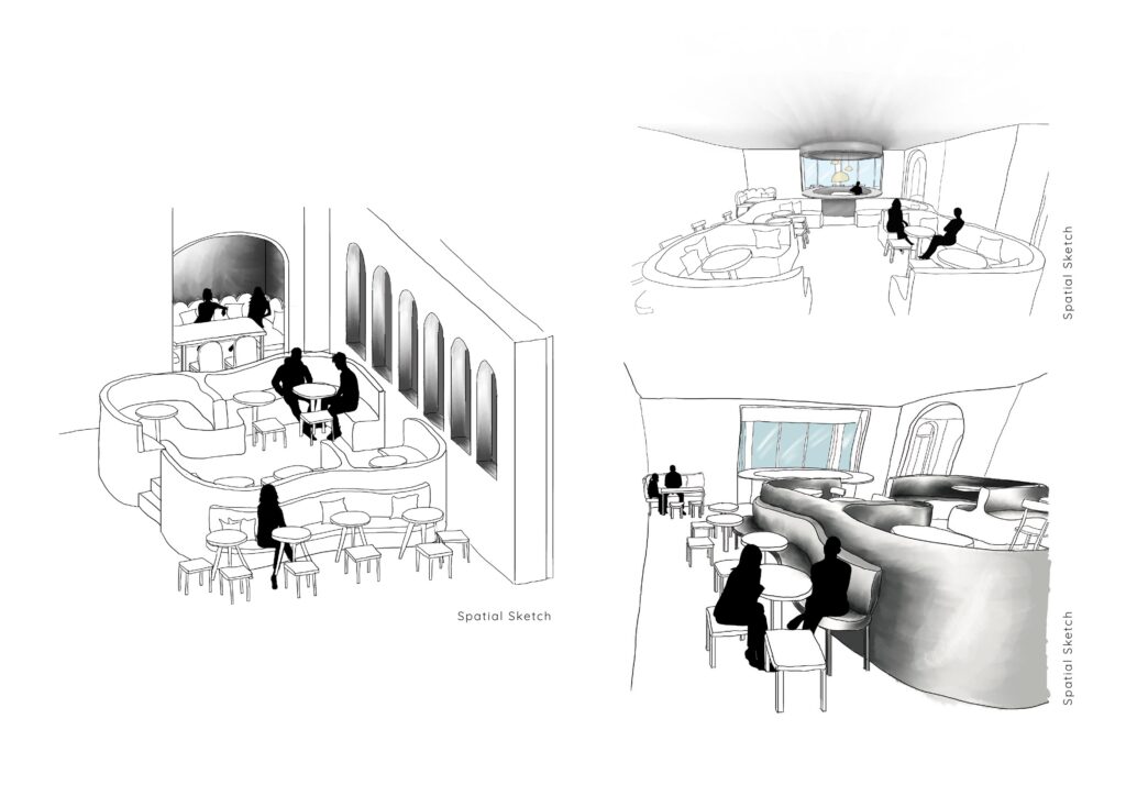
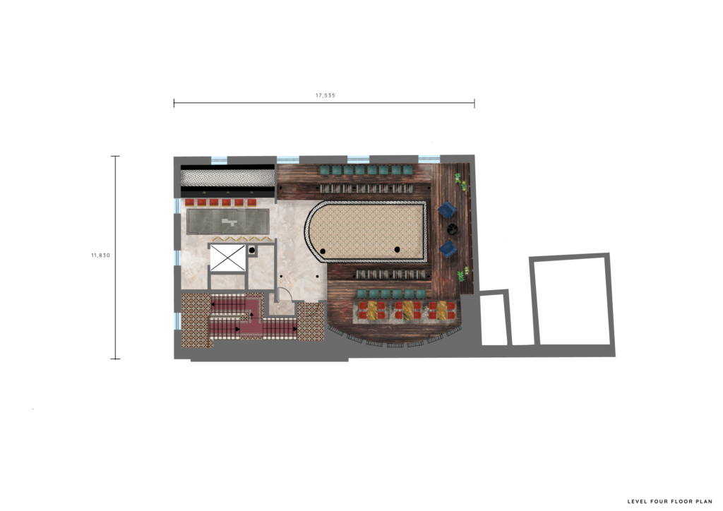
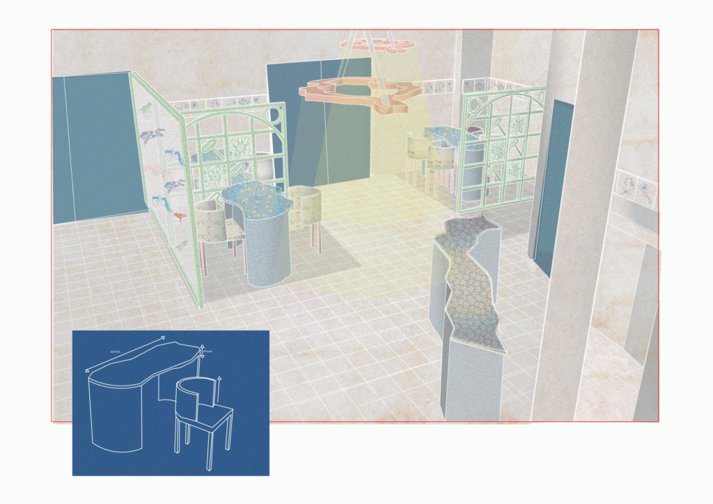
A collage of the key design elements of the hotel
Scale 1:150 technical drawing
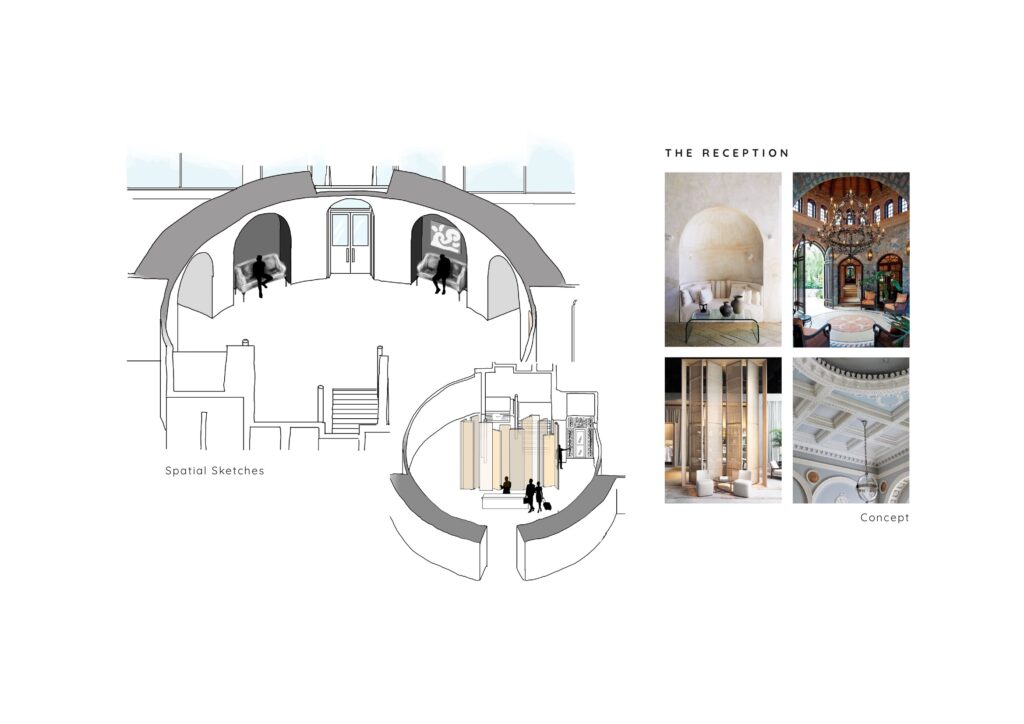
Initial reception sketches and concept
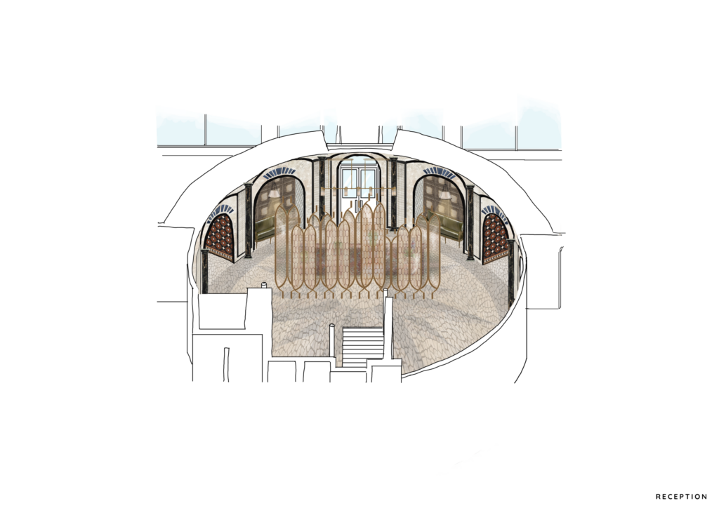
A visual of the reception
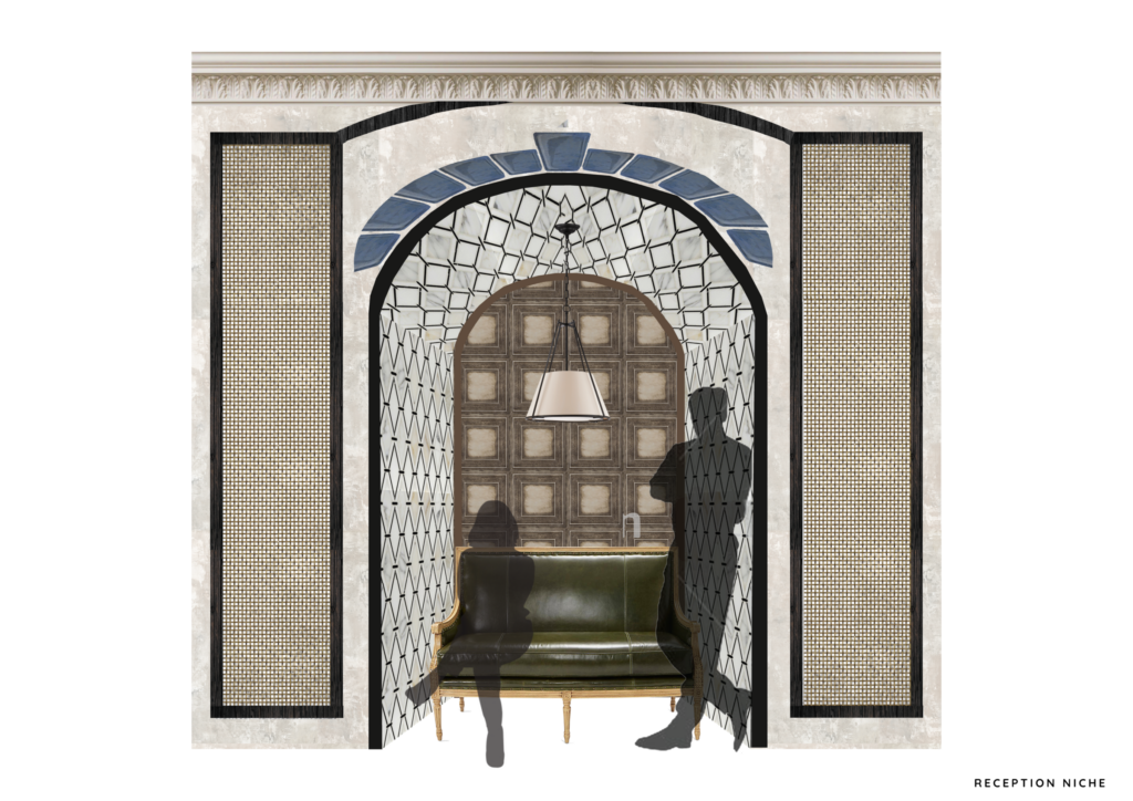
A detailed visual of a reception niche
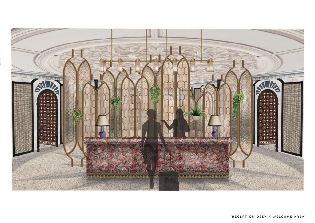
A visual of what the guest encounters upon arrival
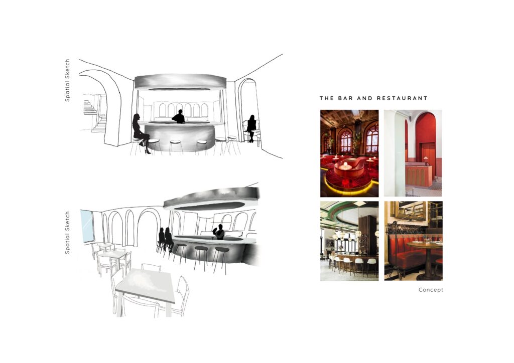
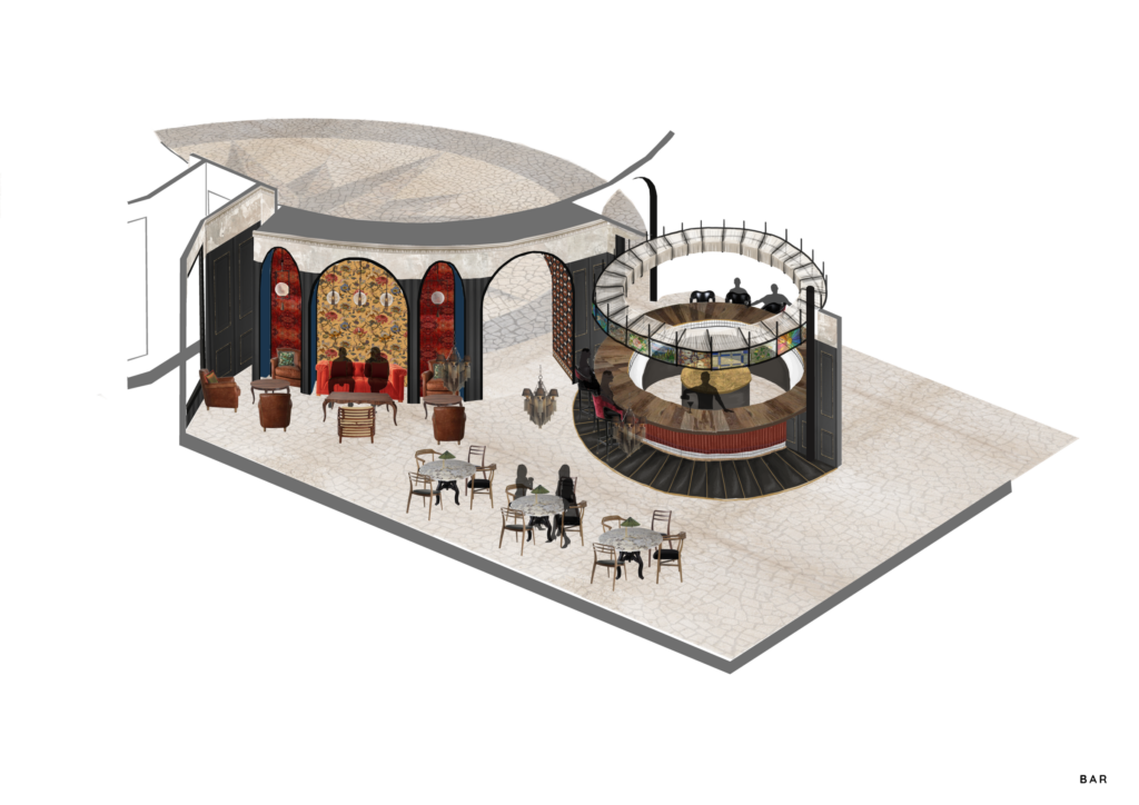
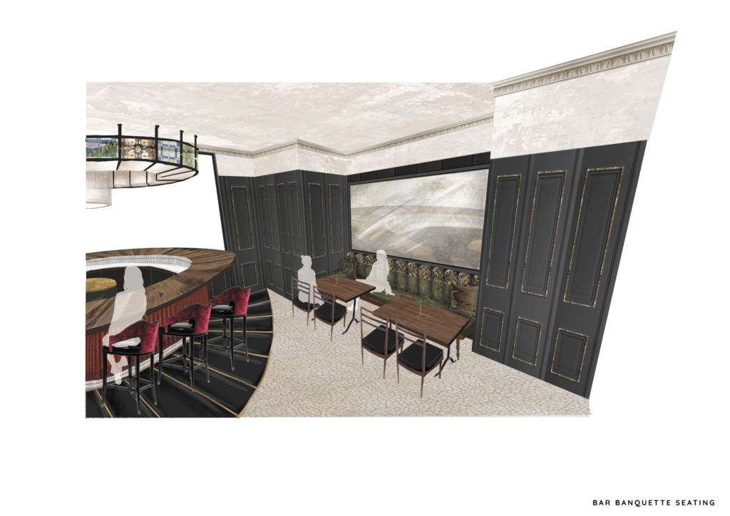
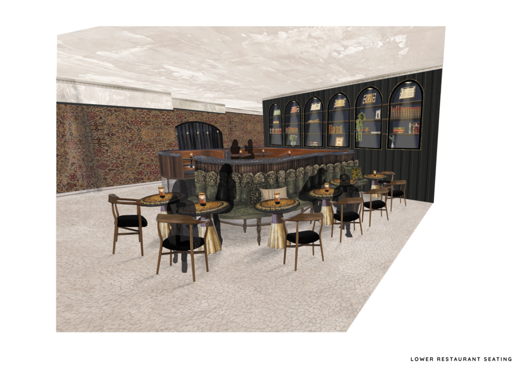
Initial bar and restaurant sketches and concept
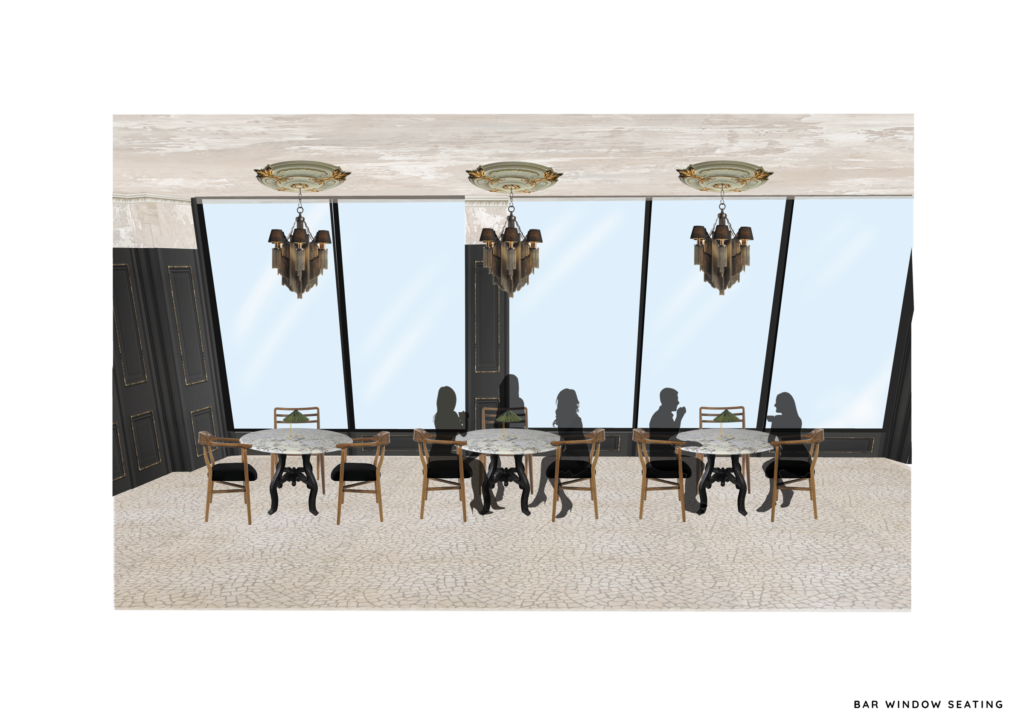
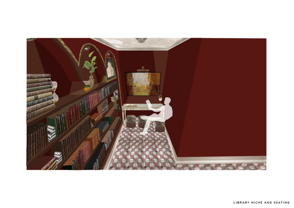
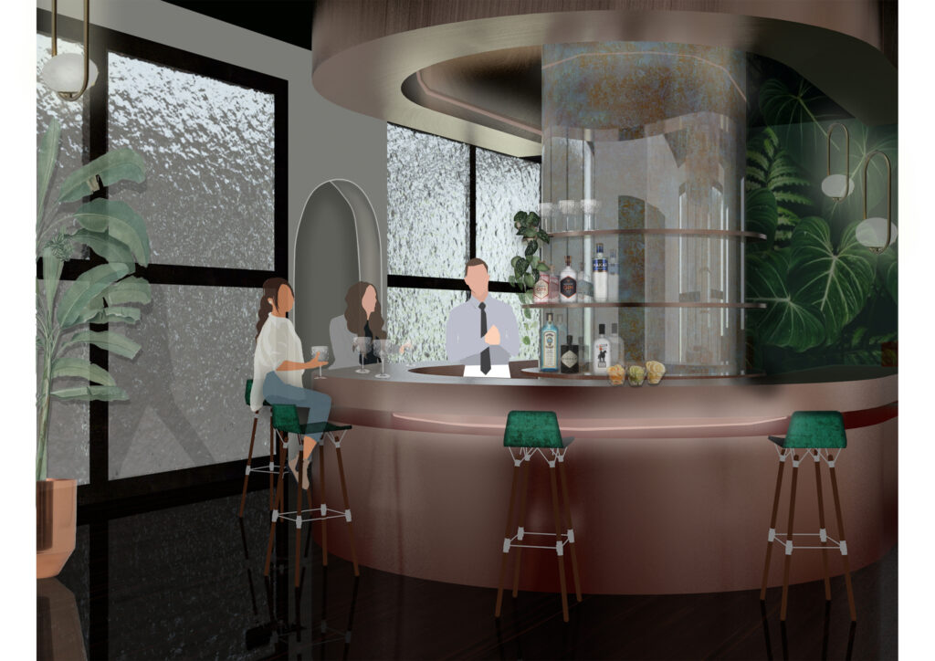
A visual of the bar
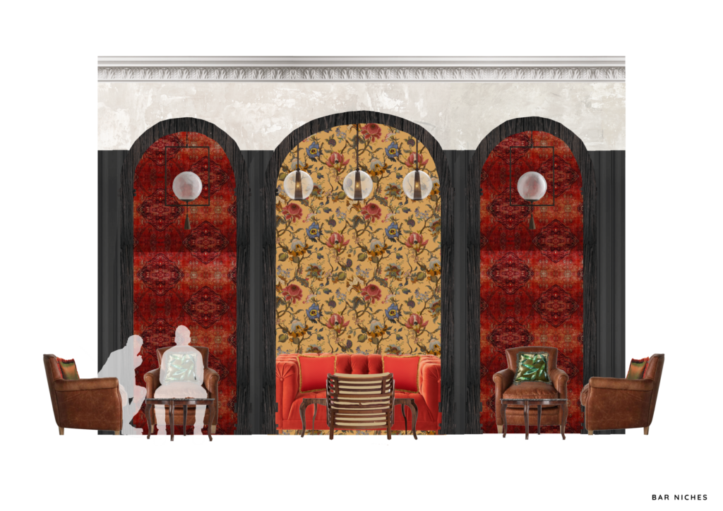
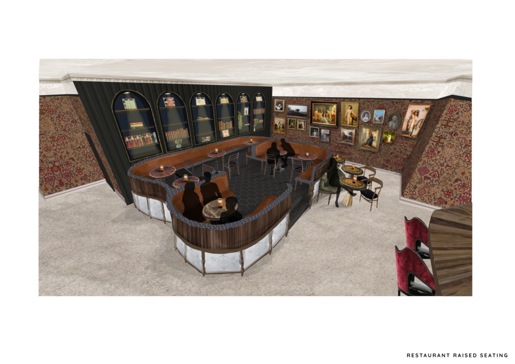
A visual of bar seating inside the niches
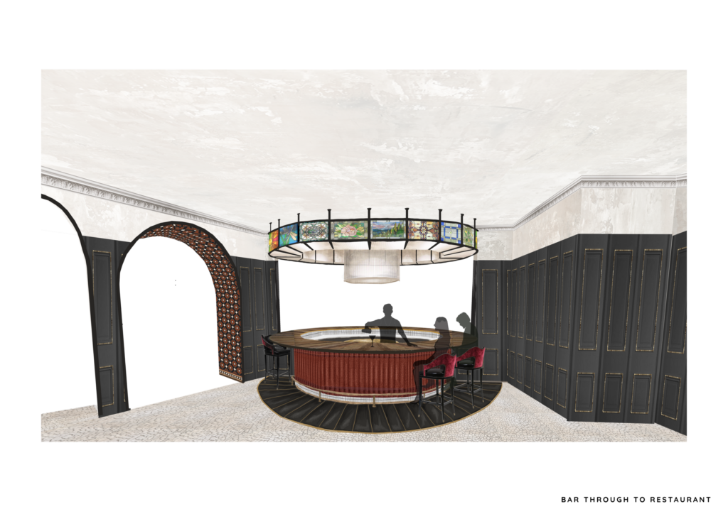
A visual of the stained glass depictions of scenes from Scottish authors' works, assembled as a bar structure, looking through to the restaurant beyond.
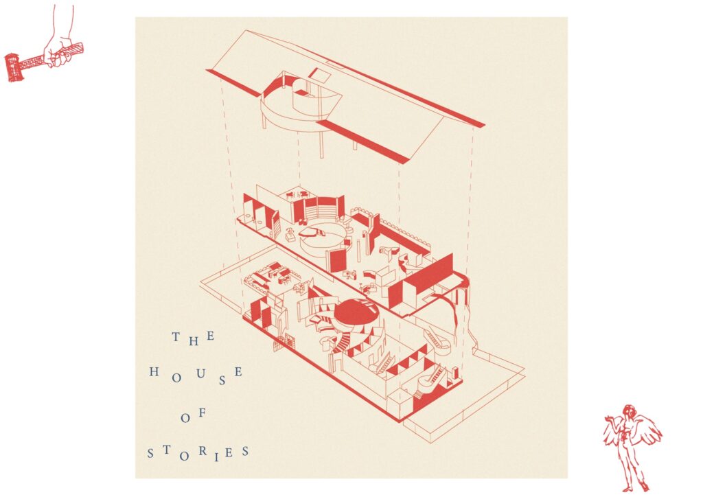
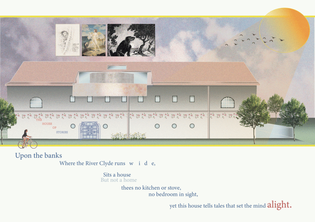
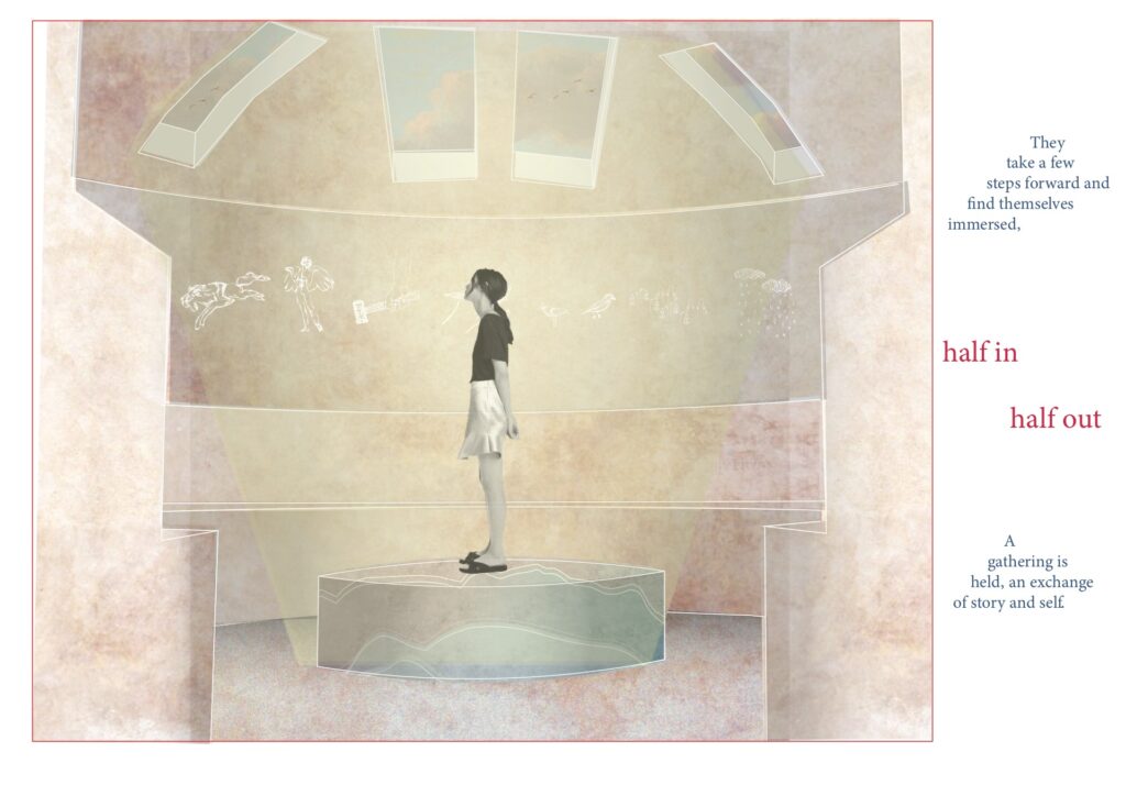
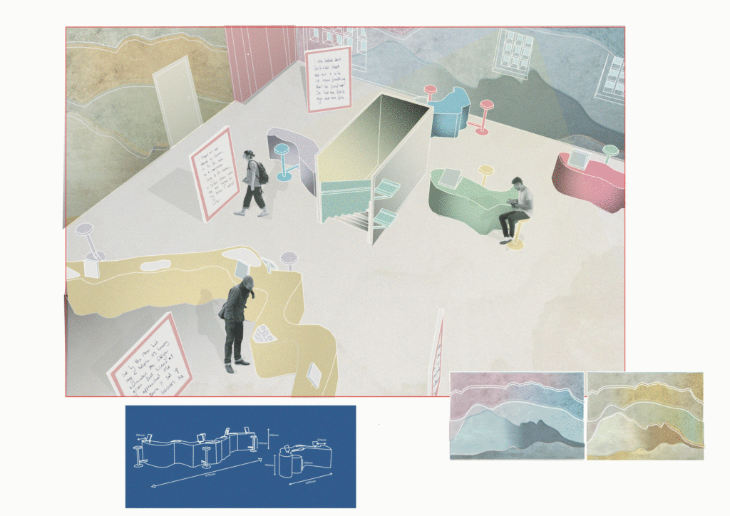
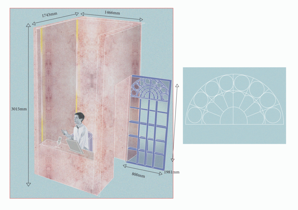
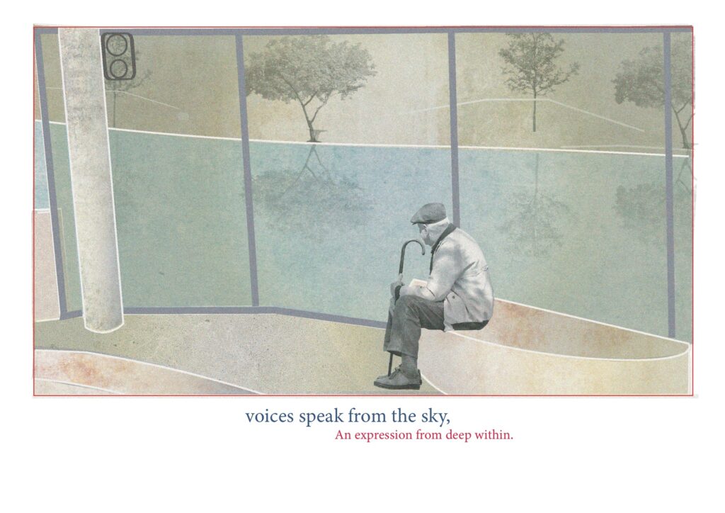
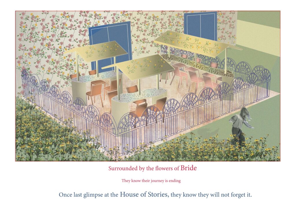
In this space users can tell their stories and myths to an audience, the space is based on the idea of telling stories round a campfire. The dome structure bulges out of the building and its visible from the exterior. This allows users to see the sky and feel connected to their surrondings.
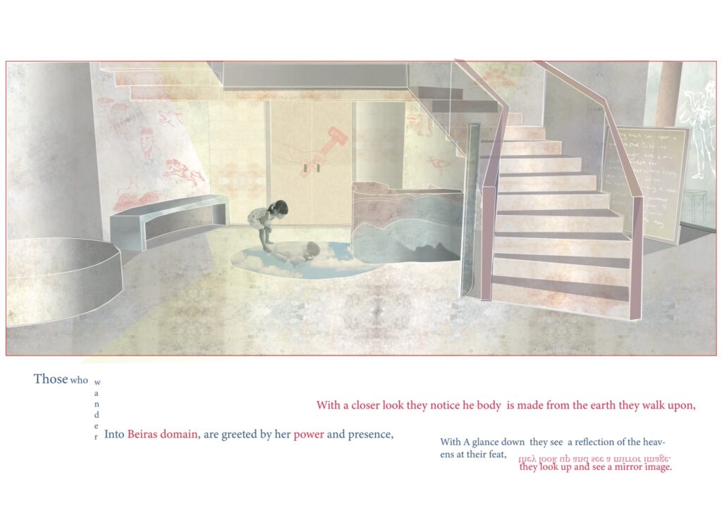
users can browse tales of Scottish mythology, there are also headphones built into furniture which allow users to listen to recordings of the tales. The structures of the furniture are inspired by Beira, King Angus and Bride.
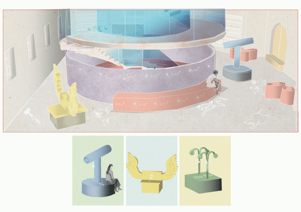
built into the roof of the building, the balcony protrudes out of the building.
users can create pictures inspired by the stories they’ve heard/read, the pictures will stay visible on the screens for half an hour.
in this space users can both create stories to add to the digital archives and browse the archive using I pads. There are screens which display stories from the archives dotted around the space and they change throughout the day
users can record their own stories which will then be added to the archives and played through a speaker in the Water Platform situated in the river
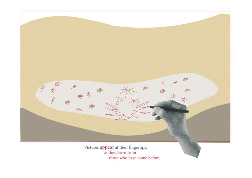
the design for the cubicle doors mirror the design of the greenhouse at the peoples palace which is situated within the park.
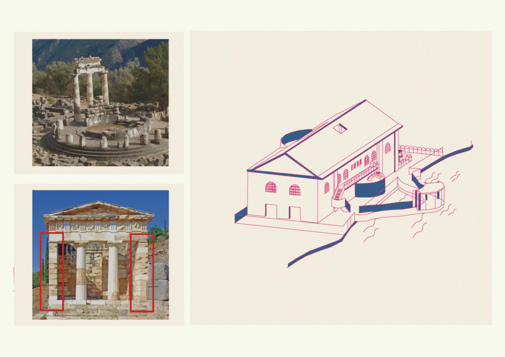
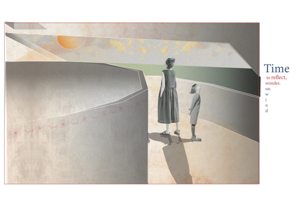
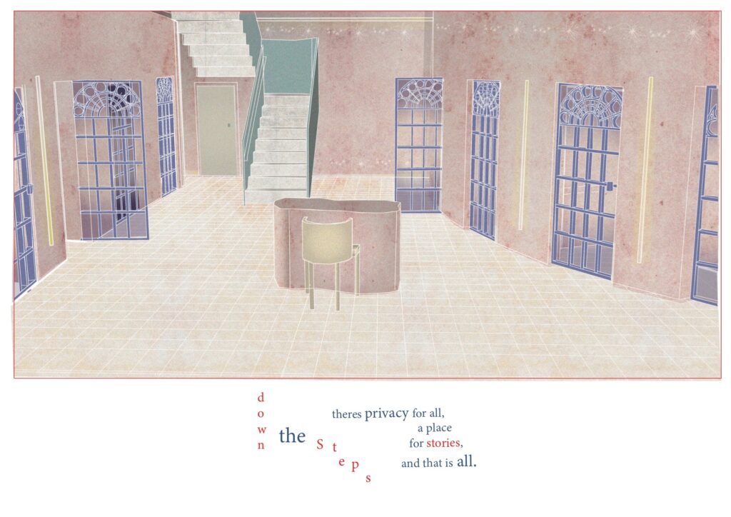
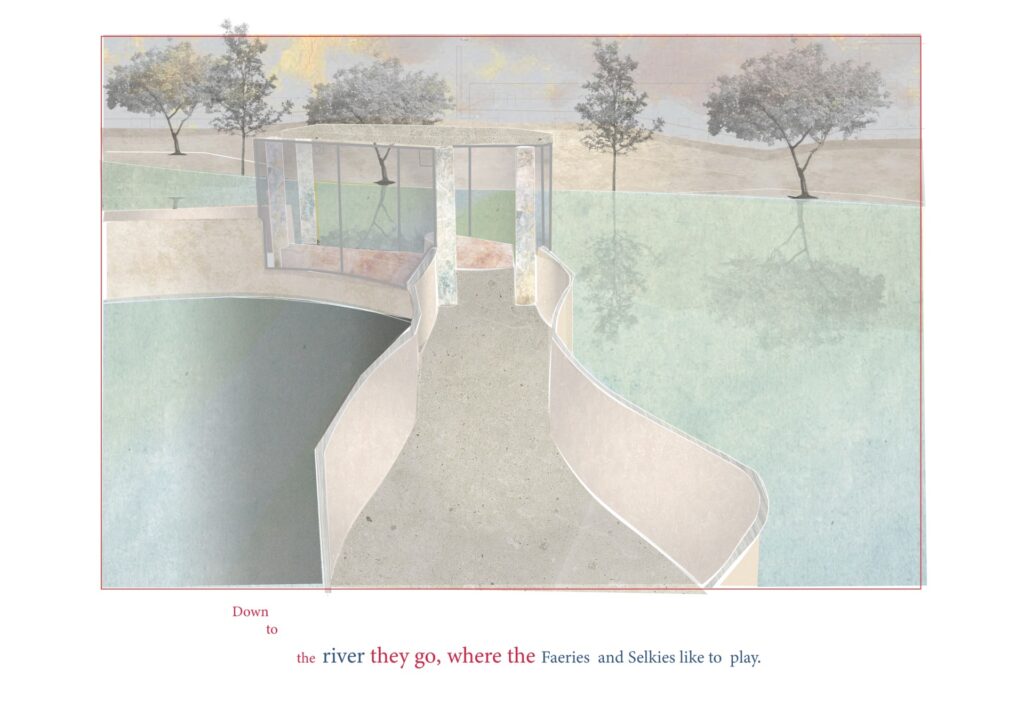
"anytime that is a betwix and between is the faeries favourite time, they inhabit transitional spaces like the bottom of the garden: existing in the boundary between cultivation and wilderness, or at the edges of water, the spot that is neither land not lake, neither path nor pond."-Brian Froud
stories users have recorded in the recording rooms will be played through a speaker. A lot of Scottish mythology is based around water so it is important users connect with the river.
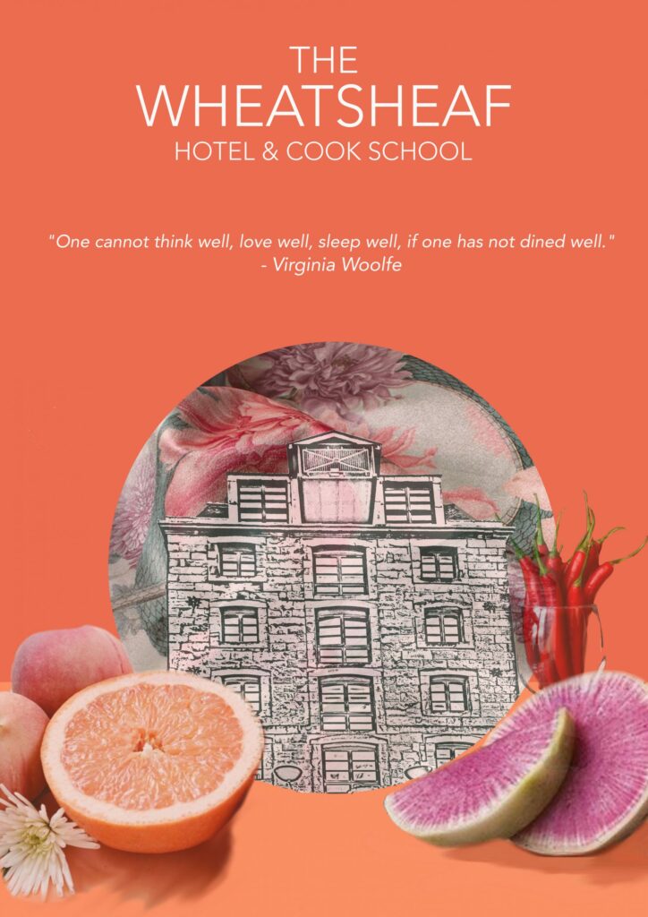
Concept poster for The Wheatsheaf Hotel and Cook School, which expresses brand ethos and materiality.
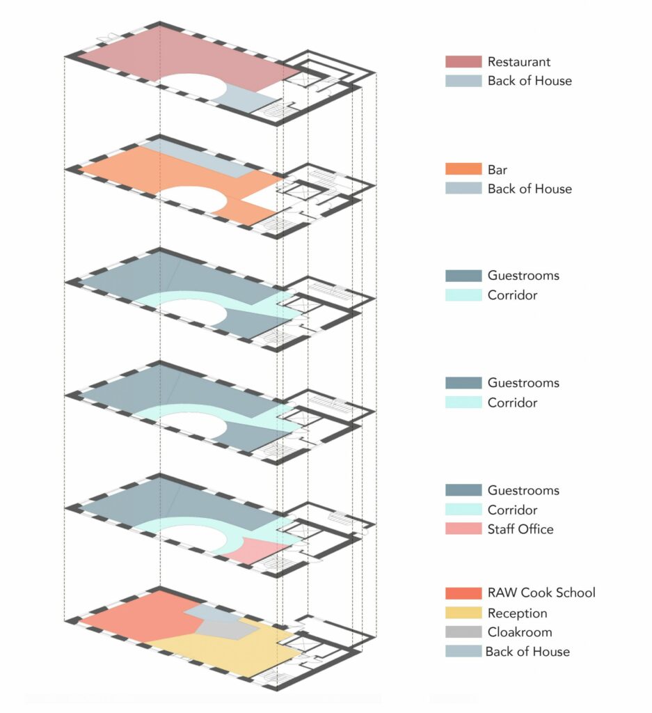
An axonometric drawing of The Wheatsheaf, expressing the zoning and spatial arrangement of key spaces.
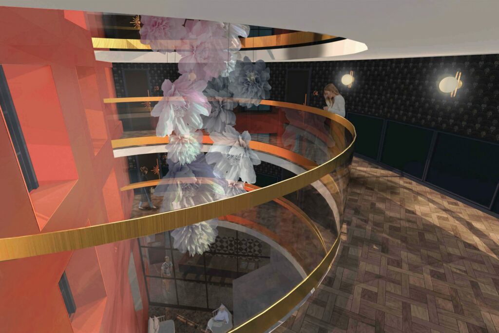
View from the second floor corridor, looking down through the void onto the entrance and cook school.
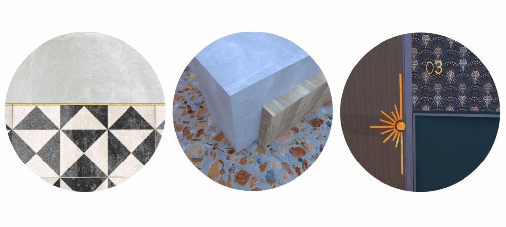
Detailing of the cook school, reception and corridor spaces.
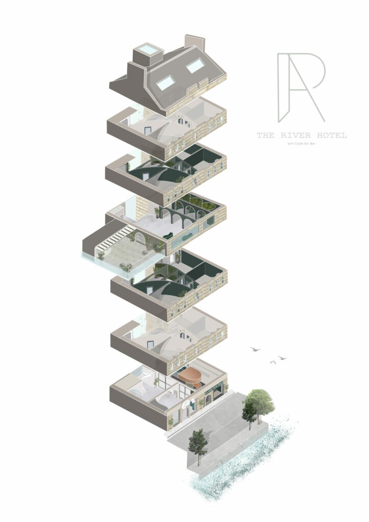
This exploded isometric illustrates the scale of the building with its layered interior, rooftop garden bar and natural surroundings within Glasgow’s vibrant city centre.
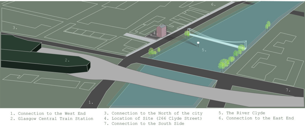
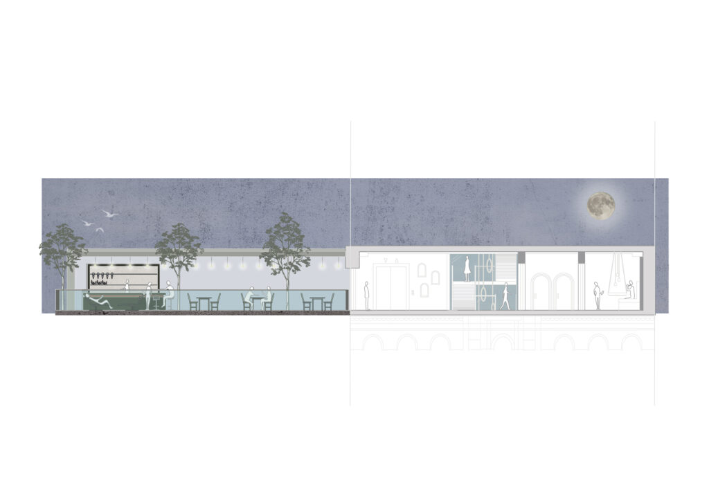
An illustrative map shows The River Hotel and Clyde Gin Bar in relation to the surrounding city centre along with main connection routes to North, South, East and West of Glasgow.
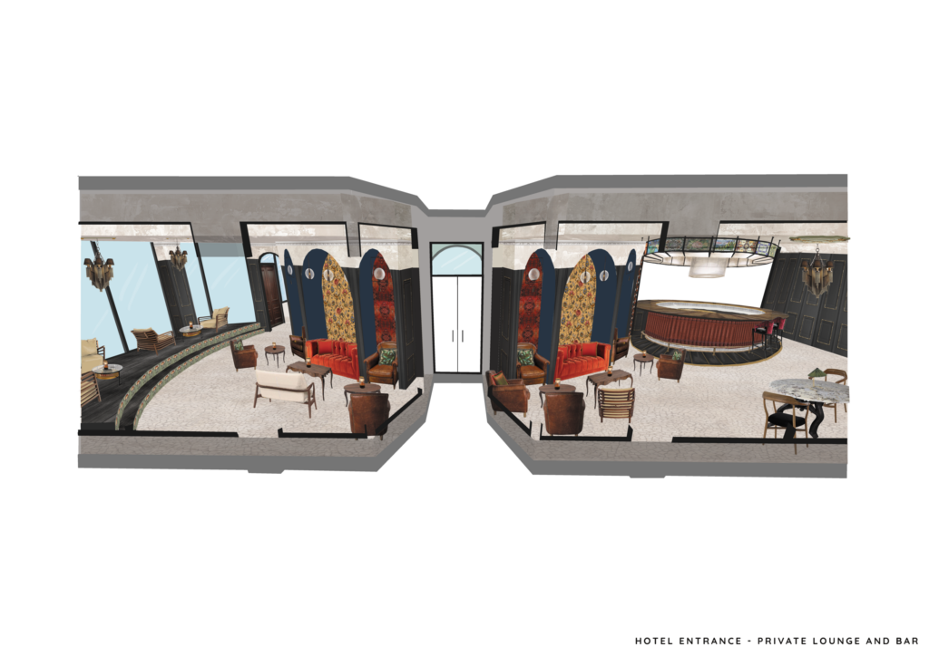
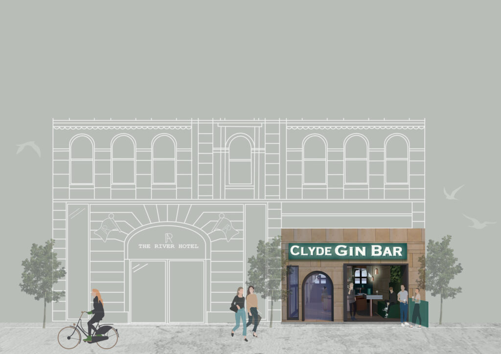
The River Hotel’s façade boasts natural stonework shown in this 2D visual seen alongside The Clyde Gin Bar, the only public space throughout the hotel accessed from its exclusive riverside frontage.
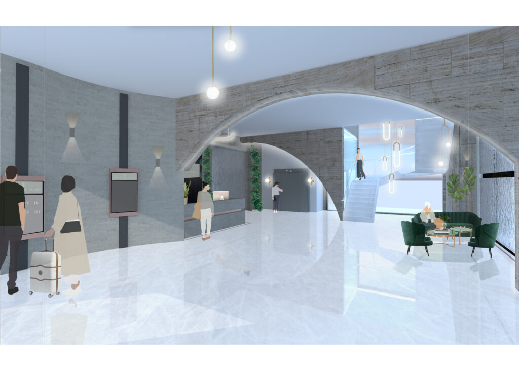
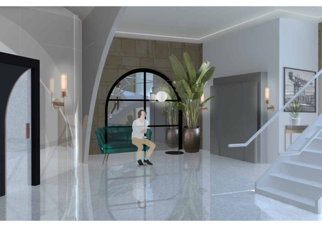
The entrance foyer makes use of natural light which floods this stylish yet functional space. With self-check in screens, 24/7 lobby desk and grand staircase, The River Hotel is bound to make a great first impression.
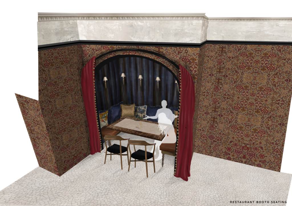
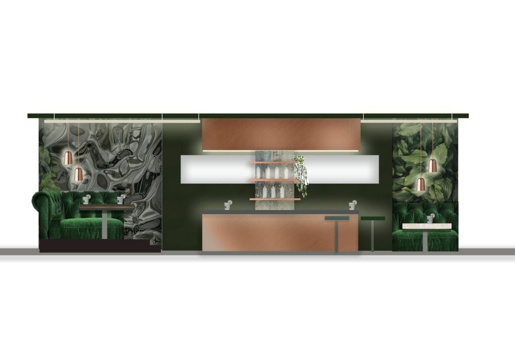
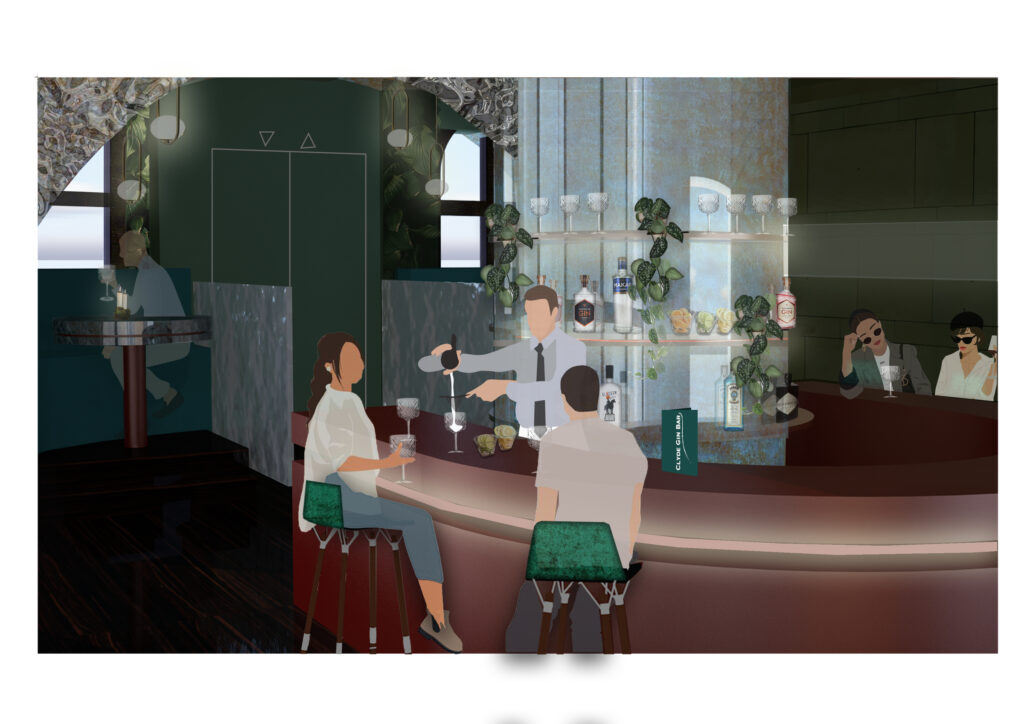
This section cuts through the Clyde Gin Bar showcasing booth seating to outward facing windows for views of the clyde, feature copper horseshoe bar and atmospheric private booth seating area towards the rear.
The Clyde Gin Bar is all about immersing yourself in local Scottish gins and how they are made. With 1:1 gin tasting experience you will learn about the botanicals used in each gin to their accompanying perfect serve. A smaller bar makes for a more intimate learning experience, creating a personal relationship between customers and staff.
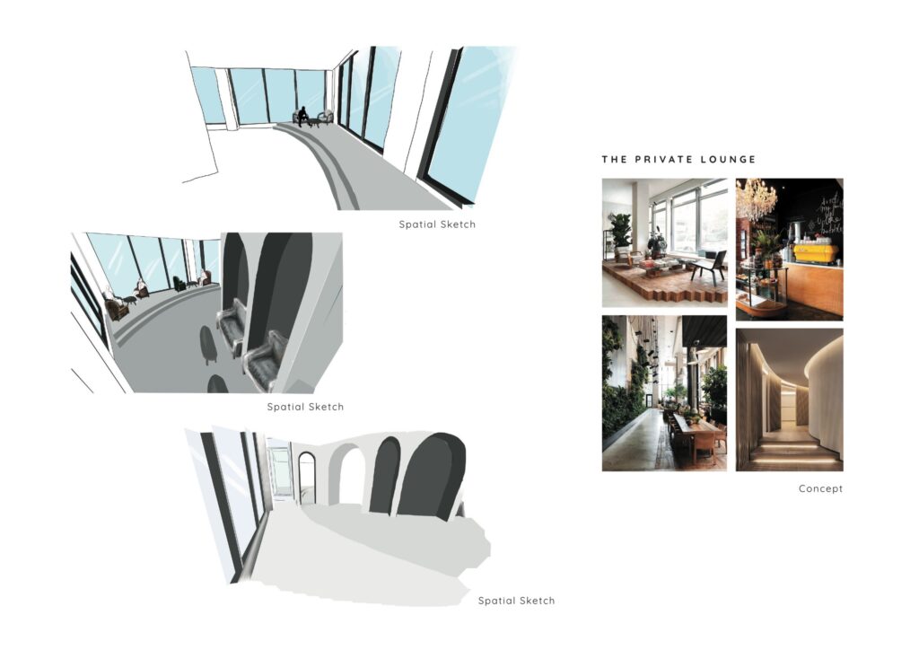
The River Hotel has been designed to create an experience for every customer while being aesthetically focused, generating a range of atmospheres throughout. As they journey through the building, the interior will encourage visitors to reflect in its quirky corridors before they cross the boundary to their own private space.
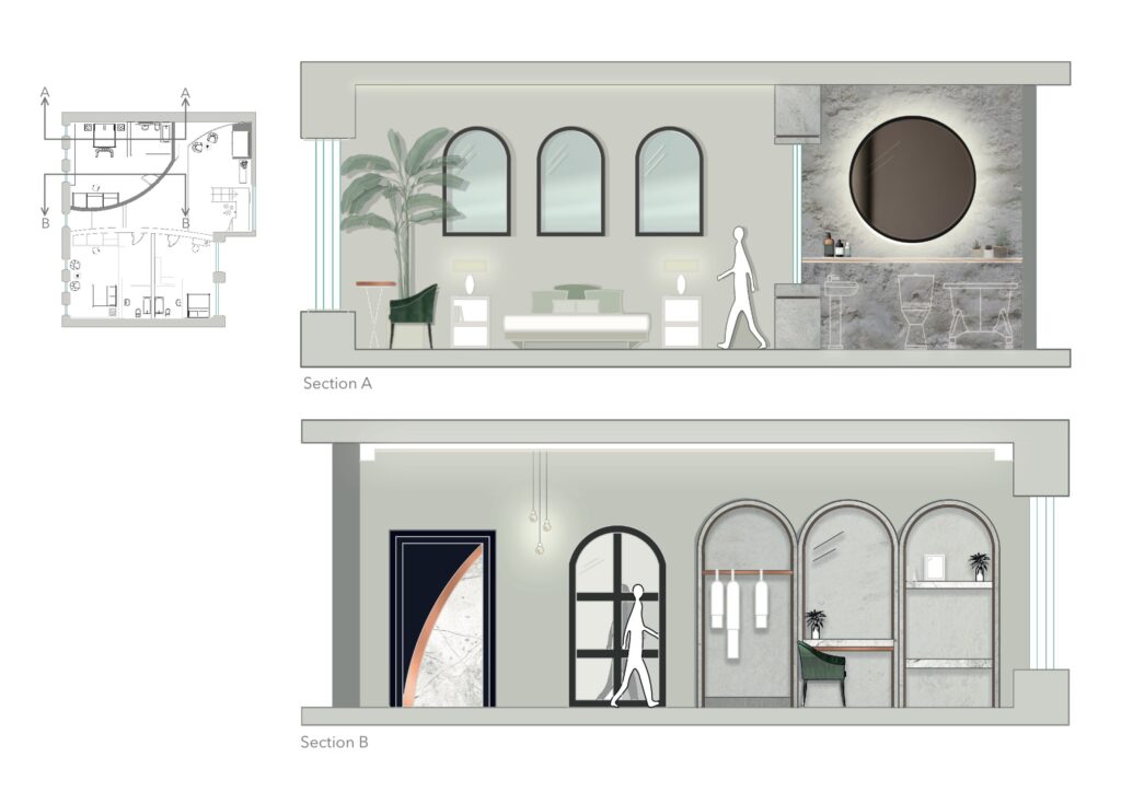
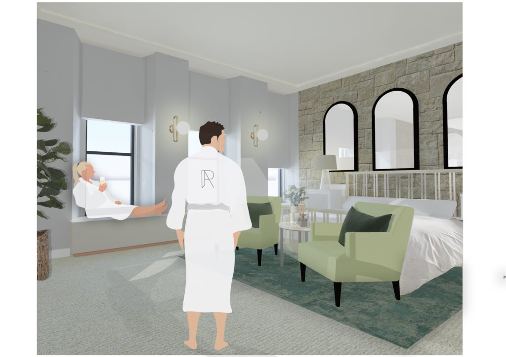
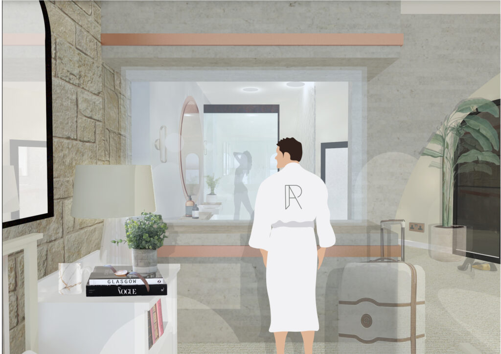
These sections showcase the Main Suite and all it has to offer. Section A displays the spacious sleeping area and its connection to the luxurious en-suite, although not completely closed off the use of materials creates a balanced divide between these two areas. Section B shows the lavished dressing area with bespoke archways housing wardrobe, shelving and vanity unit featured in all rooms. These arches are a reference the buildings architecture which is a key inspiration throughout the hotels design.
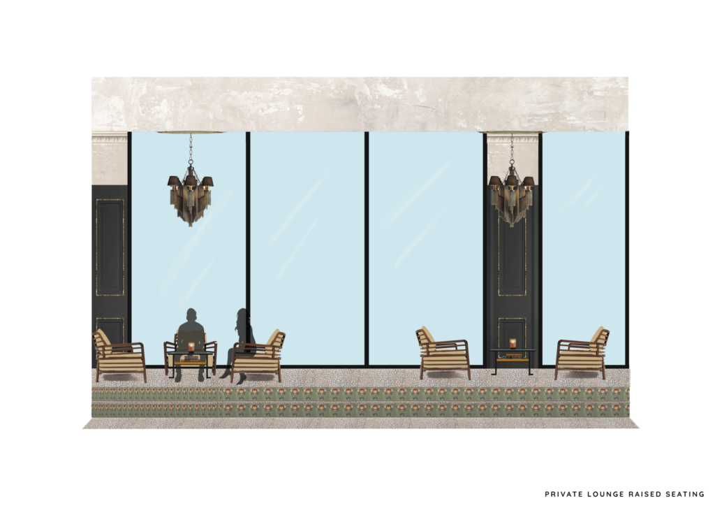
A section of the guest only lounge on the third floor, accompanied by a roof top bar area. Creating an exclusive space for only guests. The space is multi-functional, a lounge area during the day to the exclusive booths to be used for private use at night. The roof top bar offers amazing views of the city and a vital connection with the river.
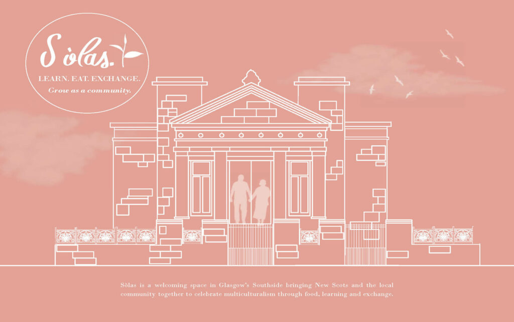
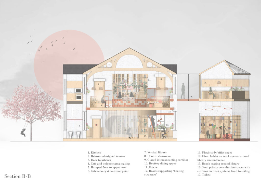
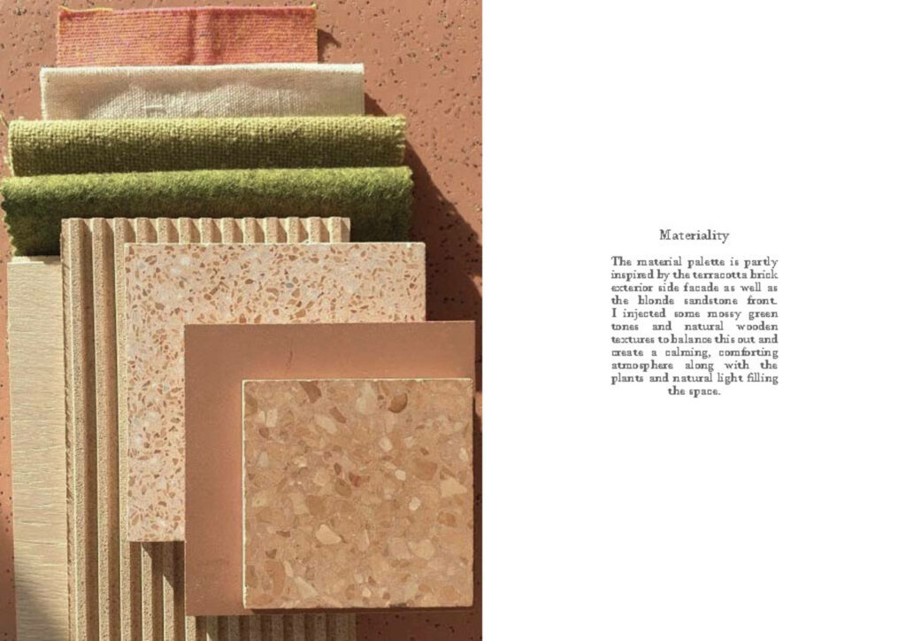
My community project utilises the former Nithsdale Mission Hall in the Strathbungo/Govanhill area of Glasgow’s Southside. Designed by Alexander Skirving and built for the Queen's Park United Presbyterian Church in 1887-88, it felt like an appropriate choice of site given its history as a supportive community space. However, I also fell in love with the Greek Thomson style architectural details on the building’s exterior façade, as well as the site materiality, which provided lots of exciting inspiration throughout my design development process and ultimately greatly influenced my final design concept. As a result of a fire, the roof and interior were completely destroyed, however this worked to my creative advantage providing me with an empty shell to design within.
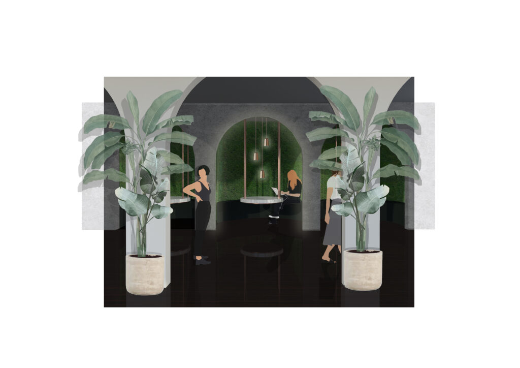
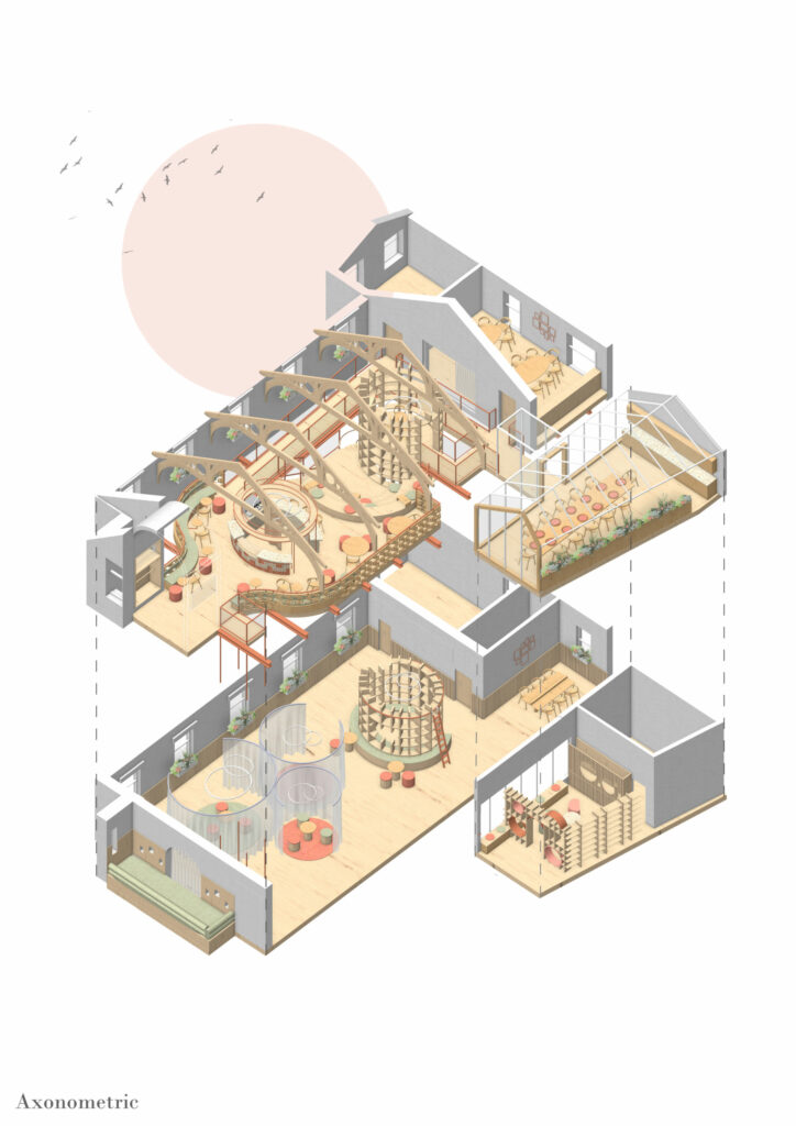
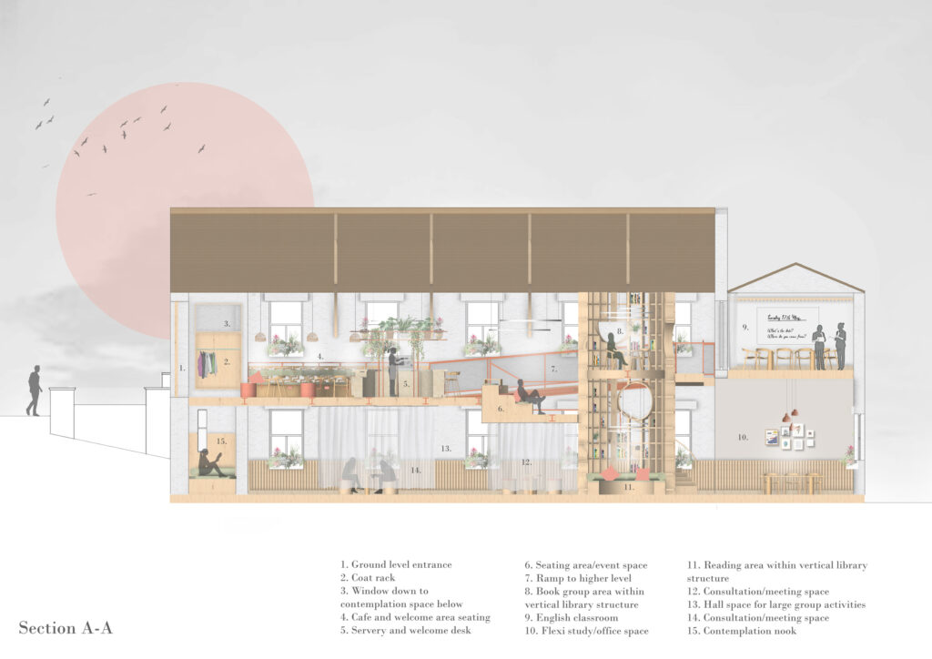
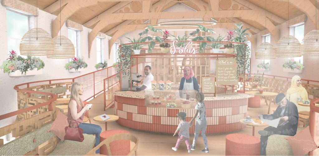
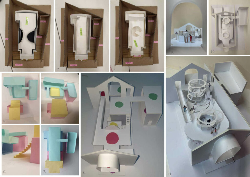
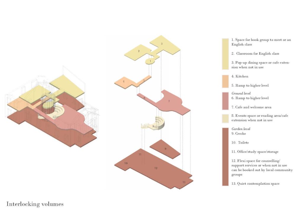
Sòlas, meaning comfort and happiness in Scots Gaelic, is a space bringing new Scots and the local community together to support one another and celebrate multiculturalism through food, learning and social exchange. The space offers a range of services including English lessons, counselling, a crèche, a multilingual library, book group, study areas, a contemplation space, and a cafe with pop-up multicultural dinners. The structural layout has been deliberately kept open to allow visitors to see the range of activities happening, and navigate around the space with ease. In doing so, I wanted to create a “buzz” within the space in order to create a comfortable, convivial atmosphere.
Entering the space from street level, you will arrive in the cafe and welcome area. The cafe servery acts as an informal welcome desk to help visitors navigate the space and is therefore strategically placed close to the entrance. The familiar cafe scene should aim to reduce anxieties for new visitors. I have designed several different seating areas to adapt to different user needs and requirements. The curved wooden balustrade aims to soften the space, while the natural tones give a welcoming warmth to the interior, along with the addition of plants and flowers. There are subtle references to the site materiality through the servery design and the wooden balustrade.
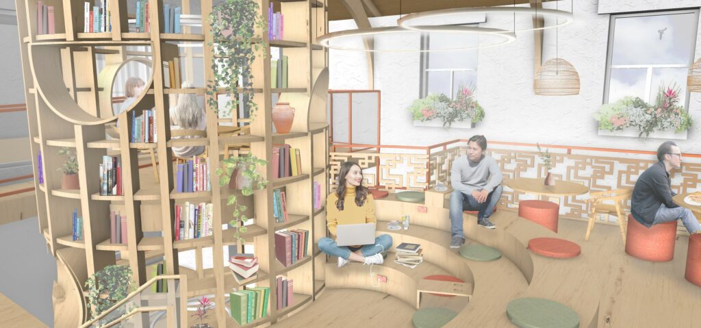
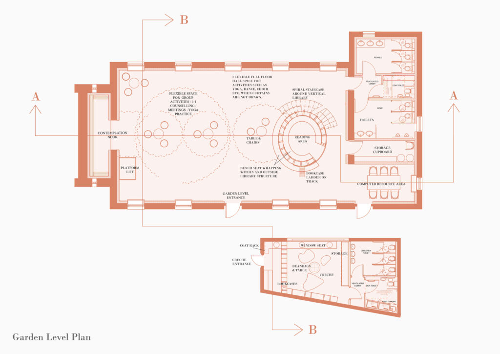
The vertical multilingual library is a central feature in my design, as it is seen from every space in the building. This helps ease navigation through the building, acting as a familiar reference point. I wanted to create an innovative and exciting space to stimulate learning and encourage cultural exchange, with a space designed on the upper level for the book group to meet. The curved stepped seating acts as an informal reading space as well as a pop up event space for talks or meetings. The circular apertures in the library structure are inspired by Skirving’s original trusses (destroyed in 2005 fire), which I have reinstated in my design.
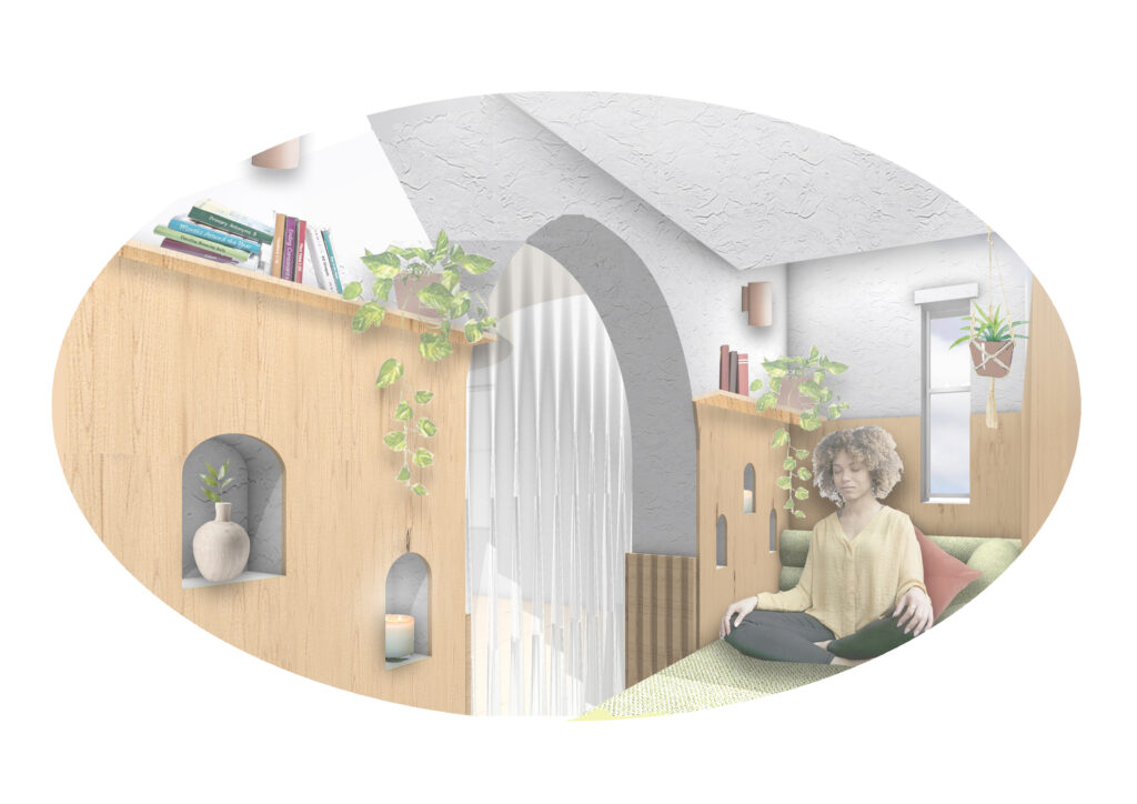
I designed this contemplation nook where visitors can escape for a moment of quiet contemplation, if feeling overwhelmed. This is a particularly important space in the design for the more vulnerable users of the space who may have just arrived in Glasgow and be feeling anxious. The natural, muted colour palette aims to create a calming, tranquil environment, as does the natural light flooding into the space on either side from the apertures above (see floor plan). Cushions and blankets are also provided for an added layer of comfort.
This section illustrates the various level changes in my design, which subtly differentiate between different zones and activities. Here you can see the ‘floating’ upper floor supported on either side by steel beams, which allowed me to create unique apertures and achieve an interesting relationship between both floors (see floorplans for further clarity). This design feature enables light and sound to flow more naturally through the building, as well as enriching user experience. The wooden wall panelling directly references Skirving’s original drawings as does the ramp which responds to the original sloped floor of the gospel hall.
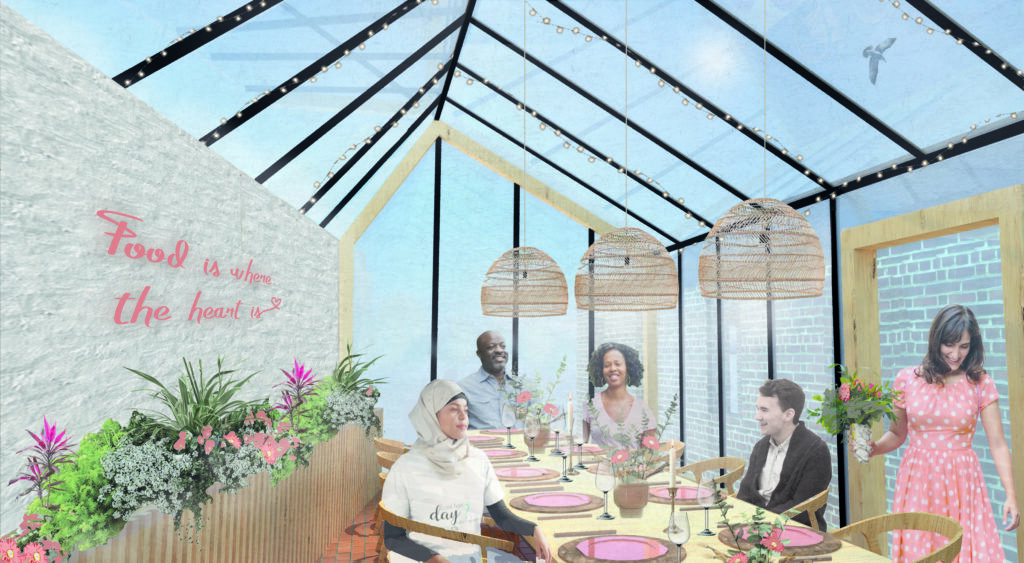
The rooftop dining space is intended for pop-up community dinners where multiculturalism is celebrated over food and social exchange. It can also act as a private meeting space or extension to the cafe when not in use. This space is an upper extension to the outbuilding on site, which I have connected to the main building via a glazed corridor. The glass roof, with velux windows, allows light to flood in. A variety of plants and flowers have been added to create a colourful, welcoming space.
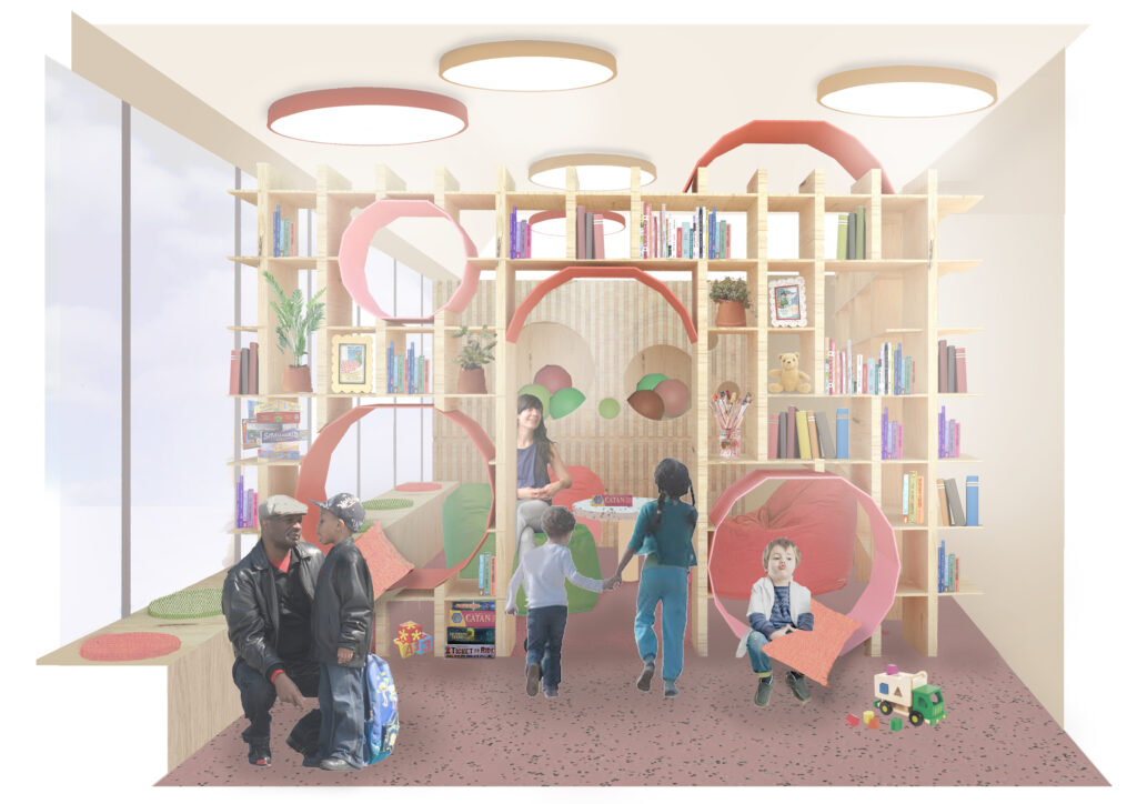
The crèche is located in the outbuilding, which I converted for this use as a means of noise separation from the main building, as well as for direct access to the outdoor space where the children can play. The design is playful, colourful and inviting with two large bookshelves for story books, games and toys. Not only is this visually pleasing for the young children but it is great for storage. The cut-outs in the bookcase take inspiration from the circular pattern formations found in the roof trusses, and are intended as fun additions to the space for the children to climb through or sit in.
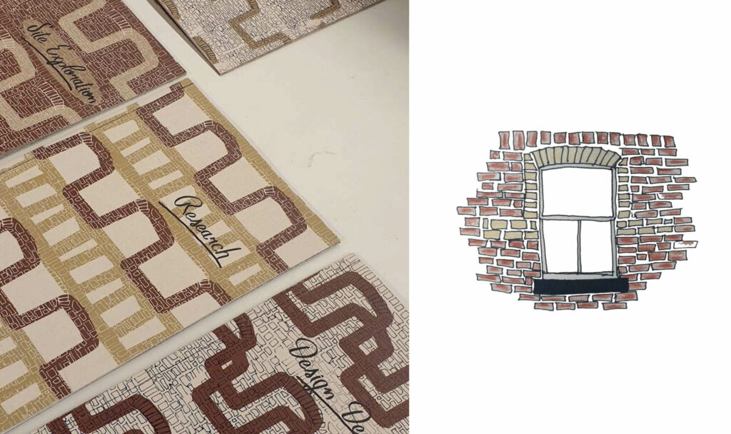
The analysis of the exterior building’s brickwork formations formed an integral part of my project, informing the development of a series of patterns based on the shapes, colours and textures. These patterns went on to inform elements of my final design including the cafe servery tiling design, the wooden balustrade, aspects of the colour scheme as well as textile designs for curtains and cushions.
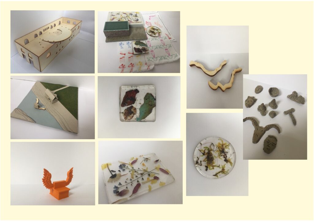
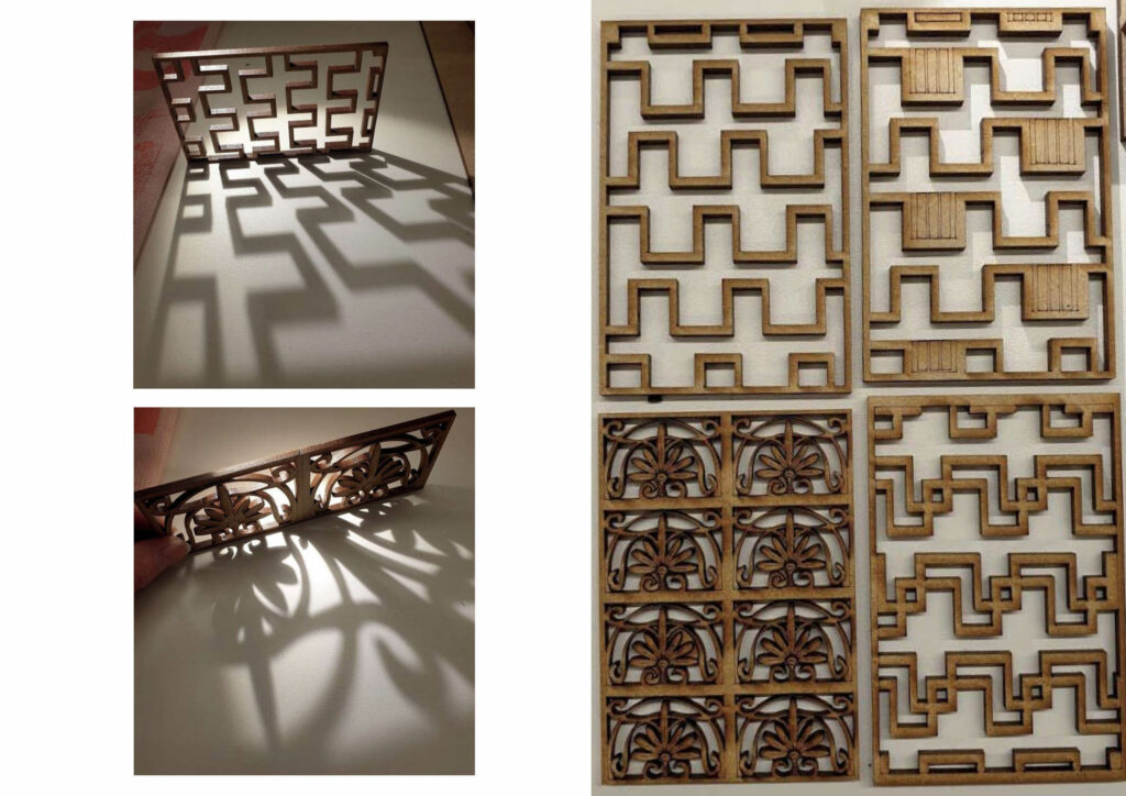
After carrying out pattern studies based on site materiality, I experimented by laser cutting these patterns on MDF to see how they might translate as physical space dividers, while also analysing their relationship with light and shadow. The cafe’s wooden balustrade is directly inspired by these patterns and references the stepped brick detailing on the building’s facade.