Next event:
ERINN SAVAGE – Performance
Tomorrow 15:00 GMT

Interior Design

The Year of the Interior 

2020, it is safe to say, is the year of the interior. For the first time, more people are intensely experiencing and contemplating the ways we live than ever before, and for students of Interior Design profound and urgent questions have already arisen from this crisis. 

Even before the dust has settled, we are acutely aware of a future that is hard to predict – what will leisure, travel, work, social contact, shopping, dining, celebrating, grieving, praying and exercising look like? How will systems and spaces change? What will become of places

We can look back to the critical speculations that emerged from design projects in various other historic situations (moon landings, modernisation, the threat of atomic war) and begin to write manifestos befitting our own time from the perspectives of our expertise. 

Visions for all sorts of alternate inhabitations had already taken shape in the outcomes of our graduating projects: how can we build joyful spaces for more resilient and integrated communities? What happens to our residential environments if inundated by rising sea levels? What material interventions might be required of a nightclub in the times of social distancing? It seems we enter the new world prepared to meet some of its challenges.

We congratulate the graduating cohort on their thoughtful projects, their hard work, focus and collegiality despite a challenging conclusion to the 2019/2020 academic year. We commiserate with you on the difficult end and what might have been, but we also eagerly await the insights and innovations that will emerge going forward.

Nadia Wagner, Lecturer, Interior Design

LUSH Flagship Store (retail)

This project analyses how existing shopper’s habits in LUSH could be adapted and triggered in a flagship store by tapping into the sensorial aspects of a consumer. The project taps onto the existing senses of shoppers that makes them move and react in a certain manner within the store itself. 3 senses, “See, Touch and Smell” are observed, thus these senses are being used to develop deeper into the flagship store experience tapping onto these sensorial aspects, allowing shoppers to wander into the space, finding their own preferences. ​

Layout Plan: Proposed Zoning, Circulation and Material

The flagship store is separated into different zones which consists of different scents. These zones are separated based on the experience and scent. The proposed zoning, circulation and material provides an overall view of the space as well as the possible journey that could take place within the store.

Red Experiential Zone

Shoppers could place their head into the opening to get closer and feel the texture of the wall. LED strips from the bottom would shine in enhancement of the experience. The experiential wall (scratch and sniff wall) are used to contain the smell within the space instead of having it diffuse around the store, overwhelming the senses of shoppers. Upon scratching onto the experiential wall, it releases the scent of roses allowing shoppers to get a preview of the smell.

Transitional Space

The transitional space serves as a preview of the overall flagship store before shoppers enters. Different coloured pod gives a sneak preview of the senses that will be tapped into as well as associating the specific colours that matches with the scent and senses.

Yellow Experiential Zone

The texture wall for the yellow zone is left exposed in comparison to the other zones as the zone tapped onto its texture such as its smooth, citrus surfaces to provide a different experience to shoppers.

Passage Way

The passage(way) shows how shoppers can walk through the store by their senses through visuals and scents. Certain zones are placed closely to allow shoppers to follow the type of scent they prefer as they can smell 2 different scents while walking through the space

Inhabitation (Installation)

Inhabitation is an experimentation on multiple design concepts by studying the existing habits within the site, thus creating an installation which enhances and invites the existing habits to take place within the installation. Habits in this project pertain to the routine of people. This project is an installation, a temporary feature on site for a 3 – 6 months duration.

Portal of Memories

Modular cubes that are hollow serve as a portal of memories to users. These boxes are like a frame captured in one’s mind, creating memories. What one sees in each box may not be what others see, hence the “memories” captured in these modular cubes differ for each individual.

Reflective Memories

Mirrors trigger a form of reflected memories such that when one peers into a mirror, what they are seeing is being reflected. This reflection alters memory, as what lies before their eyes will eventually become a memory of the past. What one sees today will become a memory tomorrow. The mirrors reflect what users see, turning it into the past.

Inhabitation

This installation allows users to identify and interact with the modular cubes such that the big modular cubes can be used as a space where one sits to read. The smaller cube serves as a step to get from one space to another. It also provides users use it as a sitting or discussion spot.

The Irreversible Cycle: Life and Death (Exhibition)

The Manifesto project is a curation of an exhibition which consists of a constructed narrative that ties the selected collection of installations and art pieces together as a coherent whole, creating a themed exhibition space. A life cycle is defined as the developmental stages that occur during an organism’s lifetime. A life cycle ends when an organism dies. Life and death are a continuous cycle, making birth and death different ends of the same spectrum of existence. This continuing loop of life, death, and rebirth is at the heart of everyday living.

The Irreversible Cycle: Life and Death (Exhibition)

Spatial context of the exhibition which includes a summarised overview of the exhibition’s narrative and its journey from the beginning to the end.

Floating Time (Mid Life Cycle)

In the dark space where lights emitting are mainly from the exhibited pieces, a black curtain is used to separate the artworks so that the lights and its effect does not seep through the spaces, allowing visitors to immerse each space fully.

Decomposition (Dying/Decomposing Cycle)

The decomposition space consists of artworks which represents death and how it can also be in the form of decaying.

Corridor Transition (Death Cycle)

Leading to the next exhibited object, mirrors are placed with the intention of providing a preview of the next artwork, Archive of Deathclock, as well as having the visitors to be a part of the artwork.

Urban Mobility in Singapore

It seems that vehicles take precedence and acquire privileges in the form of transportation in Singapore. However, a far more affordable and environmentally friendly mode of transport like bicycles and PMDs has insufficient opportunities and relevance in our country. Singapore is still lacking in offering traveling alternatives for car-less commuters other than its existing high standard of public transport.

Urban Mobility Devices

Over the years, bicycles, PMDs (personal mobility devices) and e-scooters have been a new mode of transportation for a handful of individuals in Singapore. It does not merely serve as a form of transportation but also as an important asset for some users to perform their daily jobs. However, pedestrians are anxious and unpleased as how these devices cause public alarm over the risk that it put to others.

Reactions From The PMD Ban

A large number of individuals were upset after being informed of the PMD ban on shared pathways in Singapore. It seems that these users are not given the rights and access in moving around the city freely. Besides, there are plenty of solutions that can be executed to facilitate them. Thus, banning of the PMDs is not a final resolution.

Collage of Site Settings

Collage of different site settings – hawker centre, market, MRT station and cinema.

Diagram of Hawker Centre

Diagram of inhabitation – hawker centre

Visual 1

To make use of the double volume space in the existing site, a second level was designed to particularly accommodate cyclists who prefer dining in the hawker centre. It also includes a parking space for users to park their bicycles safely while they enjoy their meal.

Visual 2

Food stalls were designed with double openings so that one of each can be used to facilitate customers on foot and the other for cyclists or delivery riders. This will allow a better interaction between hawkers, customers and cyclists as it avoids the intersection of purchasing and collecting of food within one another.

Visual 3

To avoid any collision between a pedestrian and a cyclist, the implementation of zebra crossings can alert both individuals. Hence, arrows and signages on the double bicycle lanes play a major role in creating a safe and comprehensive pedestrian-cycling network. So do the choice of colours used to differentiate between various zones respectively.

Visual 4

Cyclists can utilize the ramp that brings them to their dedicated eating space while non-cyclists have the entire ground level to dine in the hawker centre comfortably.

Visual 5

Food stalls were also designed in a fluid form as to display the flexibility of movement and interaction between pedestrians and cyclists in the hawker centre. Thus, each stall owns a distinct form of space.

Comfort Zone

Comfort Zone is a project that aims to improve the standards of gathering spaces. By looking at the liveability of an interior space through the users’ comfort and the overall spatial layout, a design intervention would be developed. Proposed design would then be applied to three sites with different typologies, and this aims to maximise the user experience of such spaces.

Recurring Language

The design language of ‘Steps’ has been identified to be a suitable design element that can evoke a sense of comfort in interior spaces. It does so by introducing the idea of ‘Versatility’ into the users’ experience. This element was then incorporated into the design interventions throughout each of the three sites, serving as a connection that links the seemingly different proposals together.

Don't Tell Me How To Study

Don’t Tell Me How To Study is a library project that aims to break the studying conventions of a library space. Proposed at Jurong Regional Library, the project focuses on promoting ‘Physical Comfort’ through the intervention of a steps design which creates a versatile study space, and ‘Visual Comfort’ with the incorporation of a uniform design language throughout the whole site.

Don't Tell Me How To Study

All forms of structural elements such as walls and doors on the site are removed, resulting in the steps intervention spanning across the library. Different spaces such as walking paths and areas to read books are thus all integrated and taking place at the same area.

Don't Tell Me How To Study

The stairs intervention is a safe design that, while appropriate for a library reading area, seems to be too ‘sensible’ aesthetically. A dose of ‘fun’ in the form of box features was thus added into the otherwise boring space. While they stand out, these box features are still in keeping with the sense of uniformity created by the ‘steps’ intervention.

Rest Well, Shop Again

Rest Well, Shop Again is a project proposed in Jurong East Mall (JEM). Although located in a shopping mall, this project focuses on the communal area in the mall’s Basement 1 floor and how well can shoppers rest in this given space. Hence, the proposal aims to inject a sense of calmness into the hectic mall environment, while attempting to blend into the mall surroundings.

Rest Well, Shop Again

Water is used as the medium to evoke calmness. Being a powerful sensory element, the use of water here was kept subtle to prevent it from overpowering the existing site. The intervention attempts to blend into the site, and thus the effects of water could only be experienced when shoppers use the space. Sensory characteristics such as sounds of water falling are also used to maximise the potential of water.

Rest Well, Shop Again

The shopping mall has walkways which are too restricted to be used as communal areas. Instead of forcefully doing so, subtle elements such as ceiling designs are instead incorporated into these spaces to create a visual link that ties the entire floor together. With this, the functions of the walkways are retained.

Sit Down Talk

Sit Down Talk is a project that aims to improve the comfort of the overall dining experience in a neighbourhood coffeeshop. Proposed to be at the Broadway Coffeeshop at Blk 286 Toh Guan Road, the project emphasizes on using the notion of ‘Decentralization’, an aspect that modern day coffeeshops lack, to bring back the coffeeshops’ original intention of being a welcoming space for everyone to gather and mingle.

Sit Down Talk

The site also presents an opportunity for a semi outdoor dining experience. This dining experience is emphasized with the selection of cork as the flooring material. Cork flooring provides a comfortable sitting platform for users, thus encouraging them to gather and sit on the floor. Not only does this freedom of choice emphasize on the sense of community, it also creates a versatile dining space that prioritizes the diners’ experience.

The Men's Mall

A collage of *SCAPE in its current condition. In our fast-paced city-state, economic development occurs an unprecedented rate. To keep up and increase density, the wasteful practice of replacing older buildings with new ones is considered the norm. Existing properties are also under constant pressure to renovate and upgrade to keep relevant. The purpose of this project is to speculate the possibilities of how under-utilised spaces in *SCAPE can be readaptedto give it a new breath of life.

The Men's Mall

Site map of *SCAPE and its surrounding in Orchard Road.

The Men's Mall

Process. Sketches and ideation of how the users will be moving through the space with swinging walls and display fixtures.

The Men's Mall

A diagram on layout studies that will be adopted in the Men’s Mall. (top) A maze layout has a fixed path and a maze of spaces for product displays. It also extends the distance users traveled in the store. (middle) A grid layout, most common in stores as it is very convenient and speedy. (bottom) Freeform layout facilitate in exploration and brings users to visit more parts in the store

The Men's Mall

Layout Plan of the Men’s Mall.

The Men's Mall

Interior of the high-end men’s fashion store. A tightly curated selection of products is displayed, encouraging customers to explore other parts of the store.

The Men's Mall

Interior of the high-end men’s fashion store. A tightly curated selection of products is displayed, encouraging customers to explore other parts of the store.

The Men's Mall

The Fashion Gallery is a flexible space that can be converted to suit various events such as workshops, seminars and product displays and aims to increase the awareness of the brand’s philosophy.

The In-Between

A simple Question of Inhabitation: What would happen in that in-between space between modern corporate shops and traditional strata shops? How would the audience from each typology interact with one another? How would the intended program in the in-between space turn out? The in-between space isn't solely owned by either party. A no man's land.

Corporate

Elevation 1 of the intended proposed design of the In-Between space.

Strata

Elevation 2 of the intended proposed design of the In-Between space.

Changing Home

A simple Question of Inhabitation: Shouldn't space be determined by the play and inhabitation of the users rather than the play and inhabitation of the users to be determined by the space layout? Boundaries and Territories are always referred to as built-in and rigid structures. Boundaries and Territories should be easily moved around to cater to the ever-changing needs of the audience.

Changing Home- An Axo

An axonometric overview of the intended proposed design.

Kitchen

A movable kitchen wall/cabinet that can extend the use of the kitchen and dining space or to minimize it in order to use the extra space for other activities.

Gym & Art

Likewise a movable gym wall/cabinet acts as a door for two rooms, and when not in use can be extended to facilitate gym and art activities.

A New Housing Typology for Rental Flats

Strong community ties is capable of providing a form of social support and resource network. Despite its importance, it rarely exists in HDB flats today. This project aims to investigate a new typology for rental flats that incorporates the notion of community within the housing estate. It sought to improve the standard of living for lower income families and strive towards achieving self-empowerment to break away from the cycle of poverty.

Utopian Vision

Le Corbusier’s idea of “vertical garden city” in Unite d’Habitation focused on communal living for residents to shop, eat, play, live and gather together outside their private dwelling space. This integration of communal service into the housing model has further encouraged interaction to take place among inhabitants. Drawing reference to Unite d’Habitation, a utopian vision on the future of a community orientated rental flat is being projected in the form of a sectional elevation collage.

Reconfigured Layout Plan

As compared to the void deck, the corridor has a greater possibility that residents would linger around as it is more accessible from their units. However, the linear and narrow nature of the corridor in block 1 Jalan Kukoh is not the most efficient space for residents to gather in. As an attempt to bring in communal spaces that encourage prolonged interaction, the linear walkway is transformed into an enclosed space by deconstructing and rearranging the layout plan, eventually coming up with multiple iterations.

Breaking Away from Standardization

Referencing Habitat 67 where the units are interconnected and stacked on one another, it allowed for a private garden terrace to every unit and play area throughout the building for children. By breaking away from the standardized design of HDB, new possibilities of interaction are introduced. Therefore, taking two reconstructed levels and stacking above each other turning it into a single floor increases the chance of interaction by half.

Eyes on the Street

The concept of "Eyes on the Street" as a form of surveillance provides a safety measure as residents help to keep a lookout for one another. Breaking up solid walls and having screens allow residents to have visual or verbal contact. These are explored with different degrees of privacy. With screens at the feet level, it provide clues on the safety of residents without taking away their privacy.

Persona: Single elderly living alone

With safety as the main priority, the unit is designed with a communal herb garden that allows residents to be involved in nurturing the plants. While doing so, residents are able to ensure the safety of the elderly through verbal contact. To a certain degree, it also allows a glimpse into a small area of the room such that the privacy of the elderly is still present.

Privacy is a common issue face in large family. Curtains fitted in bunk bed allow children to be entitled to a small personal space. By staggering the beds, these children get a private play corner of their own, accessible from all four beds. An opening is created at an eye level of a child for children outside to invite them out to play.

Persona: Single mother, 4 children, 1 baby

The vertical screen frames the amount of area to be seen in the room to retain privacy for the other family members. However, it is sufficient for the baby cot to be visible for residents to help keep an eye on the baby while the mother attends to her other children. When the sofa bed is folded, the space transforms into a living room.

Persona: Parents and a teenager

From the conceptual models, the idea of encouraging interaction to occur through close proximity by blurring the boundaries between the private units and communal space is executed in this unit. A cohesive language with the usage of panels are extruded from the steps of the stairs to seating in the living room and further extruded to form platforms for residents' use in the communal space.

Overview

The concept of interfaces as a form of threshold between public and private domain is explored through different implementation throughout the housing model. It is integrated to work as a system that encourages residents to not only interact but also to connect with one another.

The norm of working

This is so apt in this moment of a worldwide pandemic where we are all forced to stay home, work from home and work from our limited desk. Humans are the most adaptable creature in the world, we went from agriculture to a capitalist society in such immense speed. What lies in the future of work?

Adaptive Living

Most of us are comfortable in our homes because it is a place to unwind after a full day out. It is a place where our true character unveils itself. Walter Benjamin famous phrase “to dwell is to leave traces” applies to most spaces, but especially in our dwelling, our home.

Spatial Use

When we micro-analyse our space usage, the original intent of the space ended up suiting our needs instead. A room turns into a workspace or a store. A dining table turns into a study table. A coffee table turns into a dining table. How users define the use of these objects and spaces are different in every household.

Embracing the mess

A collaged utopian world of what embracing all our assumed flaws and mess could be. A messy table with a conveyor belt of endless items. A house filled with surveillance cameras. A living room with clothes piled up. The lounging seat with extension plug becomes one with the wall filled without enough socket to charge all the devices at home. A balcony filled with cigarette butts that must be cleared away every day.

Life vs. Play

In the functional bus interchange, what difference does it make when life gets injected into the space. Through play elements, biophilia elements, art installations or localized bustling coffeeshop? The robotic-like functionality of the space was disturbing. The fact that we are all part of the system of dropping off and picking up points made the idea of this standard bus interchange boring and monotonous.

Interventions

A myriad of intervention designed for a functional bus interchange. It aimed to diminish the efficiency of the space by injecting elements of life, fun and play. Where kids can play, where adults can sit.

Elemental Examination

If interventions are placed in a non-obstructive manner to ensure the efficiency of the space, is that how we can celebrate pluralism? If the intervention lies within a commuter’s walking area, how would the commuter adapt? Take a longer path? Possibly.

Life

The act of playfulness in a bus interchange does not align with the stringent requirements of what a bus interchange should be. But why should bus interchanges all look the same?

A collage that shows the overall aim of the project which is to understand the sensorial needs of hypersensitive individuals with autism and support them in spaces where they transit into an existing community.

Exploration of the spatial qualities of the communal garden by thinking through making.

In case of sensory overload within the community centre, hypersensitive individuals with autism could use the lounge, which is designed as a therapeutic healing space with interior elements that promote mental curiosity and stimulate the desire of experiencing the space.

The second part of the project is a redesigned hawker centre. The food stalls are placed within the high-stress areas while the seating area is placed nearer to the low-stress areas. The two areas are separated with the main circulation path. This redefines a spatial hierarchy which would help hypersensitive individuals with autism.

Seats that allows configuration are integrated with the redesigned hawker centre. The seats can be converted into booth seating if hypersensitive individuals with autism require a space of a sense of enclosure.

Pause spaces with seating are added into the hawker centre to provide opportunities for prospect while consuming meals. These pause spaces are clearly distinguished with a ring of landscape design which also helps with odour abatement.

The third part of the project is a community library. The library cantilevers above the communal garden, blurs the transition of exterior spaces into interior spaces and creates an inclusive environment for the local community.

HOME, TOO

Location: Interior design studio @ SIT, TP. When i first spoke to a group of migrant construction workers, it sparked off the idea of wanting to find out more about how one feels a sense of homeliness and how do one build their own home away from home. In his book titled "HOME: A SHORT HISTORY OF AN IDEA", Rybczynski compares the sense of homeliness to an onion. Onions are simple on the outside but complex on the inside, like homeliness, when dissected - it just does not make any sense and it cannot be measured. Anyone can recognise the sense of homeliness but have troubles explaining why they like it. However, he states that the Onion theory of comfort (domestic comfort) is essentially about convenience, efficiency, leisure, ease, pleasure, domesticity, intimacy and privacy. As my first project, i would want to find out how do one create a sense of home in the most minimal amount of space away from home. Everyone has a certain sense of attachment to a certain place, as for me, I decided to use my school's studio as my chosen site. The studio is where students spend most of their day there (design intervention can be used in offices and classrooms also) and my design intervention draws inspiration from our very own bedroom spaces. The way how i approached my intervention is based on these 4 main pointers: 1. the different degrees of private/ public spaces 2. the control over your own boundaries 3. the flexibility of space for interaction between people 4. the need for personalization of objects.This table shows the exploration of new materials in co-relation to the modules proposed.

HOME, TOO

In due respect to the current layout of the studio and not break the openness, I did a minor addition to the existing space. I implemented a grid ceiling that holds several elements in which the user can pull down/ take out to configure their own desired space and outcome. This current view shows the plastic netting (made out of deconstructed ziplock bags) acting as a form of partition when pulled down, hence the user can configure it based on their preferred privacy level.

HOME, TOO

The modular blocks are made out of material scraps found around the studio, all wrapped up inside a sewn-together ziplock bag. These blocks can be used however the user prefers - lying down, sitting, leaning, etc.

PLASTEAC

Location: Tekka centre Ultimately, to build the essence of home is about the people and I personally feel the need for not only the Migrant Workers, but also our own locals to not chase the papers but build communities instead. . I drew a parallel of our very own living and dining room where our families commune. Hence, I decided to use Tekka Market as my site as it is a public commune space. Having their vision as the "People’s Market" and a wide variety of audience, it made a good touch point to promote it as a space for interaction and communing there. Also,Tekka Market is home to the Migrant Workers during Sundays. My design intervention and program intends to push optimisation and promote this movement where we make use of things around us to build our own homes anywhere as a community. As there are several tea shops in the vicinity, I have chosen to promote tea culture into the space as tea is a common multi-cultural element and a good catalyst for conversation starters. The scattered layout contrasts with the traditional linear layout so as to give a sense of adventure to the patrons in the space to go around and attend different tea related workshops and source for the different flowers and herbs available for tea blending.

PLASTEAC

Plastic crates are readily available in the wet market and hawker centre. Inspired by the stacking of crates in the existing space, this terrain is where people can enjoy a different dining experience as compared to the original hawker seating. Patrons can also forage from the hanging down plants and from the crates.

PLASTEAC

This space holds the various workshops - tea-infused cooking workshop in the open kitchen, tea dye fabric and paper workshop. Also, this is where patrons blend their foraged herbs or flowers with tea here, This various workshops are marked out by the various coloured scrap fabrics canopy hanging down, In which, the fabrics are sourced from the 2nd storey retail area.

RE-KEA

The existing sewing service is instead, incorporated into the space to be used for sewing workshops. The exisiting walls separating the AS-IS section to the customer service area is removed so that the patrons do not have to walk through the whole of IKEA just to get to the exit.The netting on top acts a dumping ground of the unwanted furniture parts and celebrates the “unsightly” instead.

Location: IKEA (Tampines), AS-IS section To create a home away from home, one just requires a community and they would be resourceful to find what’s around them to build their own shelter. Applying what I have explored from my previous 2 projects, I chose IKEA as the first baby step to promote this movement for the masses to learn and apply it to their daily lives. IKEA pride themselves as a DIY company, however everything is still controlled based on what generates income - from their store layout that restricts consumers from walking around freely and the products flat-packed for one to build. People are drawn to IKEA’s products as when one DIYs, they build a stronger sense of accomplishment and attachment to the product. However, if one deconstructs IKEA’s furniture, you would realize that they actually use found materials, hidden beneath the mask of a capitalist / a major company supporting capitalism. Hence, i would want to further push the idea of DIY - just by being resourceful and make use of any found objects/ materials lying around your own and piece them yourself, you might even get a more durable furniture that you can personalize and feel a bigger sense of achievement. I would like patrons to find more value in the furnitures of IKEA's AS-IS section. That section is already strategically placed near the exit, with its main purpose is to sell rejected or defected goods from customers.Issues: underutilized recycling area, wrapping station and sewing service could serve more purpose, the as-is section is just not curated as compared to the self-serve furniture area. Materials I could consider to use: the IKEA catalogue, the FRAKTA shopping bags and the free pencils and rulers.

RE-KEA

The broken ‘frakta’ bags are repurposed by sewing them together to form a partition. It can even store the loose furniture parts for patrons to create our very own furniture by piecing them themselves. The Original MALM bed is placed beside the DIY bed to serve as inspiration for the patrons to configure their own furnitures. The exisiting underutilized wrapping station outside is instead, incoporated into the space and scattered around the whole area to be used for DIYfurniture and wrapping workshops.

RE-KEA

The wall is made of the scrap furniture parts, and the gaps creates a sense of semi-privacy between the as-is section and the staff area. With the power of repetition, even to the micro level - the free IKEA pencils, can be repurposed to form a ceiling feature for zoning, or a work mat or even a partition to give a little more privacy for the user using the sewing machine.

Margiela+Moholy-Nagy Collage

A conceptual collage forming visual links between the brand, Maison Margiela, and chosen practitioner, Laszlo Moholy-Nagy, was crafted to aid the process for The Window Project.

Spirit of Geylang Serai

The genius loci or character of Geylang is represented by a vibrant, crowded environment and its Malay community shown in this collage as part of the research study for the final year project.

Material & Activities Collage

The conceptual collage propose the use of materials and the idea of sharing knowledge through different means. It guides the process for the final year project, A Cultural Mosaic, to achieve the essence of Malayness and the importance of interaction.

Learning Space Entrance

A Cultural Mosaic is a learning space that allows a glimpse of Malayness to both the Malays and non-Malays. With an integrated library that curates books about the Malay identity and culture, it serves as a useful resource for people to learn about the Malays.

The 'Kitchen'

The furnitures were designed to play with different levels of height to create the kitchen experience inspired by the Malay rituals in a traditional Malay house. The use of screens instead of walls aims to open up opportunities for interaction and knowledge sharing.

Emotional Canvas

A look into the Vandilist Expression, a space where the youths and students can release their pent-up emotions onto a canvas, as part of the proposed intervention for The Ways We Shop.

Shooting Range

The entire facade of the assembly for The Ways We Shop uses one-way mirror to provide the freedom to express freely without fear of being stared by the public. However, from the outside, the public are able to view the emotions that are being expressed by the users.

Pandora Box

Tackling the repressed, negative emotions of youths and students which may come from peer pressure, a utopian space for students was ideated. The collage expresses the concept of the intervention for The Ways We Shop, inspired by rage rooms.

The Ways We Inhabit This Space

The proposed inhabitations for A Cultural Mosaic was illustrated through a sectional perspective view. The key ideas of the learning space’s design plays with the different ways a person can sit, referenced to the sitting rituals where a single mat can accomodate for multiple needs.

Sectional Perspective of Cinema

An open-cinema was designed for Reminiscene which aims to bring back the spirit of Malayness, the spirit of community gathering, that was lost in the present. The use of the roof abstraction was to symbolise nostalgia due to the past site, the Geylang Serai Malay Village.

Function, aesthetics and construction

Throughout history, the triad of aspects corresponding to function, aesthetics and construction has been proposed as the fundamental components in design, from Vitruvius to various contemporary authors. This year-long research, titled 'Optimal design: function, aesthetics and construction', builds upon these theoretical underpinnings, and through a series of exercises, this idea is investigated and clarified within the context of interior design. The lobby-seating area of SIT@TP was chosen as the site.

Designing to the context

The optimality of the design to its context is explored. For example, in 'Project 1: Function', a 'double-decker' strategy (shown on the left) may be better when there is space constraints, while a flexible programme and capacity may require collapsible furniture (shown on the right).

Finding the context

Factors, such as the pedestrian flow or circulation of the site, largely influence its function. In this case, the circulation reaffirms that the site is heart of the building. Thus, it may serve as a kind of landmark as one of its main function.

Functional design explorations

The circular design is explored, which conveys the centrality of the space, and contrasts against the straight lines of the building. Refinements are made on the basis of the functional concerns – its primary uses (programmes, activities and users), comfort (such as privacy, access and noise) and safety.

Spatial arrangement

Atelier-Bow-Wow style perspective plan of the design.

Aesthetics

In 'Project 2: Aesthetics', the design is approached first as a kind of sculpture or art before dealing with functional concerns. Through collages like this, the atmosphere of the space and the visual composition can be quickly explored. For the site, the quiet and darker study and resting area is contrasted with the brighter and more busy lobby area.

Aesthetics design explorations

Through understanding the formal visual language of the existing building, the new design can be conceived as the continuation of a visual composition of the whole gestalt. Different aesthetics forms can be produced based on the formal language, although they are functionally similar.

Modular furniture

A modular approach may be interesting, where the furniture can be arranged to form many different seating configurations.

Different arrangements of furniture

Physical models exploring the modular furniture configurations.

Track details

Exploration of how the modular furniture can be moved along a track. In A, a metal floor strip provides only visual feedback on where it should be. In B, a custom-extruded strip provides a small slope along the edges, allowing the furniture to slide more easily into its track. In C, a wheel-and-grove design enables users themselves to easily reconfigure the furniture arrangements, although more maintenance may be required.

The region rich in history and culture

Illustration of project site, Waterloo Centre, which sits amongst different building typologies, surrounded by rich Singapore culture and visited by people of different race and religion.

Map of intervention

Three interventions, each with different agenda, to sieve out the idea of Ornamentation that may happen at Waterloo Centre.

Sketched elements

Documenting distinct visual elements at site.

Taxonomy of elements

Taxonomy of visual elements extracted from site to speak of the lifestyle of the people, and the mix of old and new architecture.

Overwhelmed with ornaments

Section of Waterloo Centre that identifies existing and new ornamentation that introduce new functions.

The Jungle

Residents transform the site into a jungle where they grow plants and enjoy the sight of greenery outside their windows.

Iconic shop fronts

Part I: Each is a 3D collage of possible shop front design created by isolating the most iconic shapes and textures found at site.

Conceptualising new coffee shop

Part I: Iconic shapes and colours are employed to a busy coffee shop at Waterloo Centre to make it more memorable.

Model of intervention

Part II: Model of intervention outside a junior arts school located at a corner of third floor.

Glass blocks pods

Part II: Exterior view of intervention which shows the prominent material seen at site – glass blocks. The pods with varying heights and dimensions encourage exploration.

Extended play zone

Part II: The malleable sheer wall lets people on either side to connect. It is also lowered to appeal to children.

Waterloo Centre reimagined

Reimagining an ornamented HDB with striking colour, pattern, signage and plants to draw attention of the crowd.

No ornamentation

Part III: Conceptual model of intervention at the ground floor intending to link two major staircases. The cocoon-like pods amplify and transfer sound via metal conduits (represented by the coloured straws). Sound can be an ornament in space.

ornaments

Part III: Sitting area with concrete pods and metal conduits that amplify the sound of wind.

Keeping it neutral

Part III: Pods elevated off the ground to suggest lightness. Plants can help to dampen sound and soften the hard-concrete materials.

Re-Imagined Spaces: The play of light and shadow in our everyday life

This project started with questions of how the duality of light and shadow, that is so significant in our lives, impact us on a daily basis. I believe that light and shadow has the ability to evoke one’s emotions in a space even in very mundane spaces. 'Re-imagined Spaces' aims to investigate the notion of light and shadow and how it can affect in representing a space. Through a selection of ordinary and common spaces, the projects questions the possibilities of how these spaces can be re-imagined when light and shadow is used as the driving force of the space.

Part One: Exploration of light and shadow

The documentation covers 8 various sites in Singapore to explore the existence of light and shadow in our daily life. Ideas from the collection of photographs from the site visits are translated into simple study models. Through it, making discoveries on how light and shadow can affect our spatial experience.

Part Two: The Rhythm of Shadows

Looking into the play of light and shadow in everyday spaces, a transitional space was chosen as the typology of this project. A hospital can be a very anxiety charged place for some visitors. Thus, this project aims to target users from the hospital and explore how light and shadow can momentarily evoke a sense of calmness through the transition. The idea of rhythm and intensity of light and shadow was explored. Darkness evokes a form of mysteriousness and portrays silence. The forms of shadow becomes more rigid and darker when reaching the middle of the transition walkway. The idea of darkness, minimal light and stillness evoke silence in the space and aims to create a contemplative atmosphere.

At the darkest and most still point of the walkway, a slit allows a ray of light to enter the space. The only benches are placed here to encourage one to momentarily remain at this place.

Part Three: Sanctuary Café

This part looks into the typology of an ordinary food court. The project aims to create a relaxing space for people to dine in, contrasting to the surrounding fast paced and crowded environment. It will explore how the interplay of light and shadow create a comfortable experience in such a setting. The project explores calmness through the use of water. In particular, the experience is catered for solo diners.

Moving forward, the glass floor is removed and replaced with glass steps, revealing the texture of the water. The light strips aims to entice people to continue walking forward, while the black tiles gives a sense of depth.

Nearest to the kitchen is the short-term dining area. The curved seating is intended to break the linear geometry and also make it harder for users to communicate, giving more privacy to solo diners. Sounds from the cascading water fountain behind the panels can be heard to create the calming sound.

For the private pods, shoji screens are used as the materials for the partitions to keep it less rigid yet maintain the level of privacy. The screens will also reveal the shadows of people. As it is a really long corridor, the alcove will give depth to the shadows and users will be drawn towards that as they walk through.

The visual and audio aspects of water is strategically integrated into the design of each space to help create the calming experience.

Environmental issues have been so much more important to me in recent years, and that has influenced the ways I approach the type of projects I want to do and how I want to execute them. For my Final Year Project, I wanted to explore the possibilities of how we can live with the least carbon footprint as possible. This will be done by tackling how HDBs can be reconfigured in order to be more self-reliant and self-sustainable. As we live through a strange time, through the COVID-19 pandemic, the notion of being more self-reliant and self-sustainable is more relevant than ever.

This collage was my way of expressing a ‘futuristic’ Singapore and how Archigram’s unbuilt projects could become a reality. My project was very inspired by Archigram and the theory of Rubanisation by Tay Kheng Soon. The idea of Plug-In City constantly evolving to meet the needs of people, and by having all the resources needed in one mega-machine – without harming the environment, was something that intrigued me. I wanted to combine those ideas, with the strategies of Rubanisation, to redefine how we live today so that we live with the least carbon footprint.

This is a series of materials made from waste. Gas, oil, consumerism, electricity, transportation and every other form of human activity, contributes to our carbon footprint. I asked myself, what if I could make my own spoon? Knowing that waste is a great carbon footprint contributor, I wanted to explore how household waste could be reused and made into something new, to kick-start the project. What if I made my own spoon using banana peels? That would mean I do not have to buy a new spoon - I do not contribute to consumerism and energy to produce a new spoon, and I get to reduce and reuse my waste, promoting a circular economy. 1. Milk + Vinegar 2. New-paper (made from waste paper) 3. New-clay (made from waste paper) 4. New-clay 5. Alternative Banana Peel Material 6. ABPM lamp shade 7. New-paper + ABPM 8. Slab of ABPM 9. New-paper 10. Weaving ABPM 11. New-paper + ABPM 12. Weaving ABPM with mesh

This neighbourhood is the site I chose as it already had a lot of existing amenities that I could work with to create a new masterplan. The analysis and masterplans done were based on the strategies of Rubanisation. My main objective was to ensure that no building was just purely residential, it had to be combined with another programming.

The diagrams of different configurations were a process of redistributing the existing amenities from the site, to one HDB building. Although this idea sounds like a Mixed Used Development, I was exploring an idea away from that typology, hence I decided on Diagram 6 as its configuration was most different from a MUD. I then translated this idea to a very draft collage to envision the type of spaces I wanted to have. To continue, I traced over the collages so that I could draw out how certain spaces could relate to one another. It was very important to sketch them so that they came together as one whole space. In order to redefine the way, we live, I chose to focus on a HDB building because it is the most common form of local housing.

What if HDB blocks had everything we needed? A pandemic-proof, zombie apocalypse-proof housing, because we would not need to leave our homes? My vision of a new HDB typology was to combine everything in a neighbourhood, into a singular block. Having urban farms are integral for residents to be able to grow their own food. This new typology is all about self-reliance, self-sustainability and a circular economy. This compilation shows the final iteration of the collage and how in reflects on a HDB from the site. The diagrams on the right show the circulation of the different spaces, programming and space planning.

To decrease carbon footprint, the principle of sharing is very important. For instance, not everyone cooks, hence, not everyone needs a kitchen. Layout explorations 1 and 2 were to explore the optimal potential of a HDB floor plate and how many bedrooms there could be by creating a central node of common areas. Traditional HDB units were eliminated for a floor to become one. With reference to my envisioned HDB typology, I decided to develop Level 9, which consisted of co-working spaces, farm, common areas and residential.

Inspired by Archigram’s Plug-In city and how it is able to adapt and change to the needs of its users, I wanted to incorporate this idea to the residential quarters by designing adaptable bedrooms. The bedrooms can be made bigger or smaller depending on the user. By having this flexibility, it lessens the likelihood of people having to move homes which in turn decreases the demand for new housing. Hence, this could possibly lessen buildings that need to be built and thus decreasing our carbon footprint.

This series of models is an ideation of furniture design. There is also potential to incorporate the earlier exploration of alternative materials, with the construction of the furniture.

This series of models is to explore the design of the common areas. I wanted to explore how people could come together, their co-existence in this new typology and their co-existence with nature. The idea was to create spaces without having to build solid walls, so that the spaces could be open and allow for natural ventilation to take place. By being more open, the common areas are also able to seamlessly connect with the other spaces.

Creativity in Everyday Life

Project: Creativity in Everyday Life. The project intention is to allow the user to unveil their own sense of creativity. The project aim is to build an awareness that creativity is present in everyday life. Designing the circumstances for creativity to arise.

Creativity in Everyday Life

Conceptual models and sketches done to interpret the frameworks by practitioners (Bruno Munari, Johannes Itten and Tim Ingold) that motivated the study of Creativity in Everyday Life.

Creativity in Everyday Life

An exhibition showcasing the subtle presence of creativity in everyday life at home. Site: HDB Estate (Hougang Street 91 Block 909 Singapore) Taxonomy Poster: Exhibits of everyday household items in their settings and their multiple uses as created by the user.

Creativity in Everyday Life

Initial exploration of the exhibition - circulation and spatial planning. The site of the exhibition was suppose to be at Gilmann Barrack AFA Block 28.

Creativity in Everyday Life

The circulation and spatial planning were reorganised to the new site, the HDB Estate. A sense of unveiling in an inconvenient setting that allows the user a greater sense of curiosity in stimulation. A spontaneous reaction between the user and the exhibition. Evoke a higher catalyst for awareness.

Creativity in Everyday Life

Exhibition Design. Modules of the various different settings in a Home. The modules are fully interactive. Users may inhabit the space and interact with everything in the module. The interaction between the user, object and the space is a key part in evoking the sense of awareness in the presence of creativity in everyday life.

Creativity in Everyday Life

Exhibition Design. Highlighting the placement of the exhibits within the module space.

Creativity in Everyday Life

Creating from imagination rather than following instructions. This gives users the tools to create. Users are free to imagine, explore ideas and invent new things. Site: Kallang Rivergreen Building - Singapore. Taxonomy Poster: Understanding creativity in everyday life in the context of the workplace.

Creativity in Everyday Life

Perspective of intended spatial design - I. Building the workstation is intuitive and fun and resembles the direct creative output of work (precedent studies that were referenced are the Caroline Pratt Unit Blocks and Interslot by Rodger Limbrick).

Creativity in Everyday Life

Perspective of intended spatial design - II

The living room

Project 3: The mall is my living room (co-existing). Since Funan co-living is located in the mall, using the layout to allow the resident of the co-living to venture out and use the entire mall as its living room, wardrobegamesdining to workliveplay.

open living

project 3: Co-living- using the idea of IKEA showroom, as a living space for my co-living where everyone is able to mingle and live together and experience a different experience of co-living.

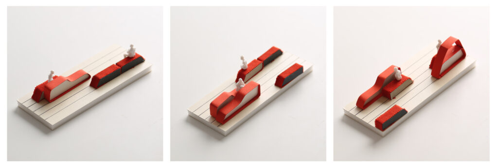
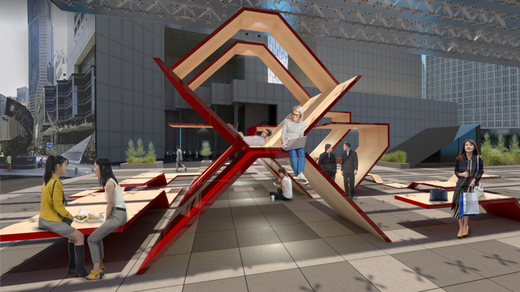
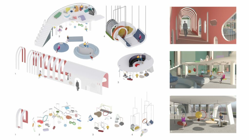
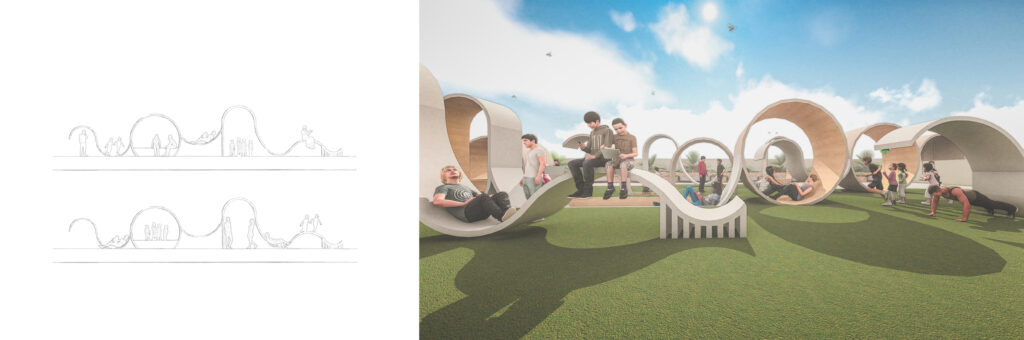
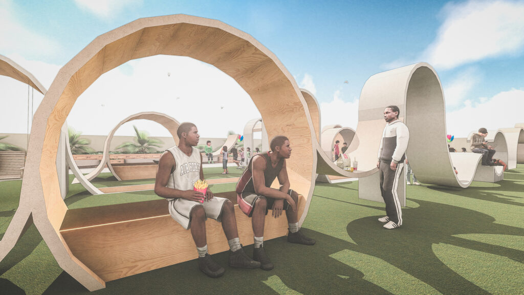
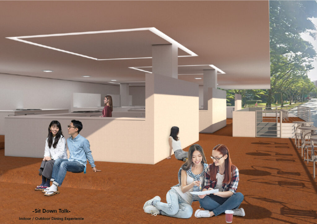
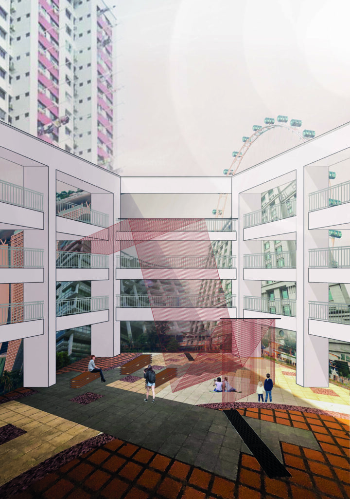
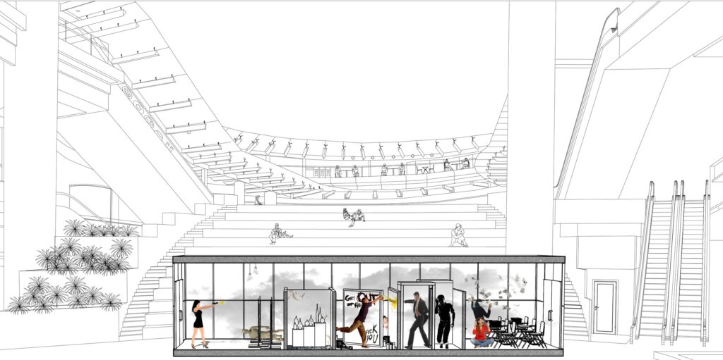
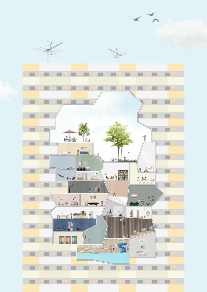
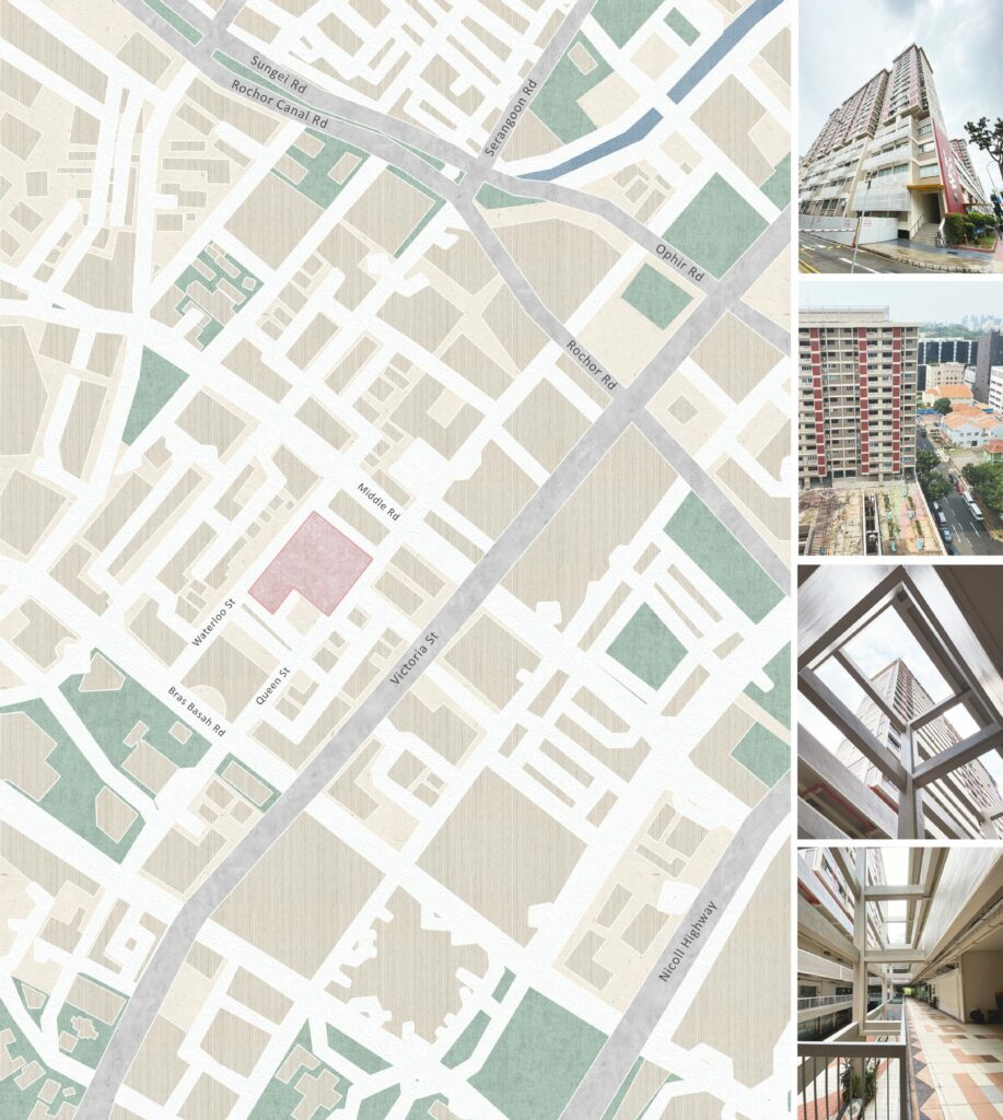
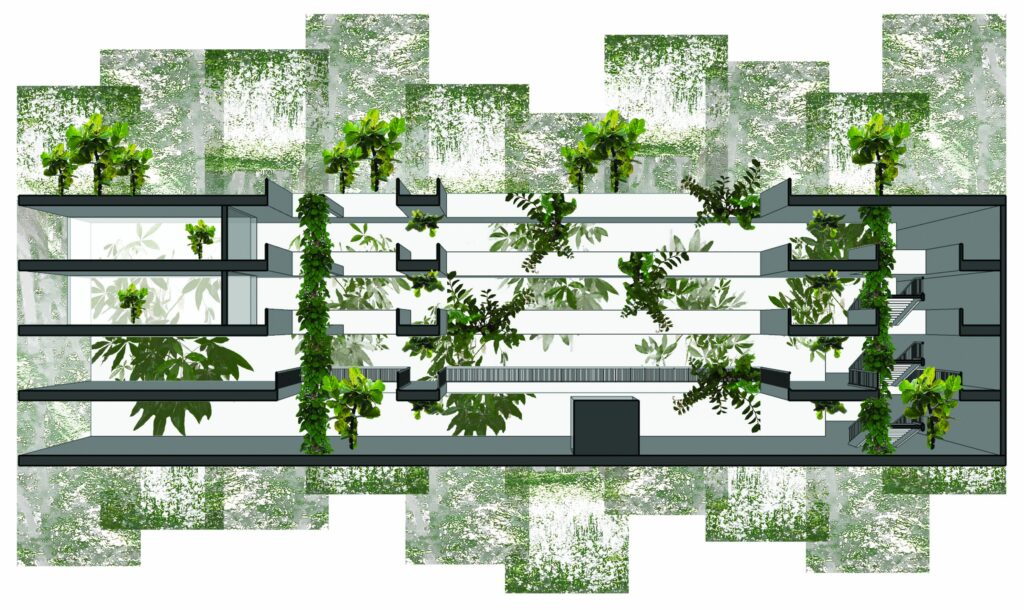
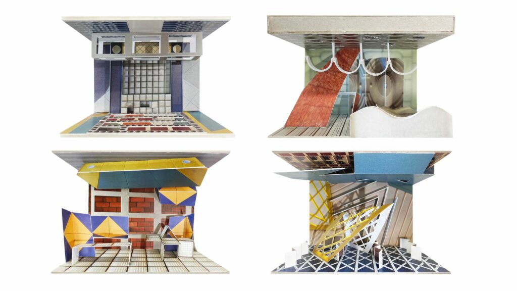
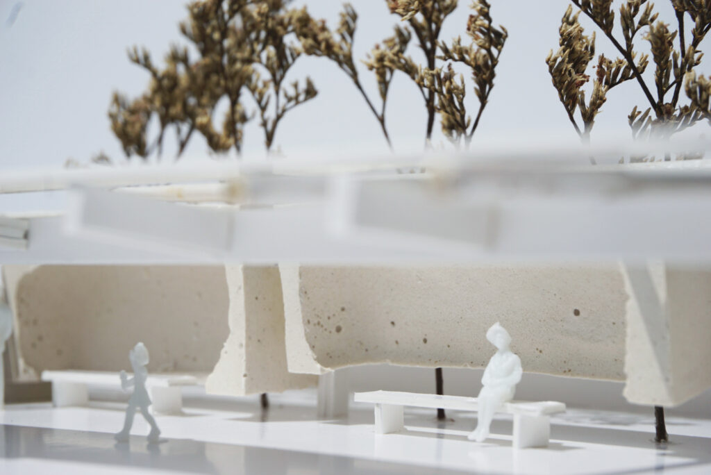
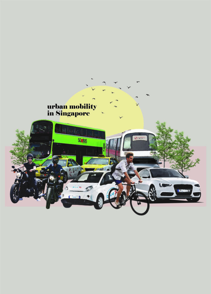
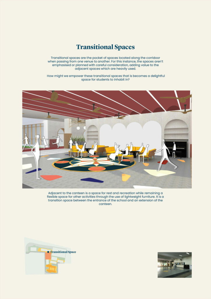
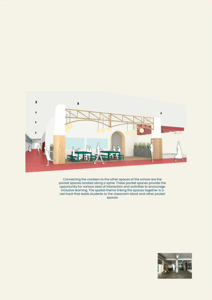
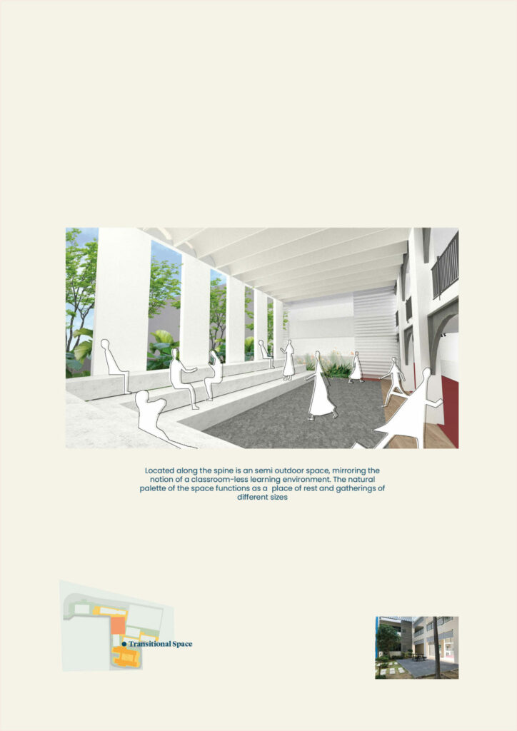
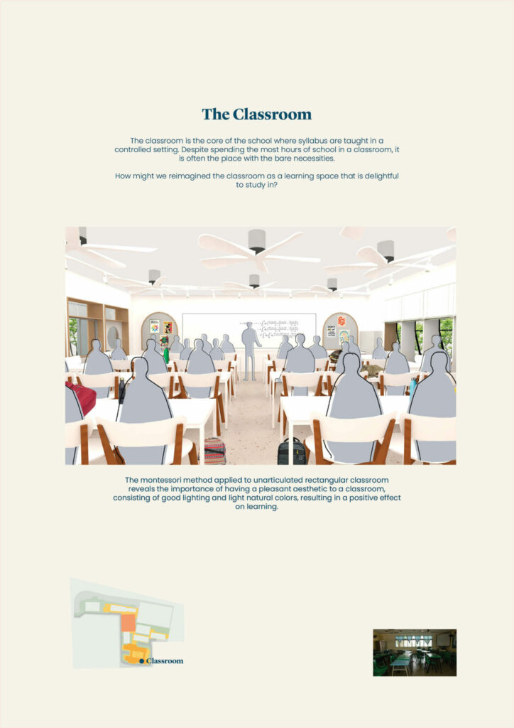
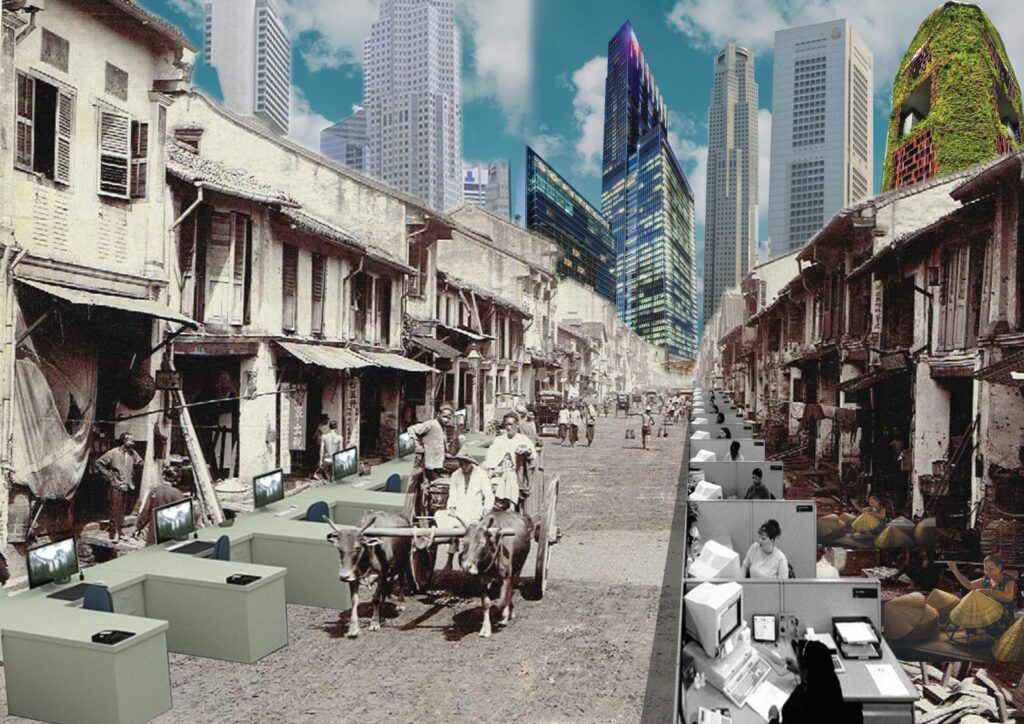
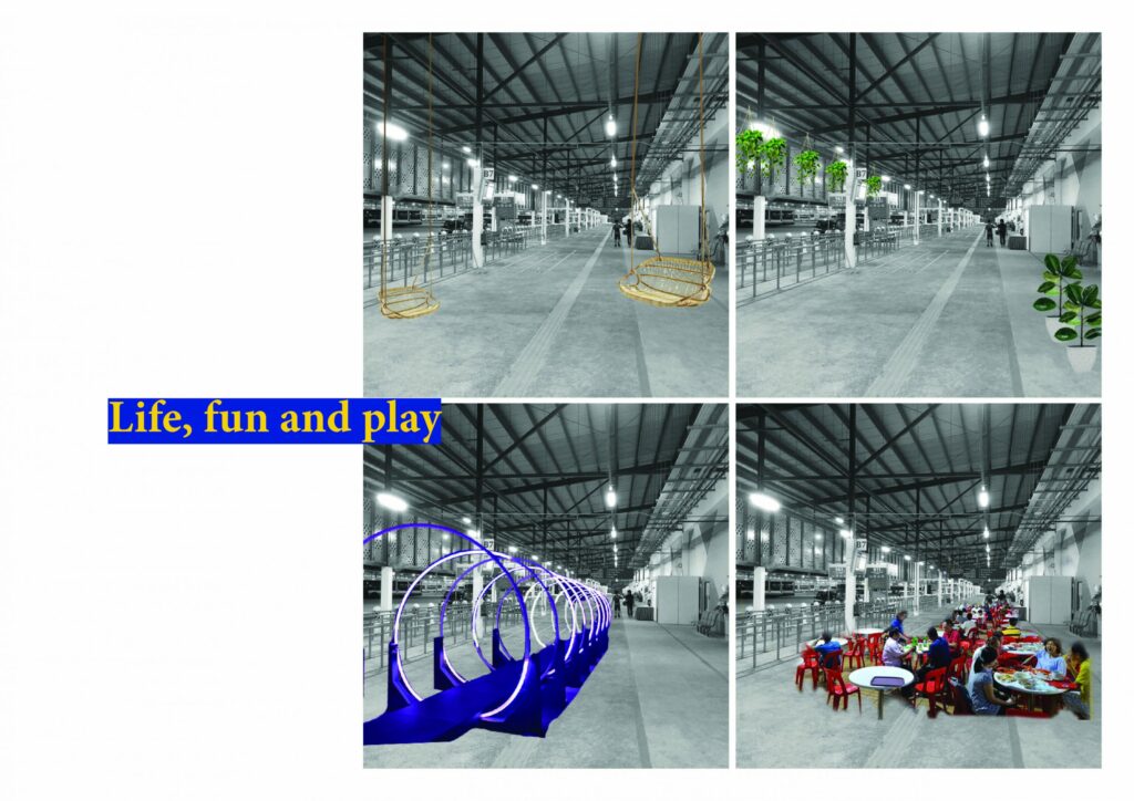
Introducing the Outdoor Experience

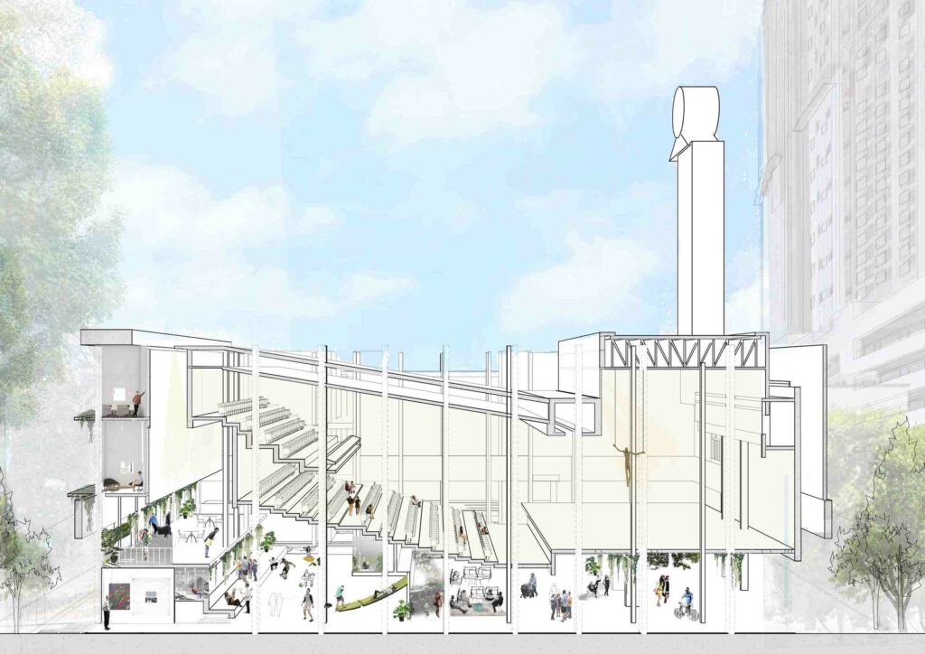
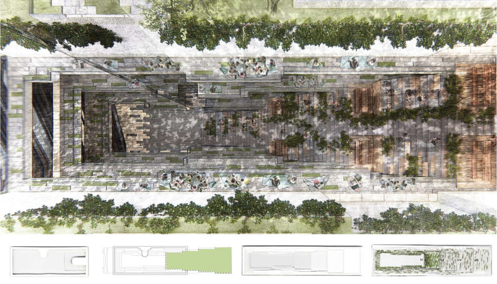
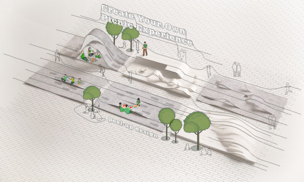
There used to be a “Gulong Gulong park” that was famous as a gathering spot to the community back in the 1980s, however, it was taken away for the development of Orchard road. This project aims to design spaces to evoke the outdoor experience of rolling in the park and improve the quality of community life through the play of leveling and staggered platform that is ideal for a wide range of events from performances to community gathering.

Redefining Spaces

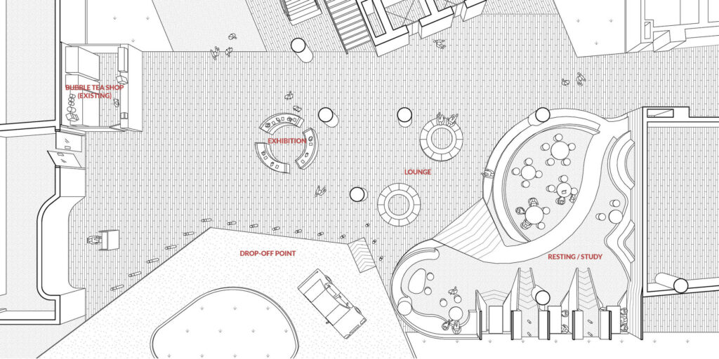
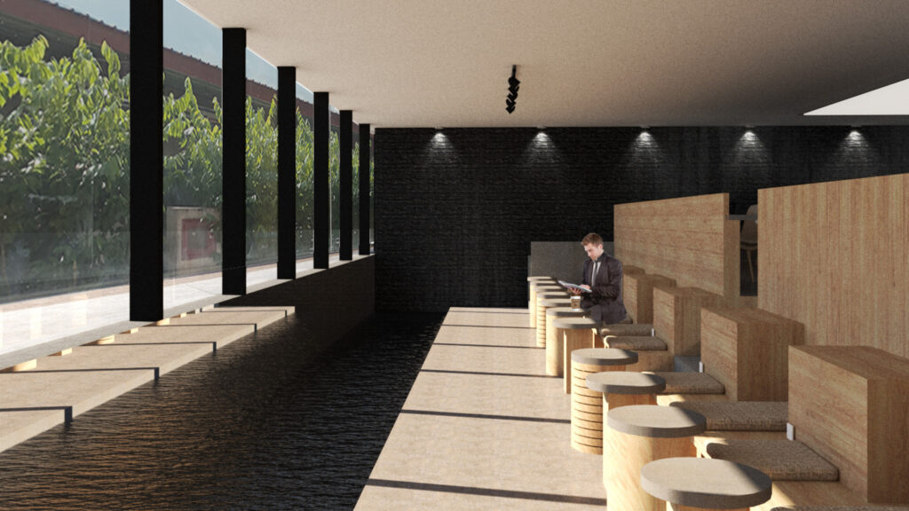
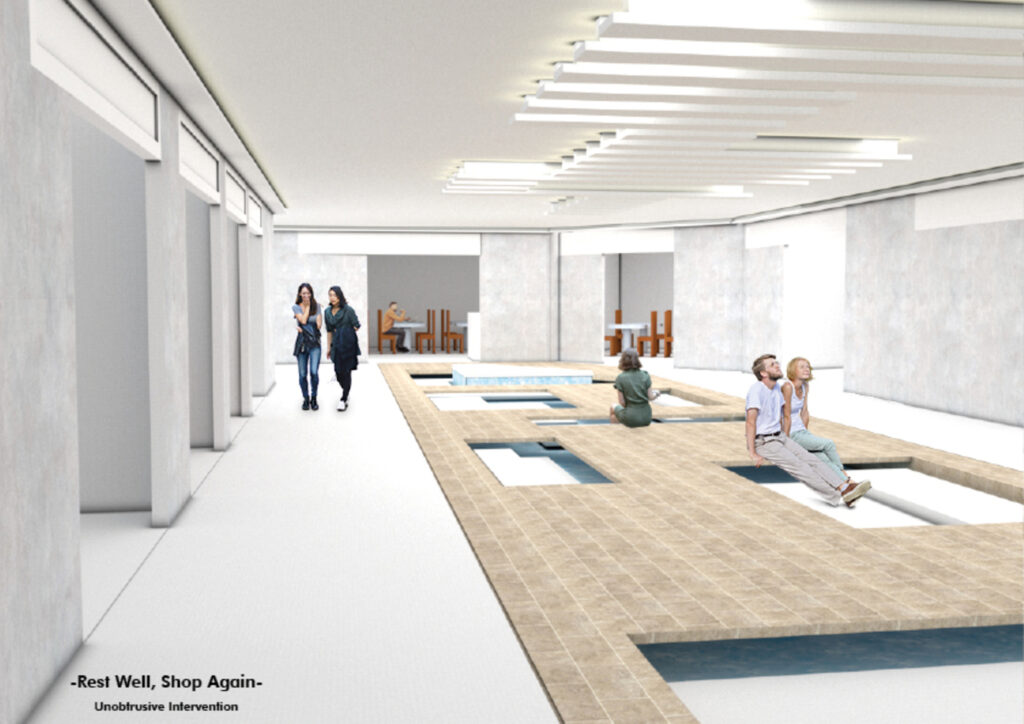
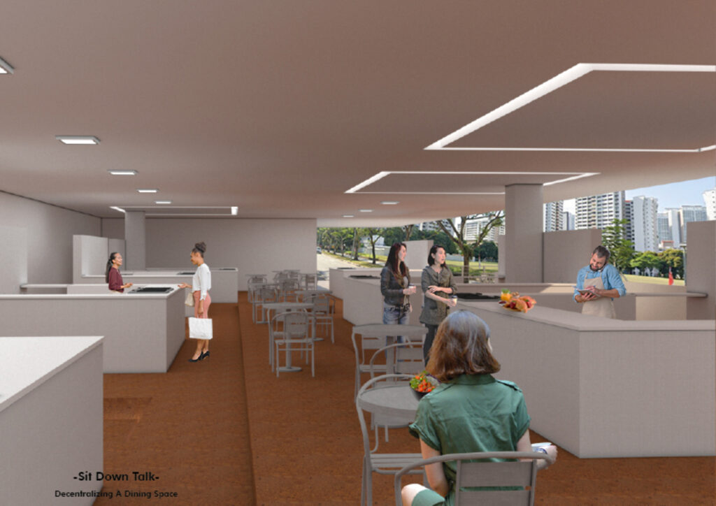
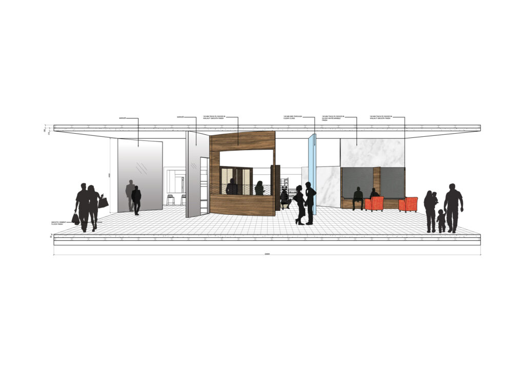
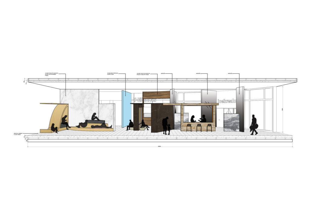
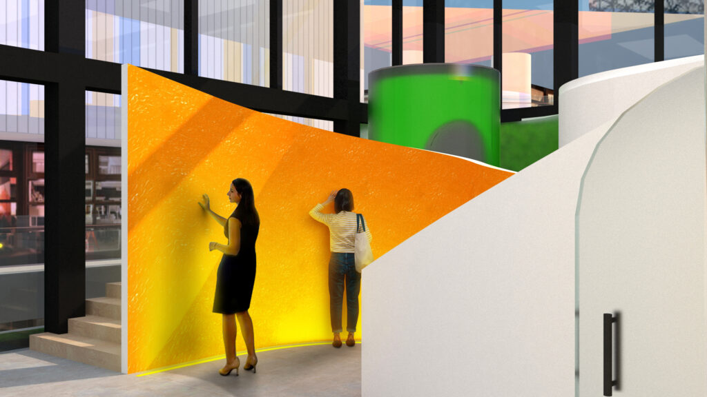
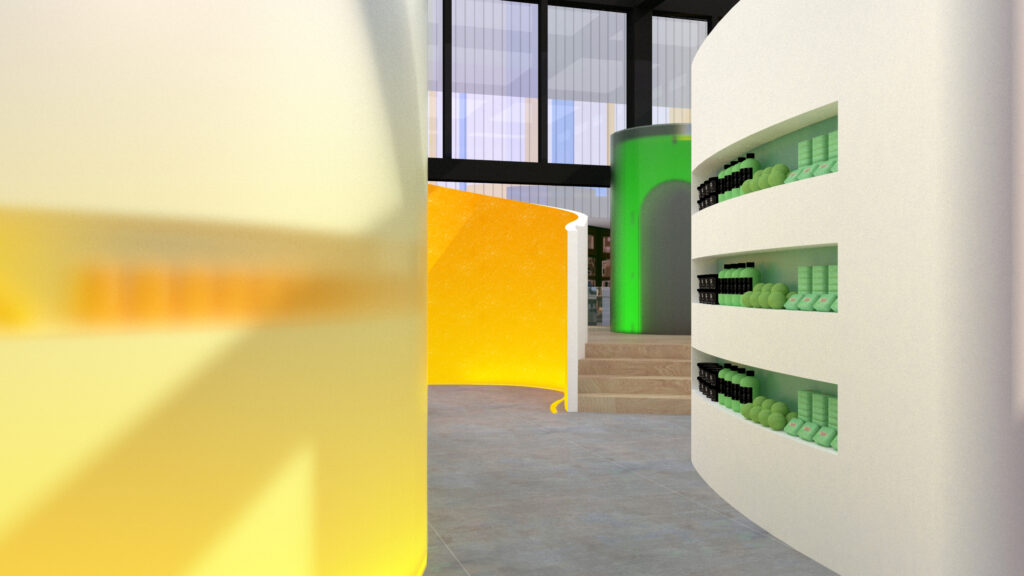
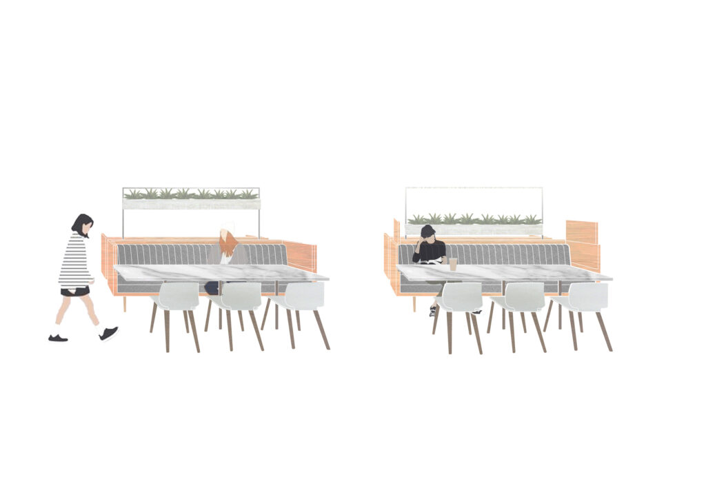
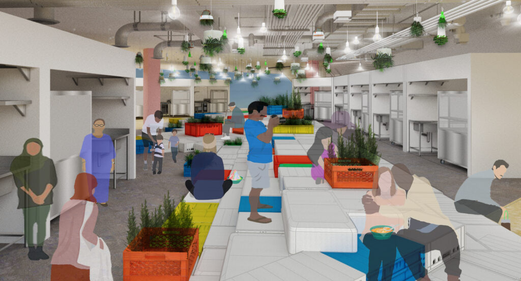
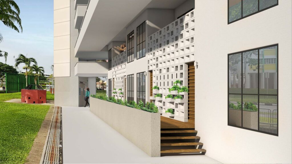
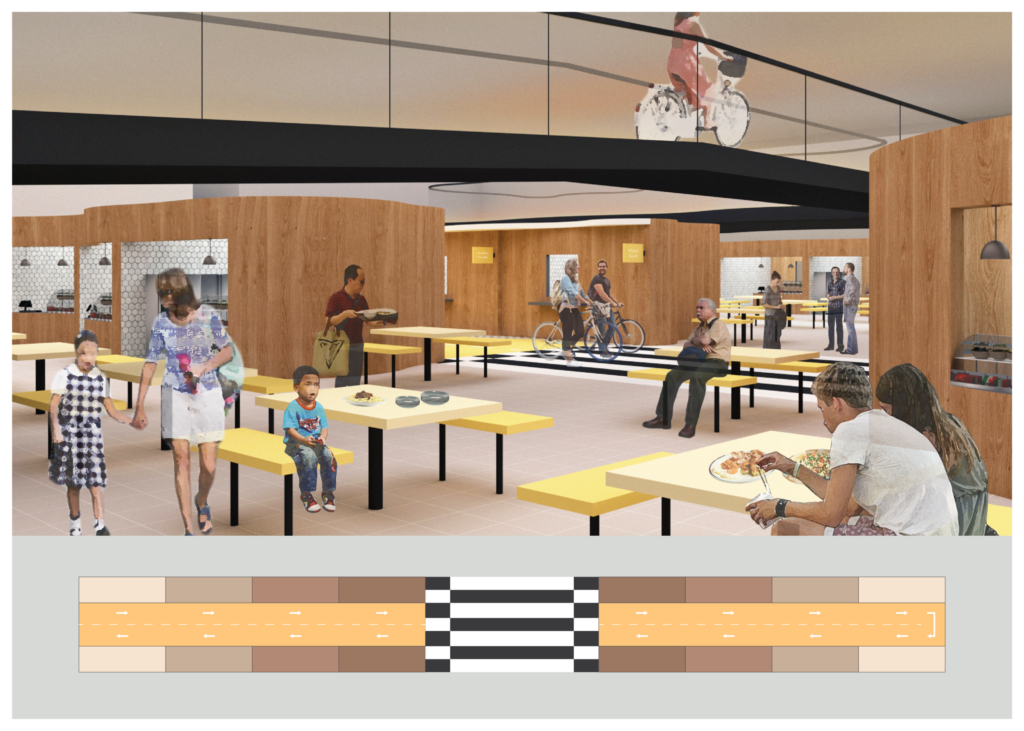
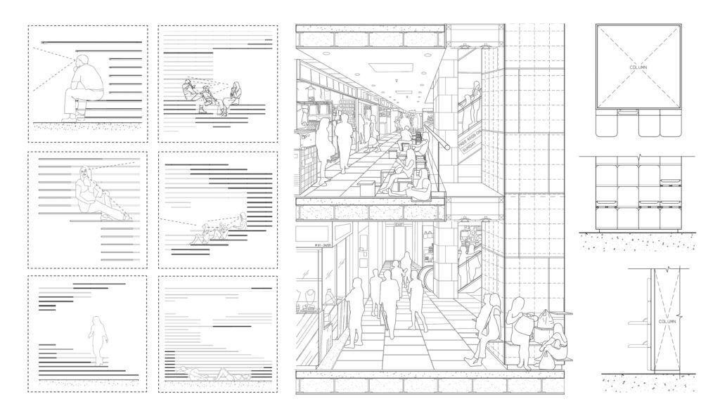
To counter the struggles of overcrowding issue, retractable seating that resembles the picnic experience is introduced to periphery spaces around the shopping mall to aid crowd control and improve the quality of life to the community.
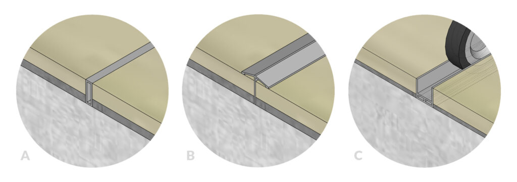
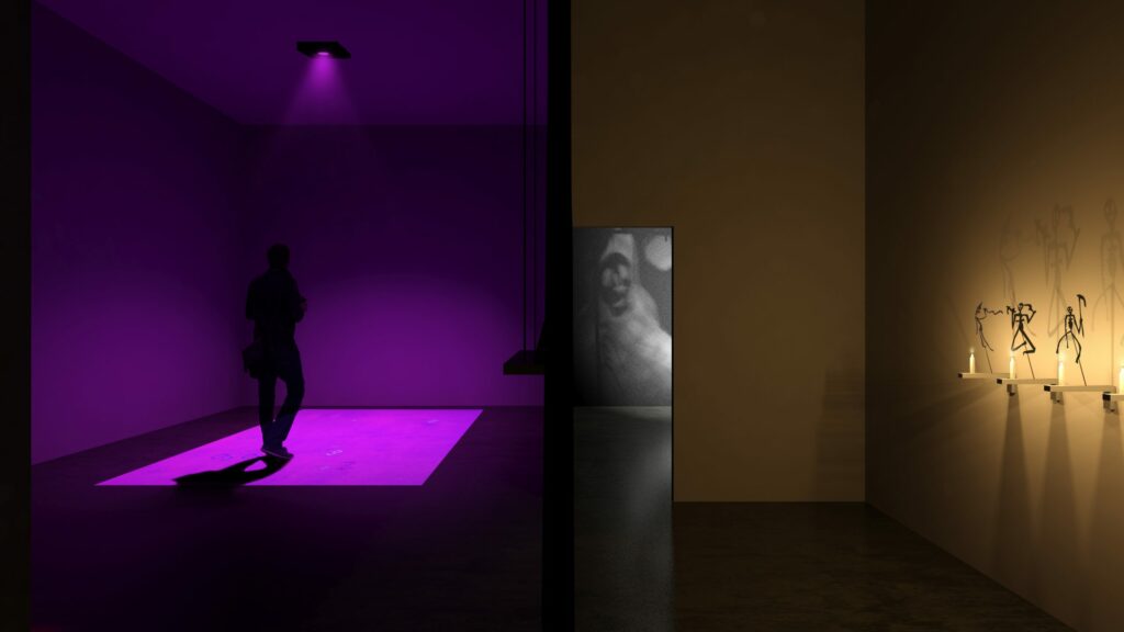
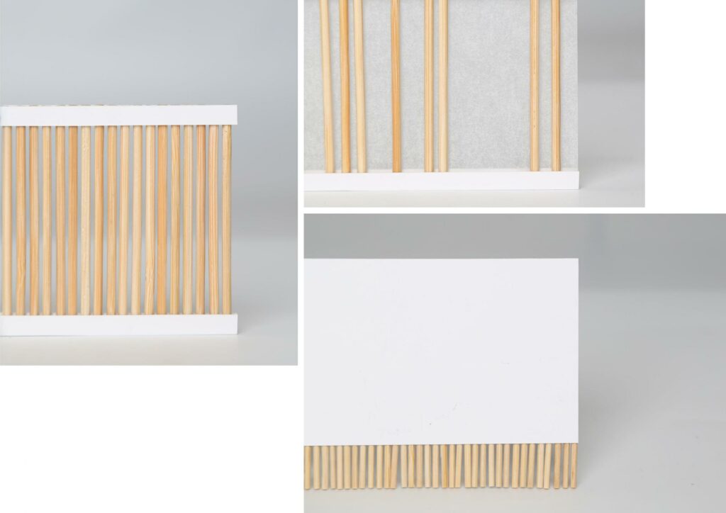
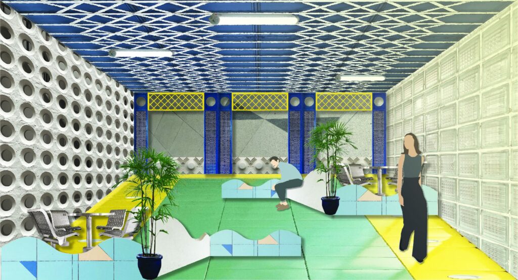
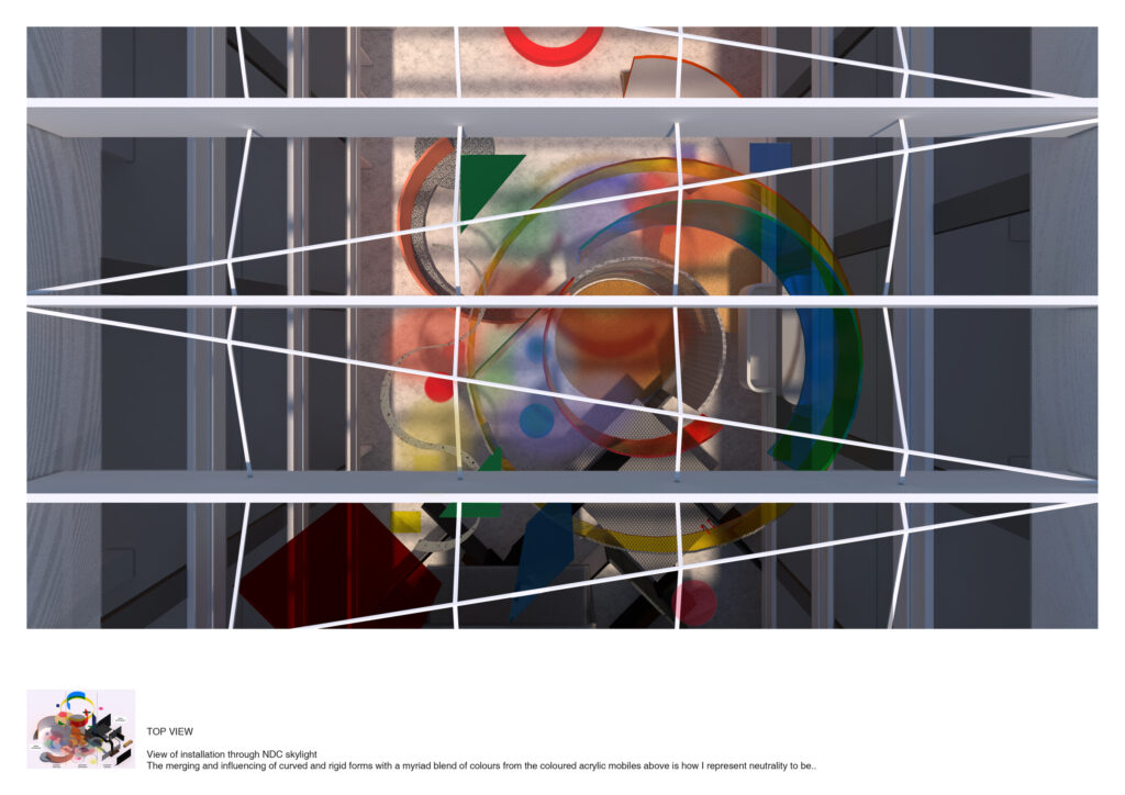
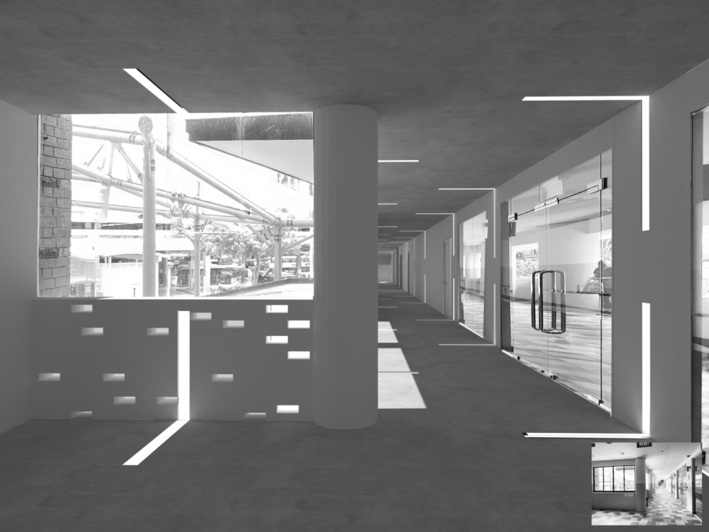
Light and Shadow

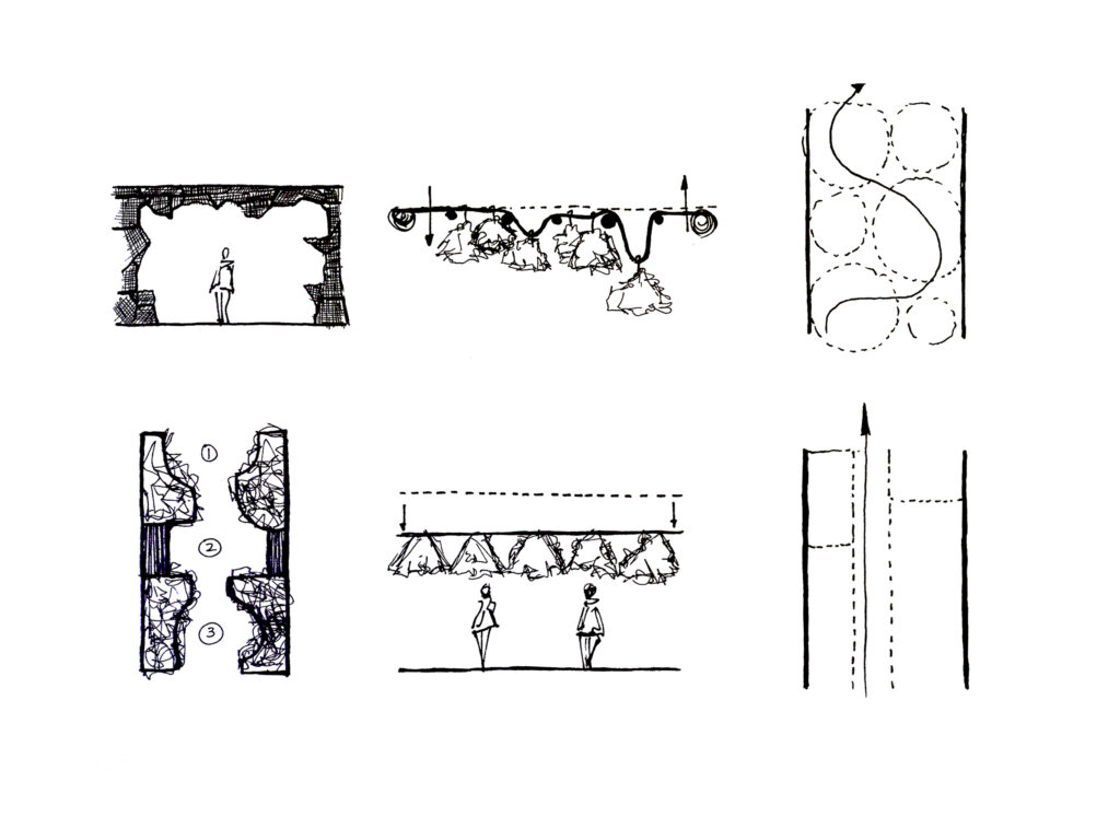
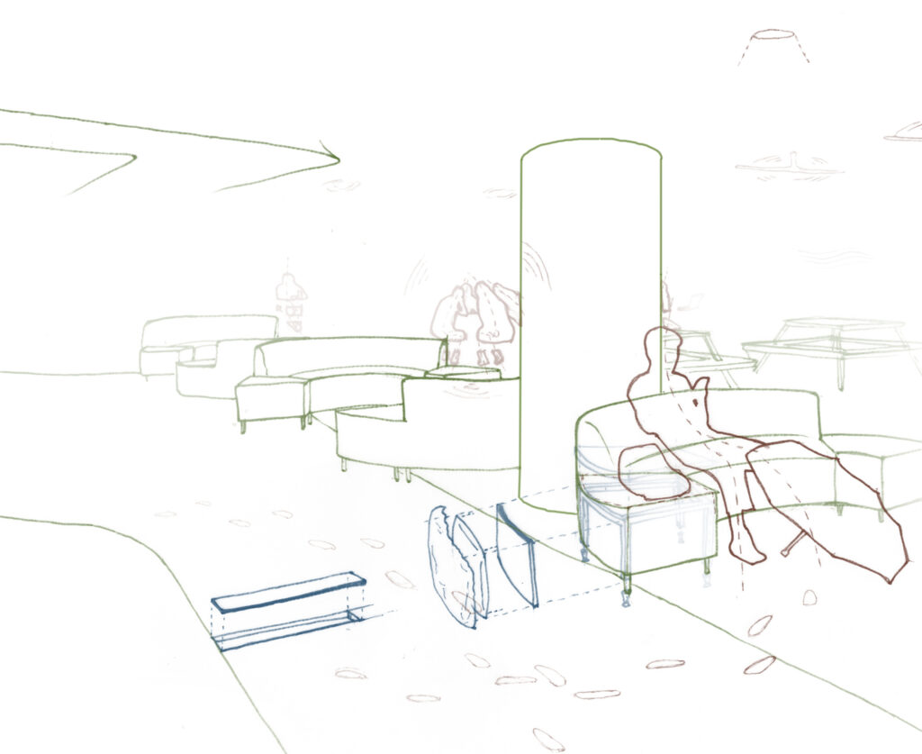
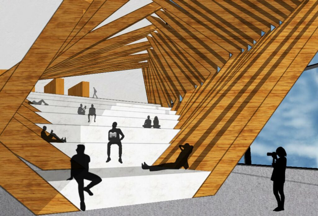
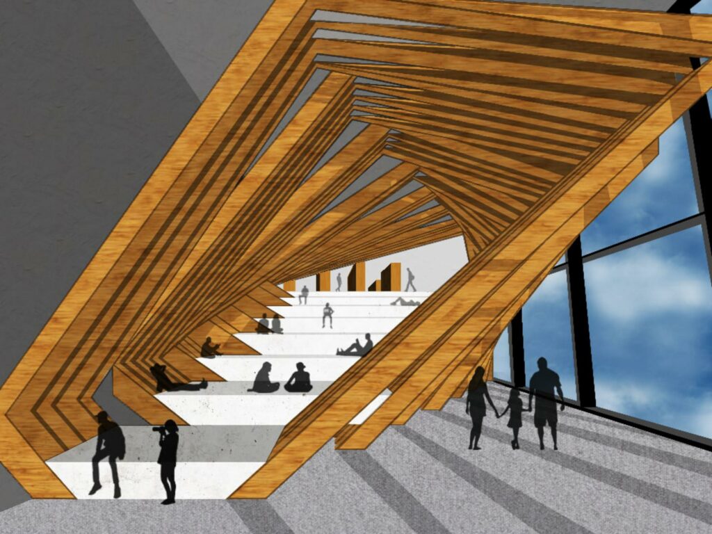
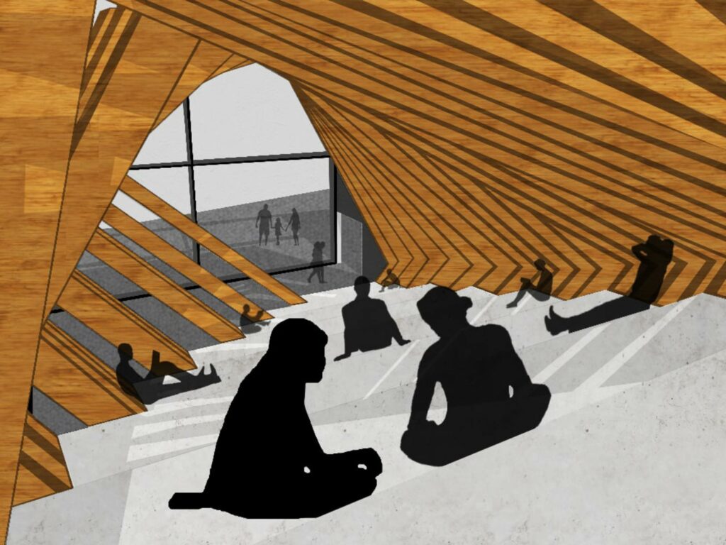
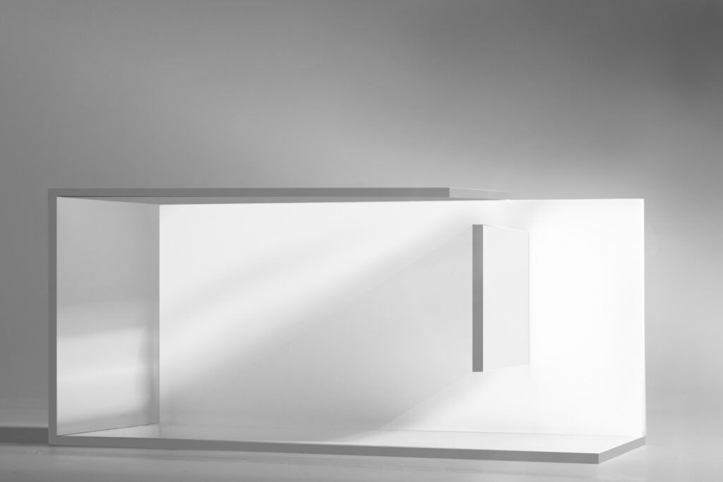
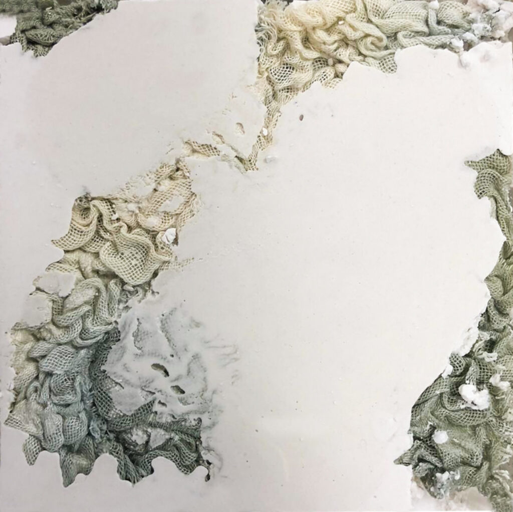
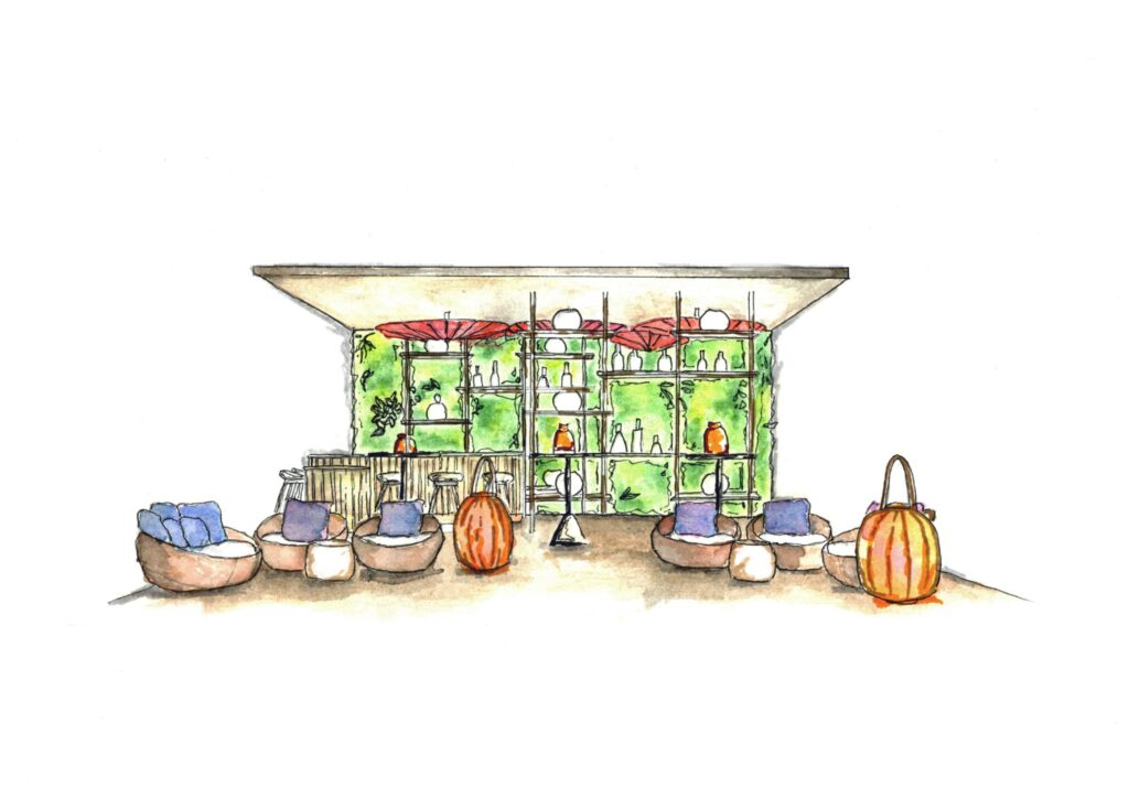
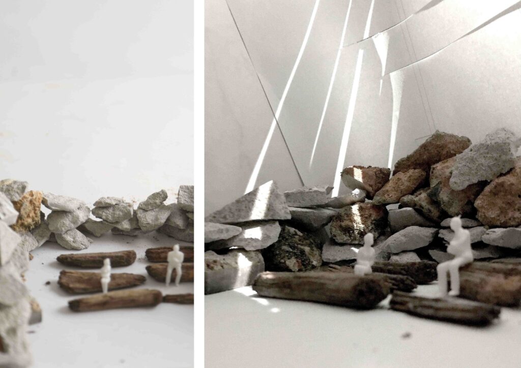
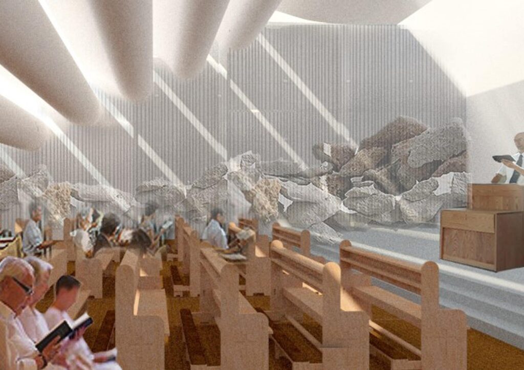
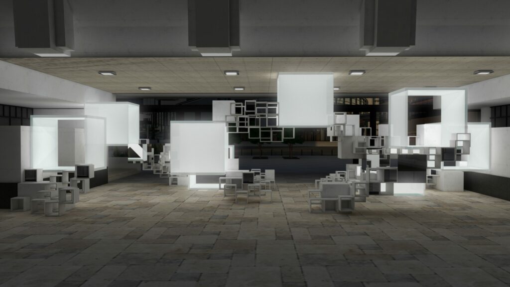
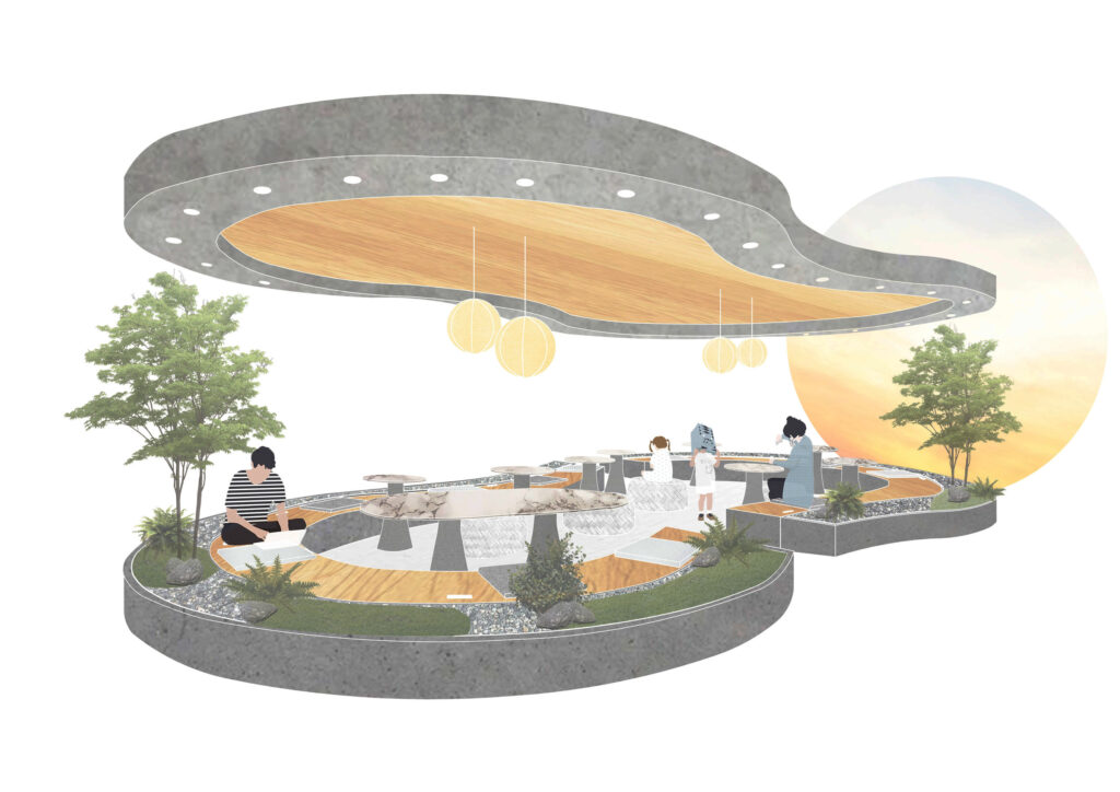
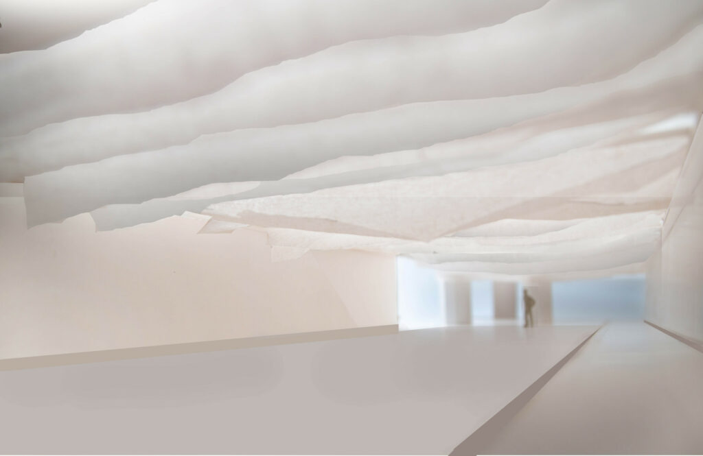
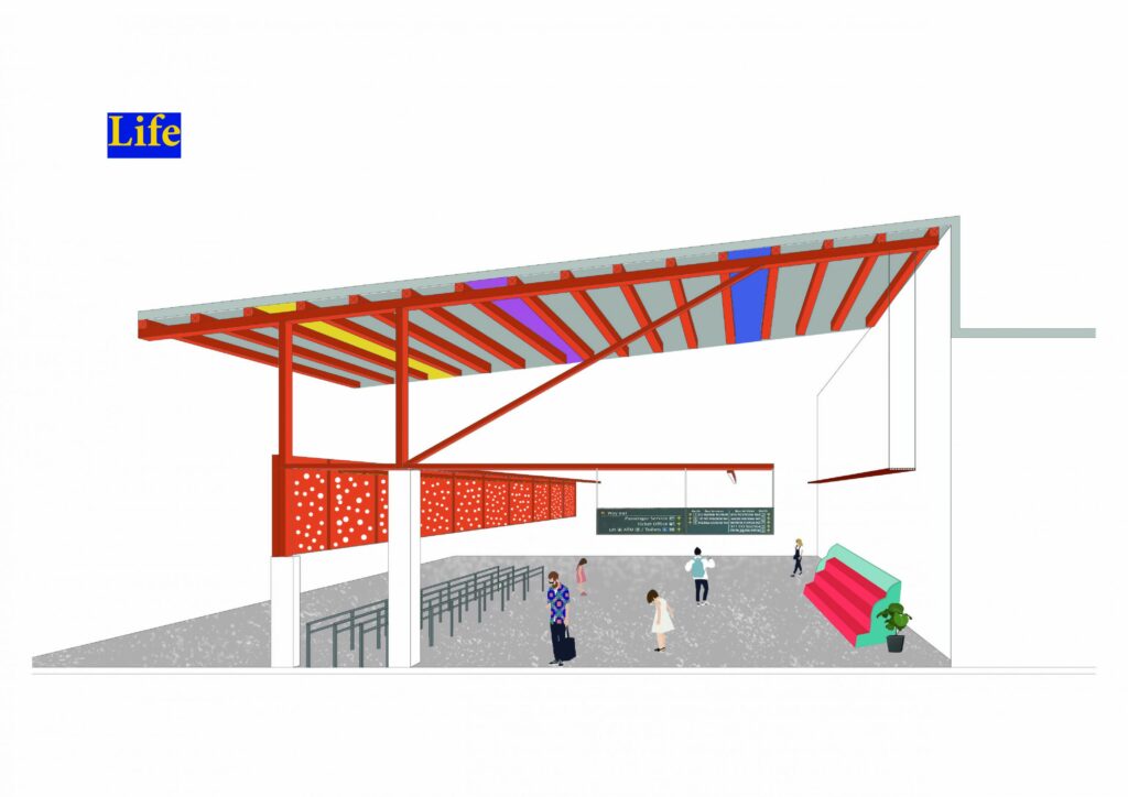
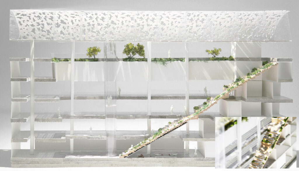
The overall ambience of the park experience is enhanced by the shadow cast of the perforated plates through the natural lighting. Creating a dappled light effect that mimics the layer of leaves in a tree canopy, visitors sit under the ceiling feature feeling calm and cozy.
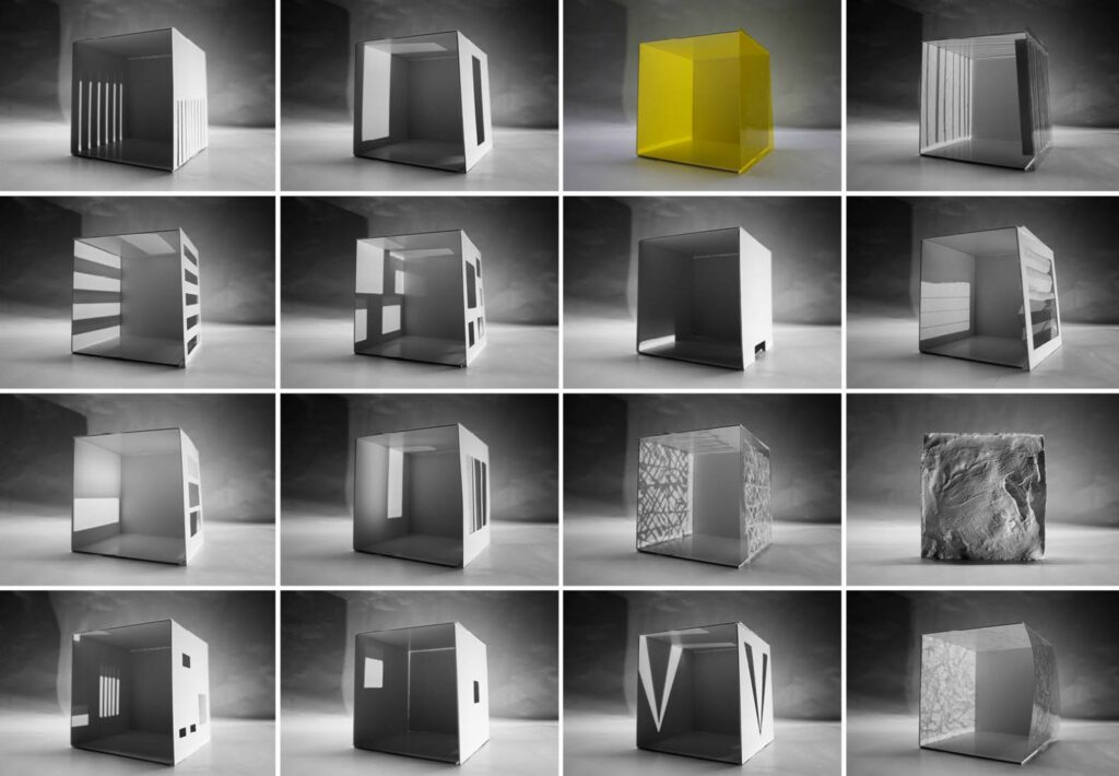
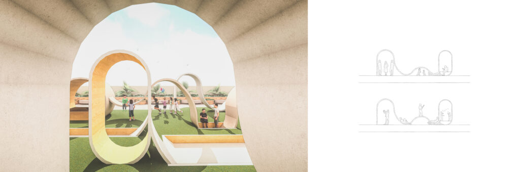
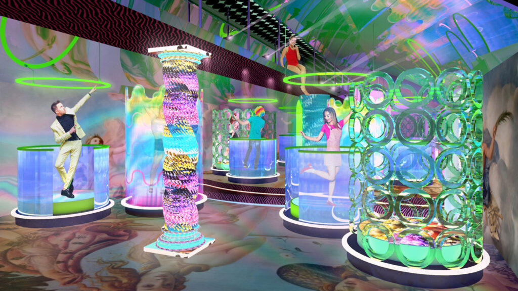
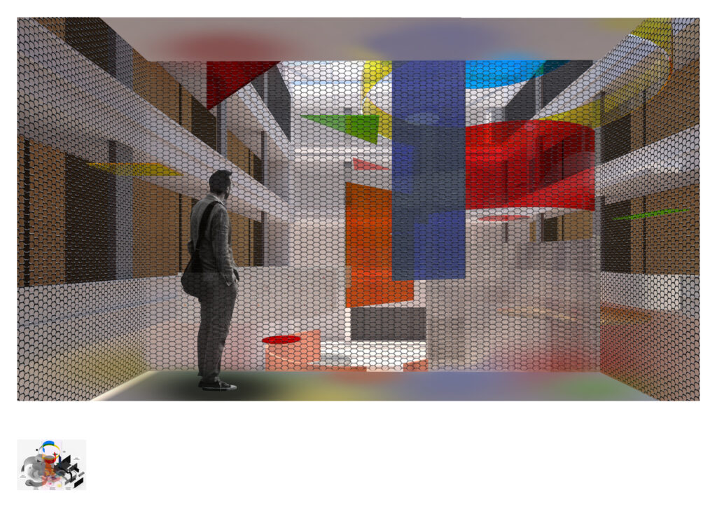
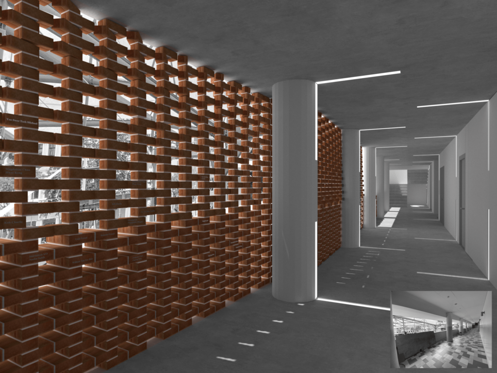
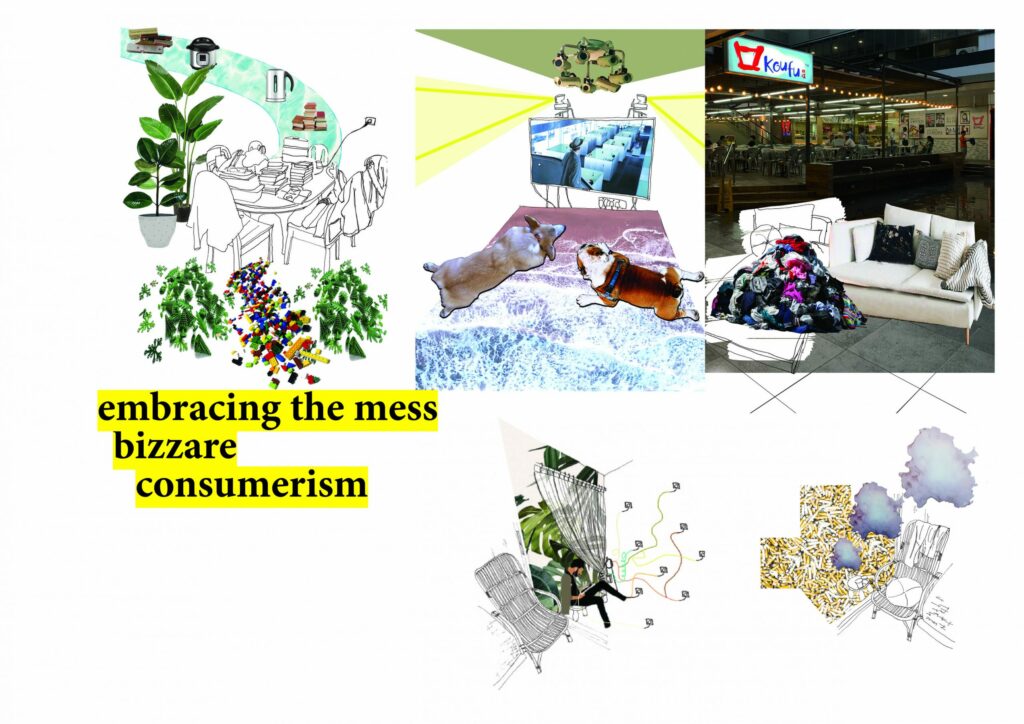
Interactive Design

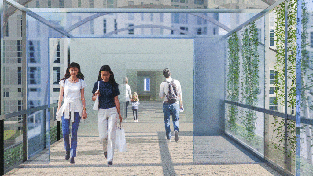
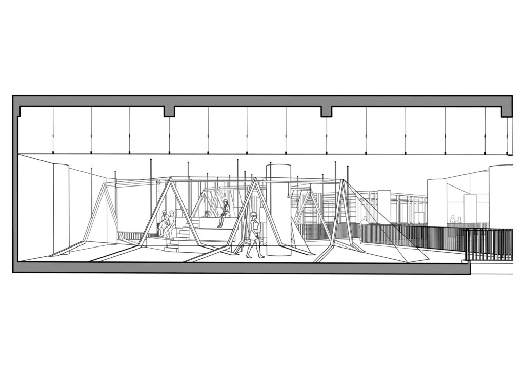
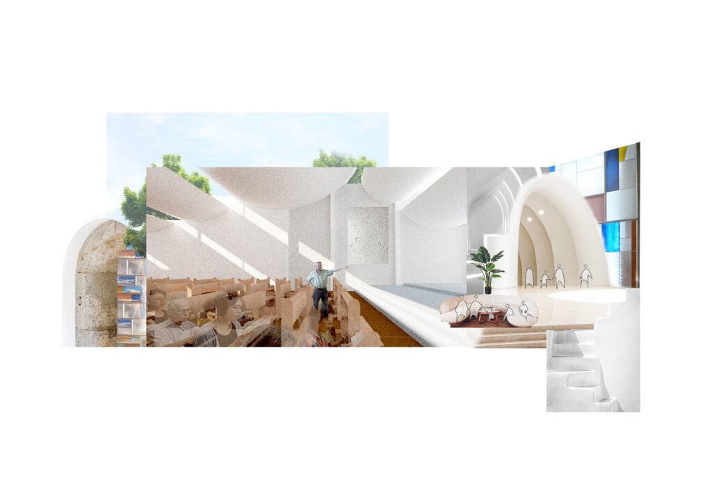
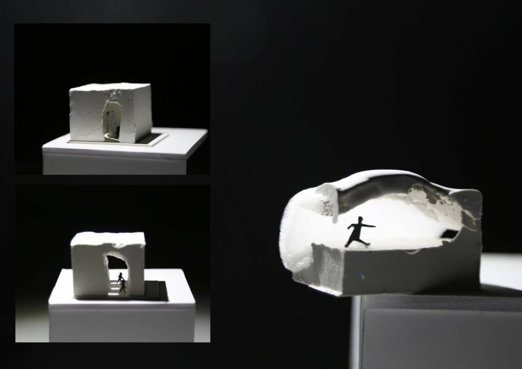
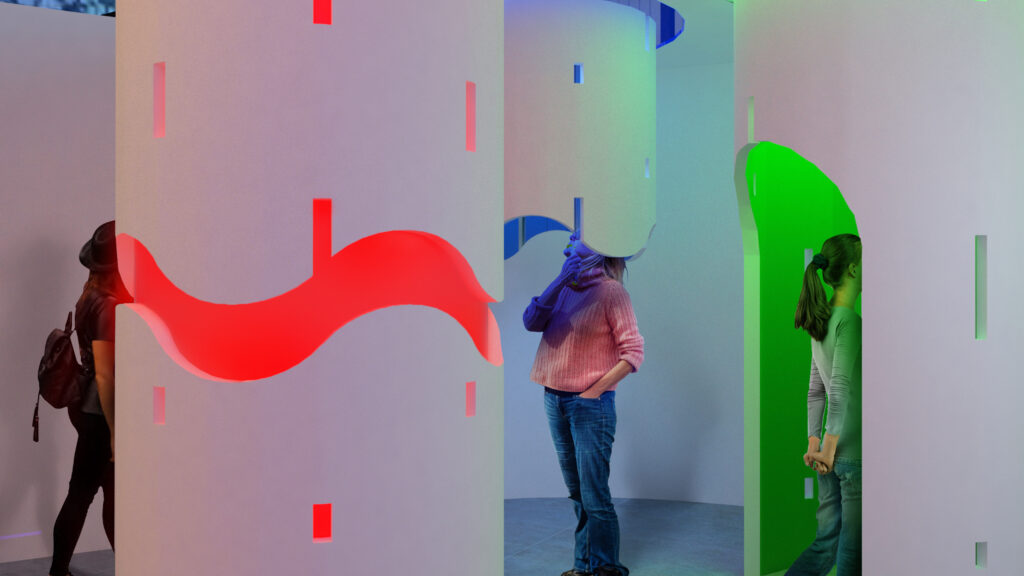
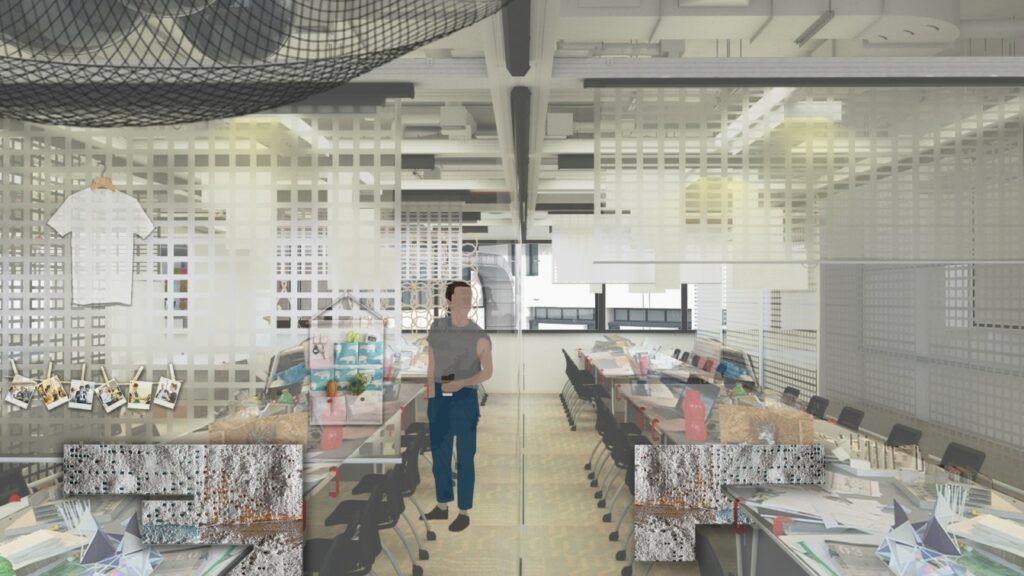
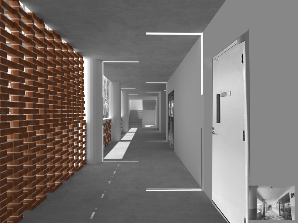
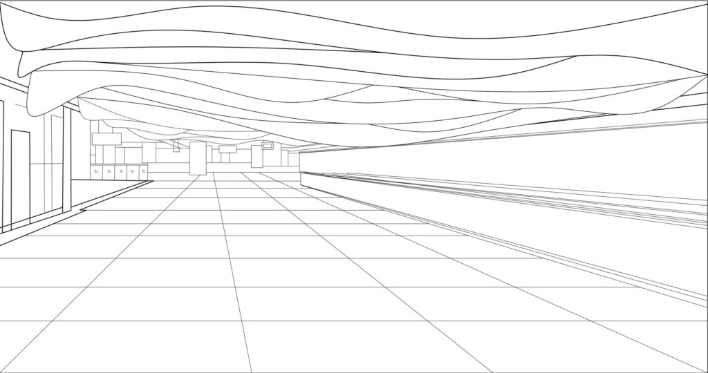
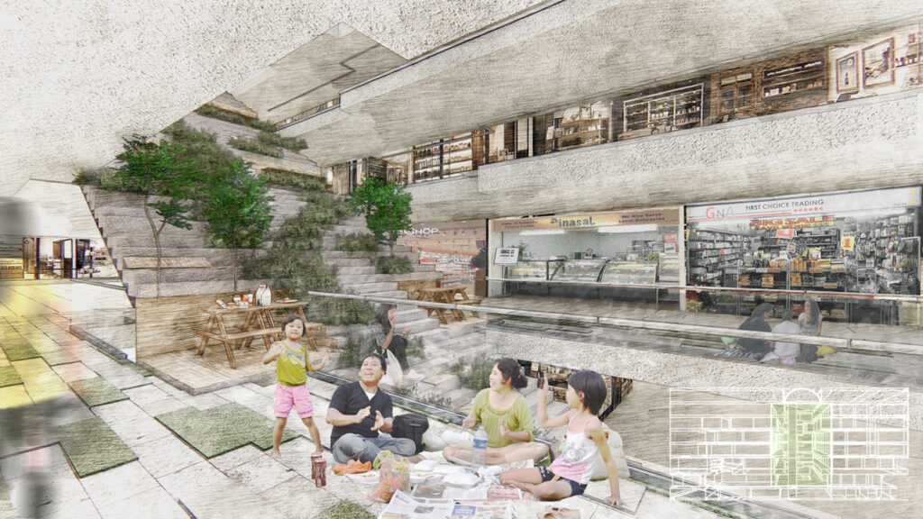
With the strong influence of The High Line project, this project seeks to transform a neglected corner into an inviting picnic garden space for people to enjoy. The project seeks to explore an approach to design in which walls, floors and ceilings function as permeable membranes to allow shoppers to dwell in the space,

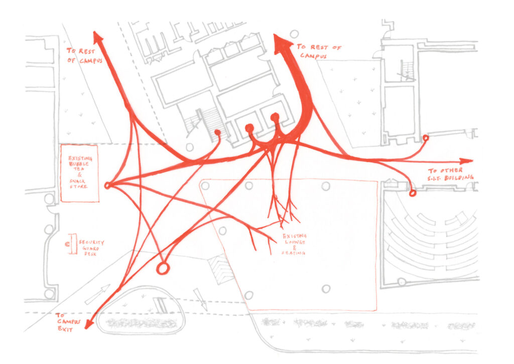
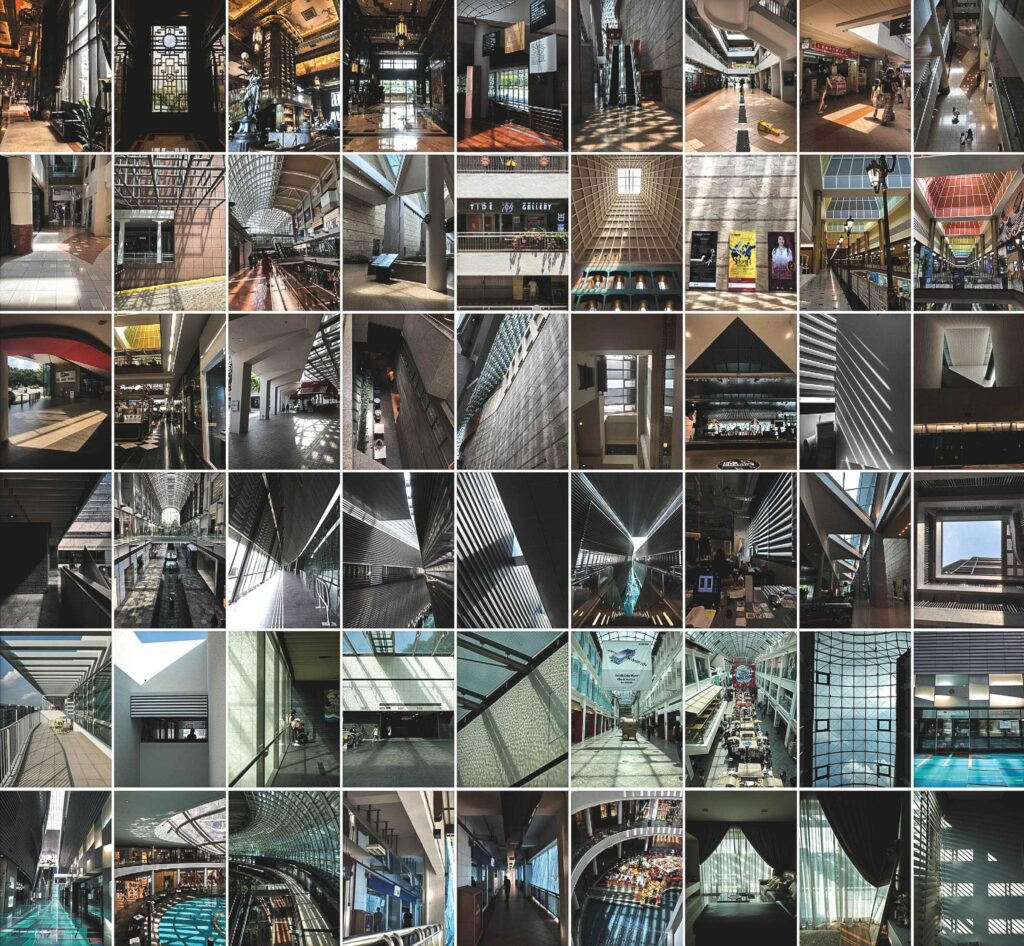
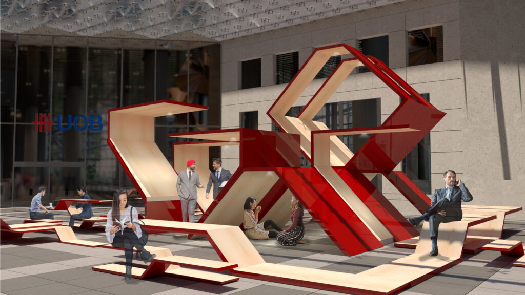
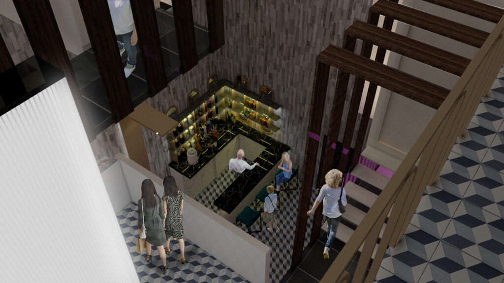
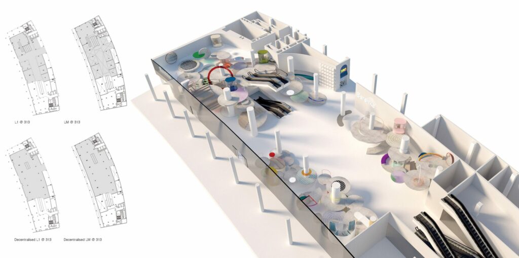
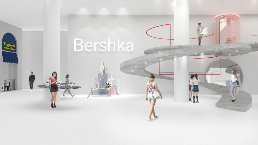
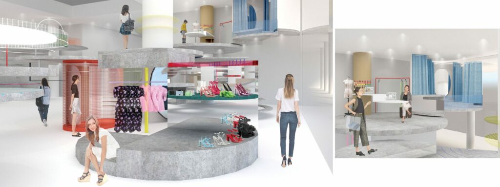
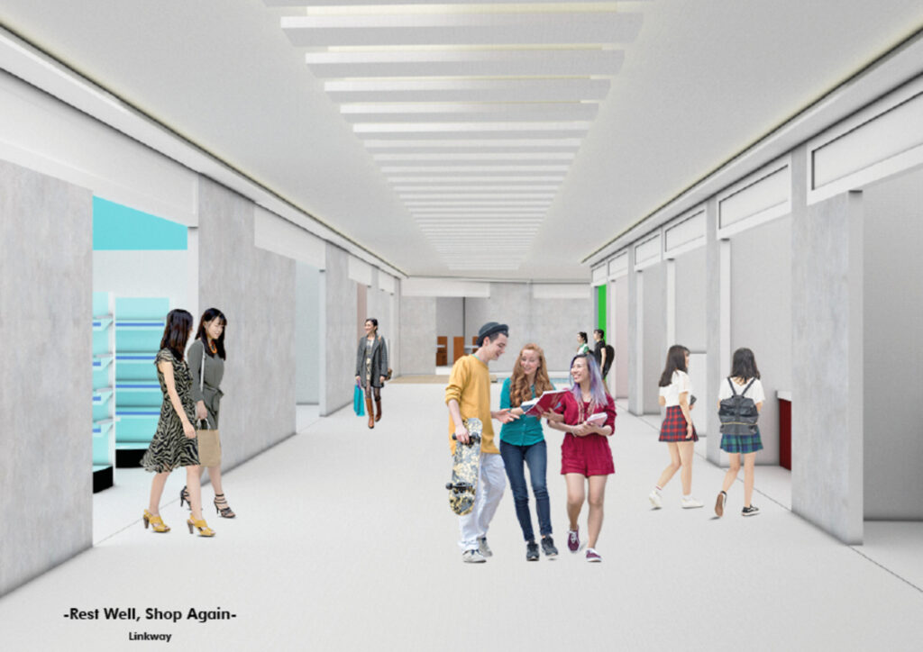
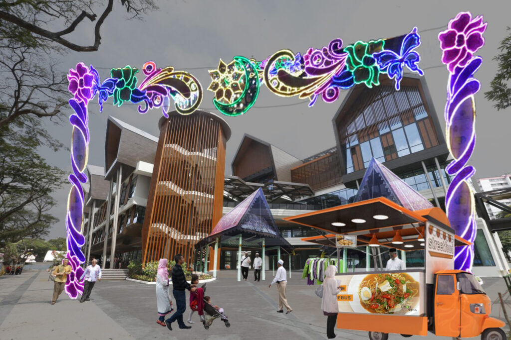
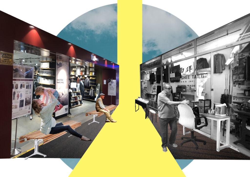
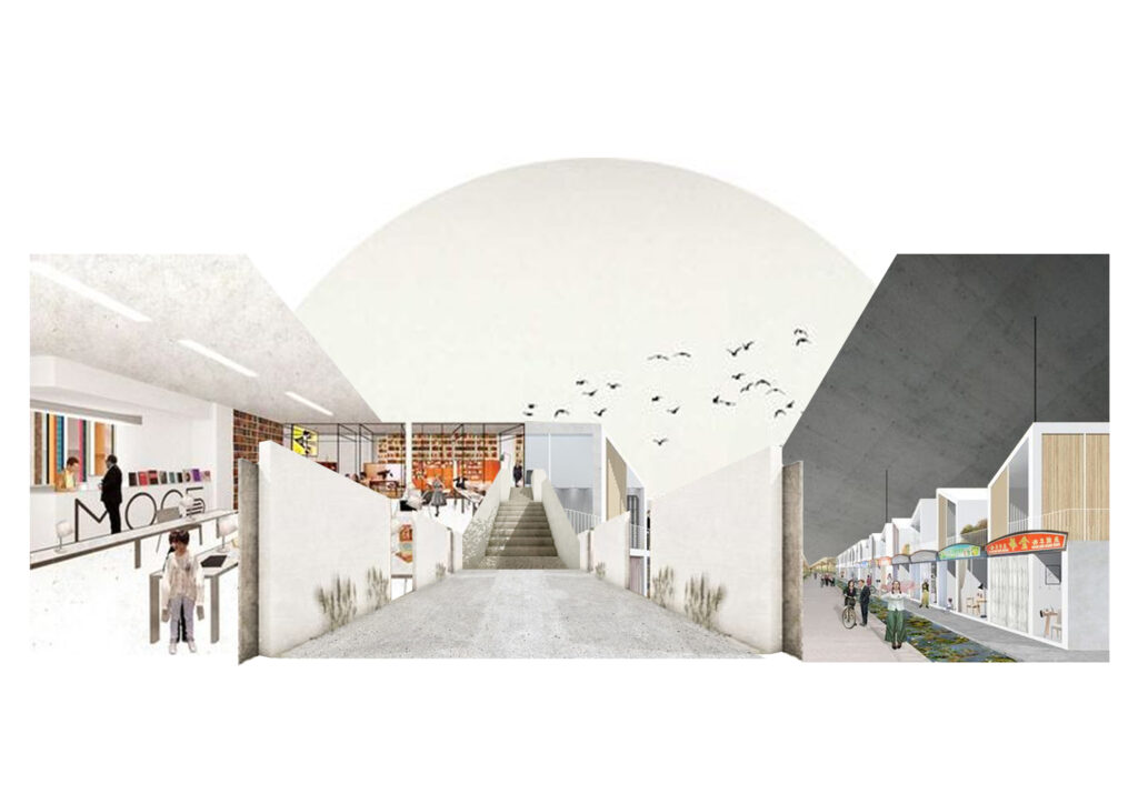
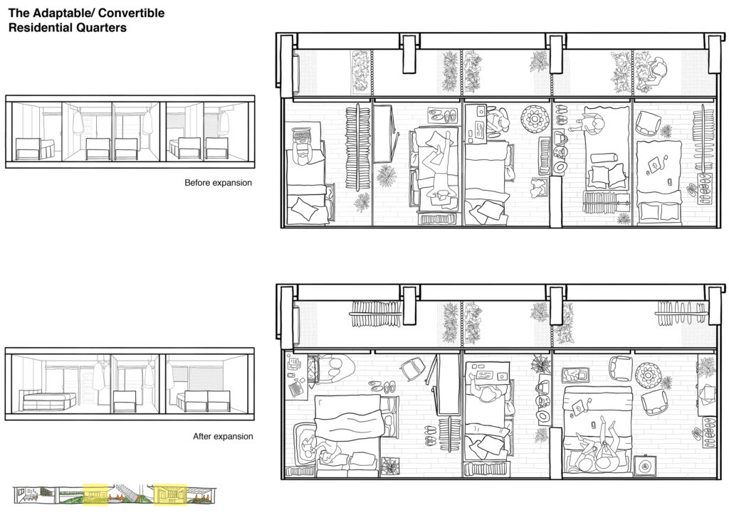
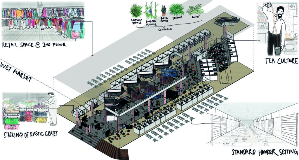
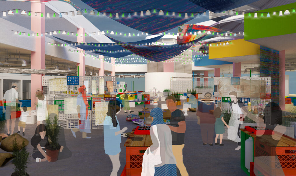
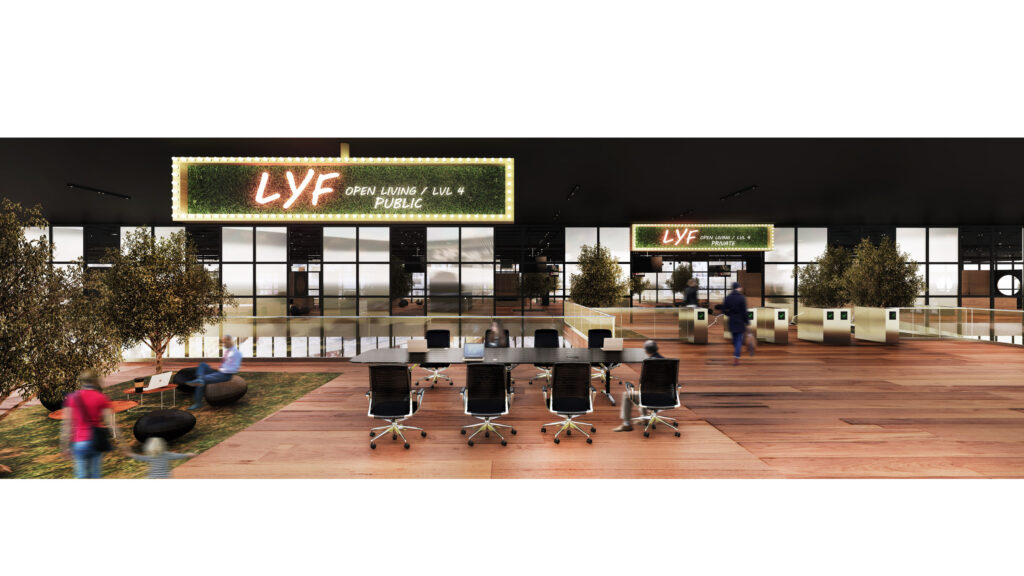
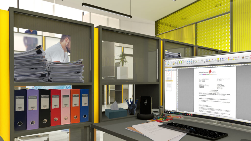
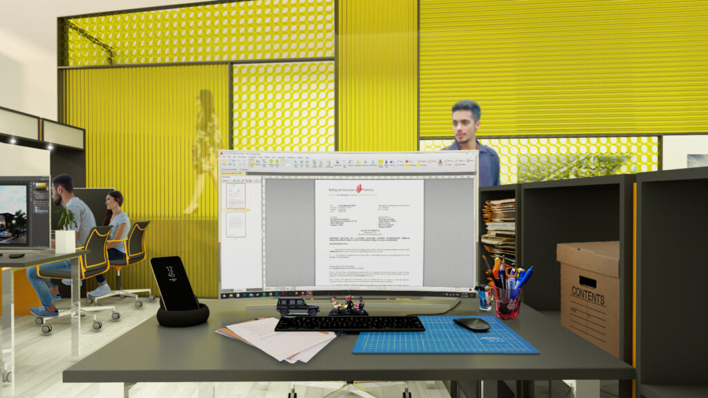
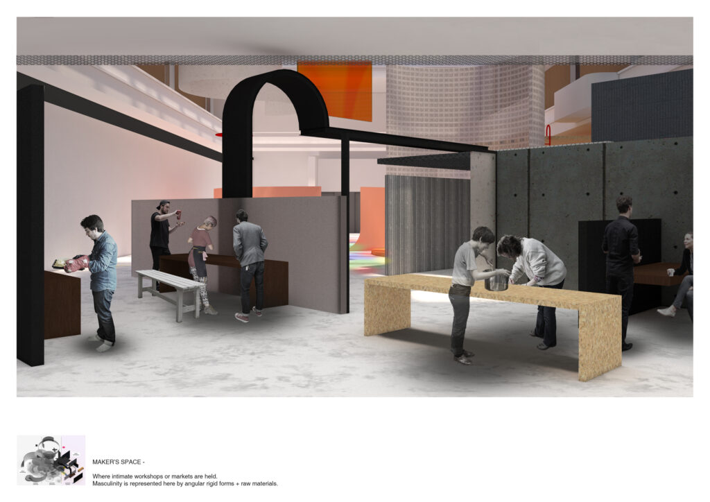
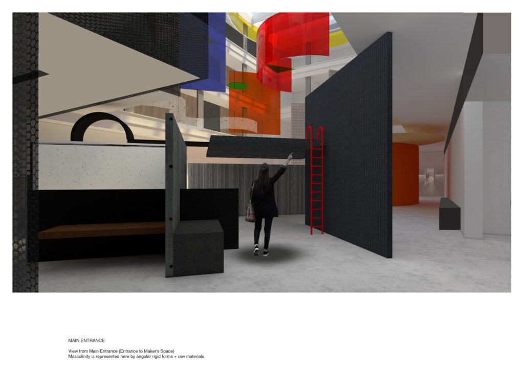
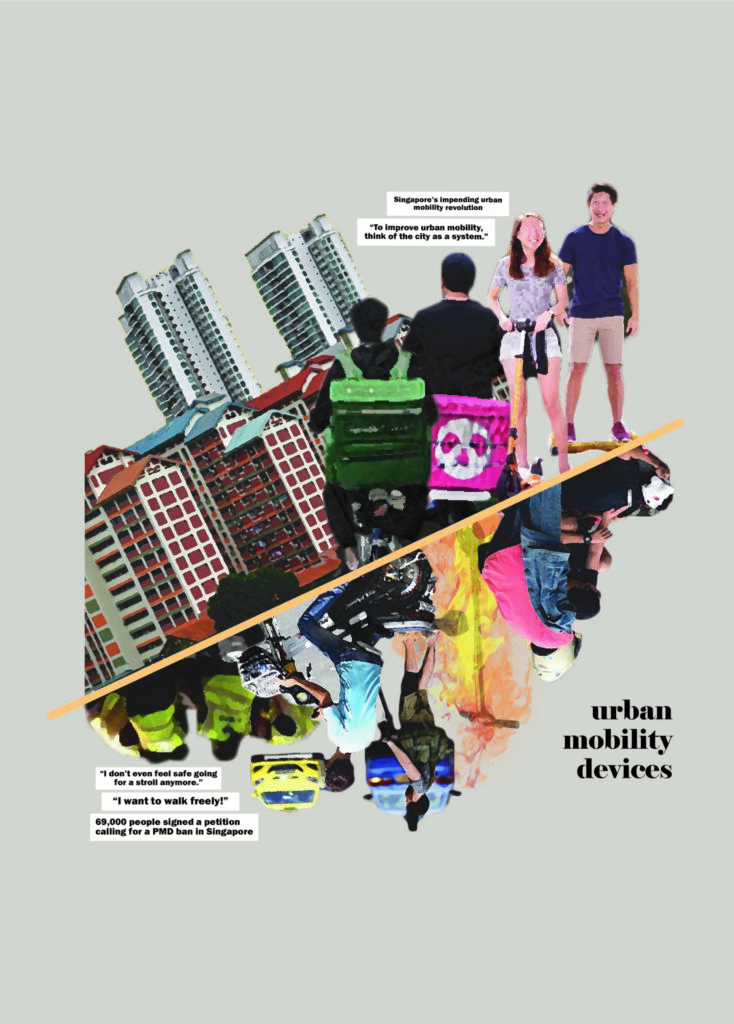
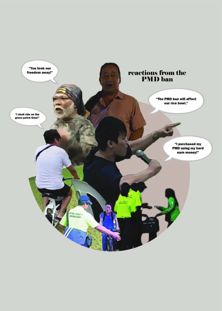
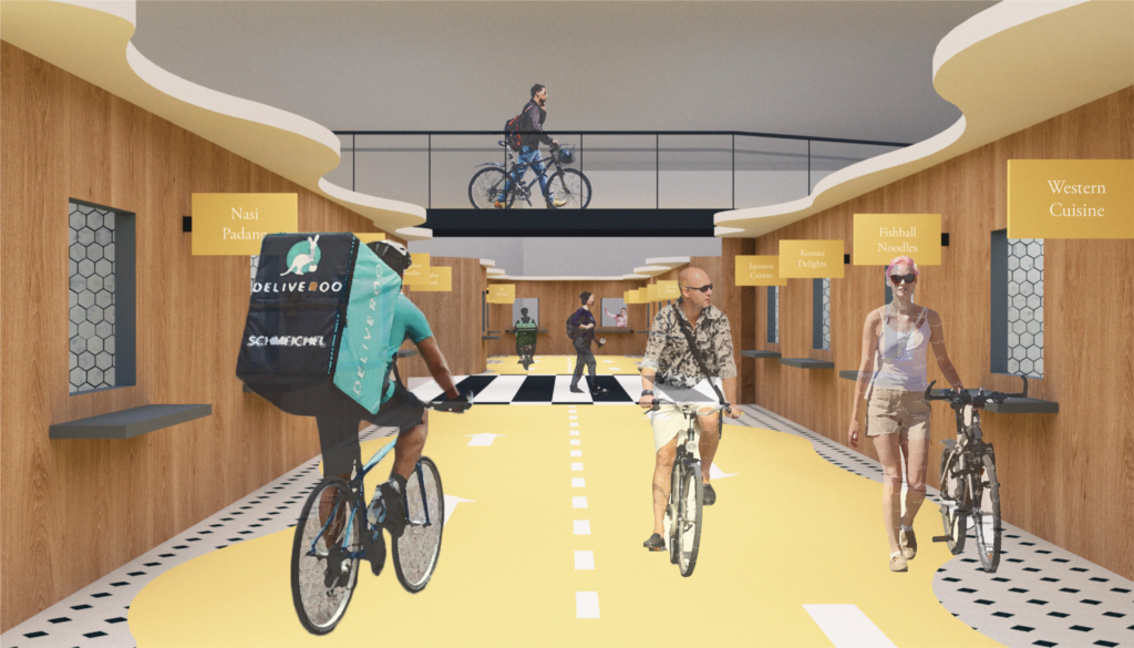
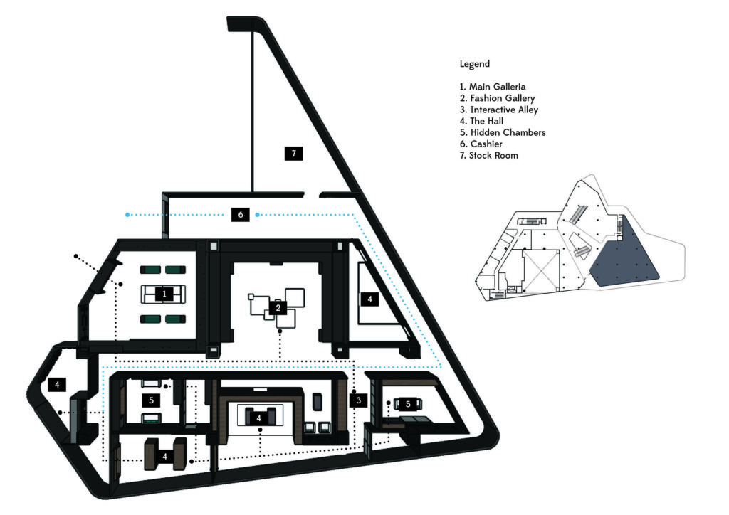
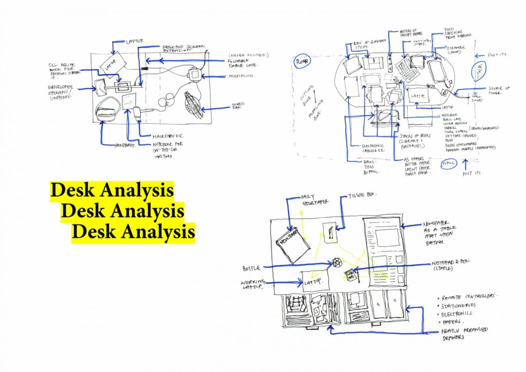
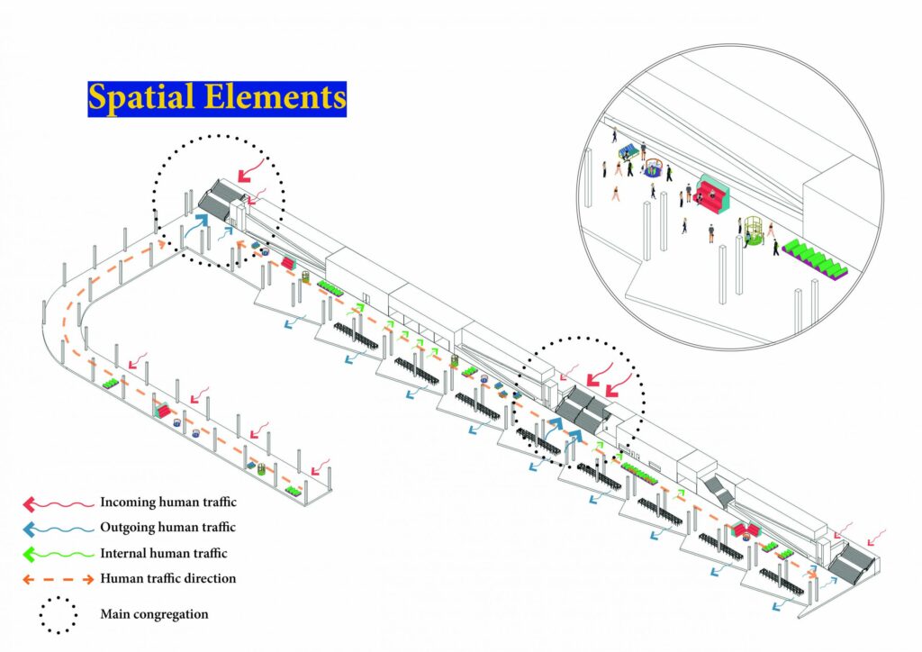
Addressing the overcrowding Issue in Lucky Plaza

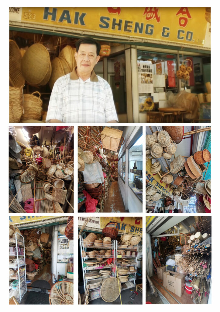
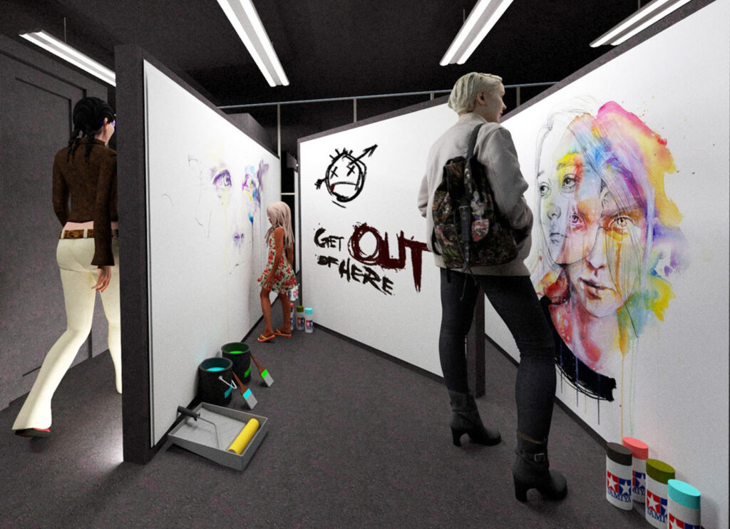
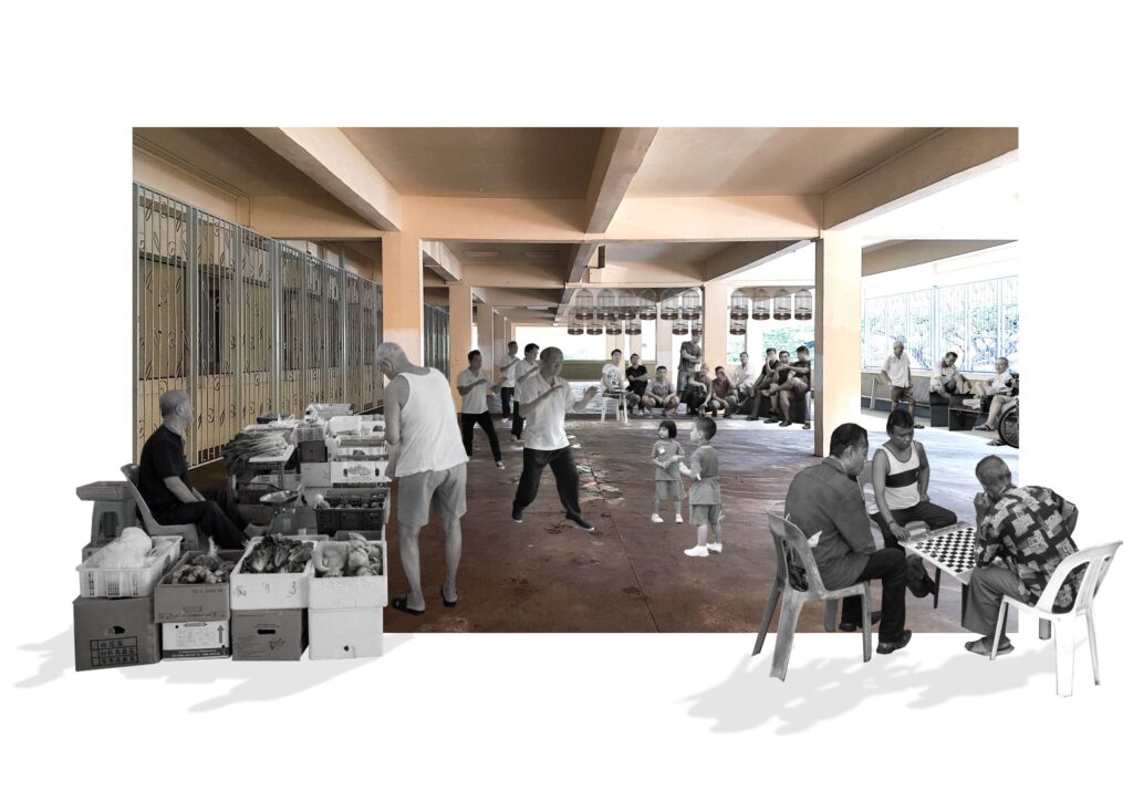
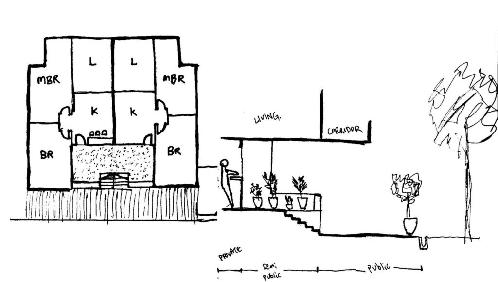
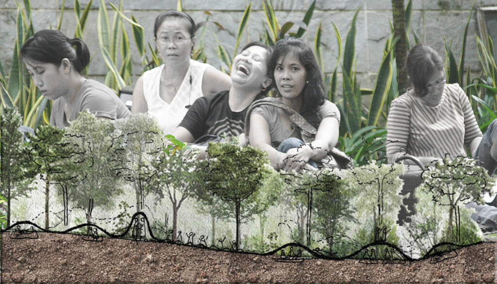
The drive of this project started from an empathetic approach towards the needs of foreign workers based here who seek a sense of community and understandably crave a connection to home. The space is relatively hectic weekly (Sunday), there was not much space to hang out with restrictions everywhere. People are struggling to look for a place to interact comfortably without getting chased away.
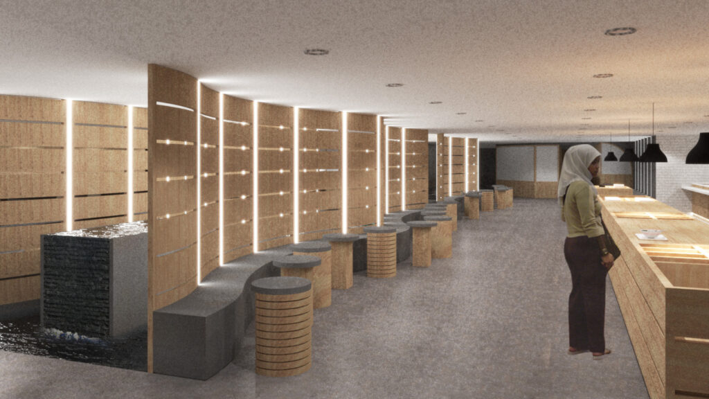
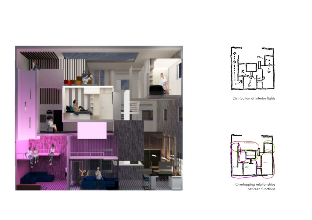
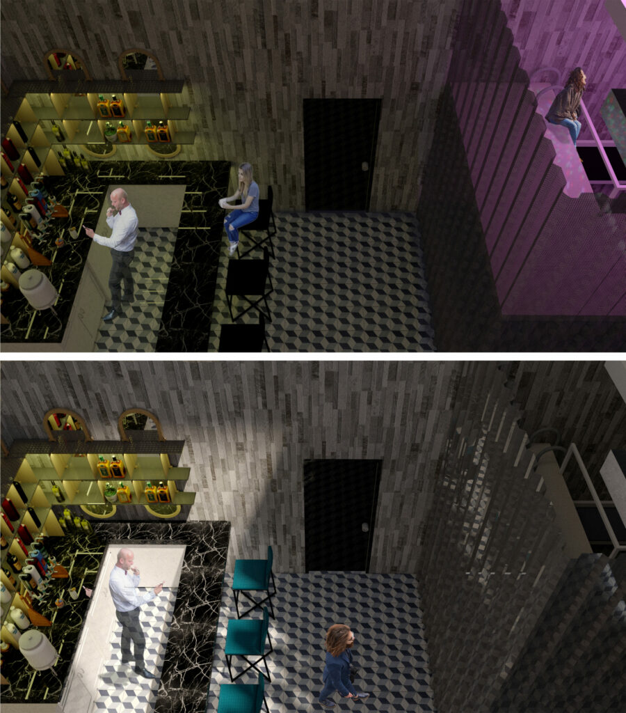
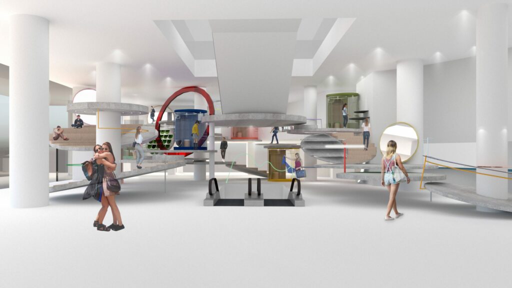
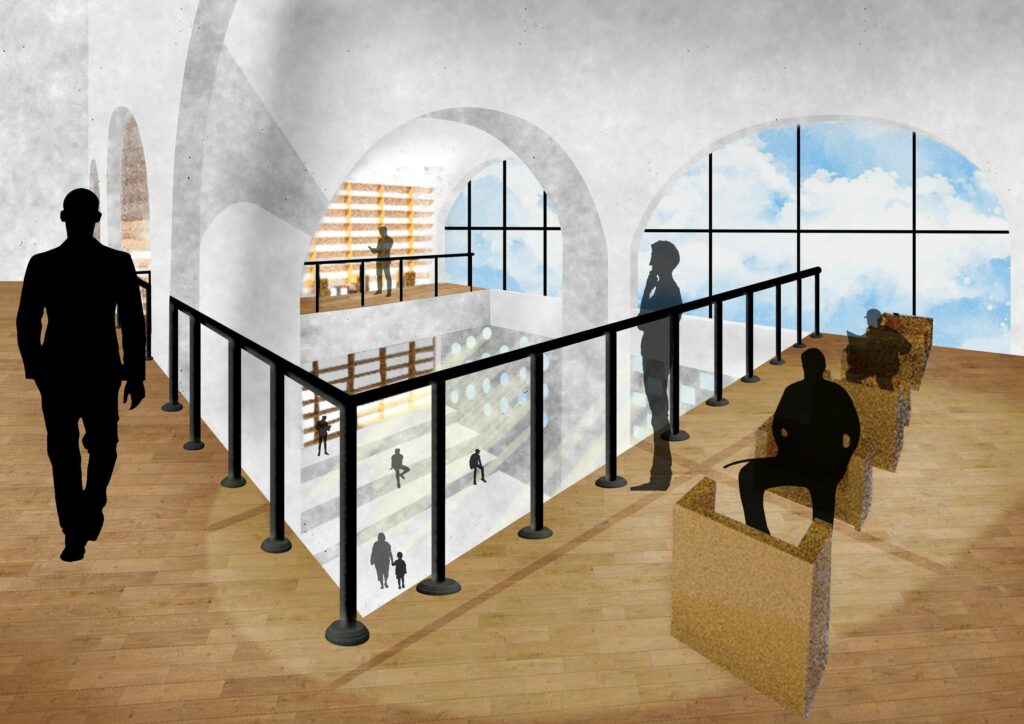
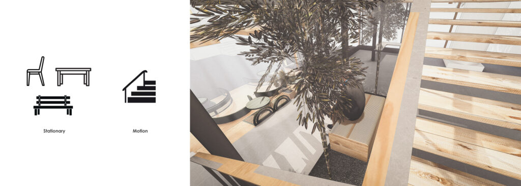
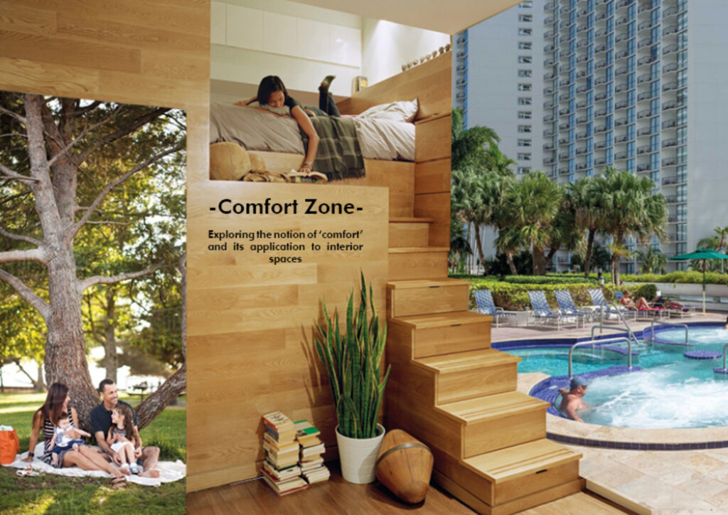
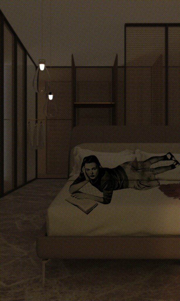
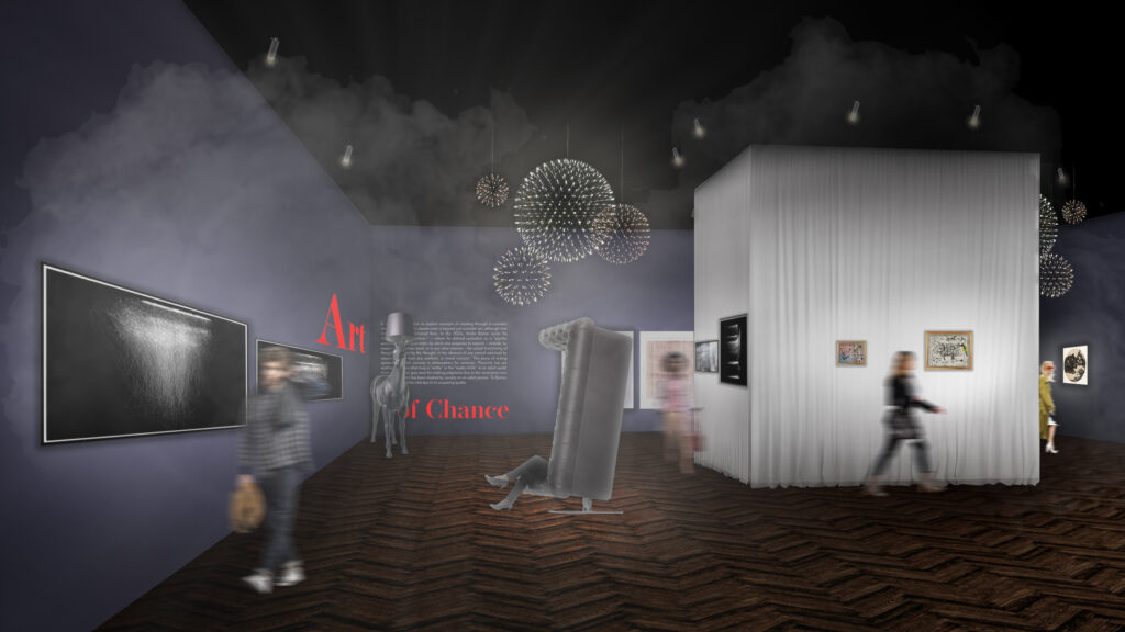
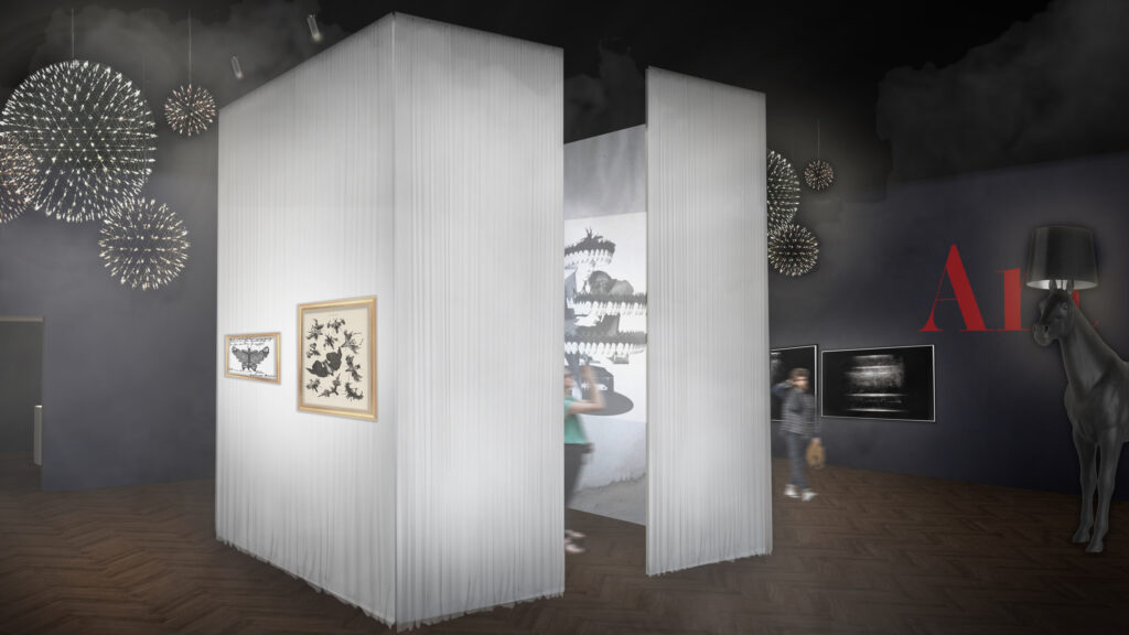
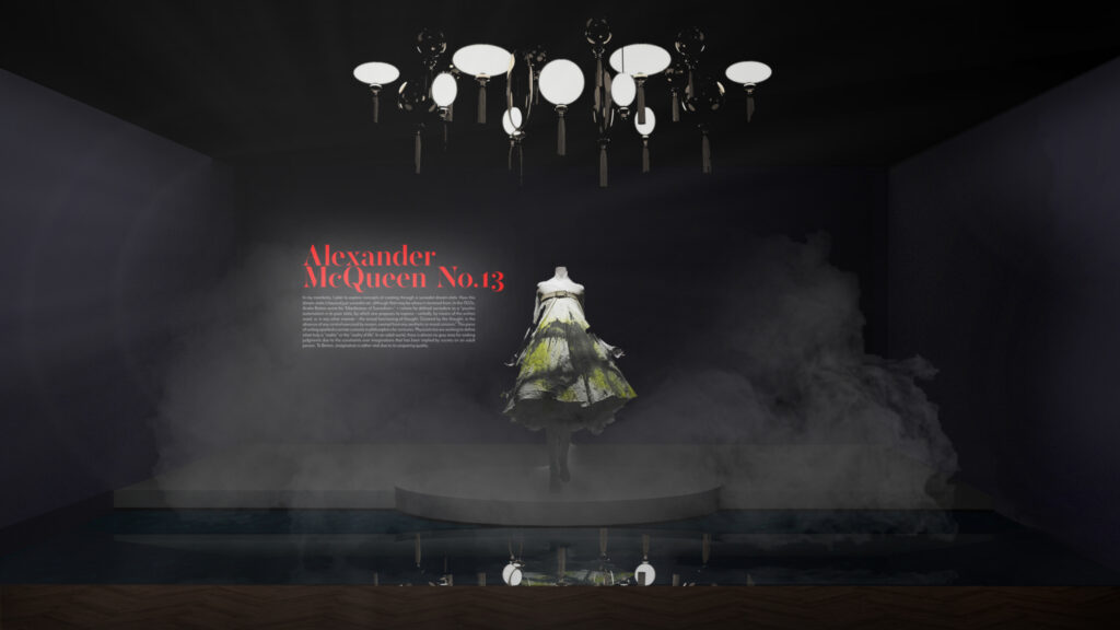
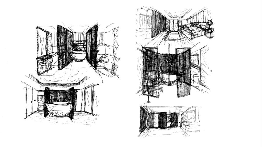
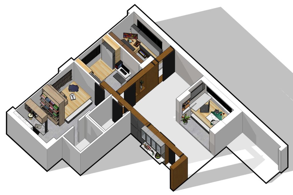
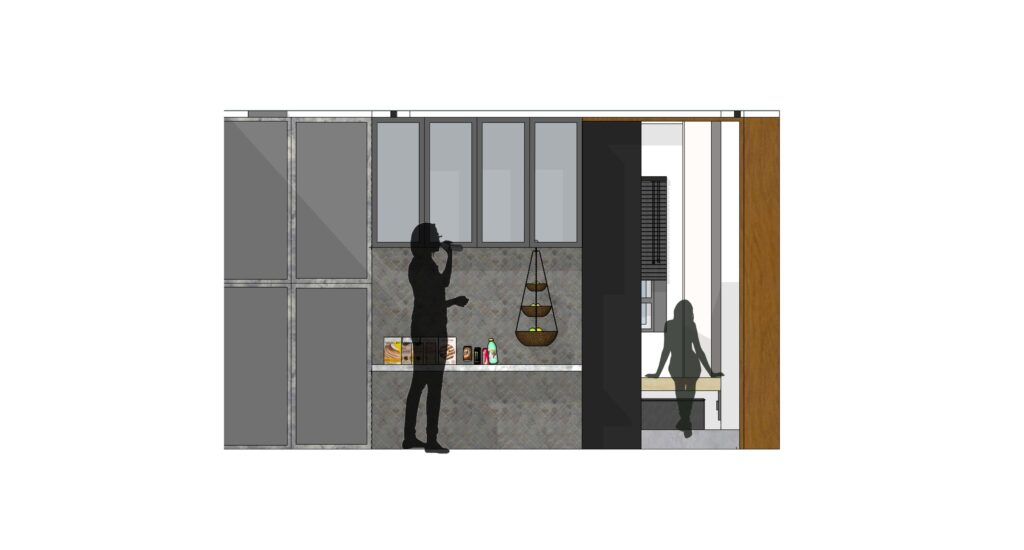
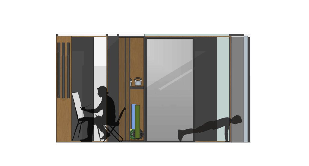
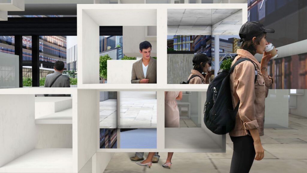
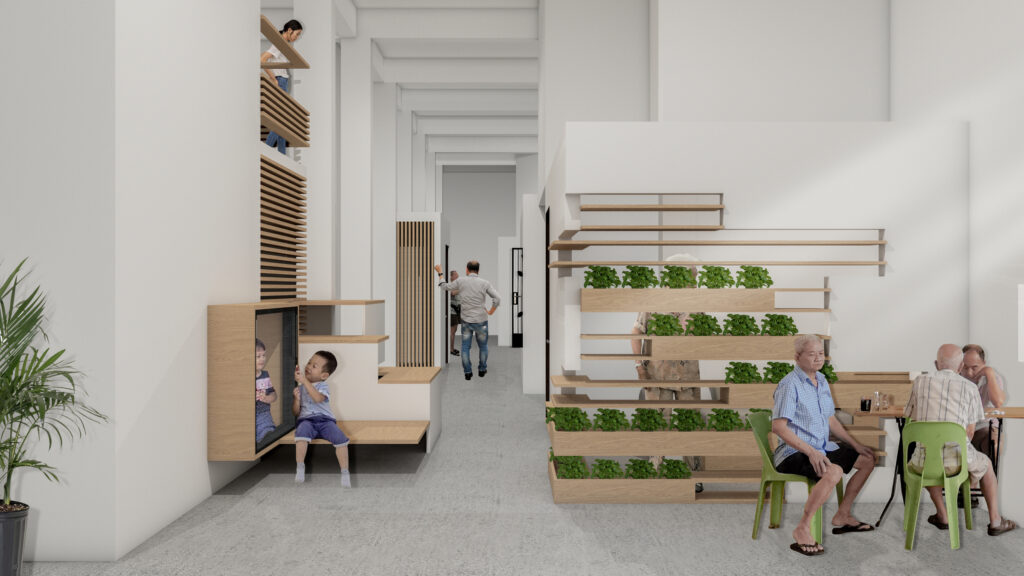
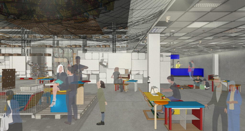
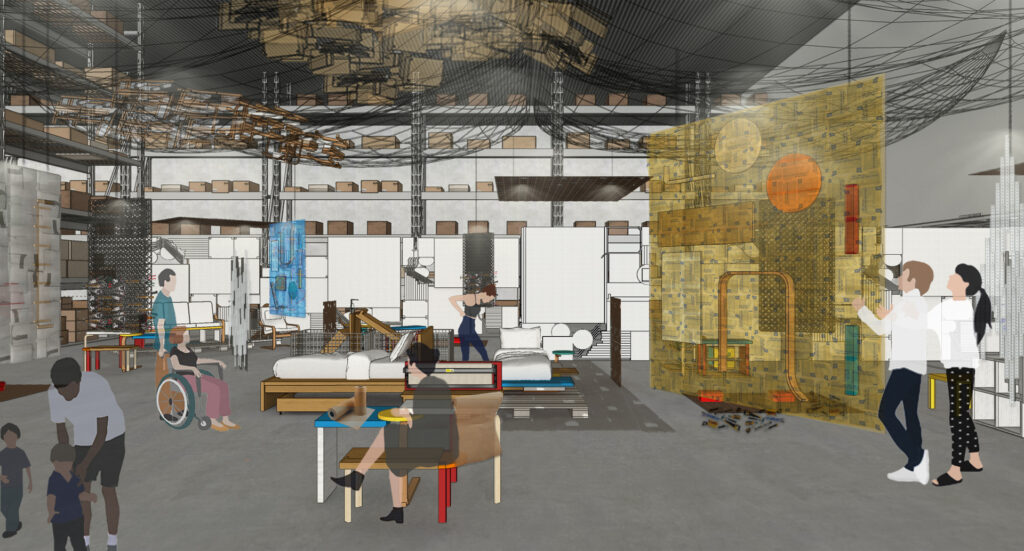
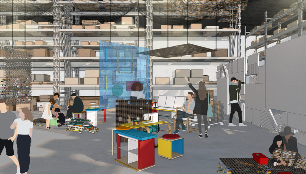
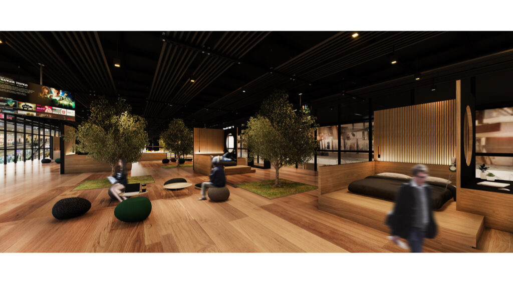
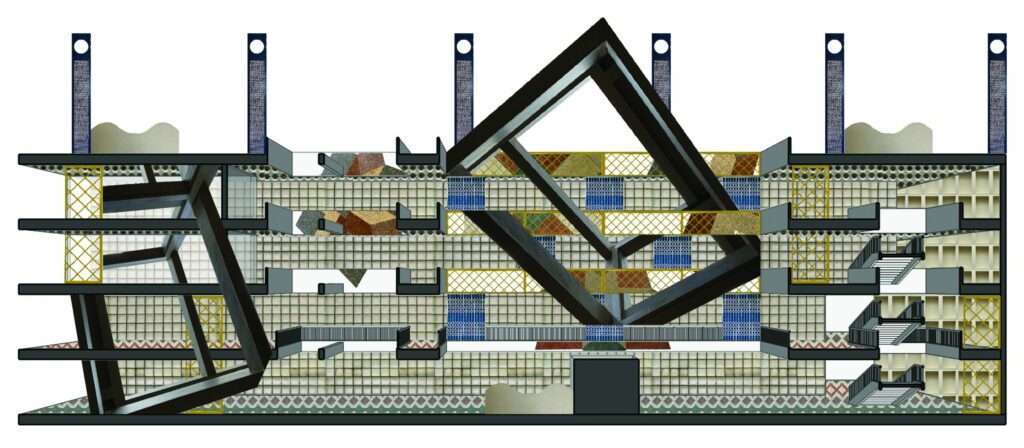
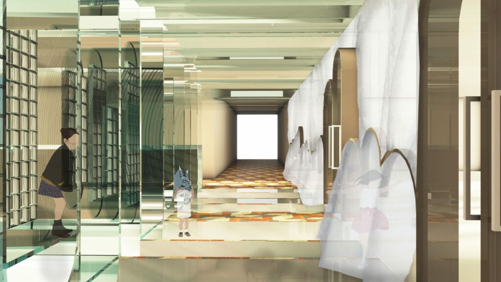
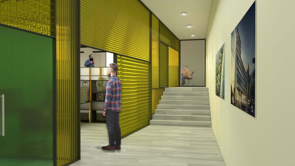
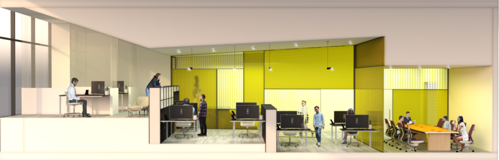
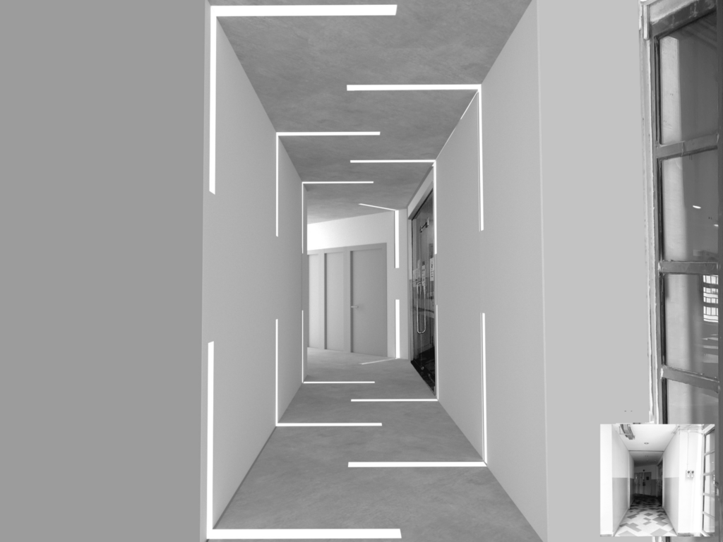
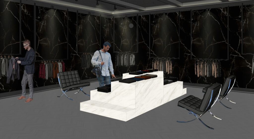
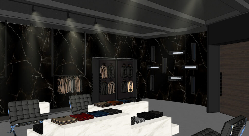
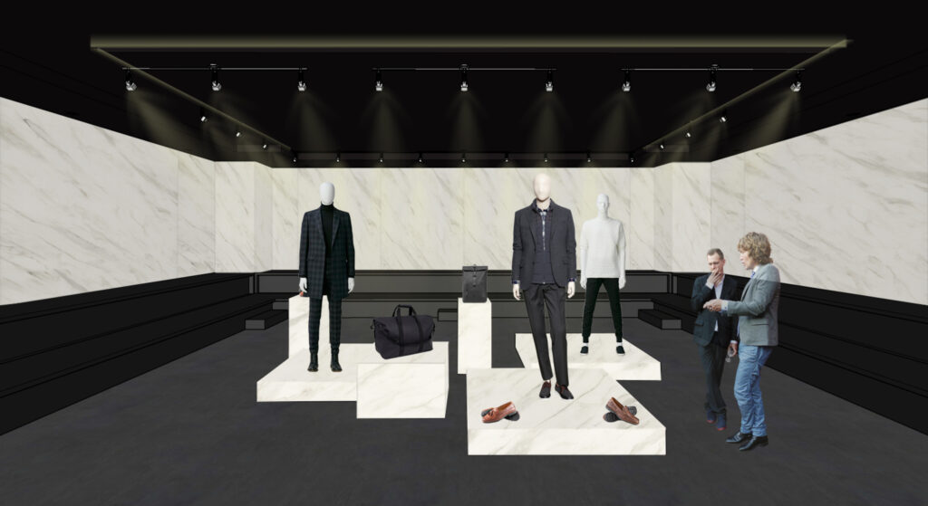
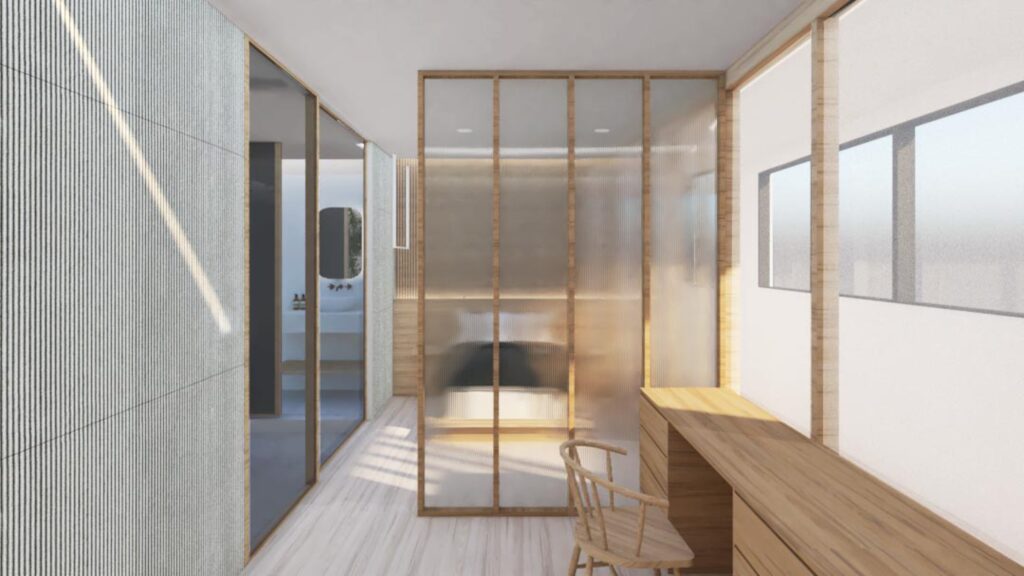
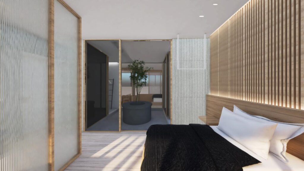
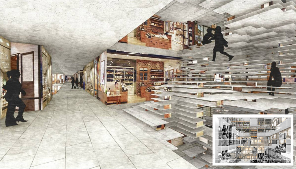
Interior Spaces

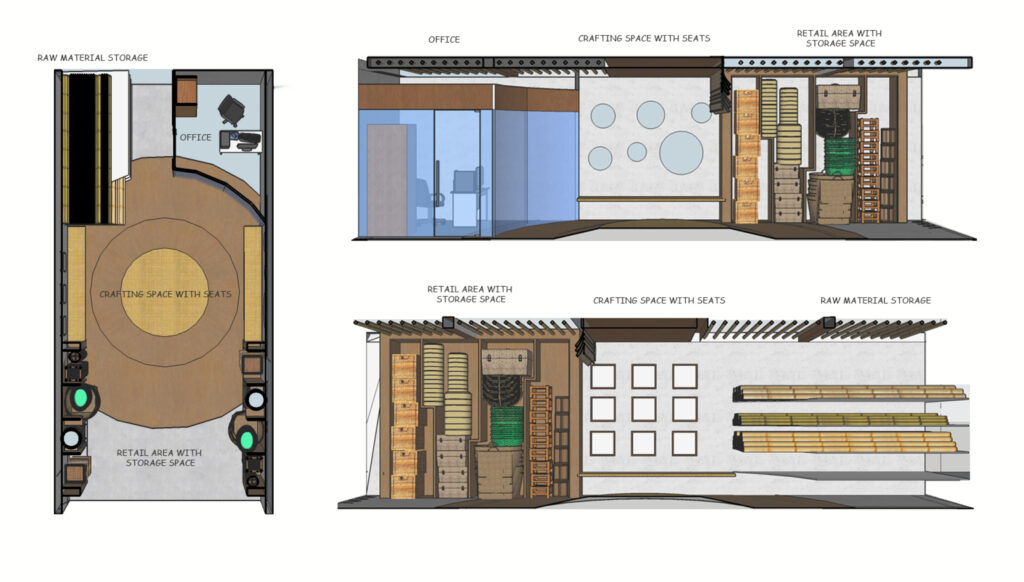
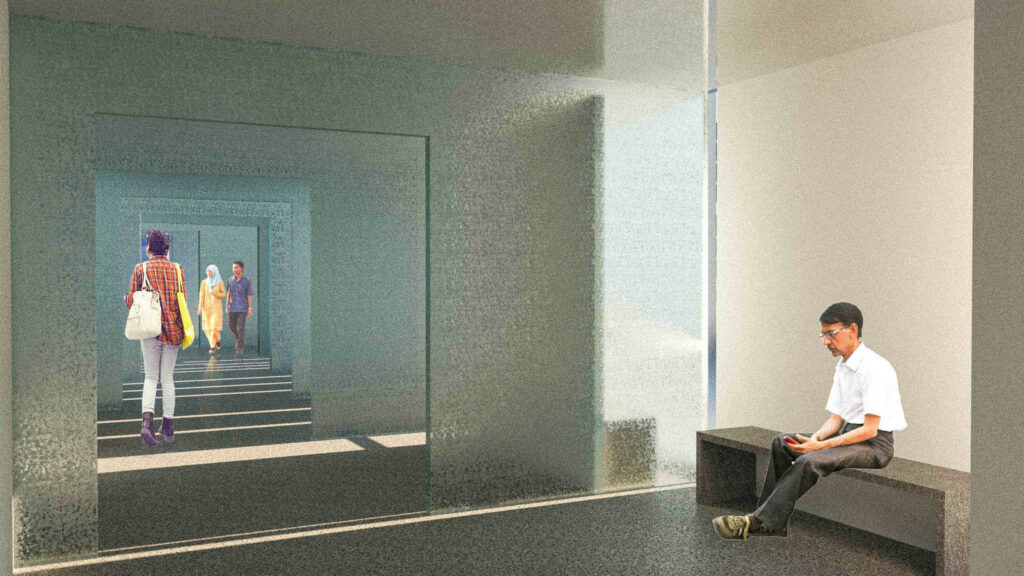
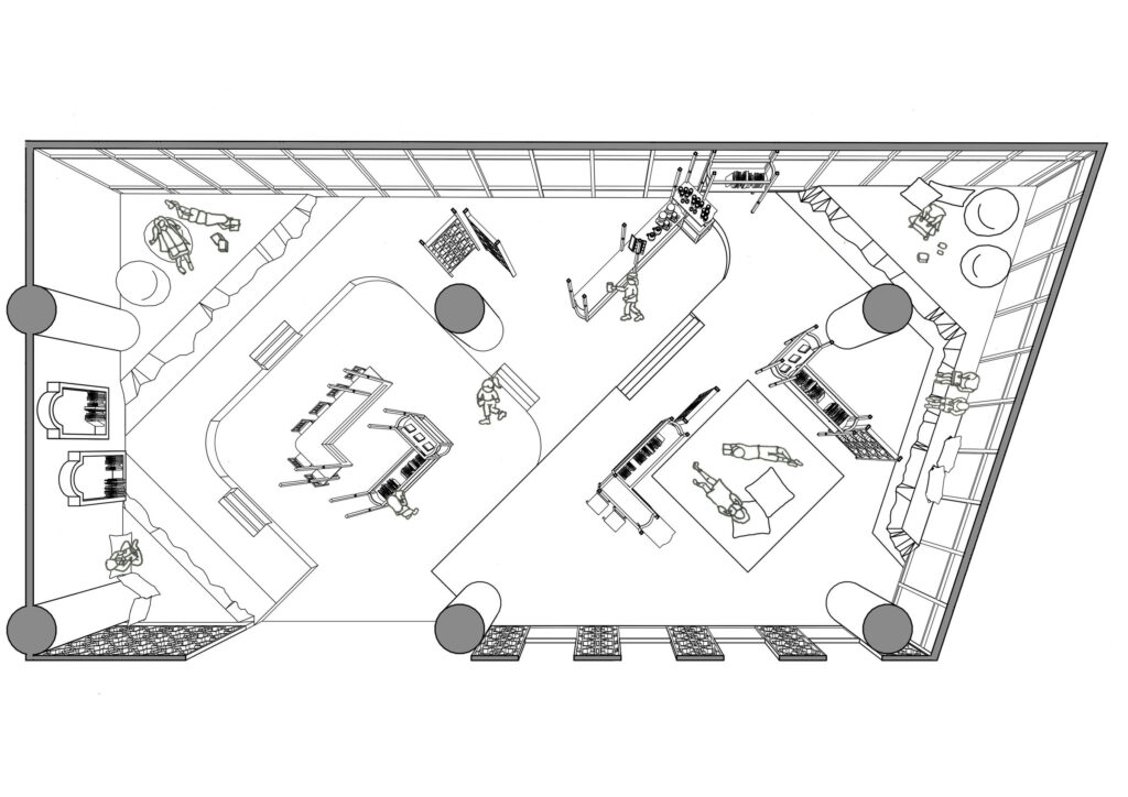
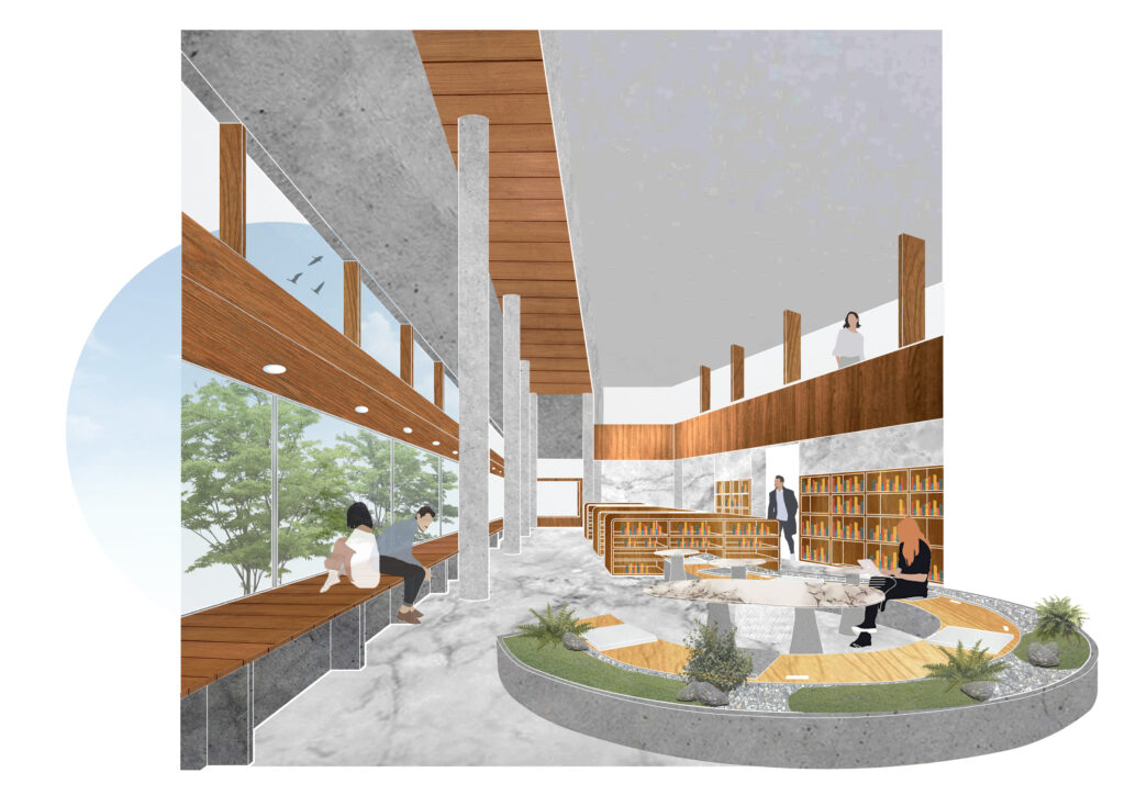
The language is kept continuous, and occur at every level, in every possible space with the play of lighting, surroundings, materiality and forms into the building.

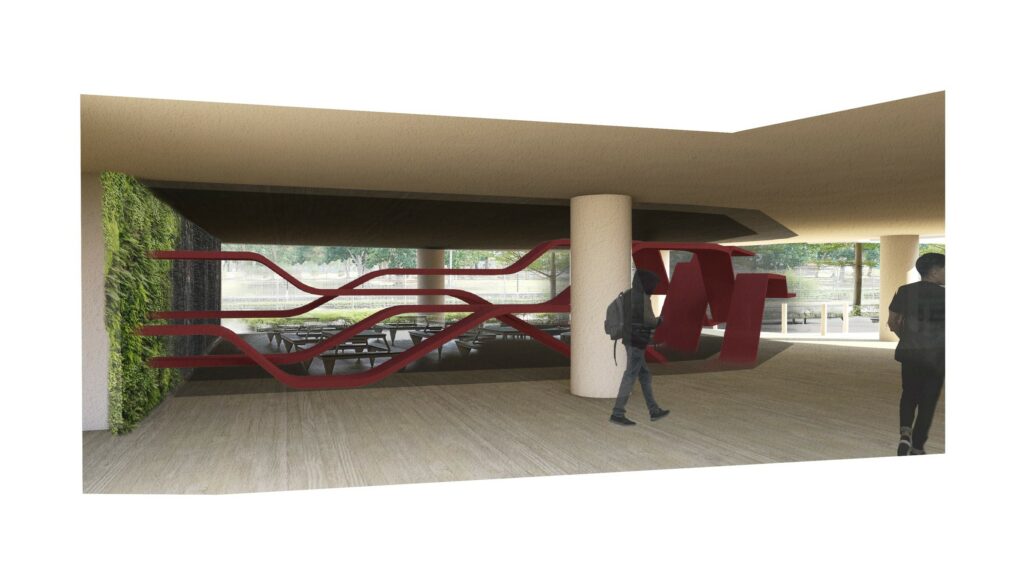
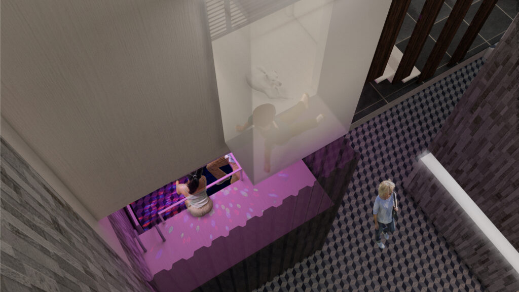
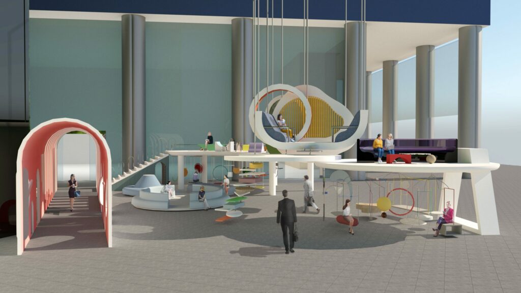
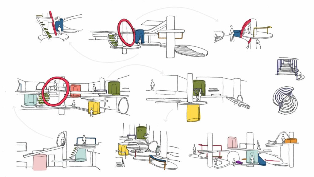
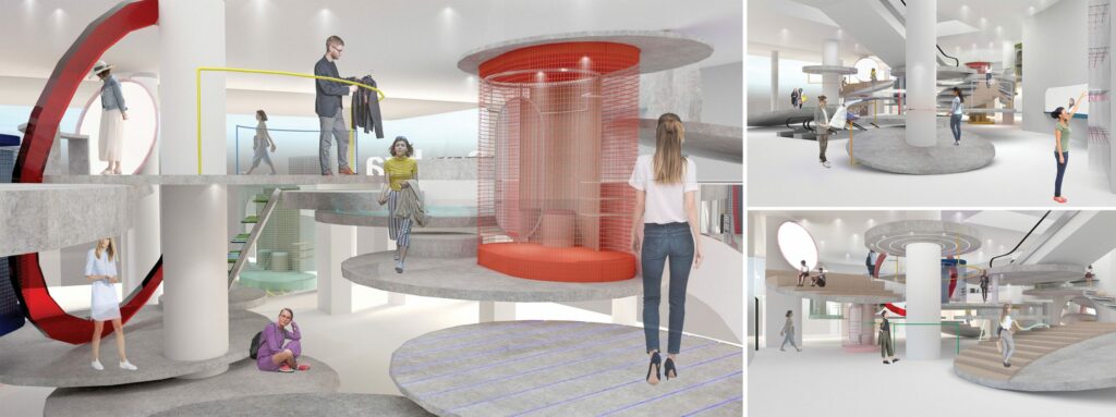
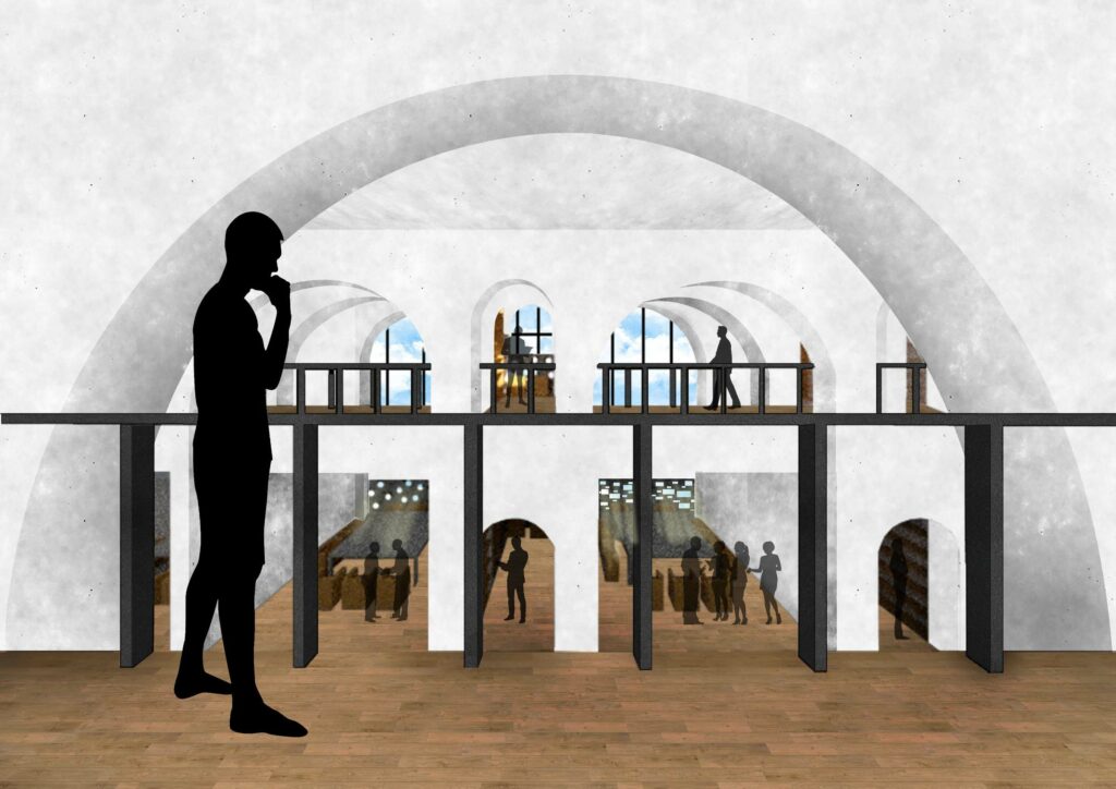
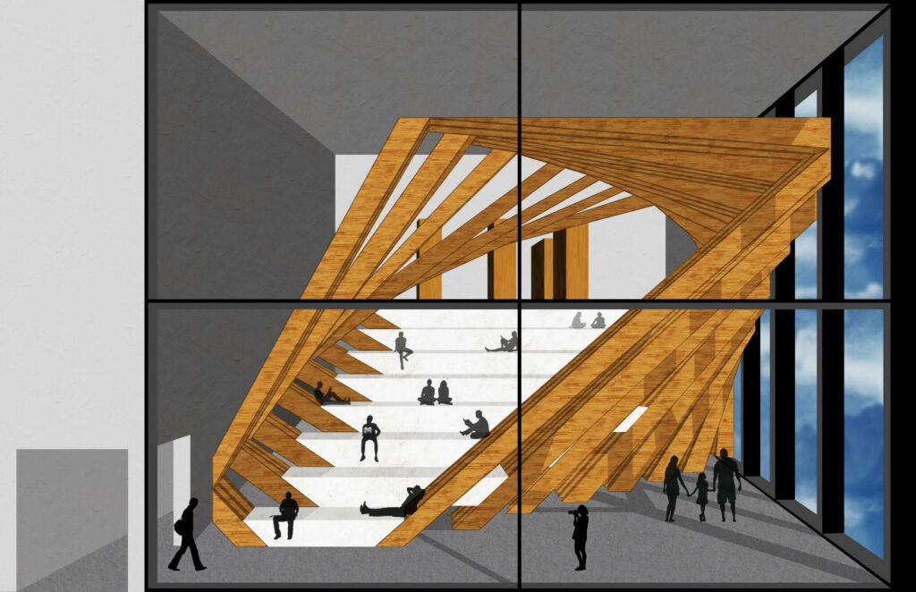
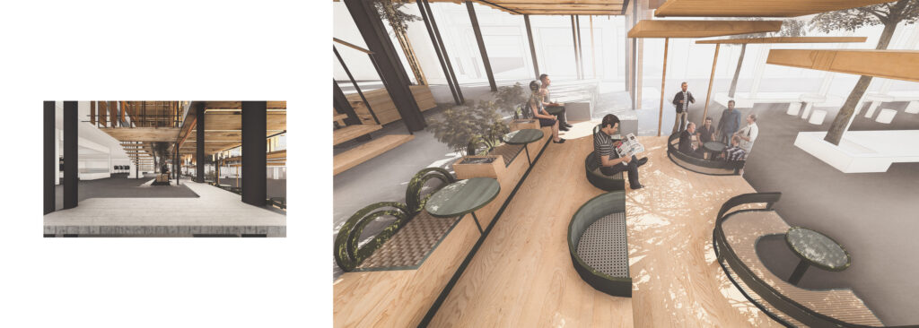
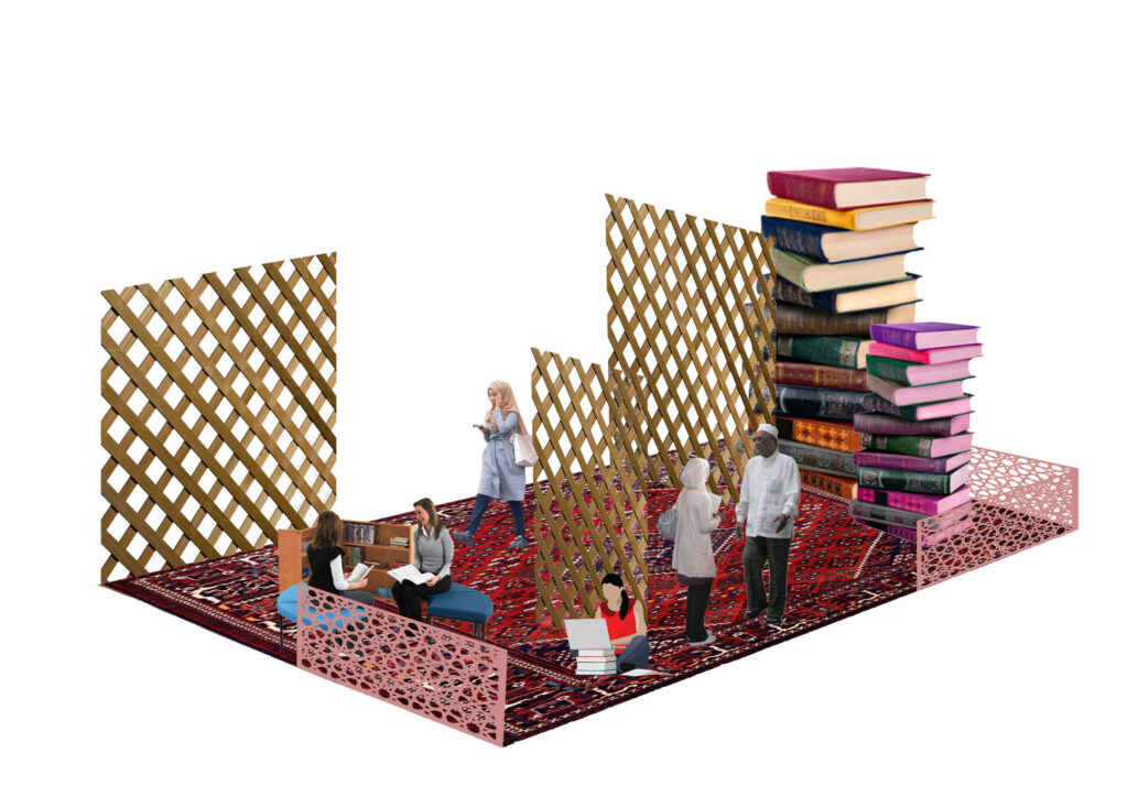
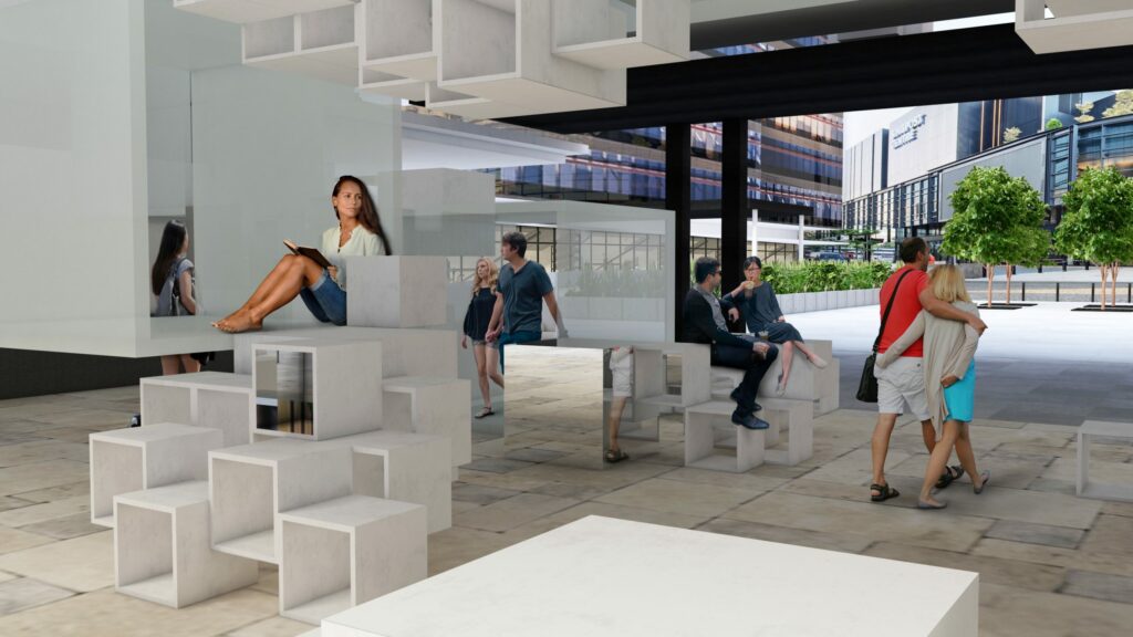
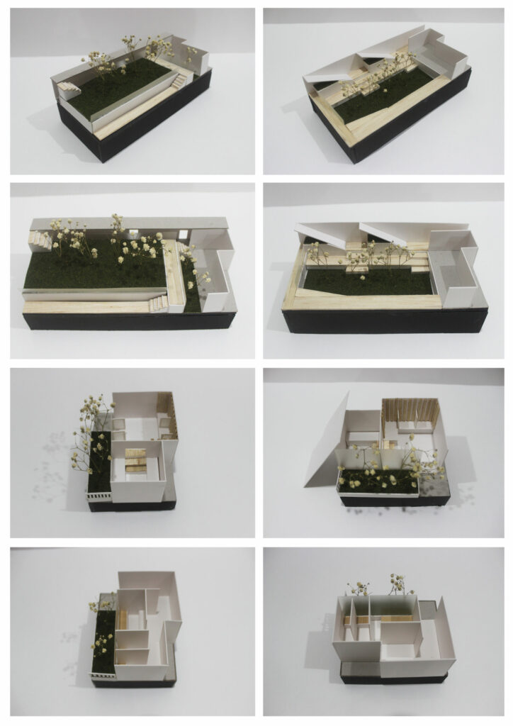
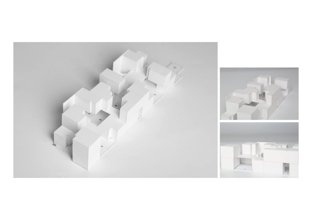
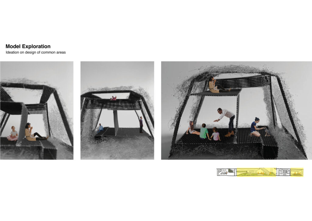
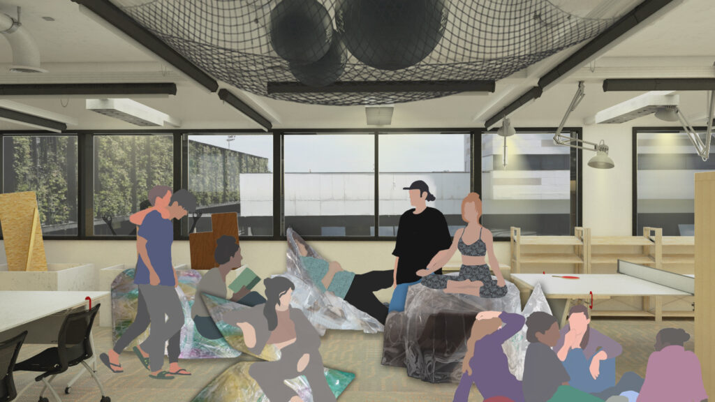
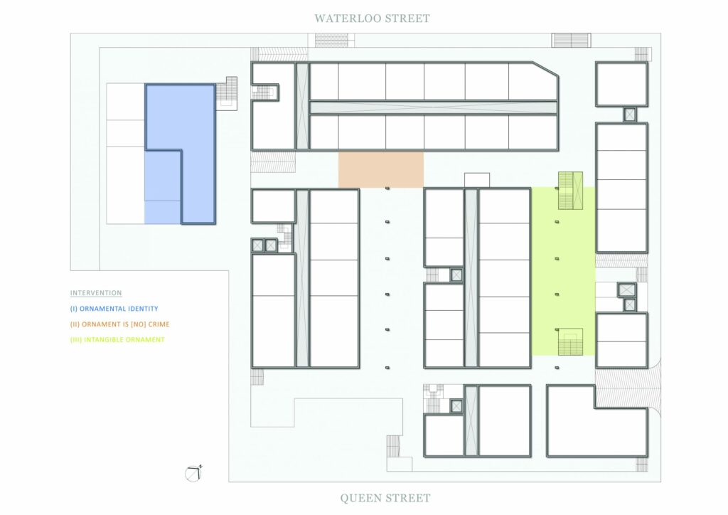
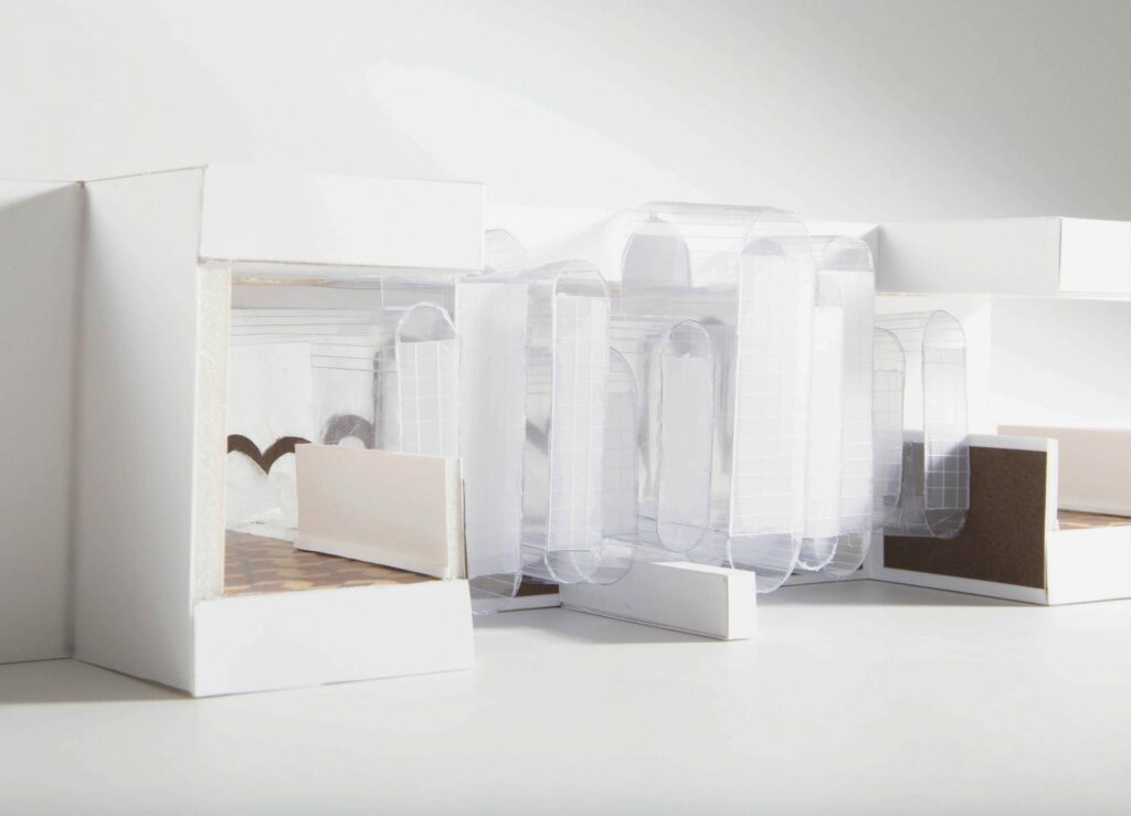
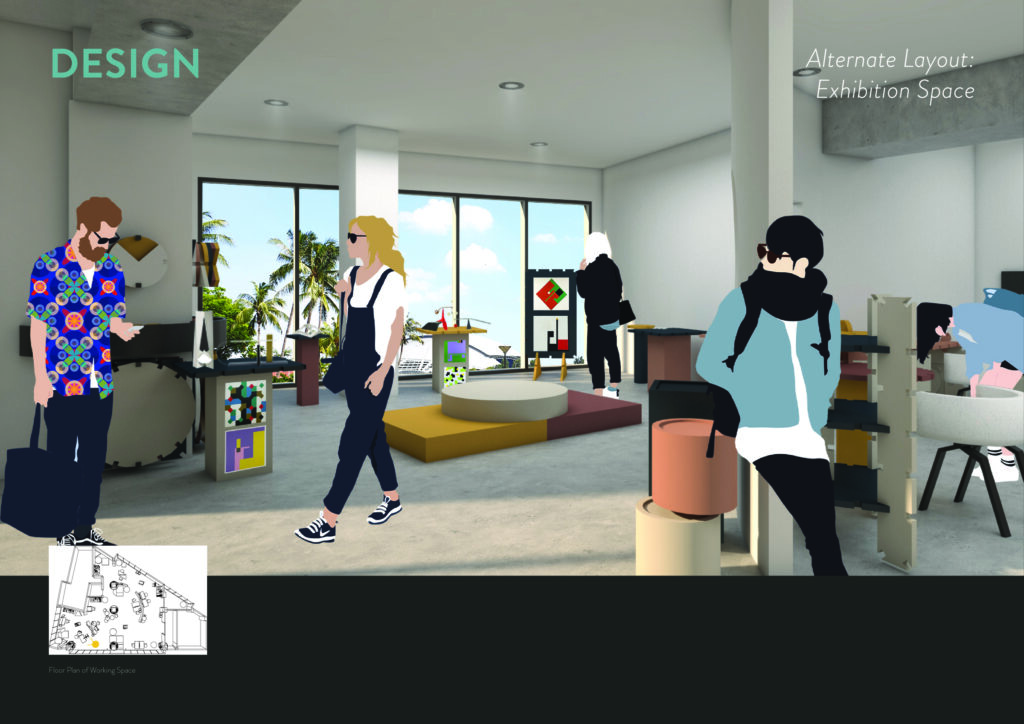
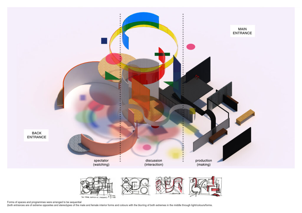
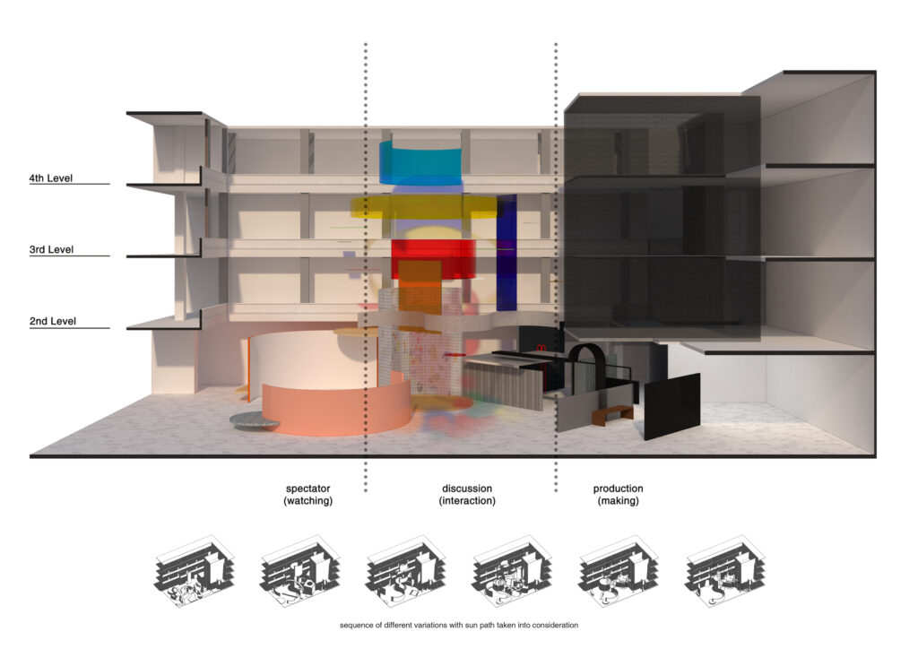
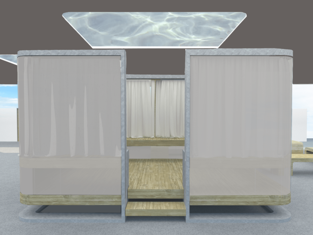
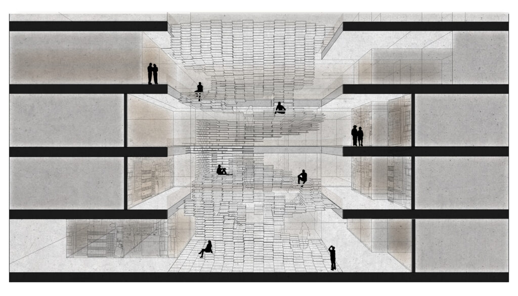
The Community Retreat

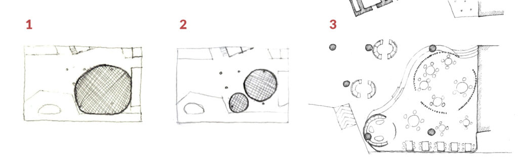
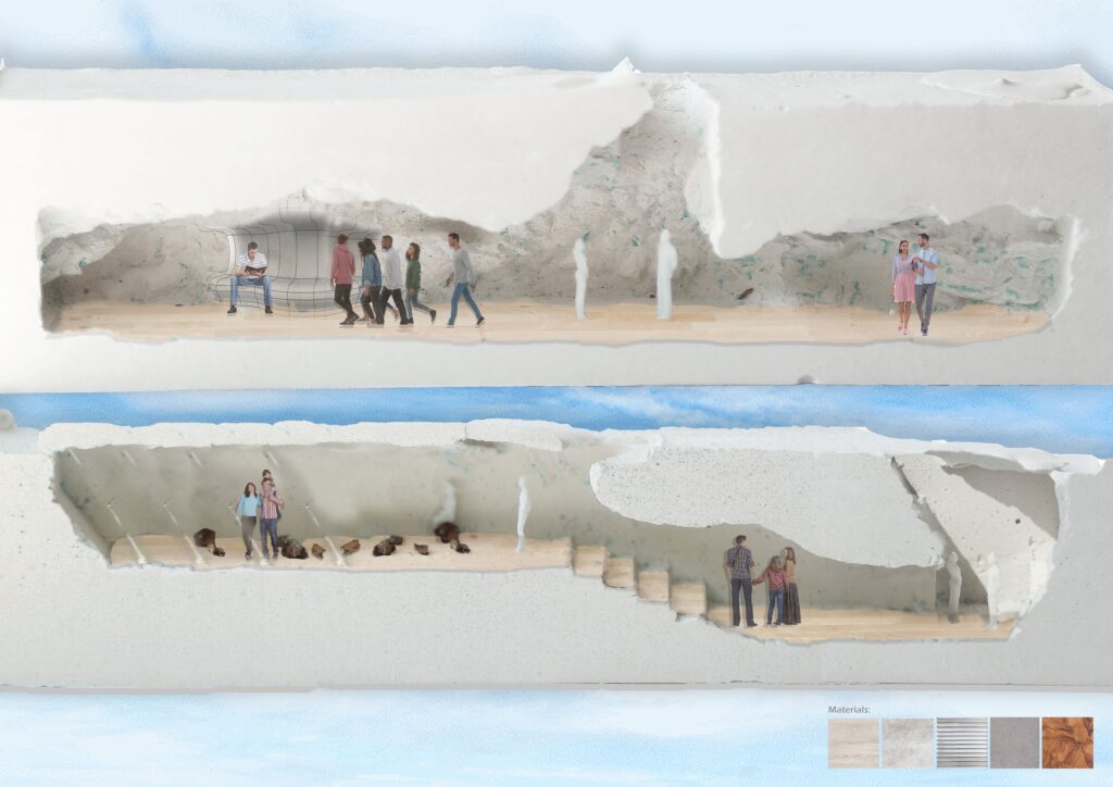
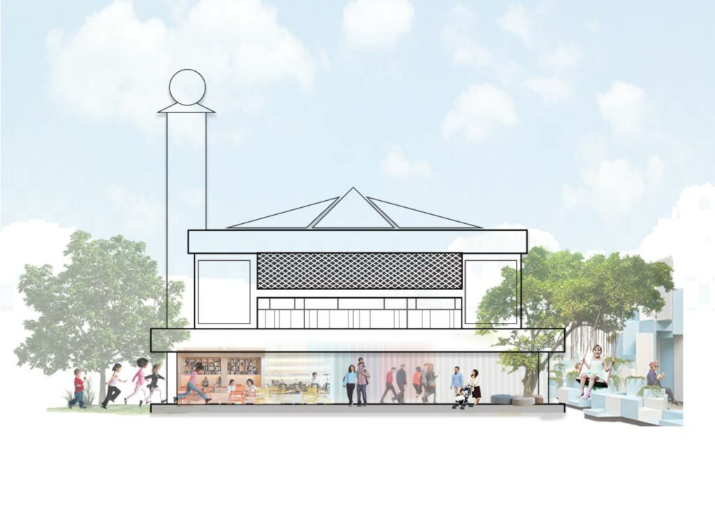
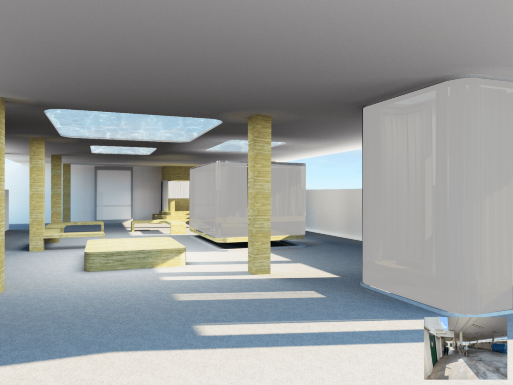
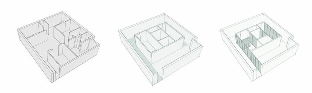
This project puts focus on reclaiming existing space, readapting a disused atrium, bringing it to life as a community meeting and event space for people to connect. Each level forms an intimate yet connective space for small groups to gather and at the same time provides a public frontage and awareness of the ongoing cultural regeneration.

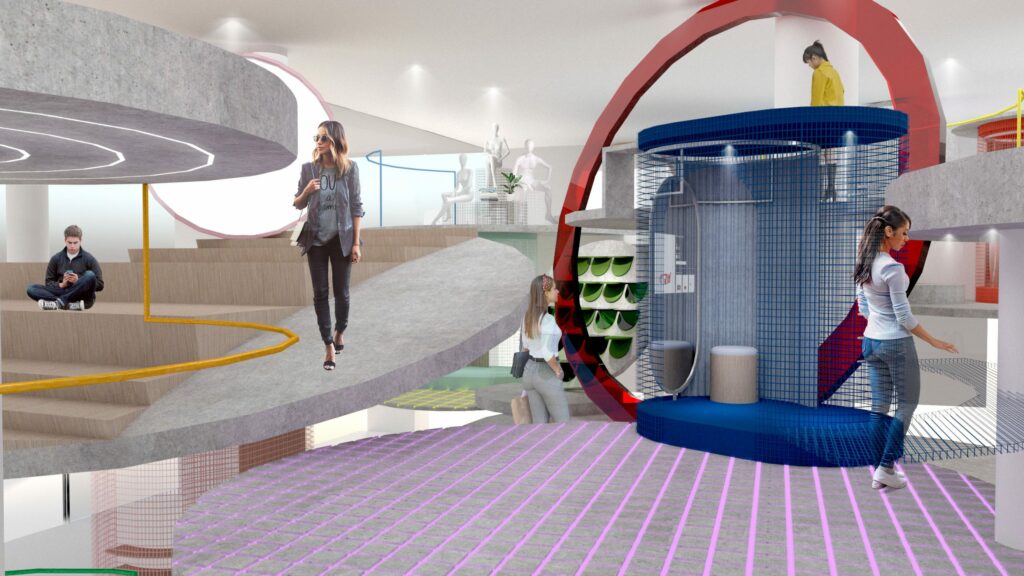
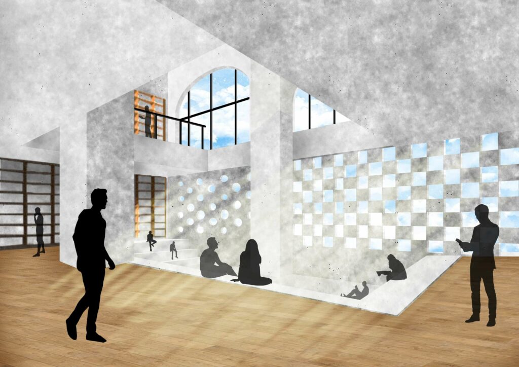
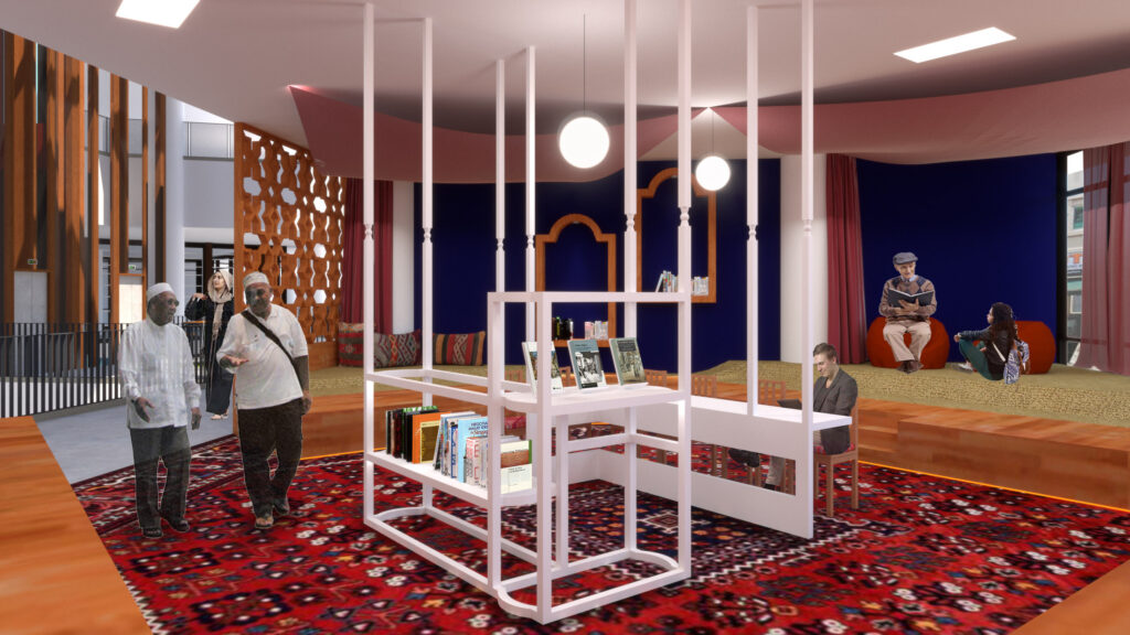
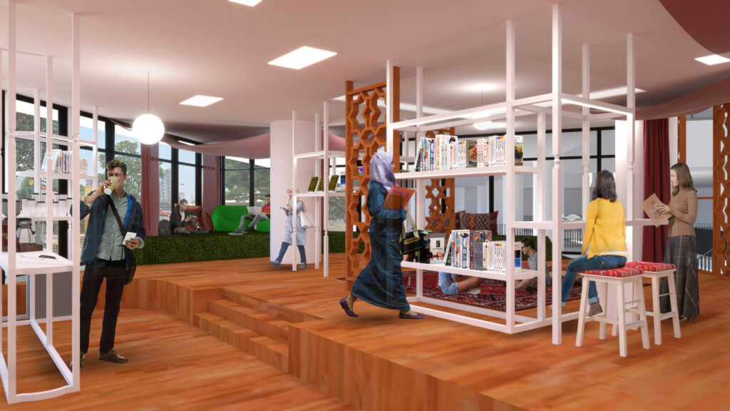
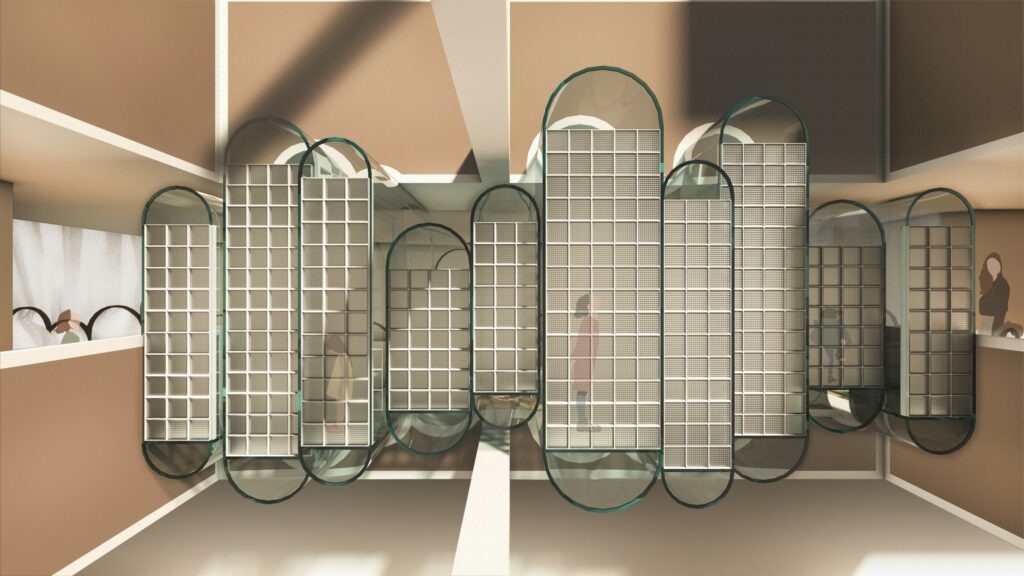
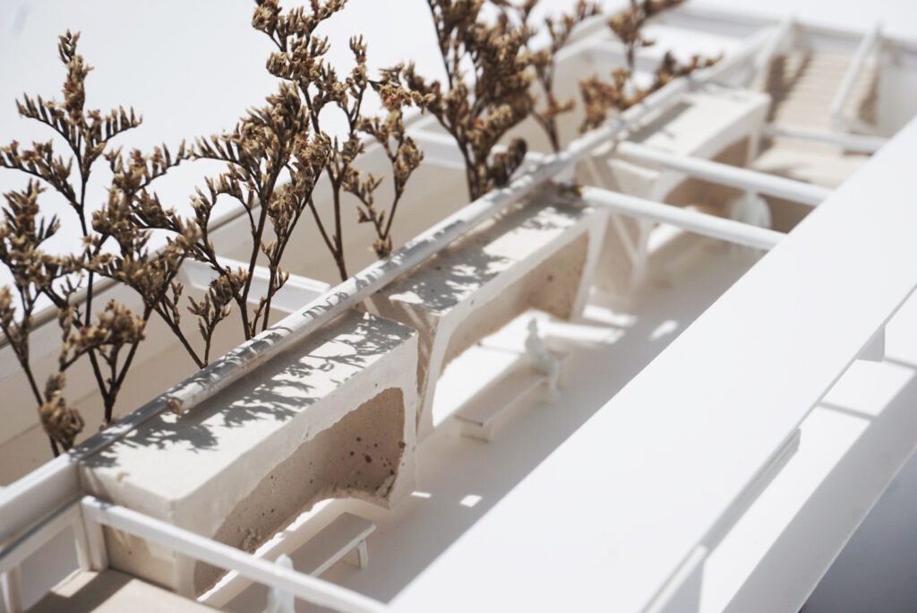
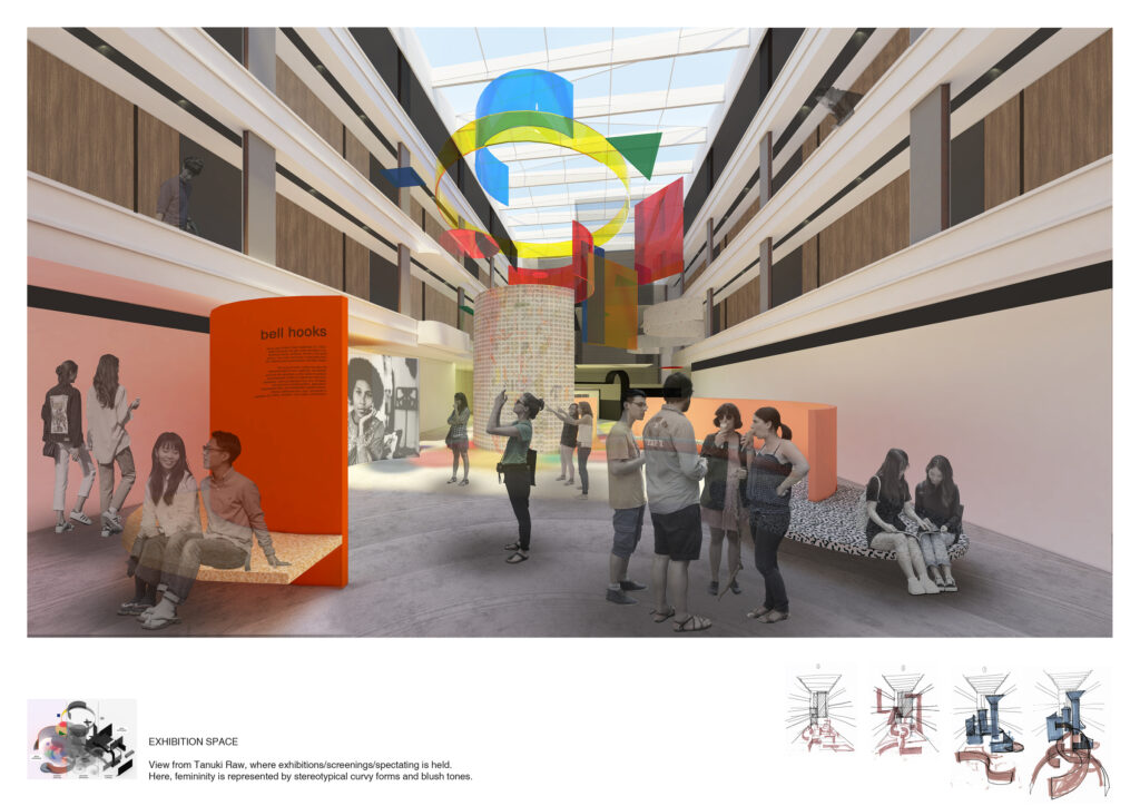
Dwelling in the Retreat

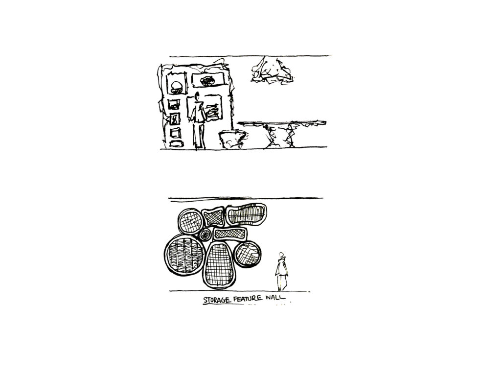
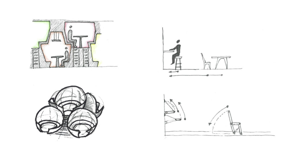
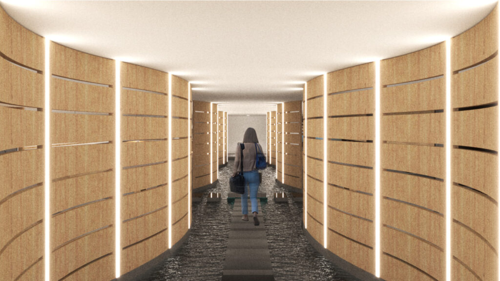
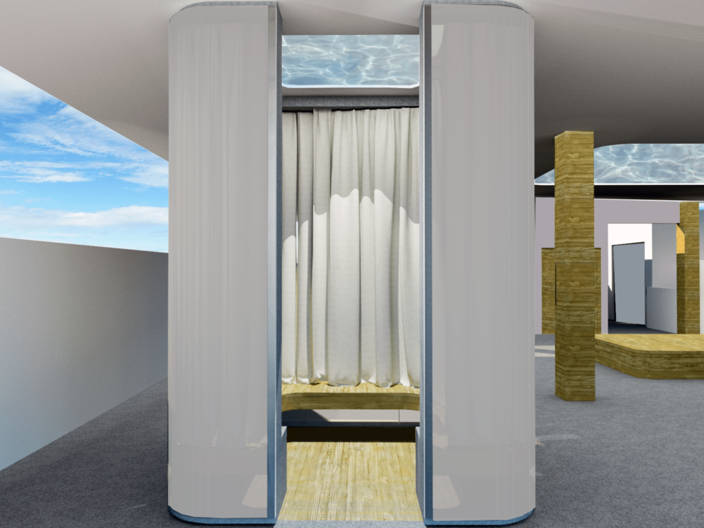
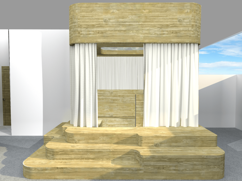
Housed in the Level 2 Plaza, the large, stacking freeform pavilion shapes took reference to the square forms tiling of the existing building. Leaving no definitive lines between each of the structure’s components, thus blending the entire interior of the space together, as well as, forming furniture, walls and ceiling to function as a retreat for the community.
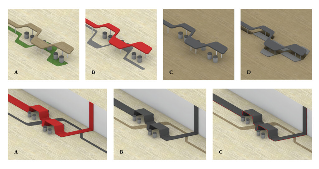
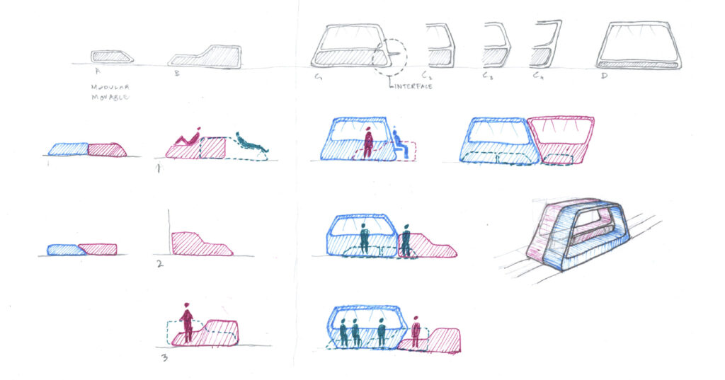
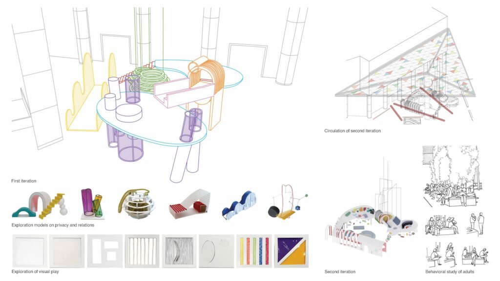
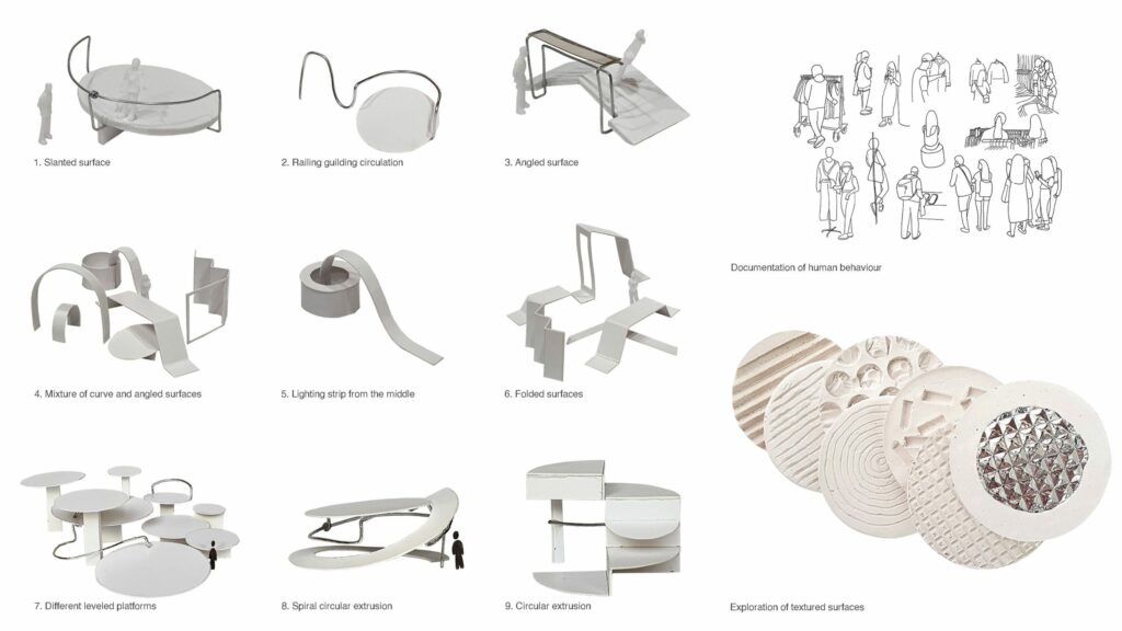
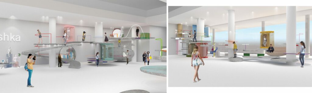
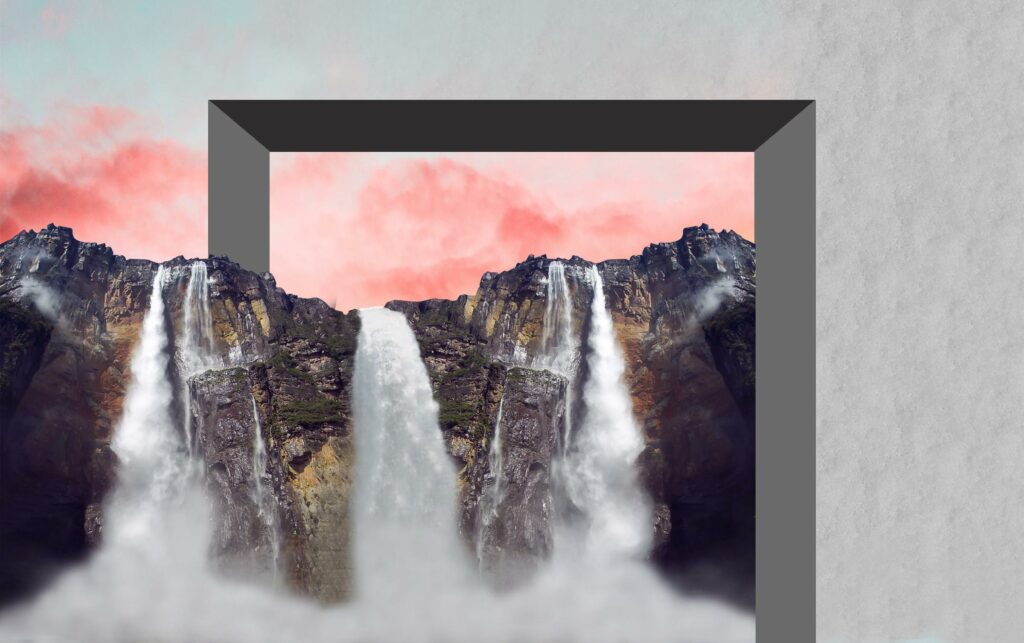
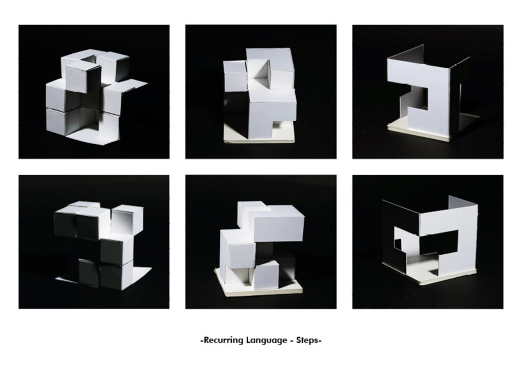
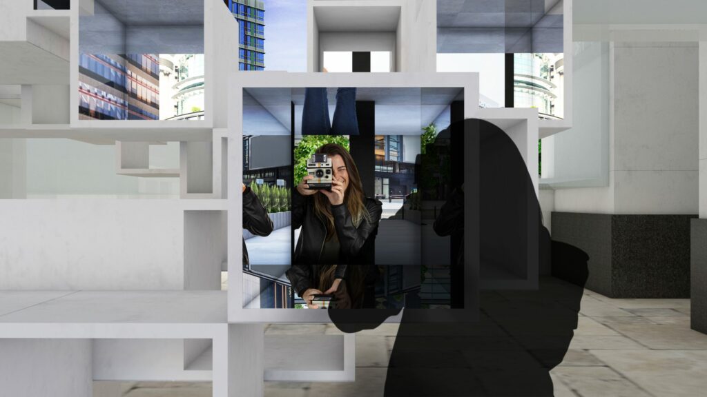
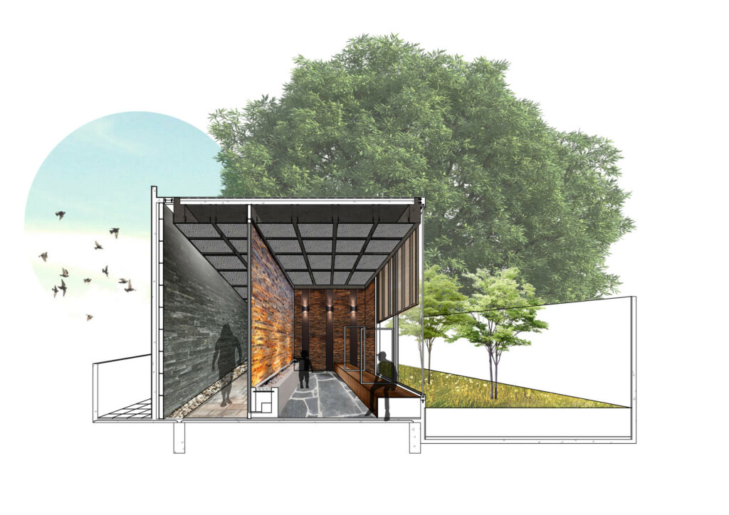
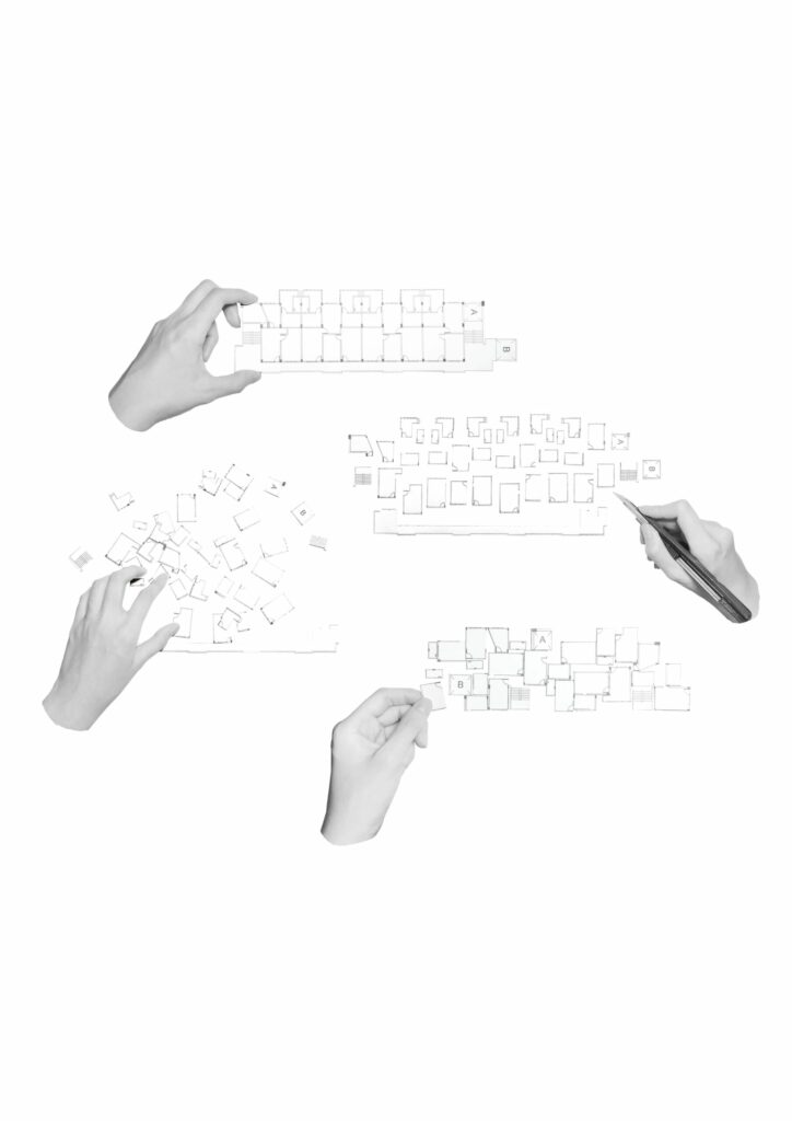
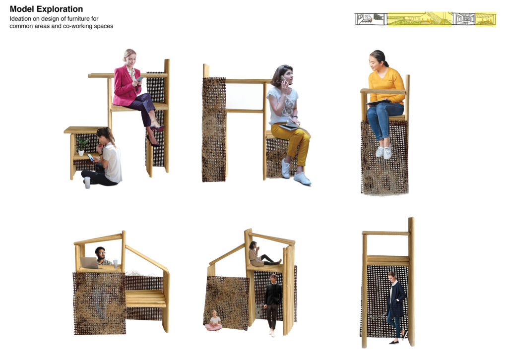
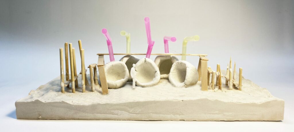
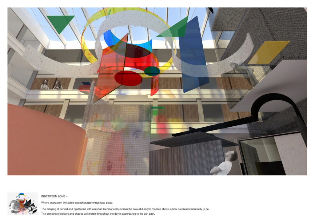
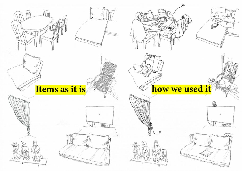
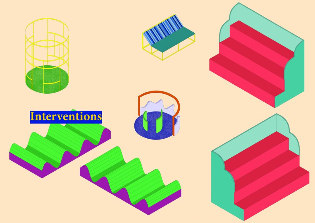
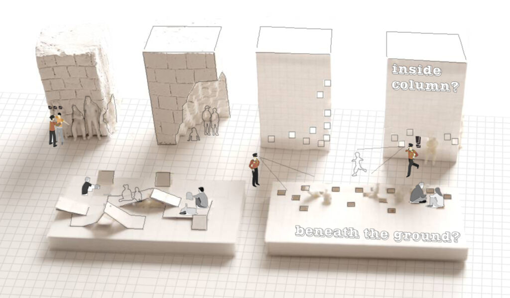
Design Ideation

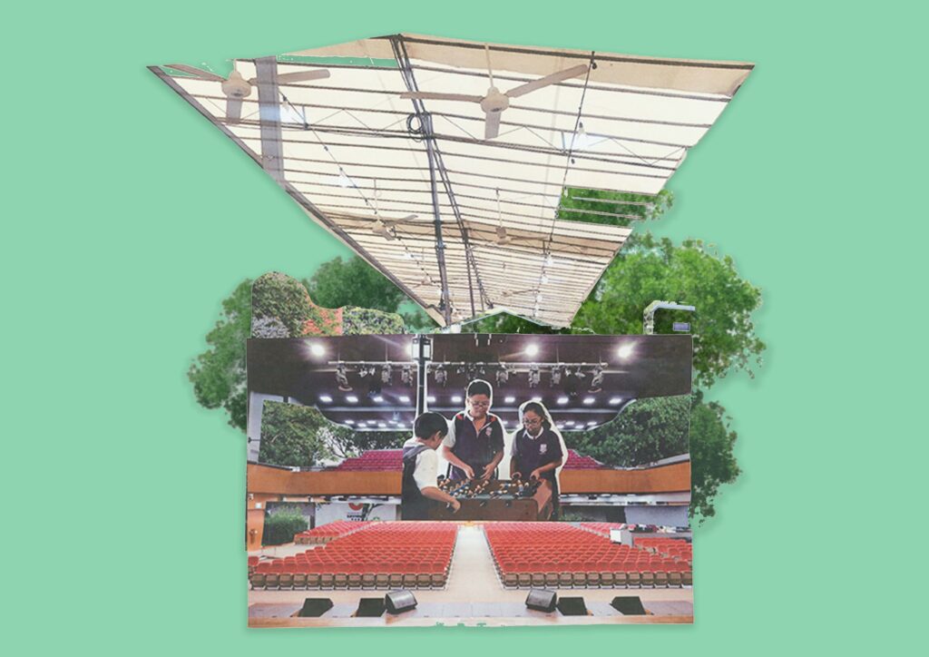
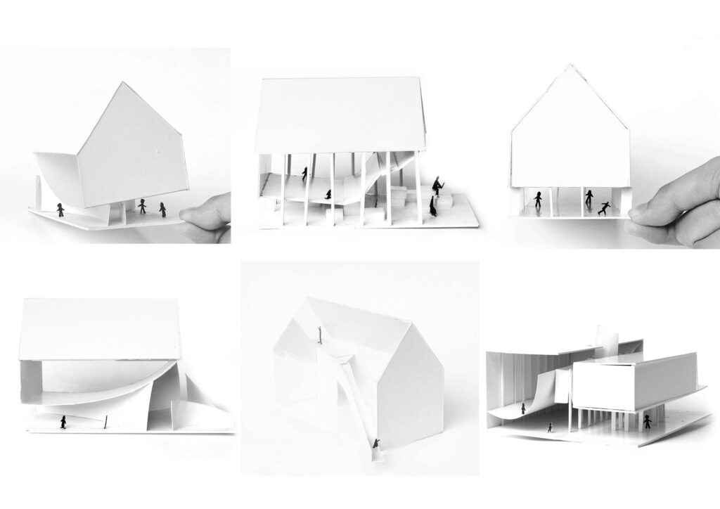
Inspired by the versatility to endless possibilities by Bruno Munari “ a low wall becomes a seat, the church steps become a living room in which to meet, the open area behind the house hosts infinite soccer games in his hot playground project and the Storefront for Art and Architecture project by Steven Holl that introduces improbability and punctures the façade. The space is designed to bring harmony between the environment and the way the human body behaves within the space.
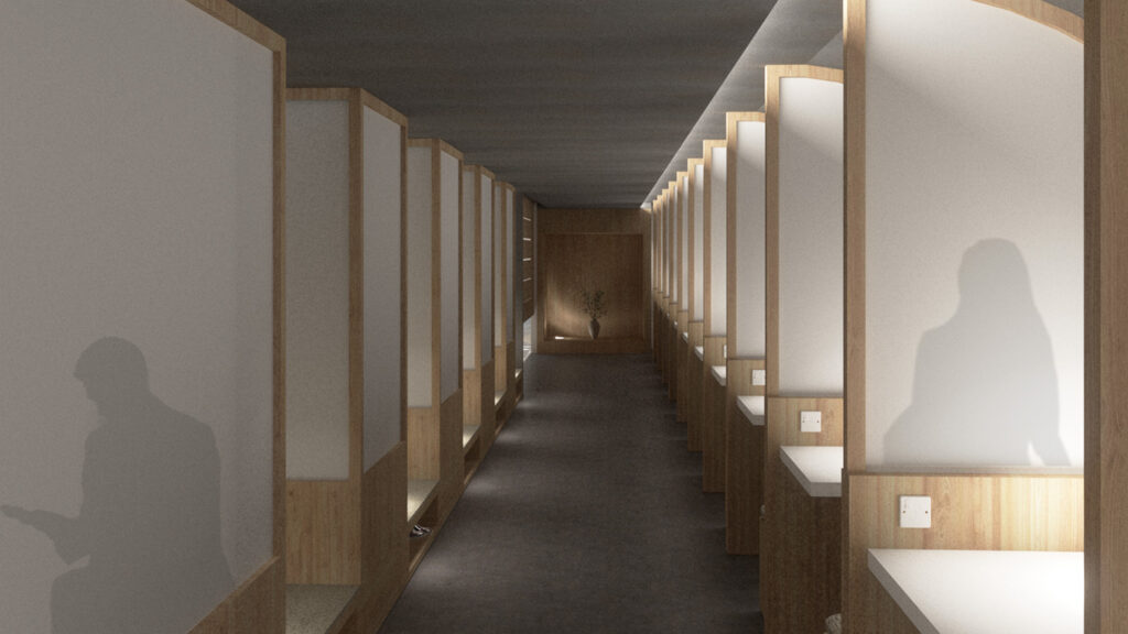
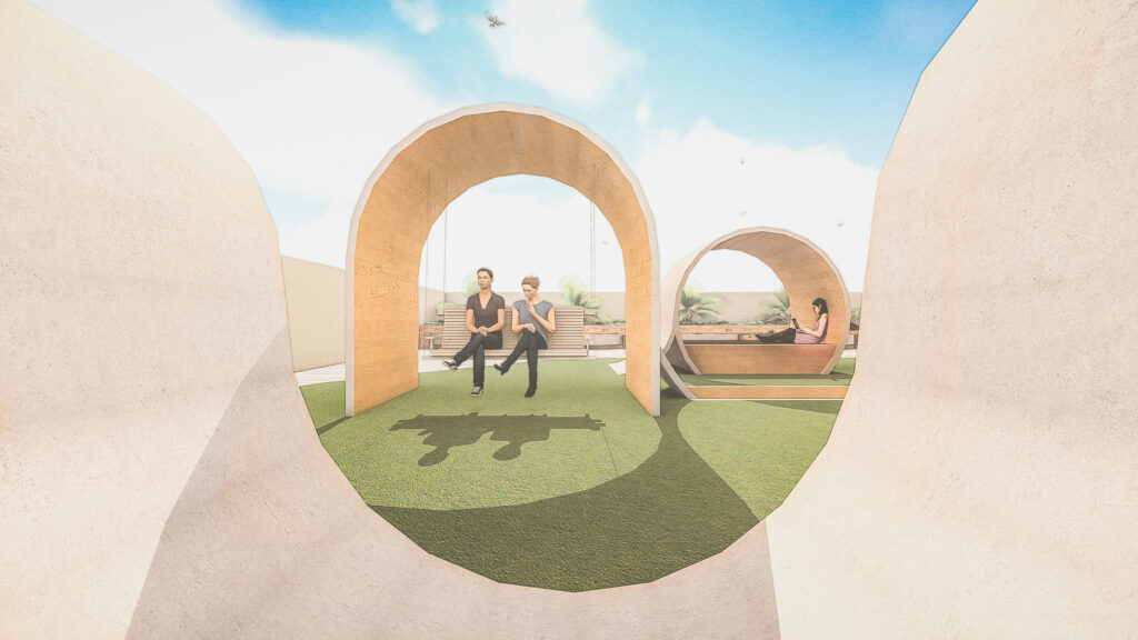
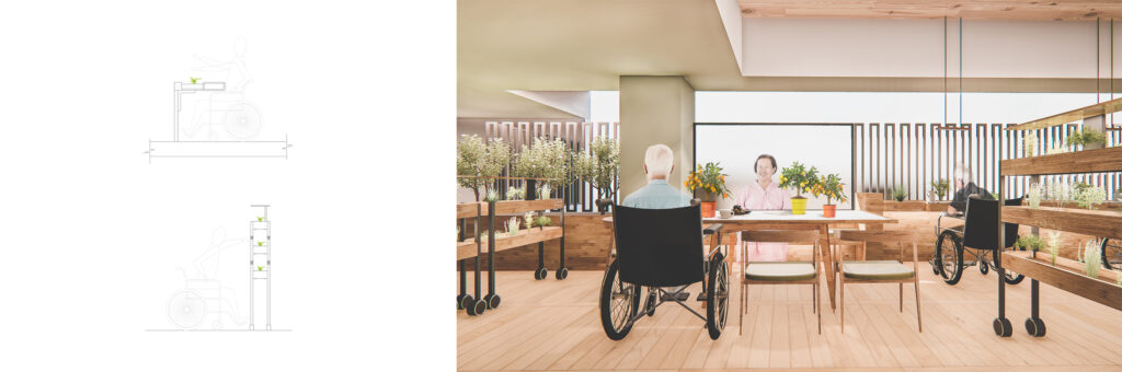
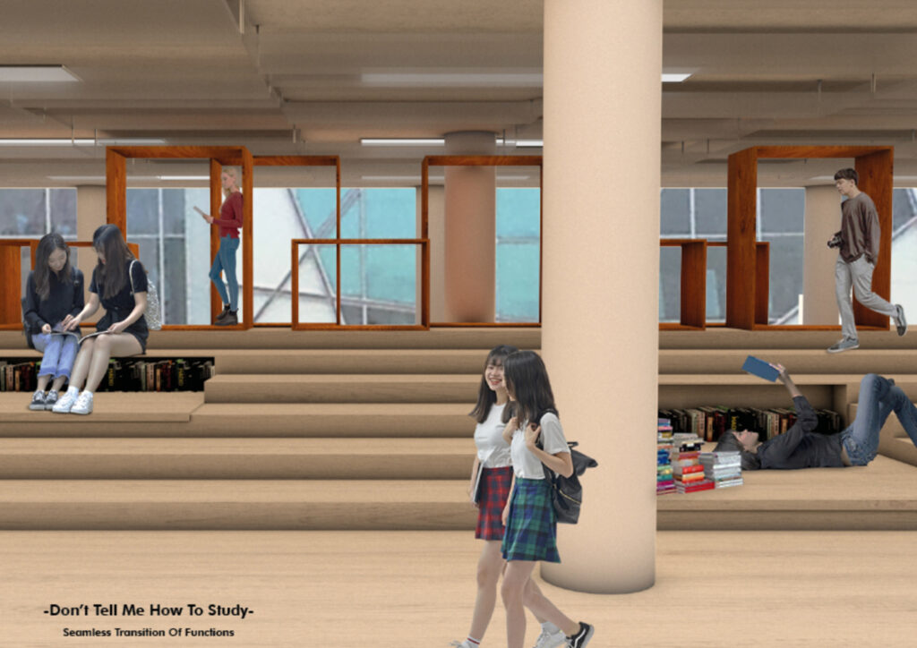
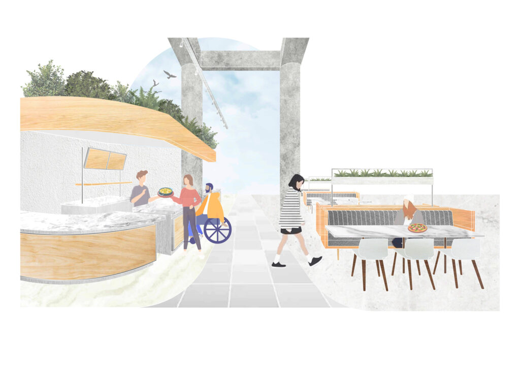
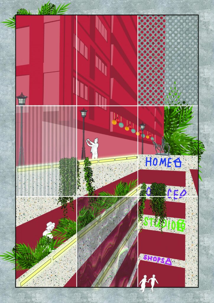
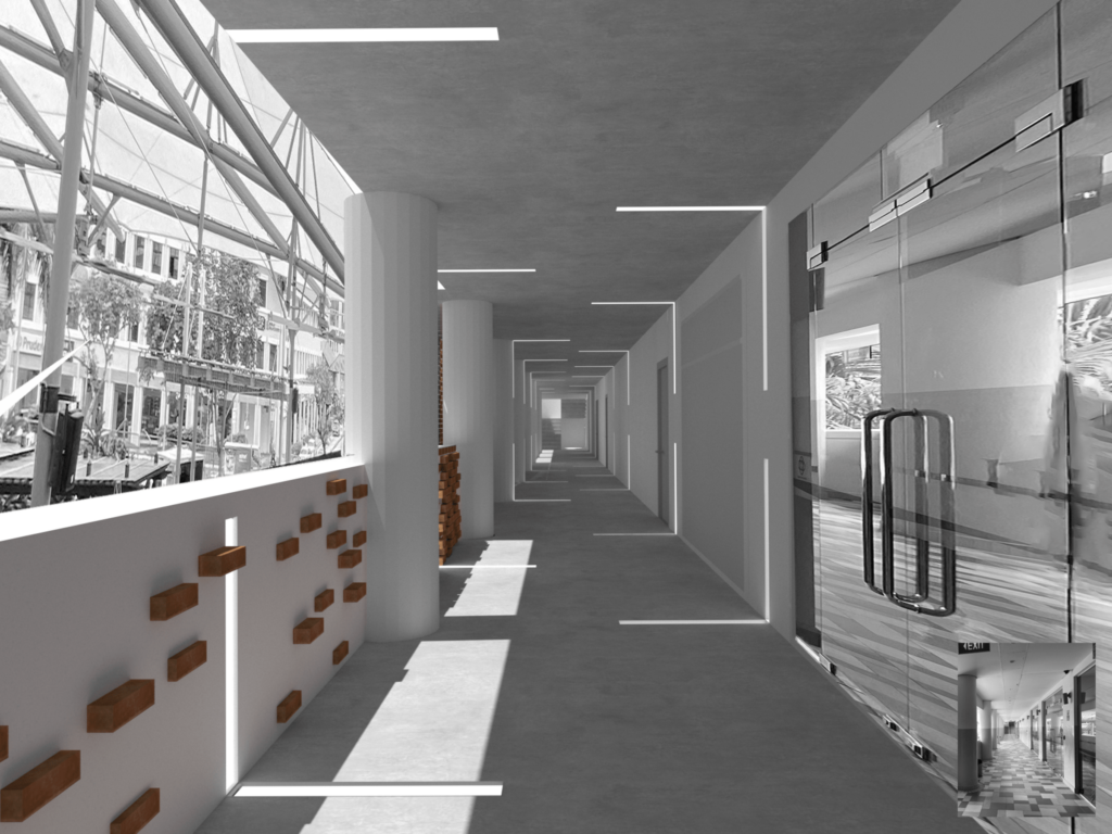
Versatility Design

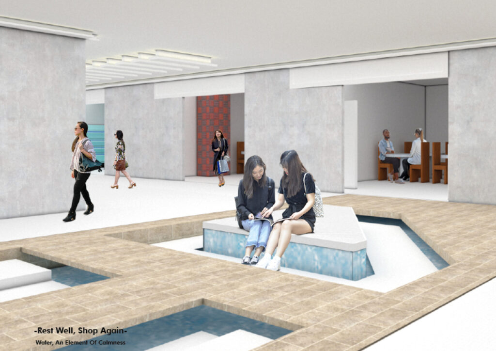
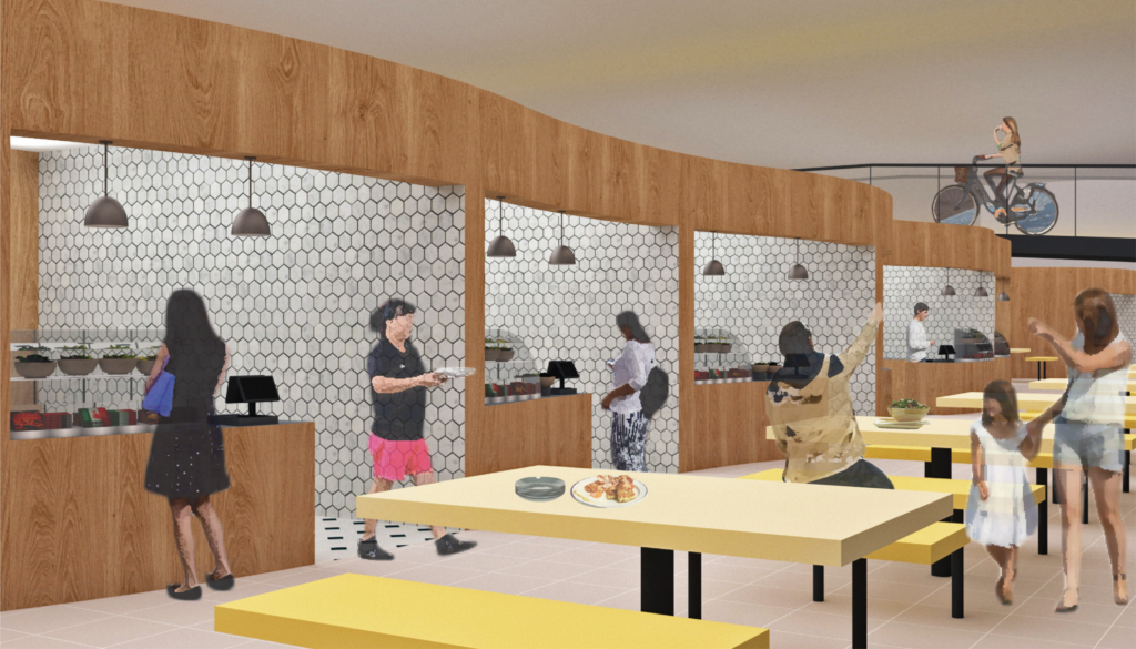
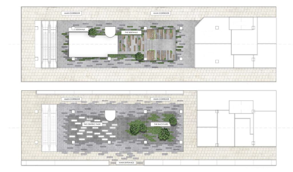
The versatility of the design is expressed around the periphery spaces in the mall, making subtle design implementation into elements such as the floors, ceiling, walls and built-in elements, also creating moments of pauses in which one can rest and enjoy the serenity of their surroundings.

Space in Place

My idea of Space in Place in a Collage from

Place in Space

My idea of Place in Space in Collage form

A take of a Modern + Historical Reading Place

A Perspective view of Modern + Historical Reading Space

A take of a Modern + Historical Reading Place

Perspective view of Modern + Historical Reading Space

A take of a Modern + Historical Reading Place

Perspective view of Modern + Historical Reading Space

A Step to a better Reading Environment

Perspective View of a steps / reading space / Amphitheater

A Step to a better Reading Environment

Perspective View of a steps / reading space / Amphitheater

A Step to a better Reading Environment

Perspective View of a steps / reading space / Amphitheater

A Step to a better Reading Environment

Perspective View of a steps / reading space / Amphitheater

Itten X Aēsop

Initial collage showcasing the synergy between Swiss Colour theorist Johannes Itten and Melbourne’s health and beauty franchise Aēsop. The bold contrasting colours of Itten’s art works complements the colour scheme used by Aēsop.

Aēsop X Itten

Window design grounded by the principles and theories of Swiss Painter and Colour theorist Johannes Itten designed for Aēsop’s stores.

Axonometric Study

Site study diagram of Golden Mile Complex The intention for the structure was to create a lively environment and a vertical city in contrast to the homogenized cities. Golden Mile Complex comes from the concepts of the Linear Cities of architect Le Corbusier.

Impressions

Artistic impression of envisioned design concept of play space located in Golden Mile Complex.

Play Space Perspective (East Lobby)

A new play space located in the Golden Mile Complex, focusing on the effects of light and shadow where sun shades rotate anti-clock wise throughout the day.

Play Space Perspective (West Lobby)

The play space focuses on generating a space that caters for relaxation enabling users of the space to experience Live, Work and Play in the same building.

Reclaiming Spaces

Typical shop in Golden Mile Complex where shop spills out beyond boundaries while the tenant place make shift markers defining their own boundaries. A lawless spillage of shops creating a reclamation of space demonstrates The Right to the City concept developed by French sociologist Henri Lefebvre in 1968.

Accentuated Pipelines

Unique pipelines that forms character, identity and uniqueness to the Golden Mile Complex.

Unique Characteristics

The image shows shops spilling out of their de-marketed zones and unique floor tile patterns in relation to the accentuated pipelines across the atrium of the Golden Mile Complex.

Lawlessness

The image shows the plan in relation to the pipes added years after original construction running above unique floor tile patterns that cover the ground floor. Further demonstrating how shops spill out.

Introduction

IntrThe original definition of panopticon in relation to the prison environment, as discussed by Foucault has changed dramatically in the present day - to an all pervasive digital form of surveillance by governments and technology firms.oduction

HDB Corridor - Thief Deterrence

This project aims to explore states of ease and discomfort in public and private environments brought about by digital surveillance. Can interior design mitigate the fine line between surveillance for crime prevention and the crime of voyeurism?

HDB Corridor - Thief Deterrence

An initial idea of space appropriation by residential unit along a corridor.

Workplace - Controlled supervision

The use of views and perspectives are used in this office setup to maximise efficiency.

Workplace - Controlled supervision

Screens are used for privacy.

Workplace - Controlled supervision

Subtle differentiation of spaces within the same volume help to mitigate the ill of the open office plan.

Workplace - Controlled supervision

View from a workstation.

The transition of light to this sacred corridor

The light guides us and sets the mood. “In the right light, at the right time, everything is extraordinary.” By Le Corbusier.

At a state-of-mind

The lighting goes seamlessly through our journey. At the start, the lights define the familiarity between us and the object that represents the dead.

The movement of bricks

The attention of the loose bricks starts to reunite as we walk further into the corridor, creating a wall of memories.

The transition back to reality

At the end of the journey. The brick wall starts to lose its tension and fades off to the lights, that transits us back to reality and daily routine.

Roof Terrace of Chong Pang Community Club

Located away from the crowd and noise of the community club, the unused roof terrace creates the opportunity to take us away from our hectic and stressful lives to peace and relaxation. Natural-like and flowing water feature helps to set the mood of this space.

Pods for 2

Pods for two is where personal information are keep safe, with the adjustable soundproof curtains the amount of privacy can be controlled. The fabric paper on the outsides blurs our identity to make us feel comfortable and confident.

Pods for 5

Pods for five is where a small group can exchange ideas and remarks. This idea was inspired by the Japanese seating culture. In this case, we are submerging ourselves, making us feel like we are diving into our journey of overcoming our loss.

Pods for 9

Pods for nine is the maximum amount of people that a counsellor can handle on the topic of grief. The gap between the ceiling and the pod allows us to look out to the sky and view the movements of the clouds as we overcome our thoughts.

Collage of Model Exploration

The first project aims to challenge the idea of slowness in a fast-paced transitional space. Here is a collage of form exploration to explore how the repetition of forms slow down the users of a space.

Collage of Materiality Exploration

A collage of exploration using different types of translucent and transparent materials to incorporate in the space.

Line Drawing of Intervention

Atelier Bow-Wow inspired line drawing of the installation design of the ceiling incorporated in the transit area.

Slowness in a Transitional Space

The final image depicts how the ceiling installation would look like. It may seem like fabric or a dreamscape to some; it allows users of the space to imagine and ponder what the design could be and to appreciate the materiality at the same time.

Passage of Time

A conceptual representation of how the lighting condition will be throughout the whole day. The lighting mimics the movement of the sun during the day, creating a different experience within the same space.

Exploration of Textures and Patterns

The second project is to create a homestay within the context of a Housing Development Board flat in Singapore as a temporal pause from the busyness of everyday life. Plaster casting that explores different textures and patterns The intention is to create textures that attempt to speak of the passage of time throughout the day.

Re-arrangement of Spaces

The walls of the space are reorganised to have the living spaces in the middle. This creates a longer walkway for users to slow down their pace. Panels with different degrees of translucency are added to offer privacy and invoke curiosity as one walks through the corridor space.

Conceptual Model of framing and materiality.

A model exploration using framing as well as different degrees of transparency to slow users within the space. By using framing and translucent materials, it allows users to be cautious, but allowing exploration within the space. This creates different experiences as well as different views one can experience within the same space.

Sectional Elevation of the Home-Stay

Sectional elevation view that shows different degrees of transparency and wooden panels that offers privacy as well as invokes a sense of curiosity for users in the space.

Corridor Space

The corridor view when one interacts with the translucent washi paper. It offers privacy as well as invokes a sense of curiosity for users in the space.

To Rest and Ponder

Small pods for users to sit ponder and rest as well.

Different Degrees of Translucency

The bedroom where fluted glass panels are placed to offer privacy as well as to continue creating different degrees of translucency throughout the space.

Layering of Spaces

A small garden is placed in the middle, separating both living spaces.

UOB Plaza installation

We commonly perceive boundary as a form of physical segregation, rather than as a state of mind. Using the construct of efficiency as a focus on this study, the physical intervention is designed disrupt the psychological boundary. The idea of boundary as a state of mind stems from the observation of people's behaviors during the course of their commute. In a journey, different events may occur, efficiency results in people being fixated on their next destination, often forgoing interacting with their surroundings, like an intangible imaginary boundary around an individual.

UOB Plaza installation

Much of these observations lay testament to Pierre Bourdieu's theory of Habitus, which mentions ingrained habits, skills and dispositions, the way that individuals perceive the social world around them and react to it. An intervention in the end brings about a platform of interaction to an open fast paced region. However this opens up a new question, must boundaries be blurred? or can they be balanced.

243 Joo Chiat Road

This project explores the notion of balance, using a shophouse unit at Joo Chiat Road to carry out this investigation. Joo Chiat has an interesting mix of contrasting functions under one roof, typically segregated by levels. Using existing functions of a bar, habitation and KTV, this project tries to build a reciprocal relationship by blurring the physically boundaries through an interconnection of the functions.

243 Joo Chiat Road

This project uses the idea that lights give preeminence to the active functions at a given time and vice versa. Forms used create different levels of privacy for various functions, whilst light and materials determine the degree of privacy. The denotation of shadows, light exposure over times of the day and form allow for allocating of functions, functions categorized according to their levels of privacy

243 Joo Chiat Road

In the space, activities of each function are exposed to one another. The KTV here can be seen in contrast to the bar, artificial lights from the KTV indicate its dominance in activity at night, while daylight of day reveals the bar open as an eatery and the active function of the moment.

243 Joo Chiat Road

Apart from lights to denote boundaries, forms and materials are important. Consistent materials that pertain to particular functions subtly indicate the domain of public and private. Difference in forms denote the difference in domains. The denser and more rigid forms indicate the habitation area, while more open areas denote the public areas. All of which are connected to each other in different ways. The question of balance in boundaries among functions may not solve immediate problems, but rather opens up avenues on boundaries and their intangibility, and how they can experiment with in the vast domain of interior design.

Adjacent Play Space

This project explores ways to bring about playfulness in adults; to relieve stress relief, develop social skills, to allow for relaxation and to provide “escapism”. The installation is located in front of Ocean Financial Centre and is open to use for all who are passing-by. Enhancing their experience on what they deem as escapism / leisure in Raffles Place is key rather than physical play.

Adjacent Play Space

My models made were inspired by Bruno Munari’s geometrical shapes and Alexander Calder’s theory of the relation between things, to create “private-ness” as most adults there are comfortable being in their own zones like using their phones, talking to friends and looking around. Iteration one consists of most models but seem too enclosed. While visual play is being explored, play in this project is about embracing “private-ness” in the open space.

Adjacent Play Space

The proposed design works around existing circulation with visual play, movement, and interaction. Having natural lighting, there can be a play of colours that will reflect on the ground. The shapes hanging is an interactive installation, allowing to be pulled down or rotated while able for one to sit on it. This might make one feel more comfortable if they want to have a certain private physical boundary.

Retail Play

“Retail Play” This project leverages on the activeness in teenagers to create an interactive experience with the displayed products. Located in 313 Somerset, Level 1 and 1M, for the fashion brand, Bershka, the design centers on the idea of decentralisation. Bershka is about fashionable colours, contemporary furniture designs, and for it positions itself for adventurous young people who are aware of the latest trends, music and social networks.

Retail Play

Observations of consumers were made, and models were presented on how products can be interacted differently. The circular shape is chosen as the final as it is more cohesive with boundless circulation as compared to rigid fluidity, and there can be interaction with both merchandise and forms.

Retail Play

Being a retail space, play in this project is interactivity. Although being able to see the merchandise from afar, there might be a gap between the levels that forces them to figure out how to get there. The coloured areas indicate fitting rooms, rails, and a platform for the products.

Retail Play

With decentralisation, all the non-load bearing walls and the mezzanine level were removed to create one space. Similar to model 7, the levels allow one to figure how to get to certain products. Fitting rooms are incorporated throughout the forms so that consumers do not need to carry so many items all the way to fitting rooms at the end of the shop like most do.

Retail Play

Products are placed on different heights, materials, and colours to engage consumers. These platforms blur the line of a resting space and an area for merchandises.

Retail Play

Lights of different colours, shine from the grout of the surfaces giving it vibrancy. The different levels allow one to explore where they want to go next.

Retail Play

Tablets are provided for consumers to look at the merchandise all at once at the entrance. Similar to model 8, this spiral allows a clearer view of the merchandises on the red rail and green display.

Retail Play

A workshop area is found at the corner of the left, while the right has an alteration area and seating at the front for the seasonal fashion show. During the fashion show, models will be coming from all areas and have a runway at the empty space in the middle.

Retail Play

Similar to model 9, the extruded circle serves not only as a platform as there is different heights. The left shows an area for evening dresses while the right shows the alteration area, with the fitting rooms on the extruded platform.

Wandering to Dwell

The Dwelling - Located at 8b Canton St above the convenience store, Seven Eleven, the living room was designed accordingly to the preferences of eating instant foods that both inhabitants cultivated whilst they were wandering in Glasgow. For example, the living room boasts of an unconventional kitchen with a sit-down hotpot experience. This is so that the inhabitants would be able to get their instant food from Seven Eleven.

An elaborate floor plan recalling the activities that happened in Ada and Kelly’s accommodation in Glasgow. The map revealed certain habits cultivated from their wandering in Glasgow. For example, the kitchen was always in use as the food in Glasgow was expensive. This resulted in both the inhabitants going to TESCO supermarket frequently to purchase instant foods.

This section is a work in progress to translate these wandering experiences into a dwelling. According to Witold Rybczynski’s ‘The Most Beautiful House’ in the world, the entrance is a key component in setting the tone of the dwelling. Hence it was considered that the inhabitants can enter their dwelling through Seven Eleven to create a certain porosity to the living arrangement.

The wandering experience also extends beyond Glasgow. Based on the experience of a visit to St. Andrew’s Cathedral, the bathroom was designed in a way to facilitate reflection and pondering by including a prayer area as well as a shelf for scripture to encourage the meditation of the psalms. Meditation and prayer are acts that allow the inhabitant to truly dwell.

Based on wandering through the magazine Apartmento issue #24, it was realised that a house is a collection of all things and experiences. Hence, the bedroom was designed for the many items and clothes that were collected as a result of travelling. There is also a seat by the window to allow the inhabitant to look out onto the streets and wander vicariously.

Ada was inspired by Japan’s tiny homes where a young couple bathed under the sunlight. She also loved how the layout of the couple’s tiny home was open. There is also a ladder incorporated for Ada to climb up to the roof and wander visually through the scenery of the Singapore River. An opening on the wall beside her bed was designed to allow both Ada and Kelly to interact whilst still having the privacy of their own rooms.

So Close but So Far

SO CLOSE BUT SO FAR - This project is a speed dating laundromat and bar that is a continuation of the dwelling. It was found that wandering continues as we meet new people - we are the vessels in which our experiences are contained.  However, in light of the COVID 19 pandemic, this response looks at how people might still love without touching each other.

Inspired largely by Hippie Modernism, collages were made in an attempt to translate the visual aesthetic that closely simulated one on drugs, as well as the concept of not being able to touch each other.

The participant will first: 1) Order a drink from the enclosed bar at a safe distance from each other. 2) Proceed to engage in the different systems that would allow interaction without physical touch. 3) Couples can proceed to the enclosed kissing booths. 4) Designated areas for the speed dating hosts to have a view of the entire bar to facilitate the rotation of couples.

First impressions count. Inspired by the fish tank scene in ‘Romeo and Juliet’ as well as ‘A Minute of Silence’ by Marina Abramovic, the aquarium seats offer speed dating participants to interact without touching. It does this through a visually heightened experience.

From entertainment to salvation, the former Venus Theatre in Singapore

In 1983, the Venus theatre in Singapore’s west went through a metamorphosis by adaptive reuse after the cinema suffered economically. In 1985, the Church of Our Saviour became its new occupant. Today, the church continues to operate in the community, struggling to stay relevant. This project aims to create a greater connection to the community through a multi functional, therapeutic space bringing people together whilst being relevant to the current context.

Breathe

This collage shows how the project proposes to open up the enclosed space, bringing people together and breathing new life into an old building. The site happens to be strategically located along the Queenstown MRT and Queenstown Secondary School. Because of its favourable location, the church adapted the space to fit the needs of the youth who can use the site’s facilities for quick foosball games, water break, resting spot and meeting point. However, the main church auditorium remains untouched during the weekdays making this space underutilised.

Model Exploration

With a desire to open up the enclosed space, model explorations have been undertaken to break the buidling’s rigidity by adding alternate circulation, playing with volume height and width, yet celebrating the original structure, and taking both its interior and exterior activities into consideration. Some of Singapore’s buildings seem greatly influenced by Le Corbusier’s modernist, 1960s practice, especially his “Five points of architecture”. In the case of the Church of Our Saviour pilotis act as a primary support of the building.

Redefining the Church

While adaptive reuse gives a space new purpose, the church community was forced to dwell in a building that was not originally meant for its use. This photo montage hopes to represent how a church hall could look- drawing individuals into the holiness of God through considerations of form, materiality, zoning, light and shadow.

Forms, Light and Shadow

Martin Luther gave birth to the reformation and protestantism, changing Christianity through a rejection of ornamentation, the legacy of empire and majestic socio-spatial power. These model explorations look at the influence that materiality and light can have on atmospheres that may draw individual to sacredness. Taking influence from monolithic architecture where buildings were carved from a single piece of material, these models try to replicate a similar raw, intimate dwelling space.

The journey into the main sanctuary

To create a dynamic and versatile interior space that enhances the look and creates a timeless, classic feel, materials such as natural stone, in particular limestone, were used, as well as both elements of wood and glass. Lime stone is known to be strong and able to withstand abrasion. A tunnel was designed to play with depth, and a low ceiling creates a space that allows for individual contemplation.

Sanctuary

In reference to Peter Zumthor’s Bruder Klaus Field Chapel of which he says: “In order to design building with a sensuous connection to life, one must think in a way that goes beyond form and construction” this design was established from a foundation of two contrasting materials: rock and light. With minimal ornamentation, this design hopes to bring people atmospherically into an experience of holiness.

Interior Space

This image shows the exploration undertaken, to captures both materiality, form and texture in render.

Space for the community

This project looks into creating a dual functional design, i.e. two programmes that operate at the same time in the same space. The first floor caters to a public crowd, while the upper floor caters to the existing Church of Our Saviour community. This design hopes to revitalised and be relevant to current community activities in the face of urbanisation.