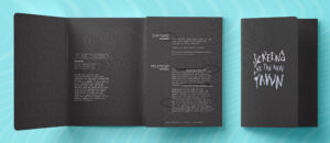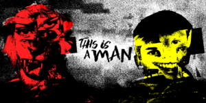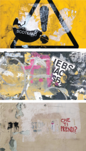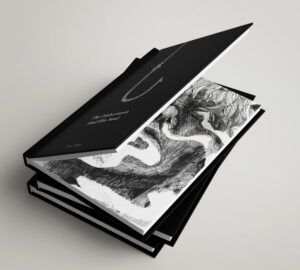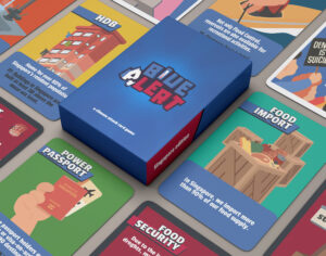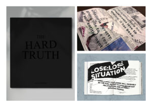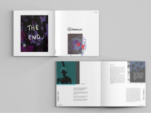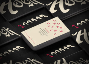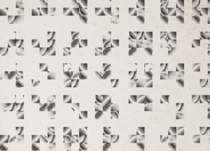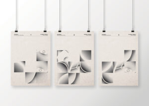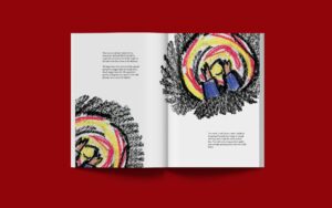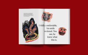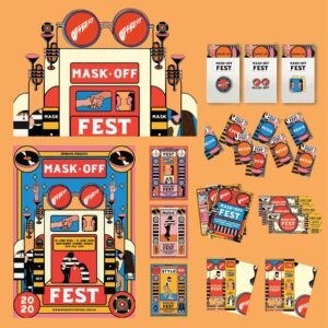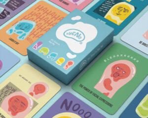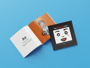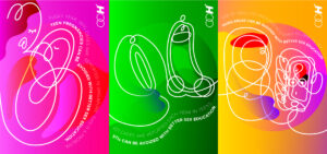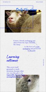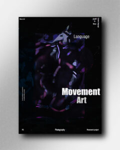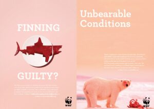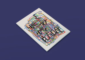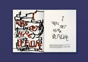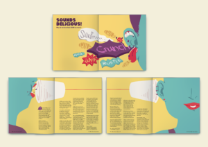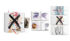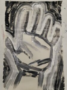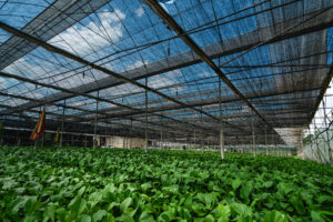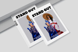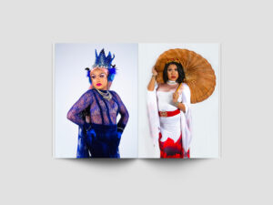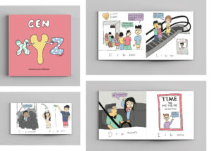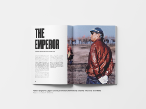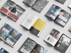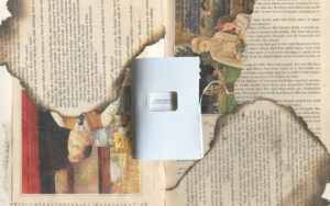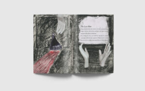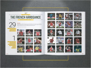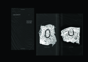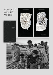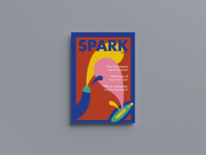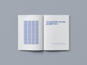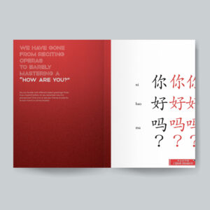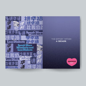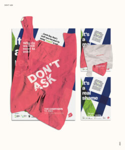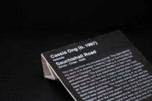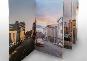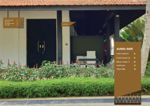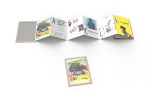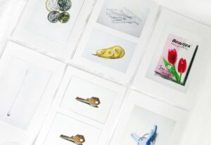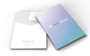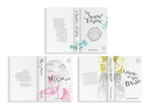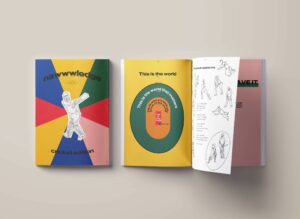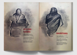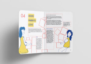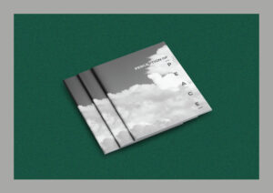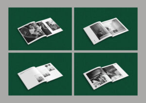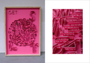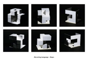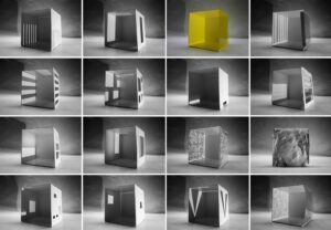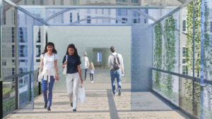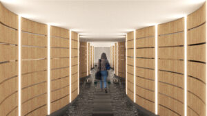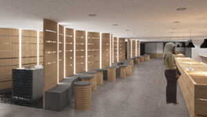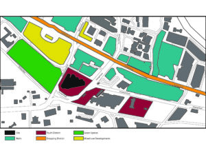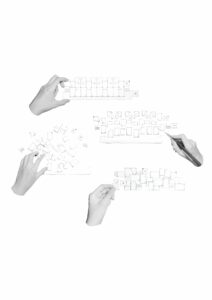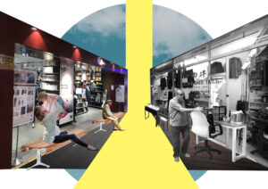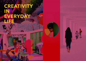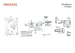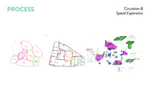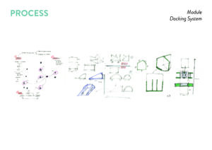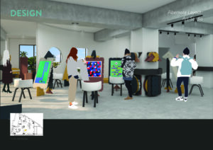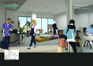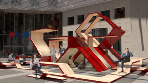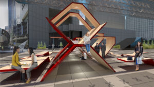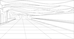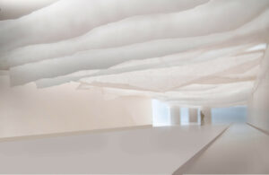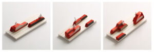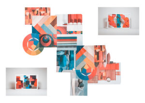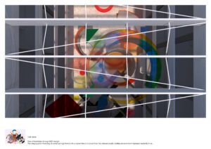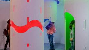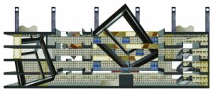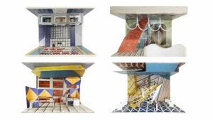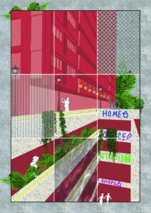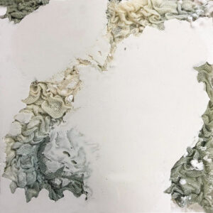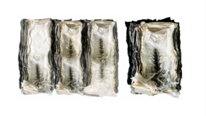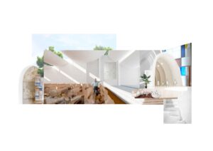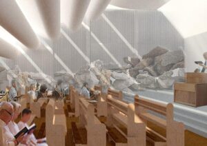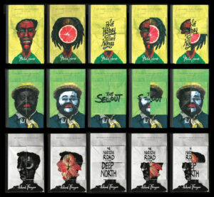
Booker Prize Collection
An unraveling of the plot and characters as the story is revealed stems as my main inspiration for the redesigns of these Booker Prize winners. Readers can interpret their favourite stories through these covers, using the foldable segments to change the image on the front. This lets them continue engaging with the story even after finishing the book and create a memorable experience for the reader.

Booker Prize Collection
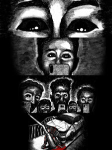
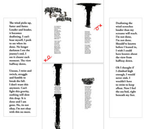
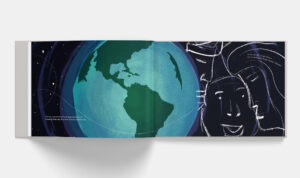
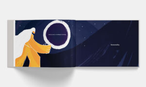
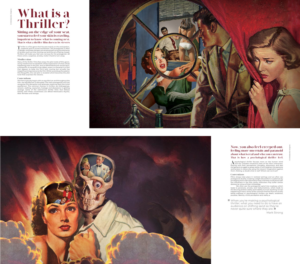
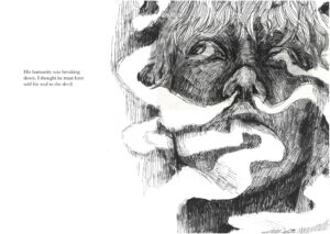
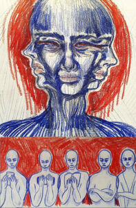
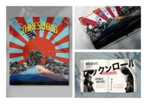
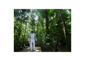
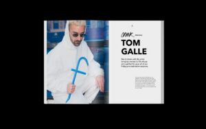
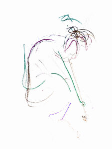
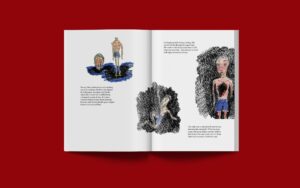
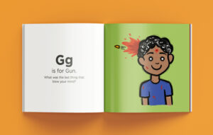
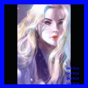
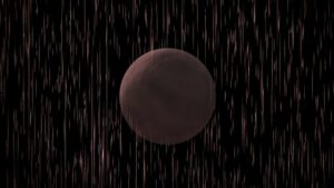
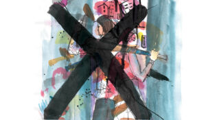
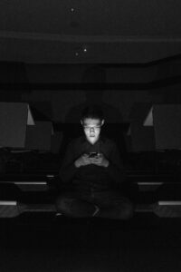
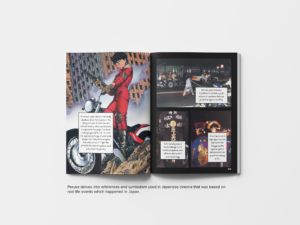
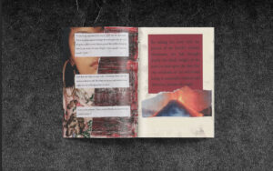
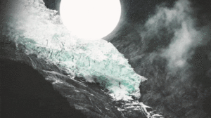
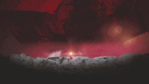
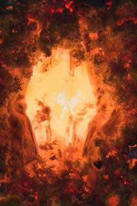
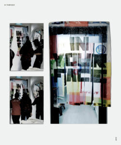
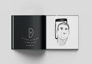
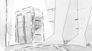
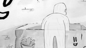
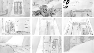
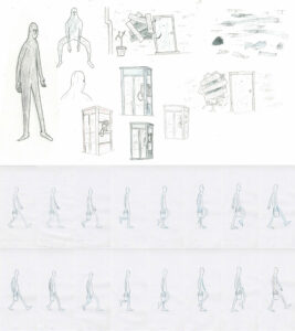
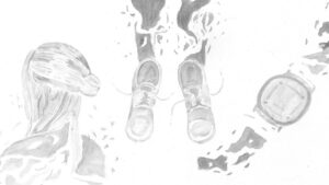
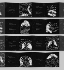
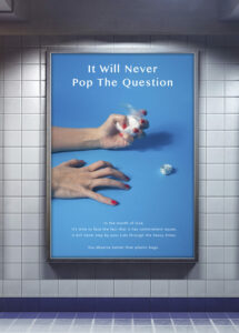
Extraterrestrial
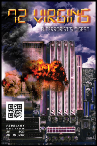
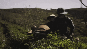
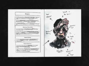
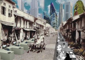
'Extraterrestrial' explores the relationship between human behaviour and the mobile phone. How does it affect the way we see things and how do we act in these times when a video can spread across the world with a single click? The hand-drawn animation is used to create an ominous, almost horror-like tone, to drive a stronger message.
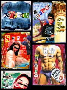
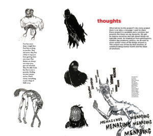
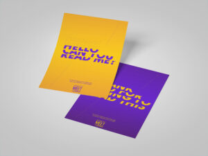
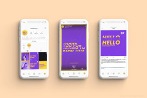
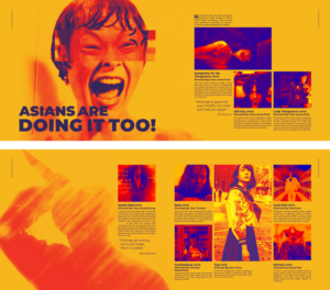
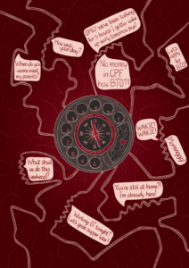
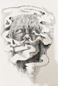
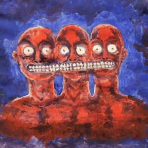
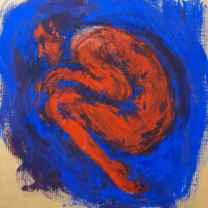
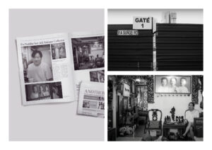
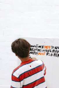
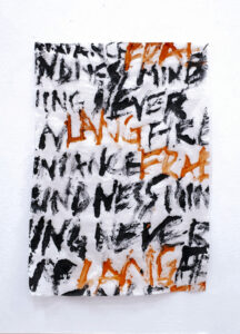
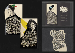
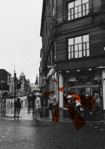
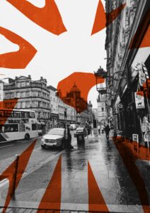
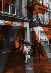
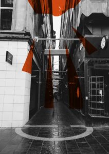
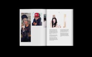
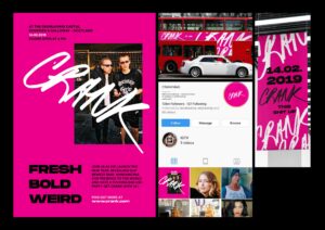
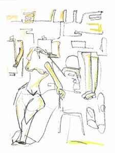
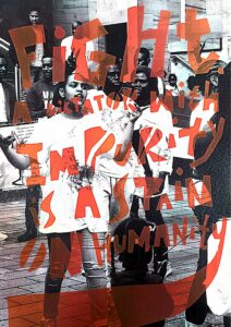
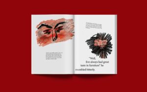
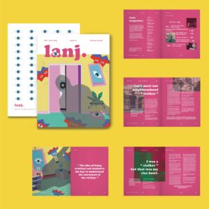
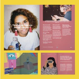
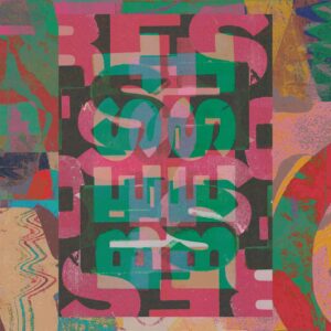
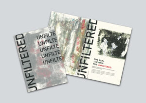
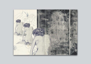
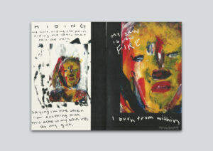
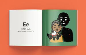
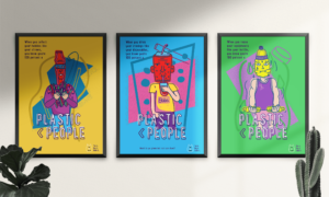
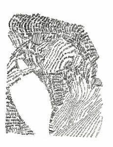
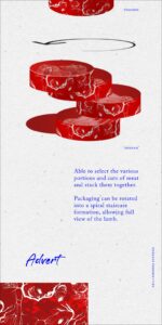
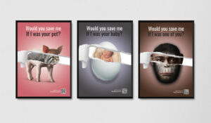
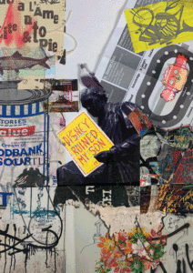
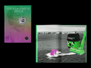
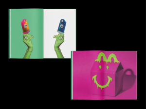
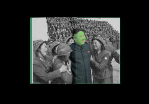
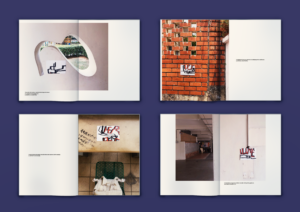
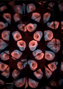
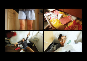
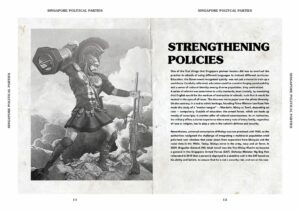
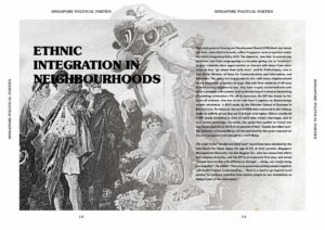
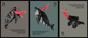
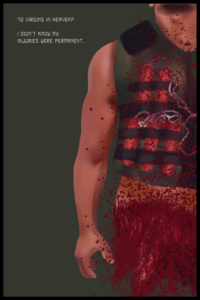
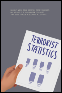
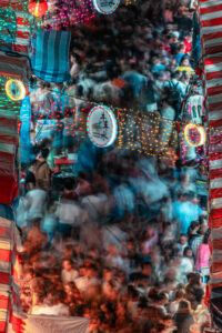
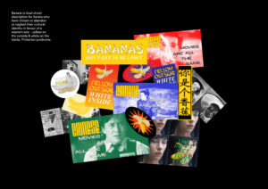
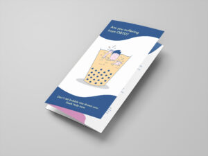
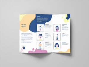
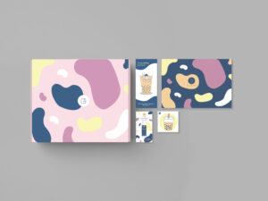
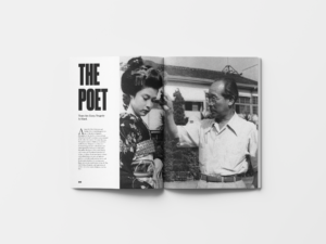
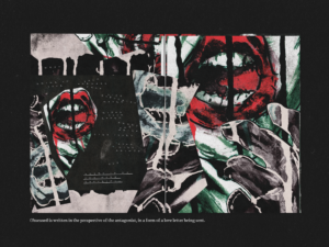
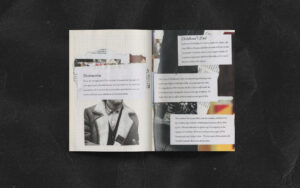
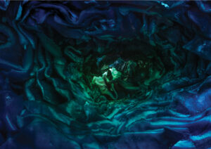
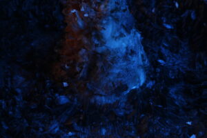
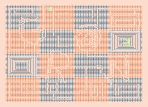
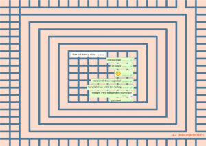
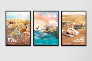
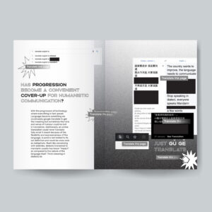
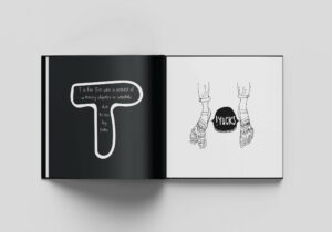
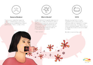
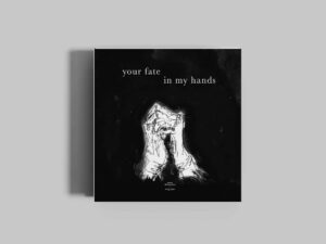
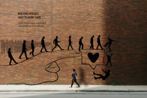
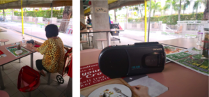
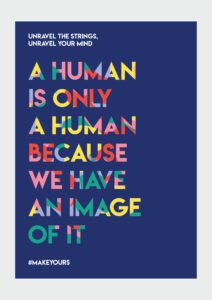
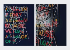
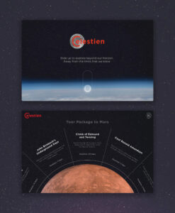
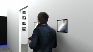
Anomiedia
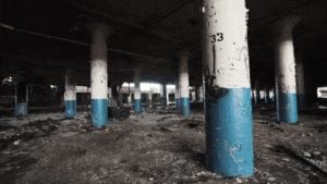
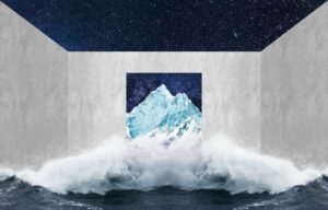
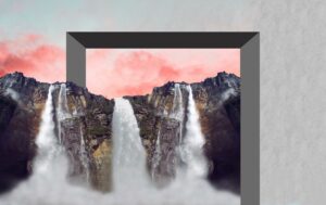
The word anomie is a term used to describe a condition where society provides little moral guidance to individuals. And when the actions of certain social media ‘influencers’ are used as guidance for impressionable teenagers, what becomes of their own actions? Anomiedia is an image series that explores the link between the reality of social media and the facades clouding the true nature of these posts.
Anomiedia
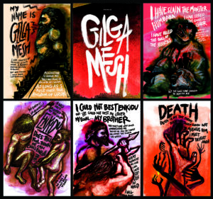
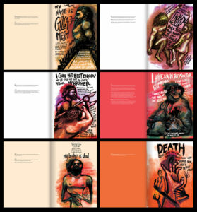
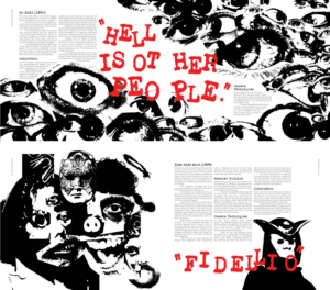
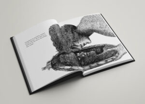
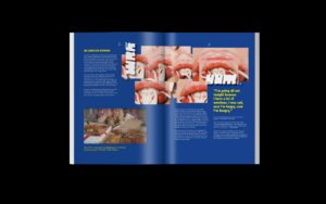
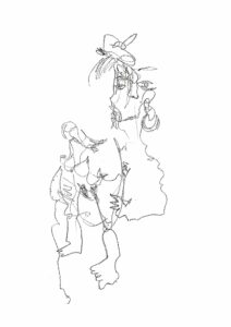
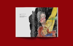
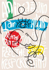
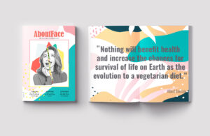
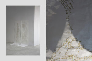
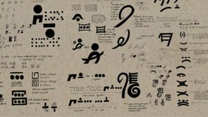
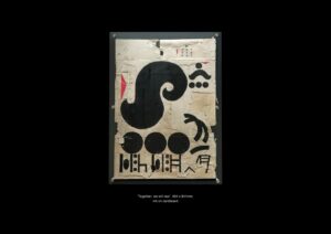
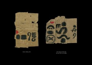
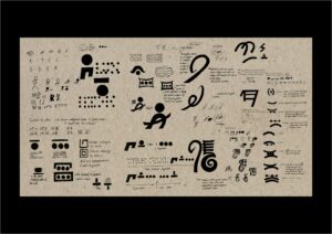
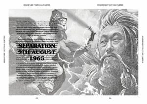
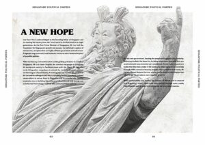
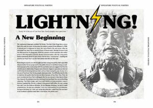
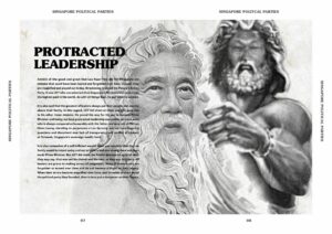
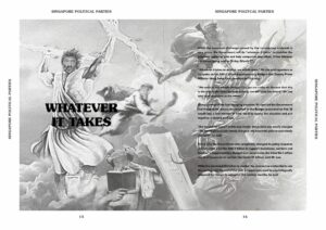
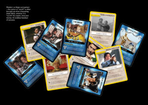
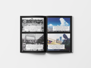
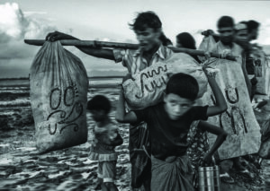
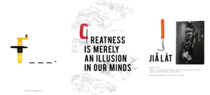
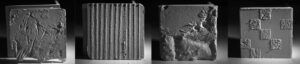
The Epic of Gilgamesh
An adaptation of the historical 'Epic of Gilgamesh' based from the BBC podcast 'In Our Time', this version is retold from the point-of-view of the demigod Gilgamesh himself. The illustrations and typography evoke a more personal story than the original text which lets the reader relate to this larger than life character and even possibly see parallels in his situation to stories told in modern day.