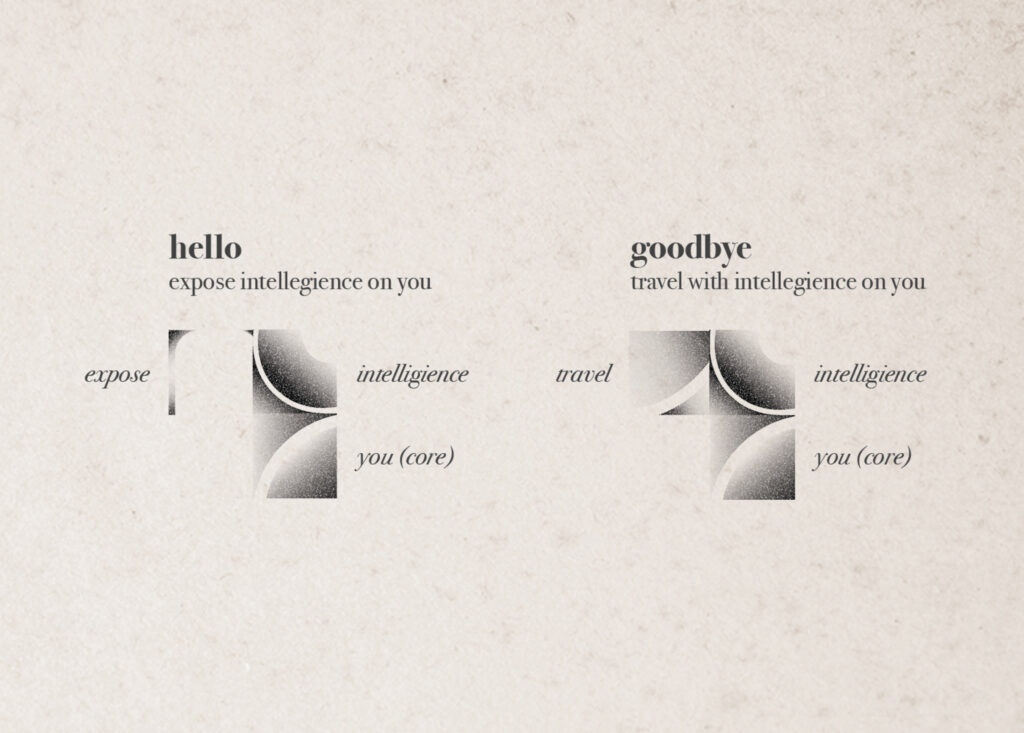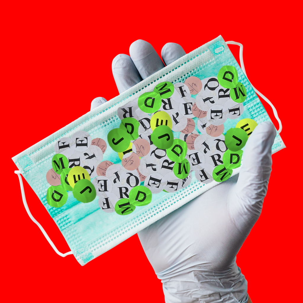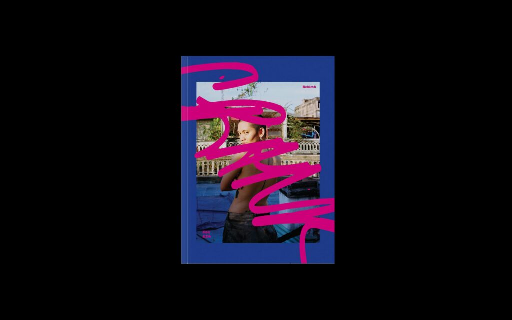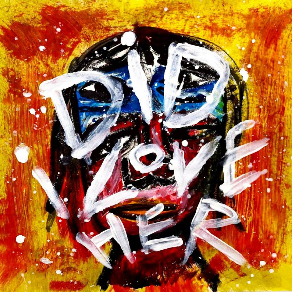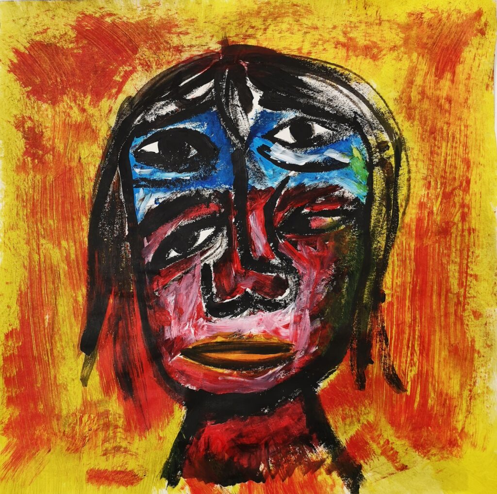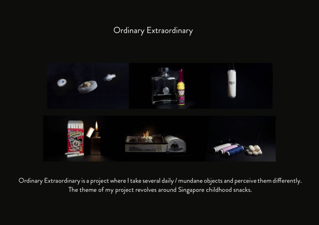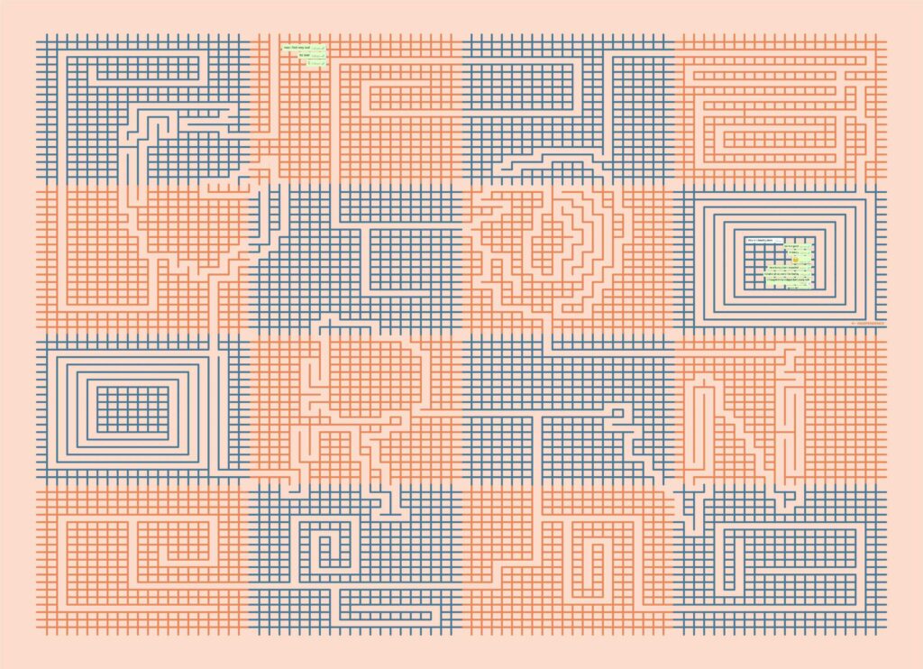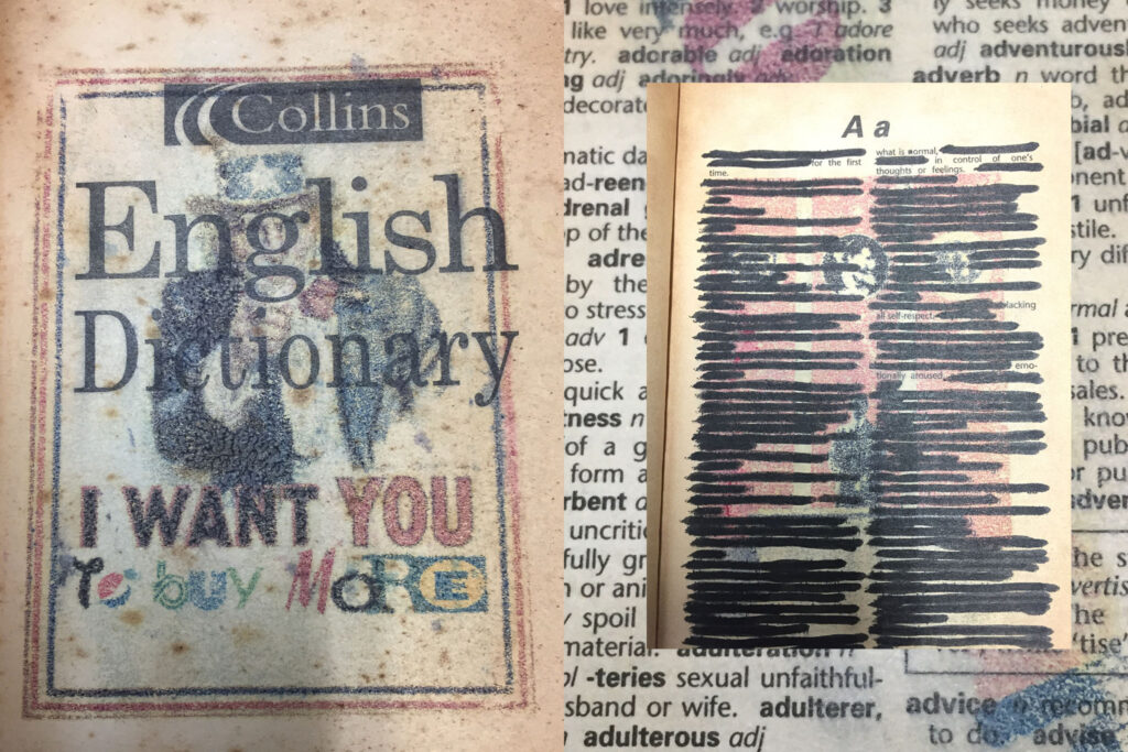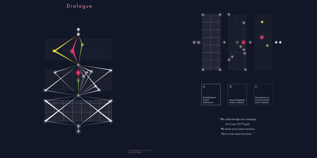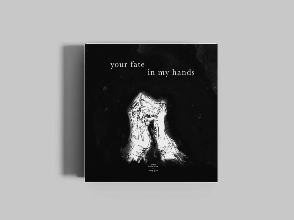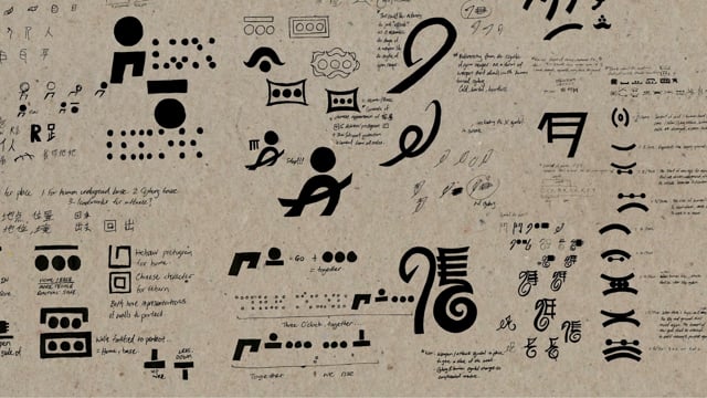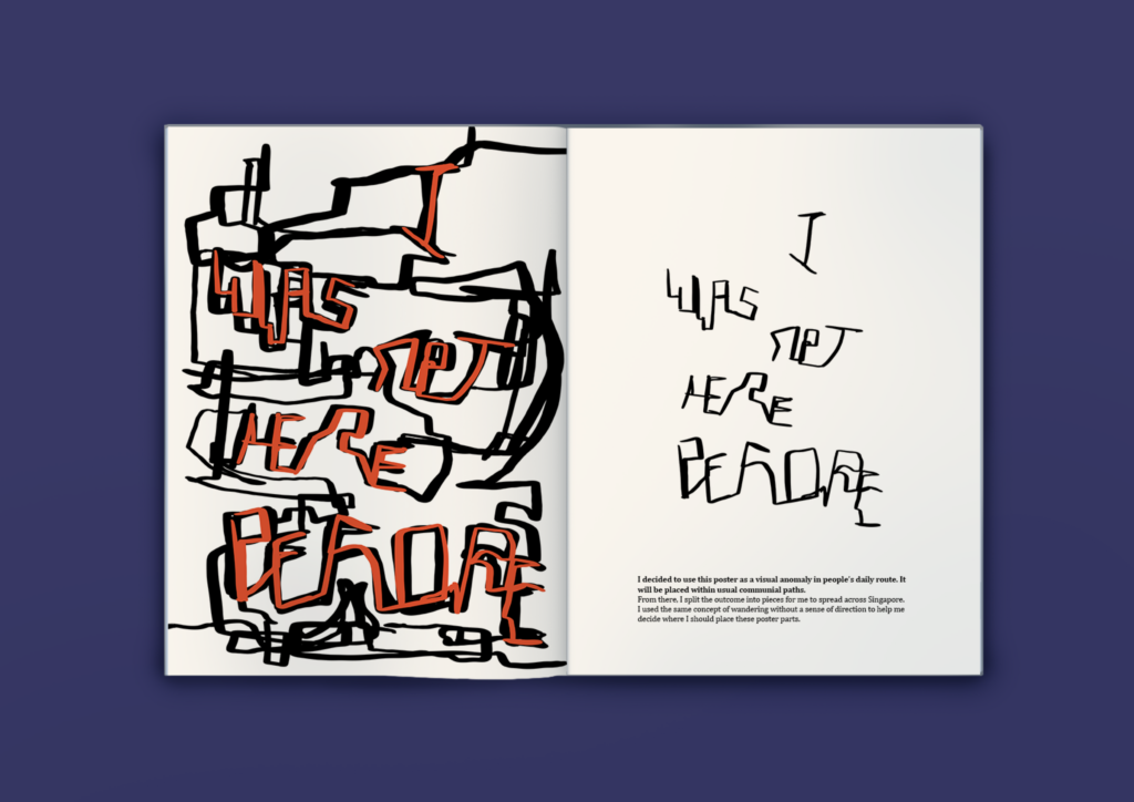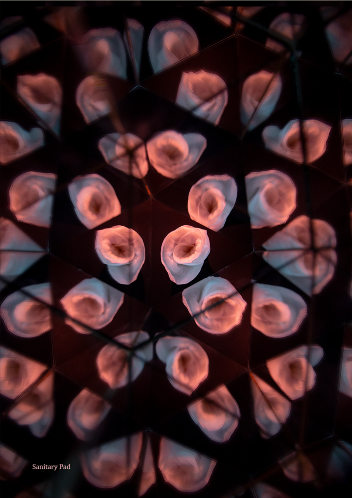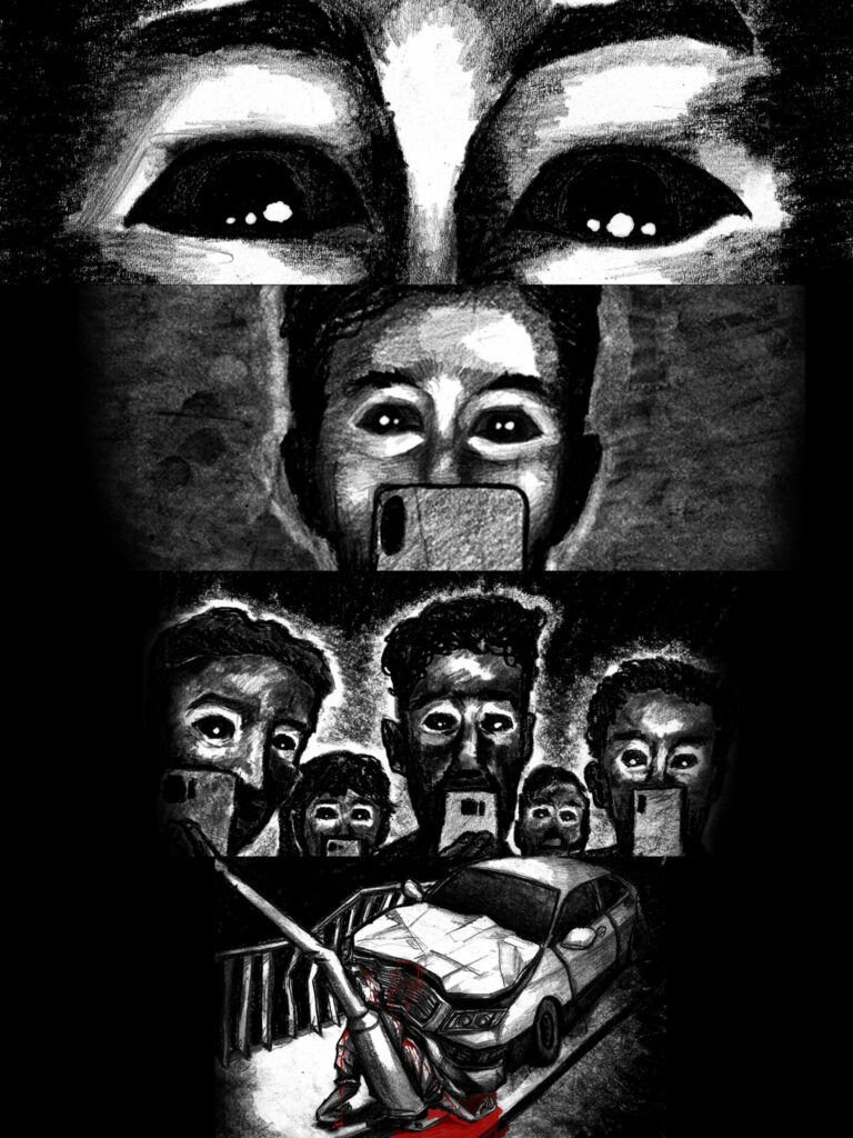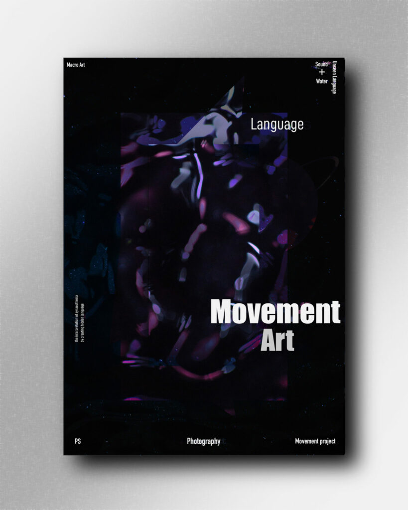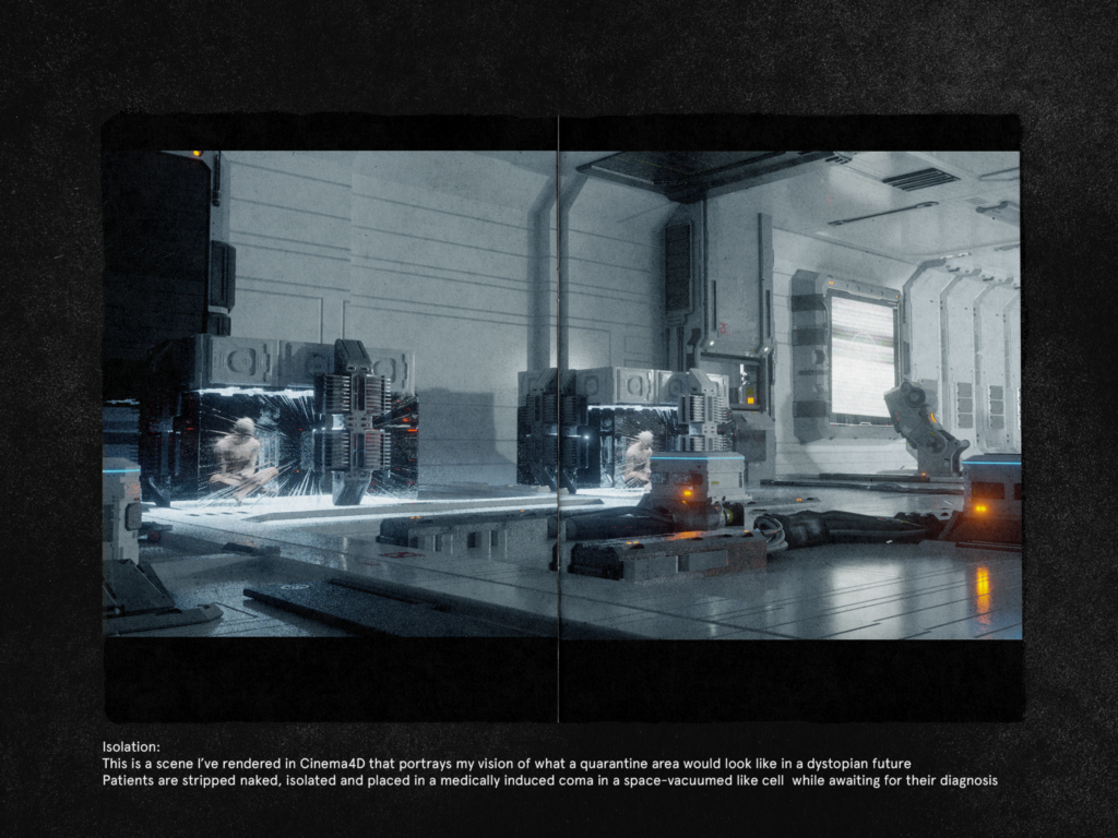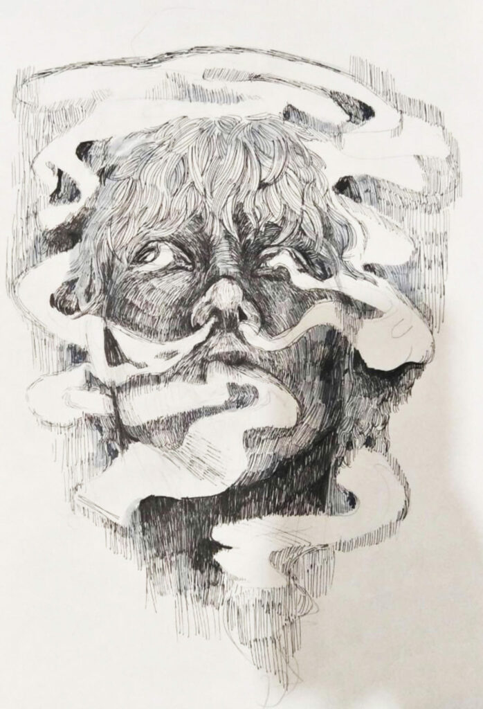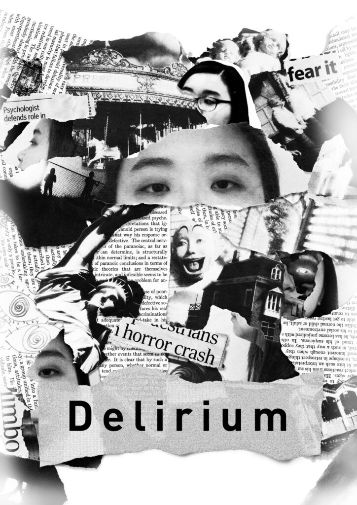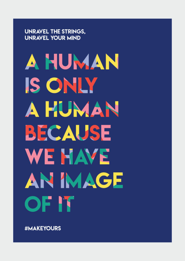
Human
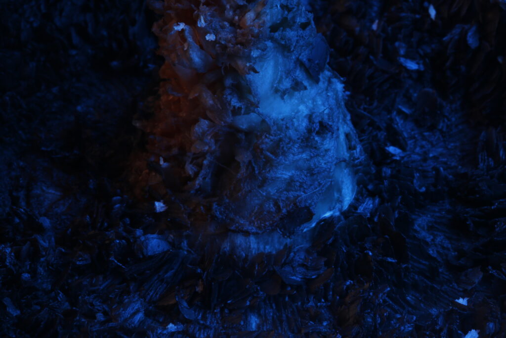
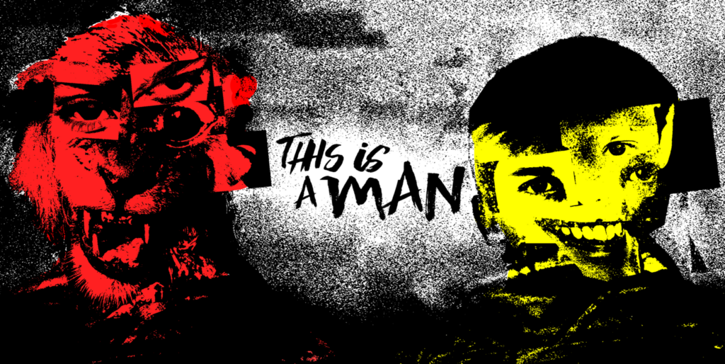
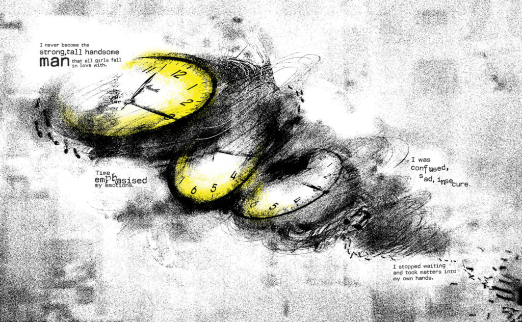
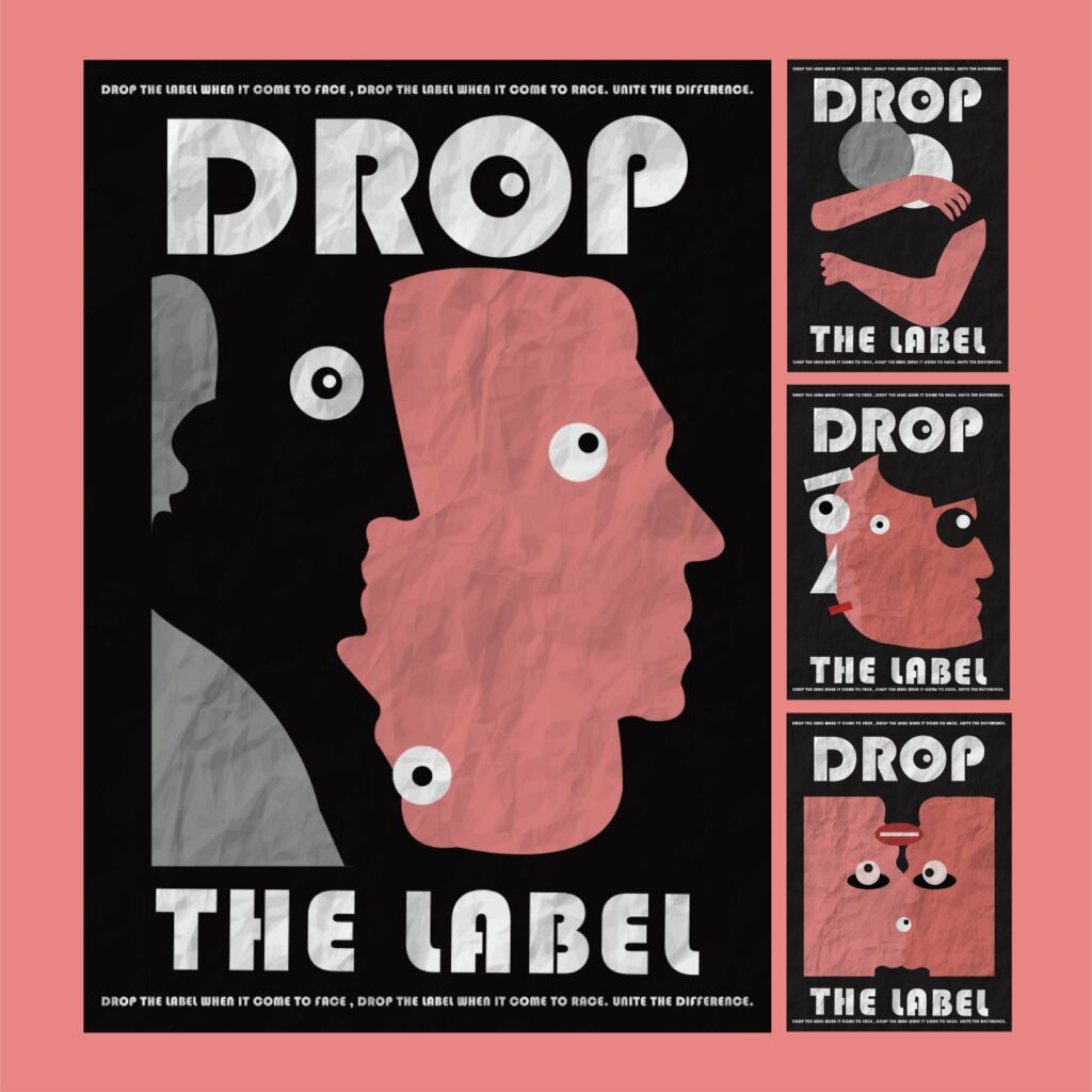
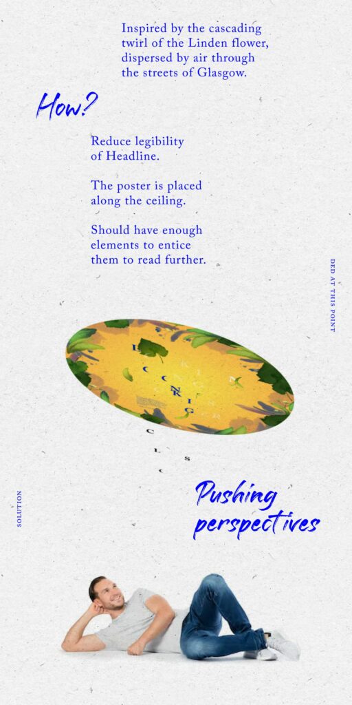
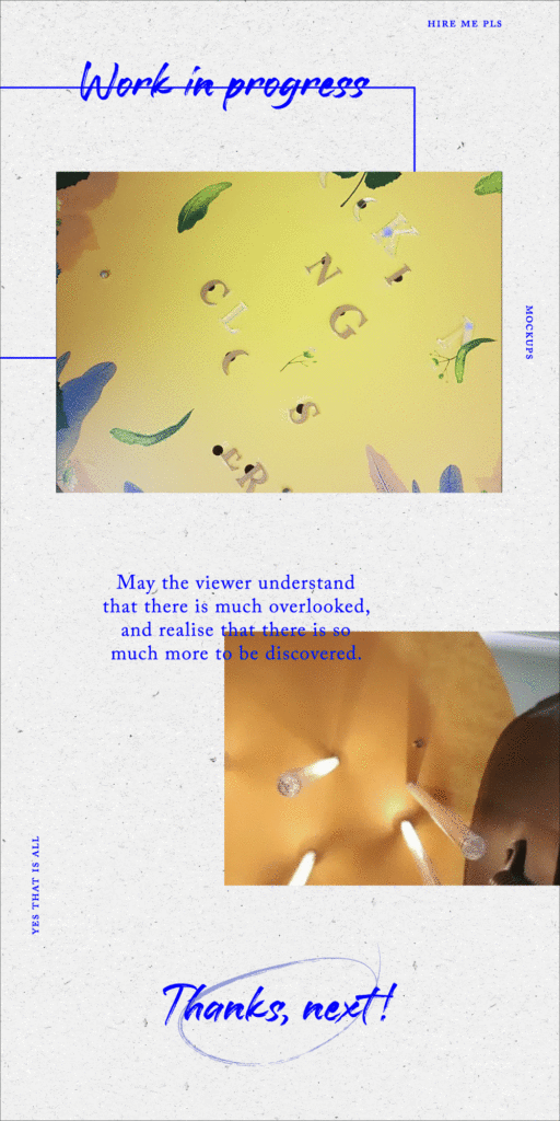
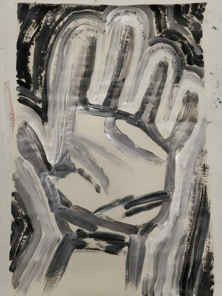
Maybe we should see life with an open mind of what can be, instead of through the narrow lens of what should be. Part 1: ‘Human’ is a reflection of my biggest takeaway studying abroad for the first time. I realised how we humans subject ourselves to preconceived notions and perspectives instead of cherishing the freedom of what could be and are often disappointed if not achieved. With this poster as the base design, I continue by physically adding things on, to create an interactive experience for my audience. "A human is only a human because we have an image of it”
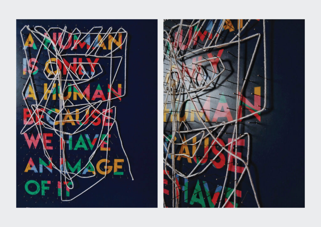
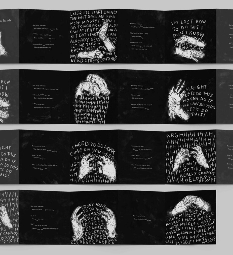
Human
Part 2: Attached are needles to create a string play board to encourage audiences in creating their own image of a human. With every unique interaction, I am hoping to break boundaries of what should be and reinforce the concept of what could be.
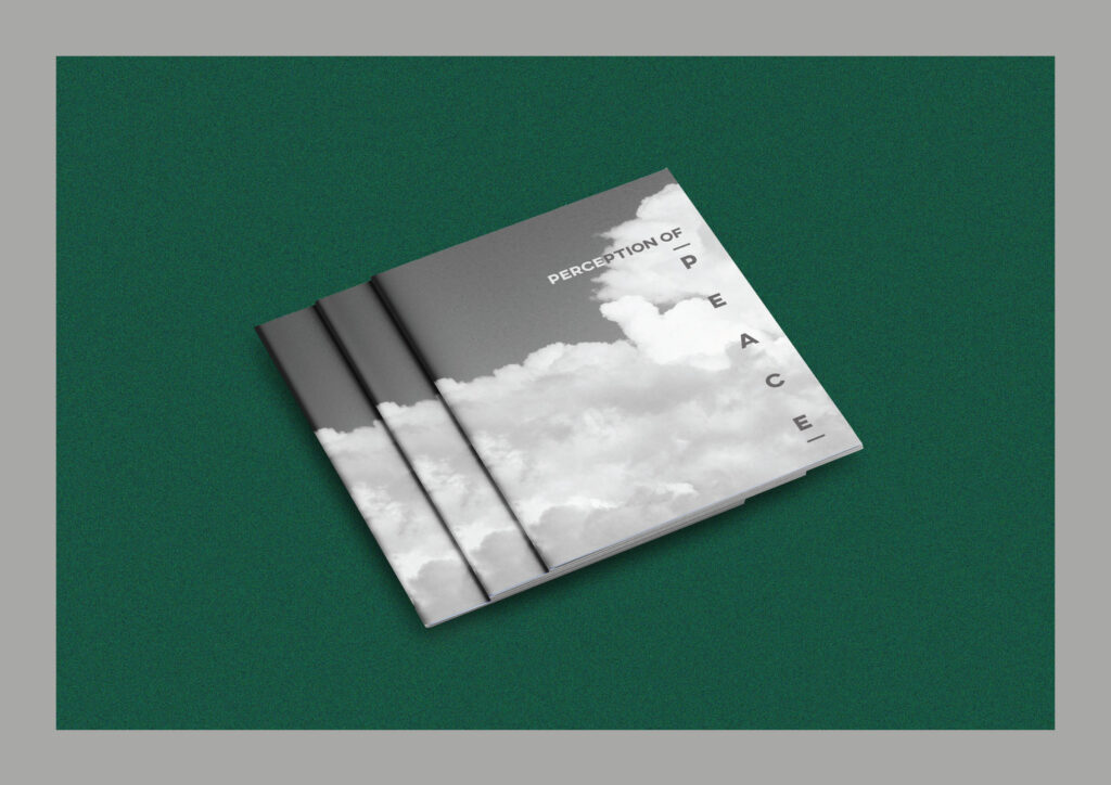
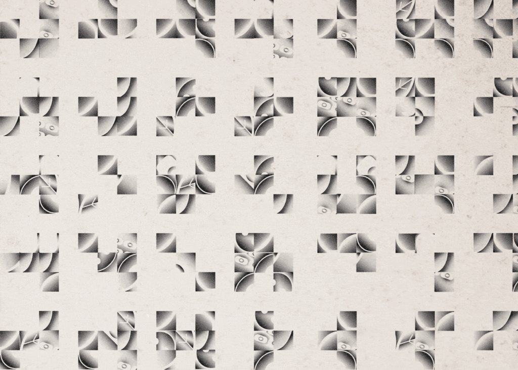
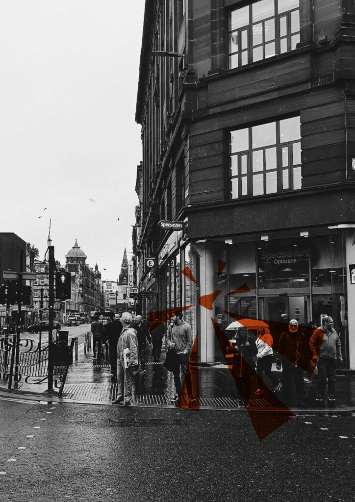
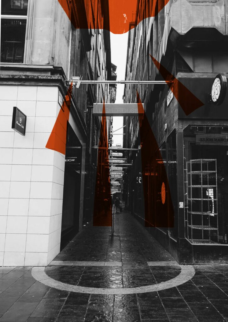
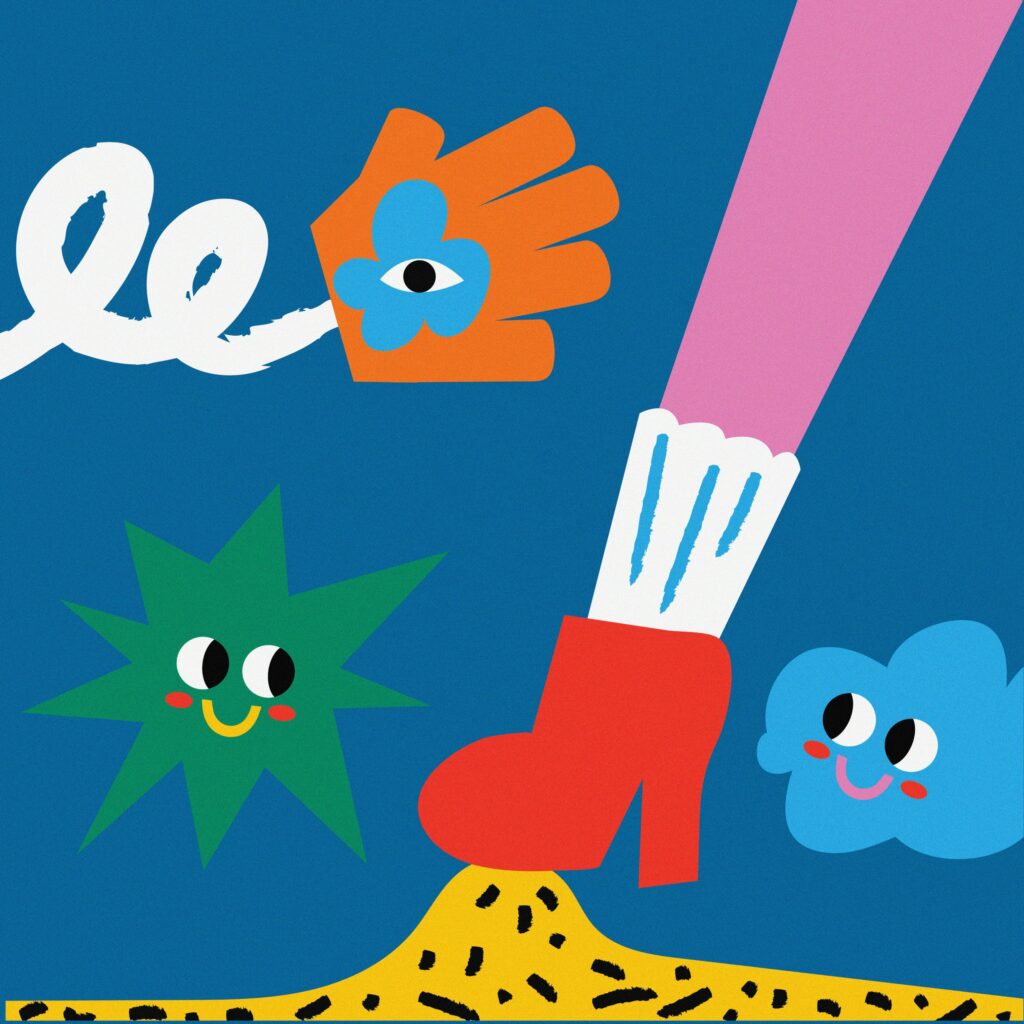
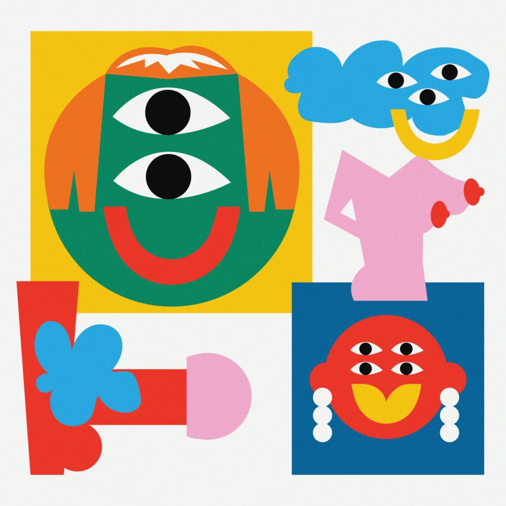
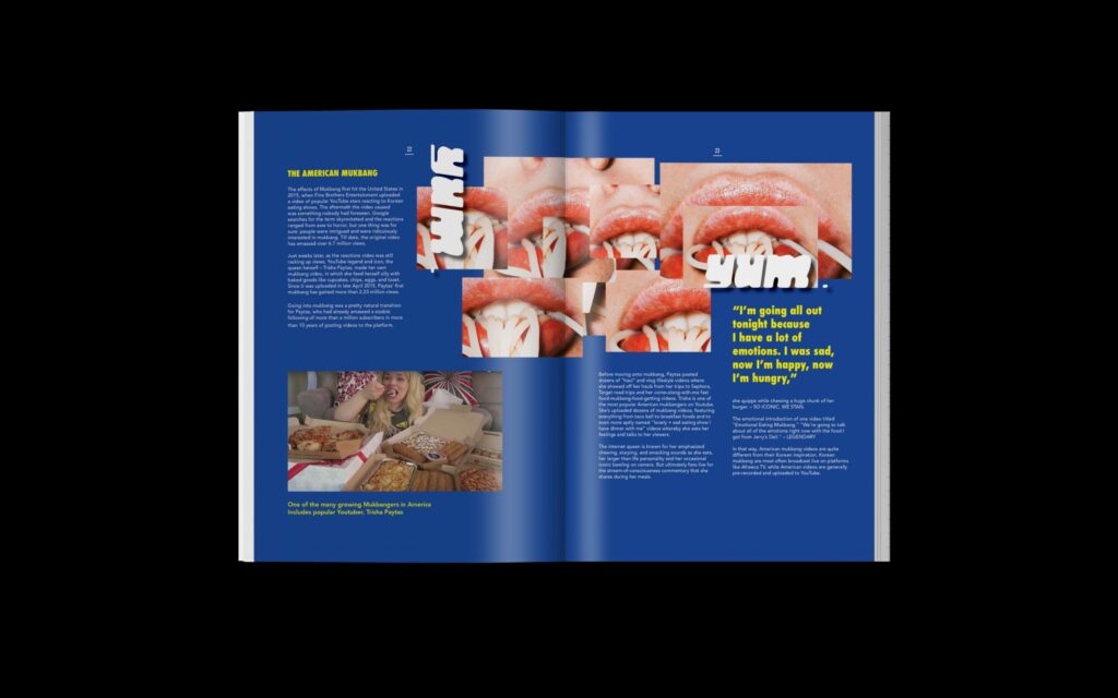
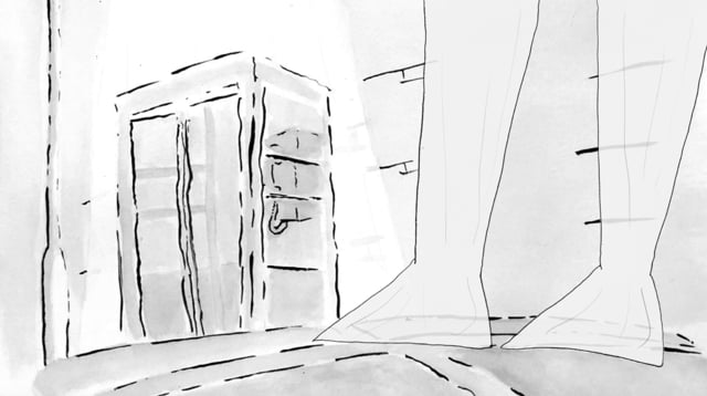
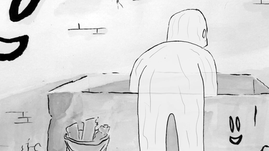
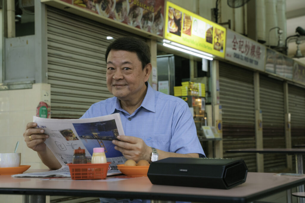
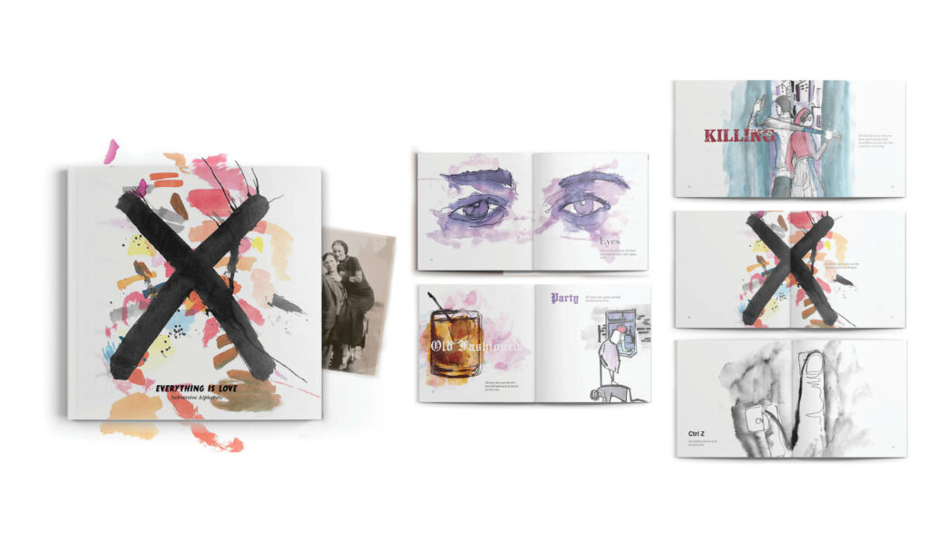
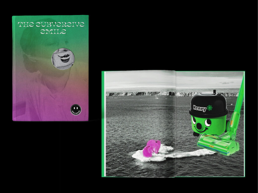
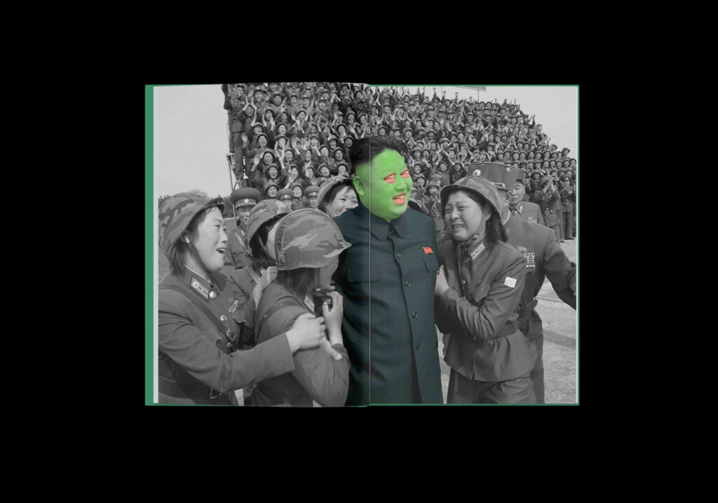
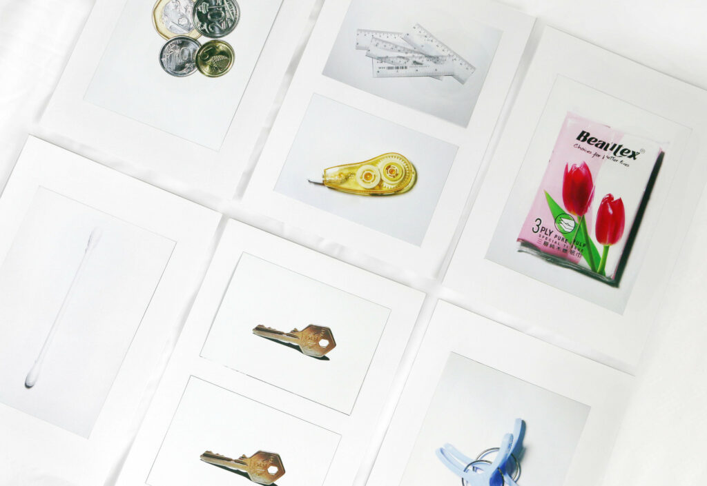
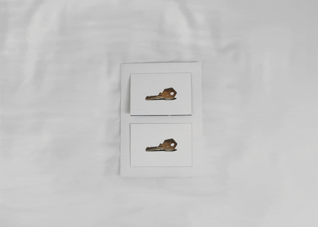
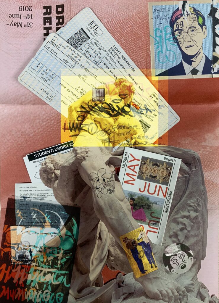
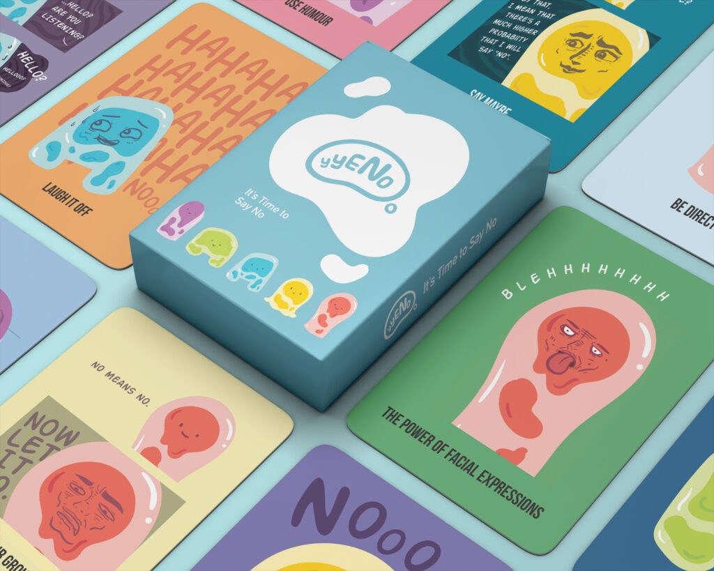
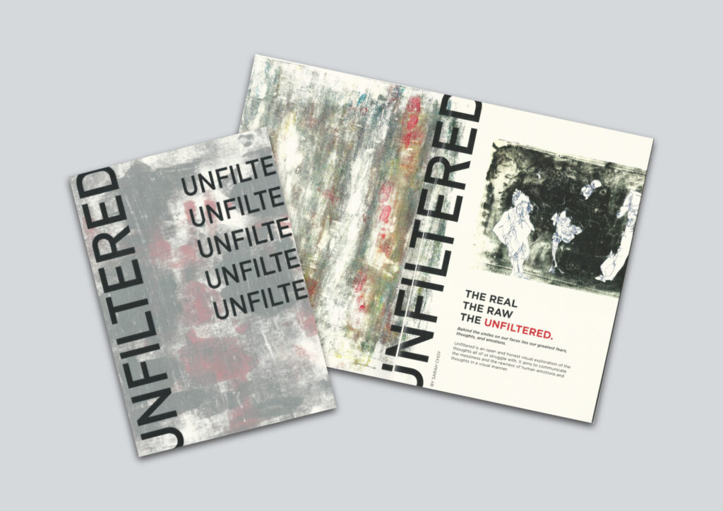
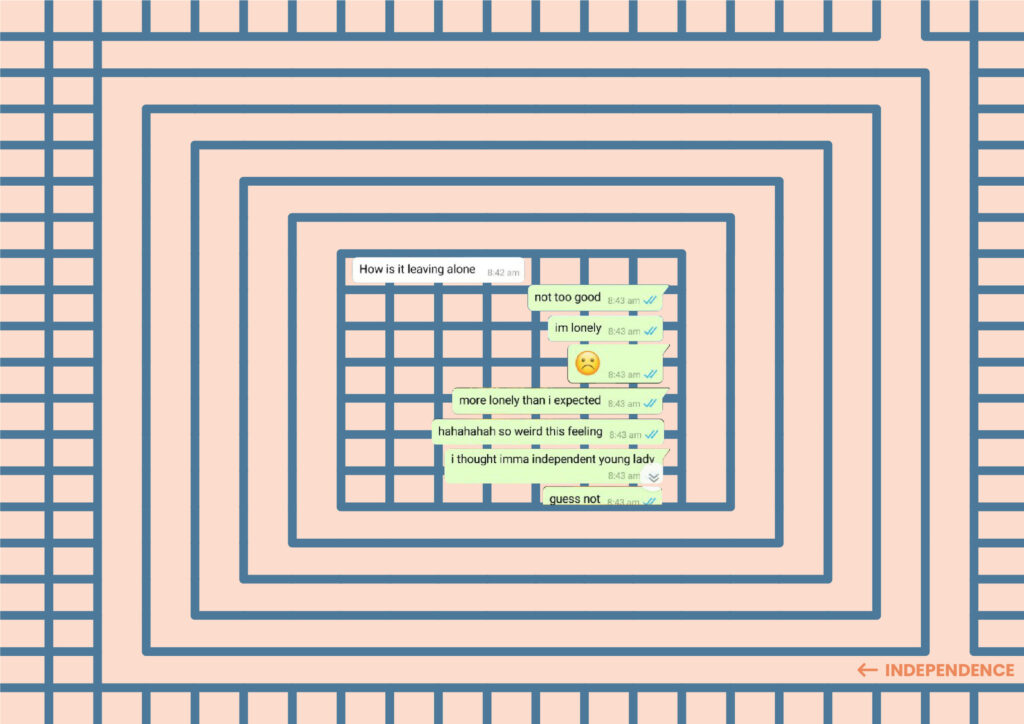
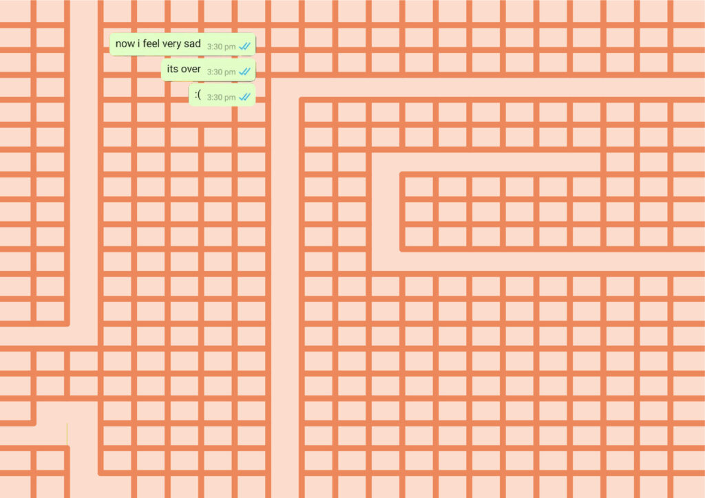
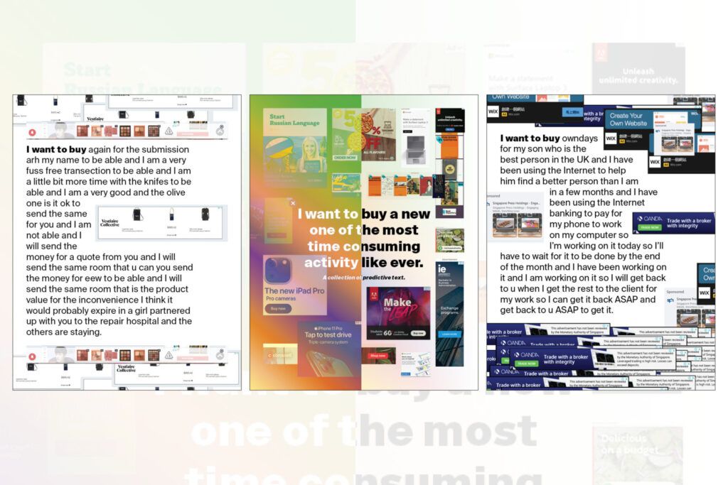
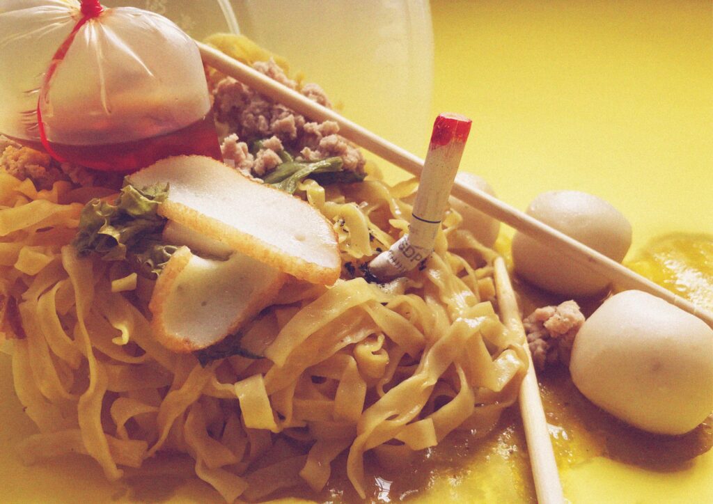
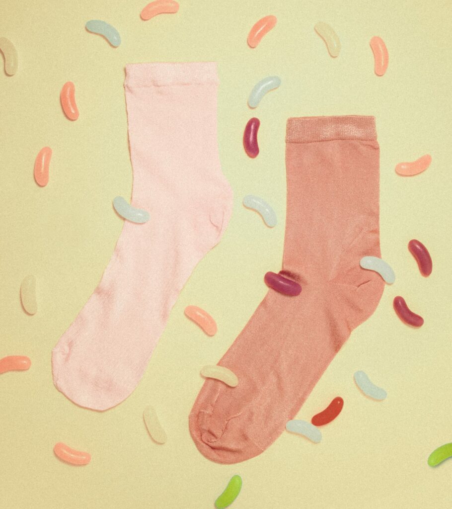
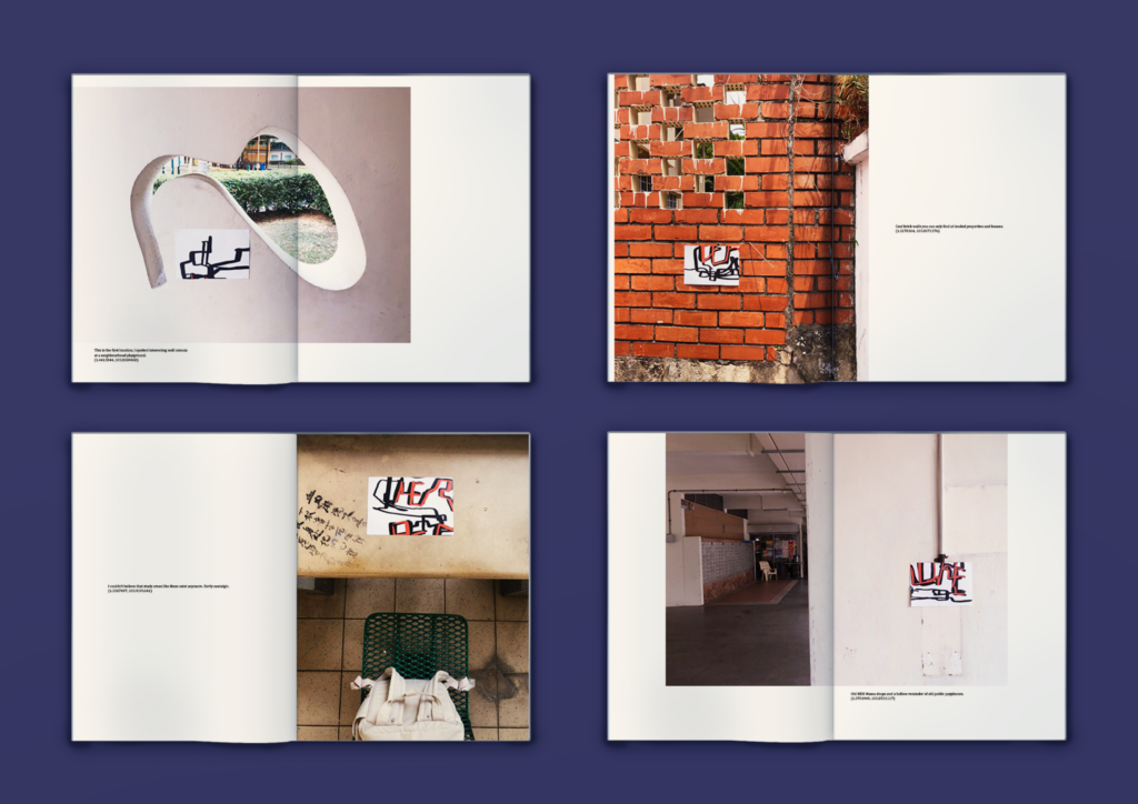
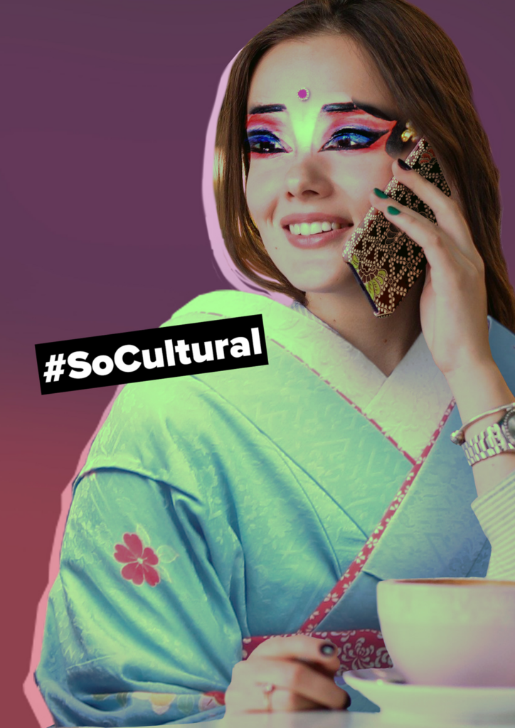
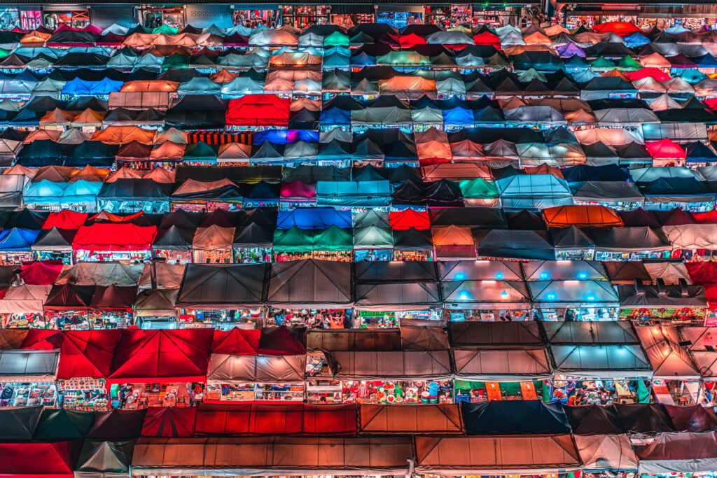
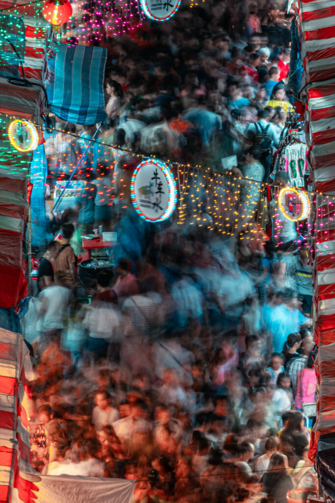
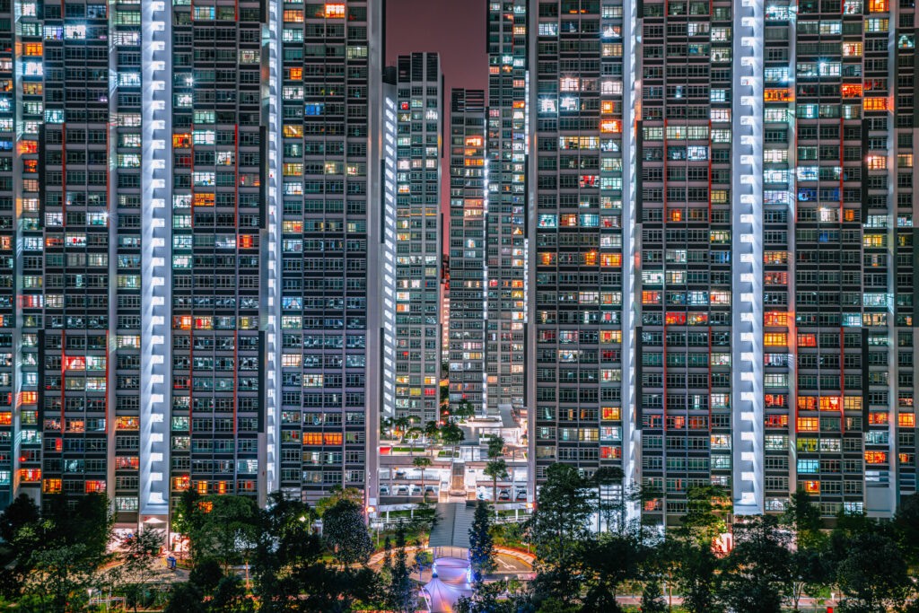
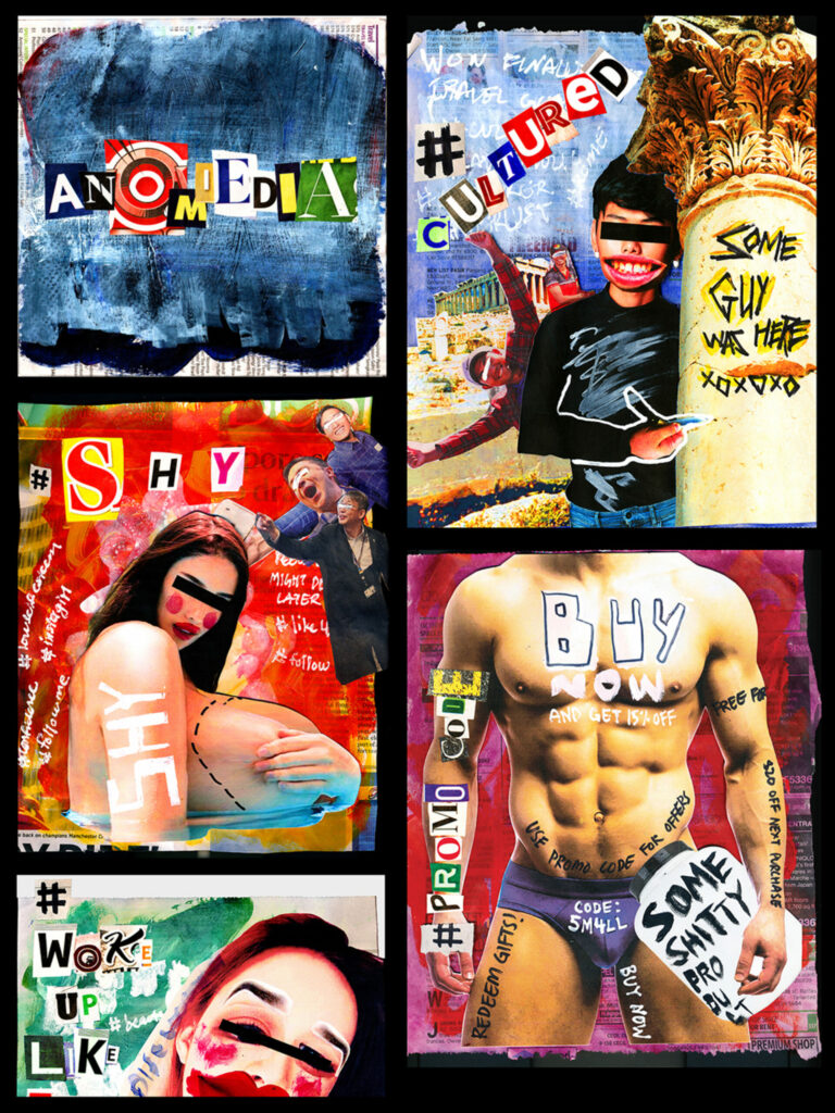
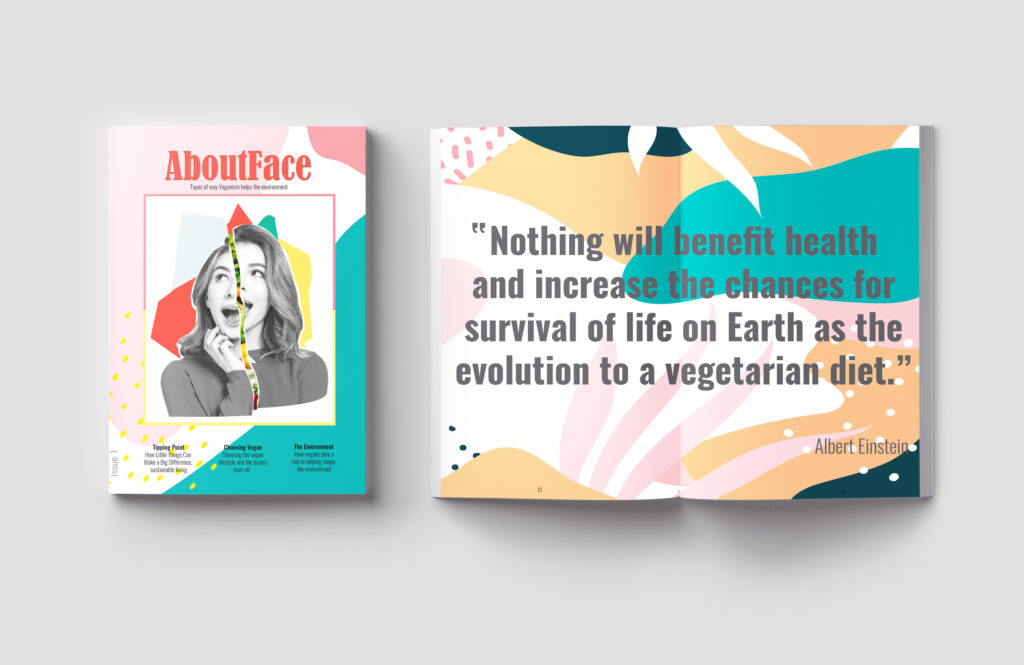
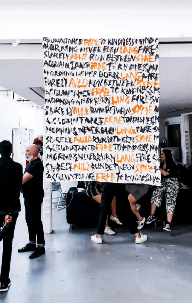
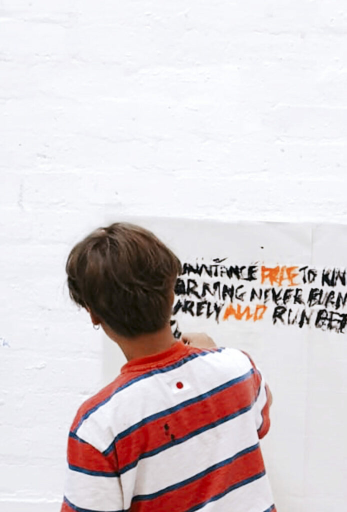
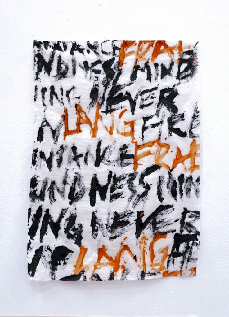
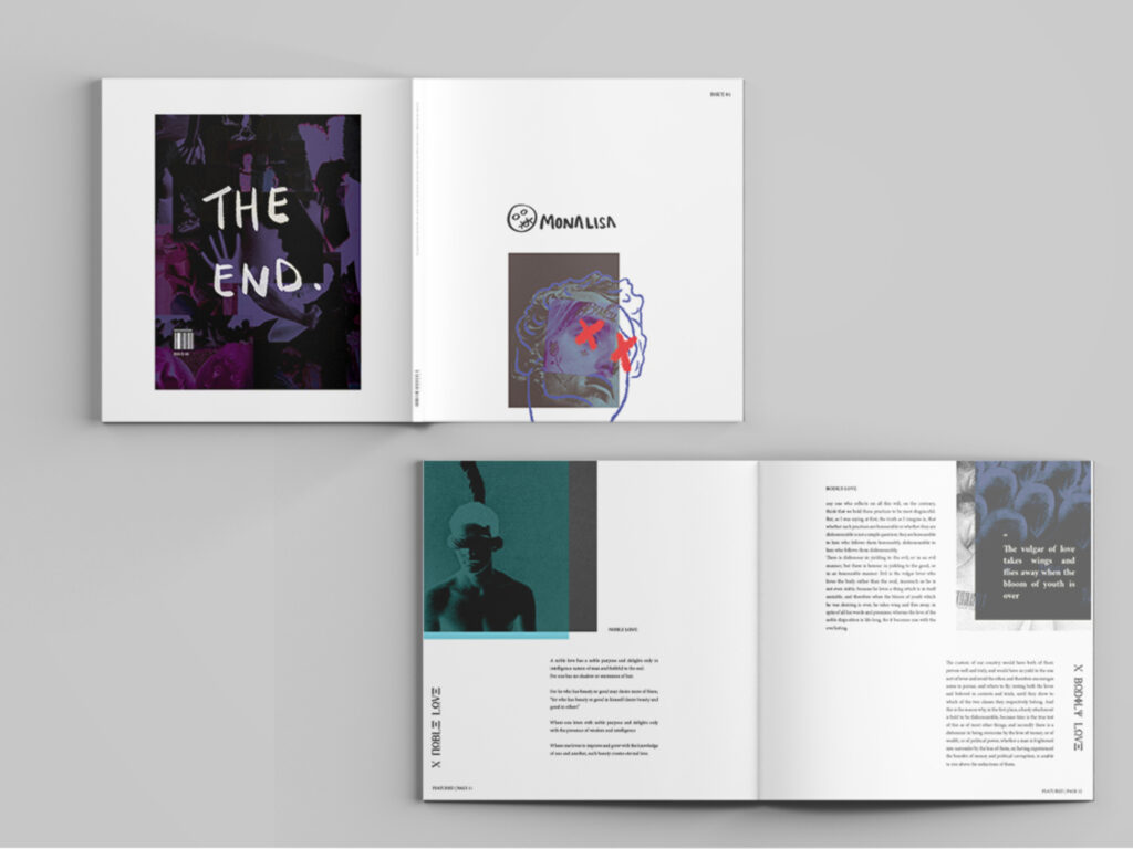
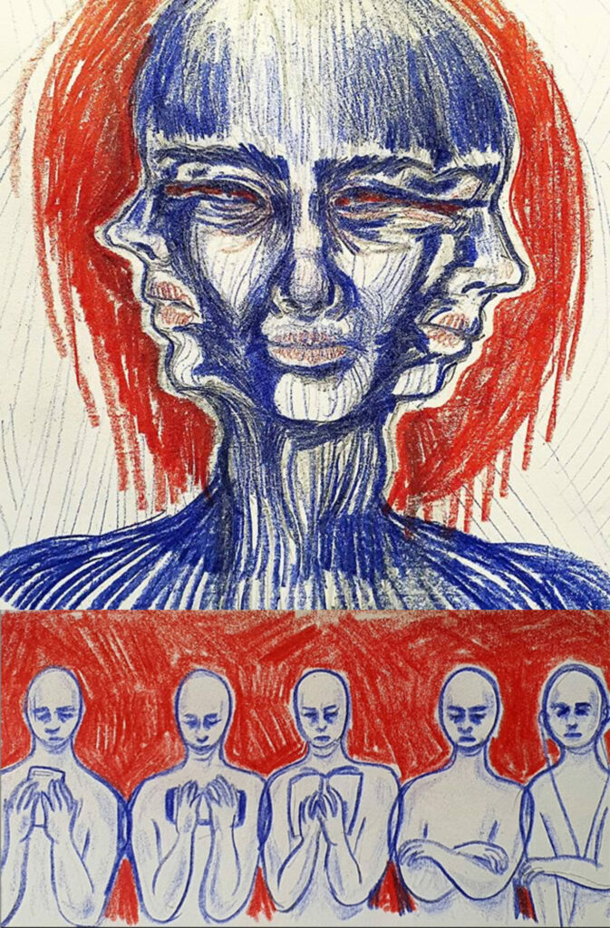
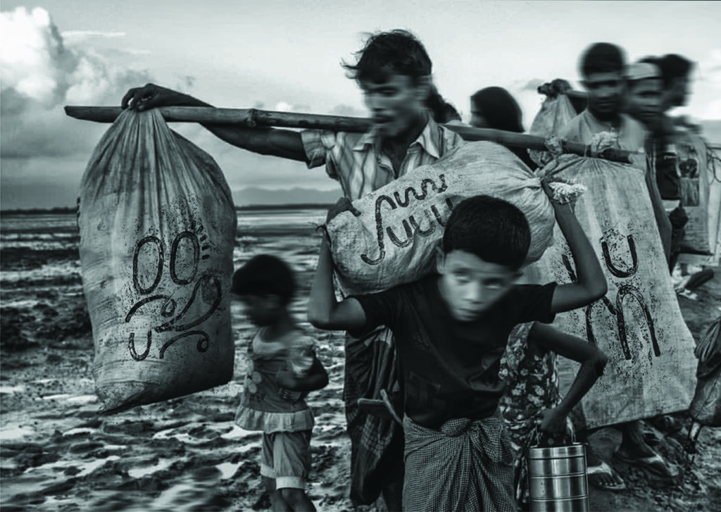
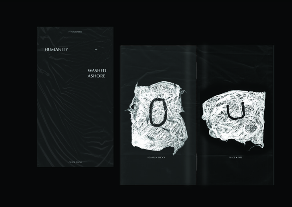
Perception of Peace
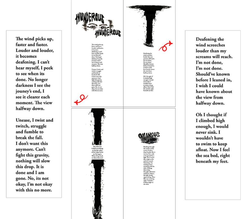
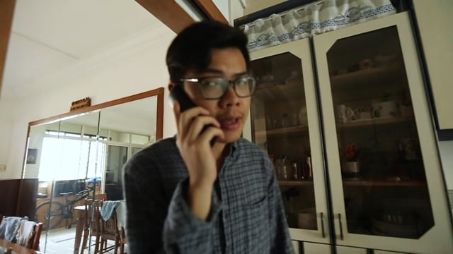
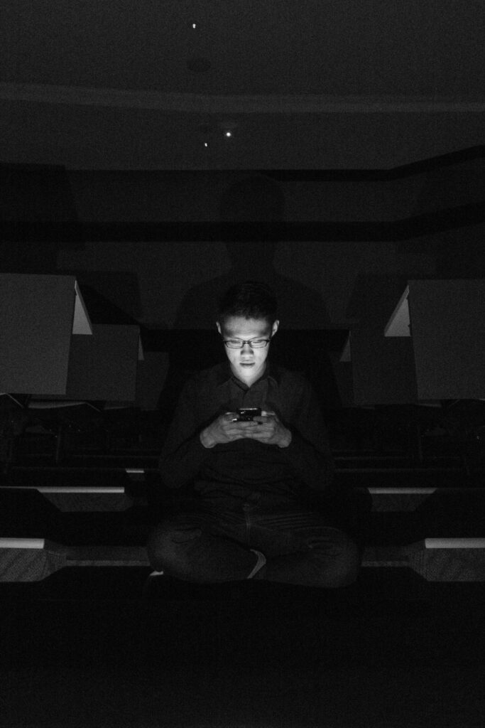
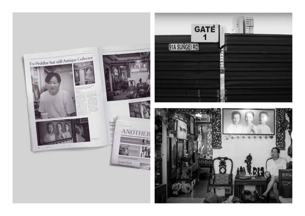
Living in a fast-paced city-state, it comes as second nature to find peace away from the hustle and bustle. Albeit often associated with vast spaces and tranquility, this publication hopes to bring awareness to another perspective of peace by documenting the raw emotion of the things that make our city-state fast moving :- The People
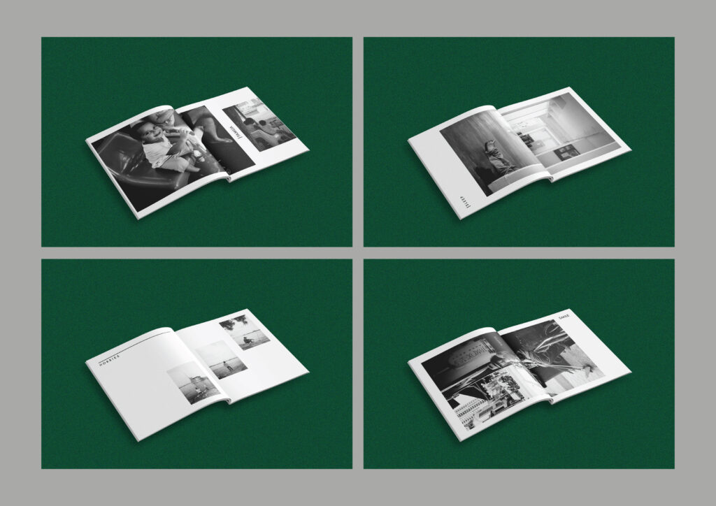
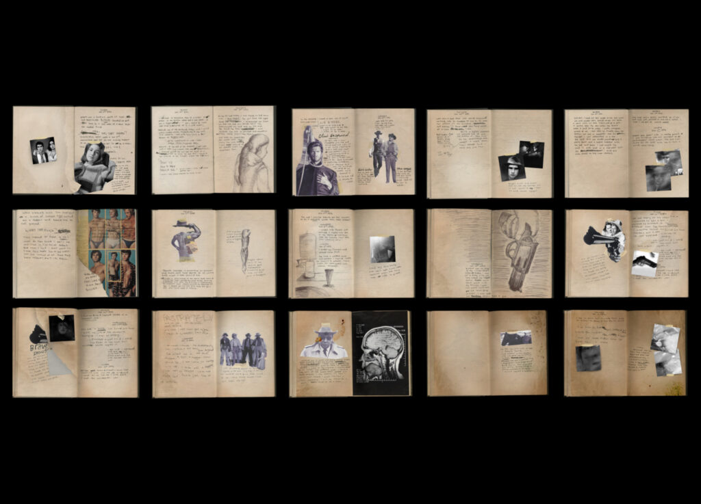
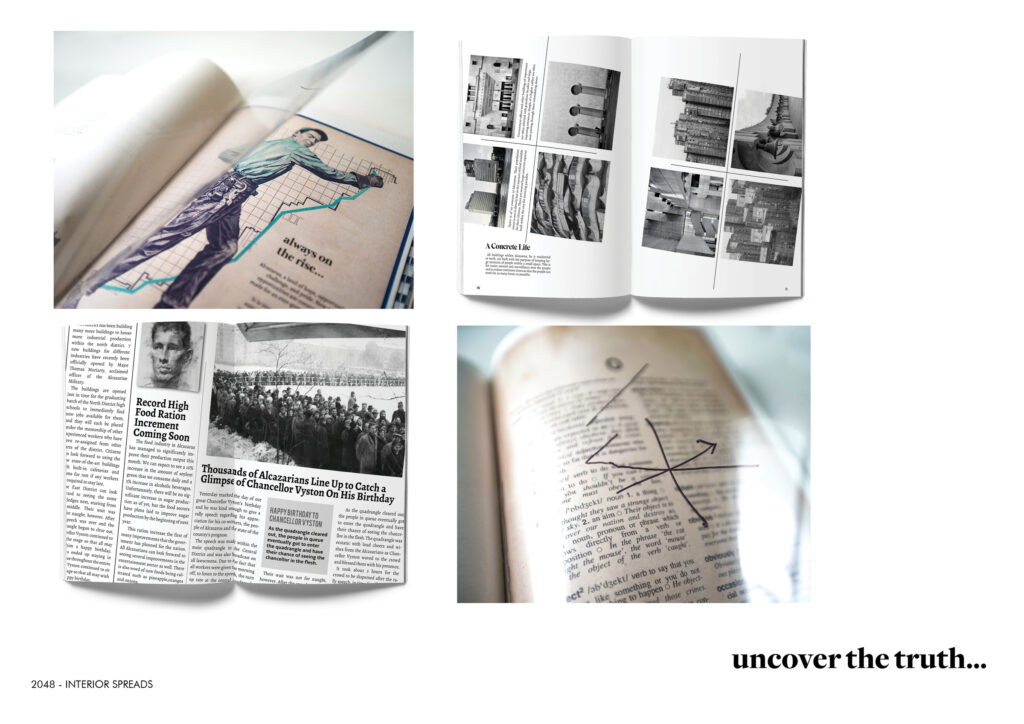
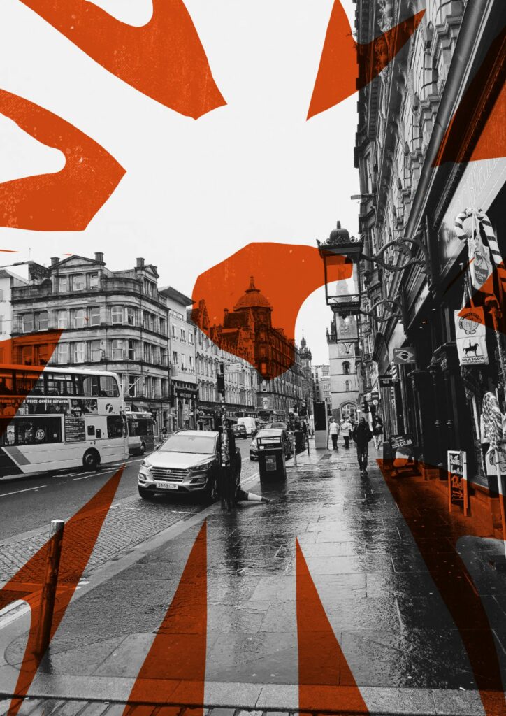
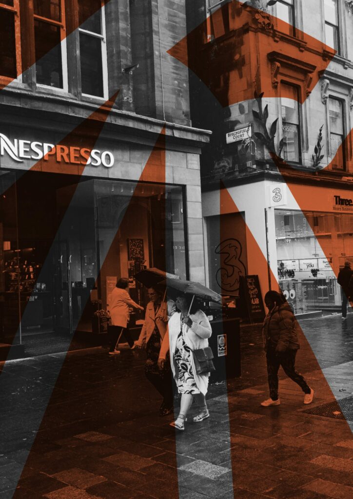
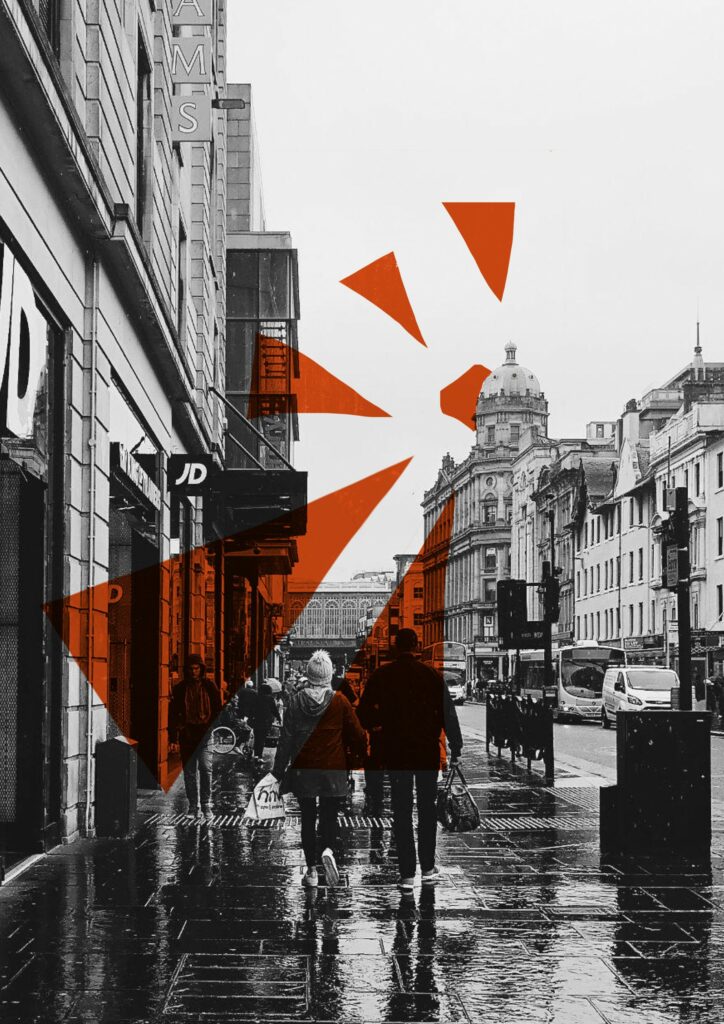
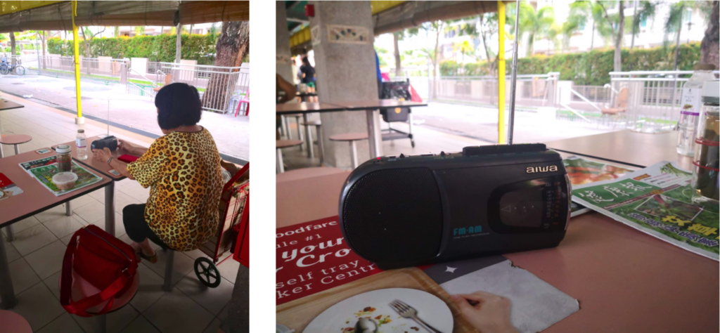
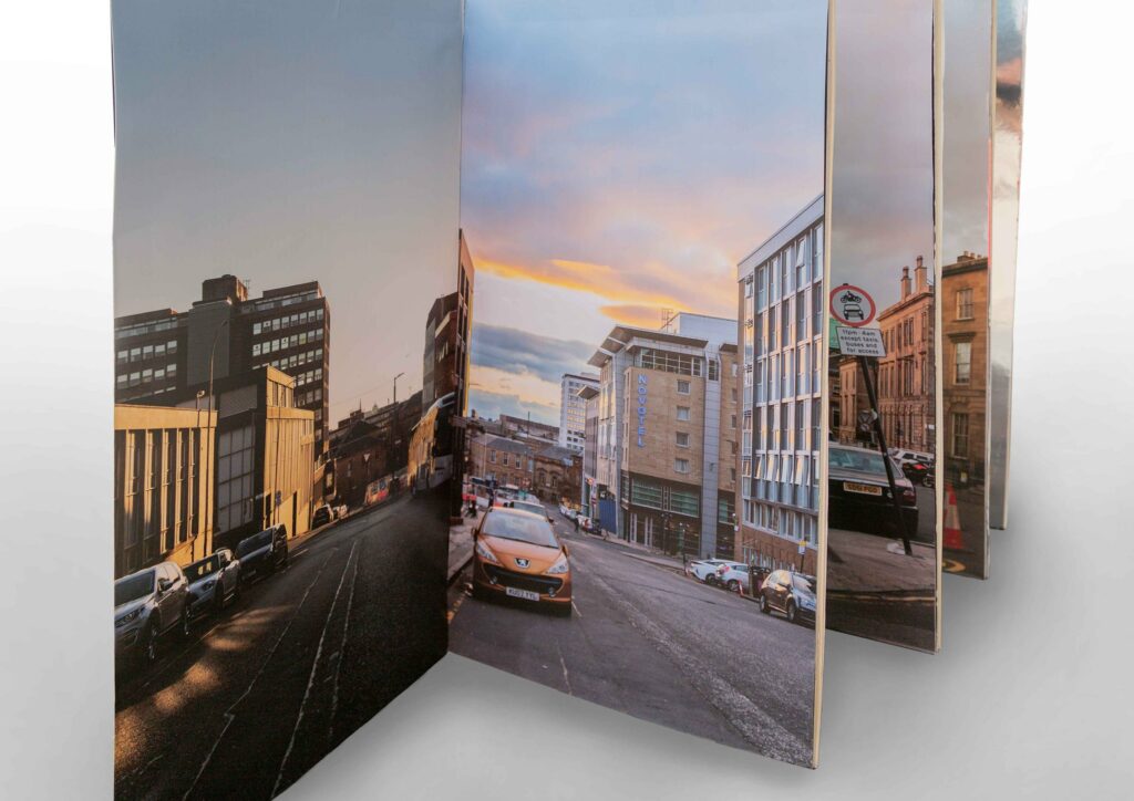
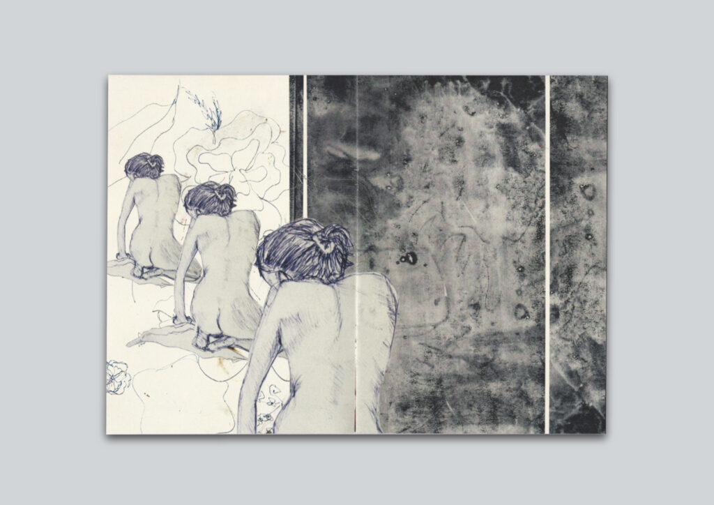
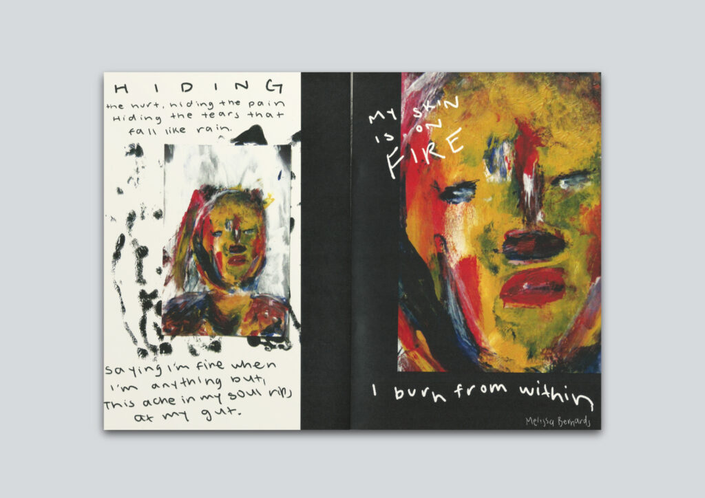
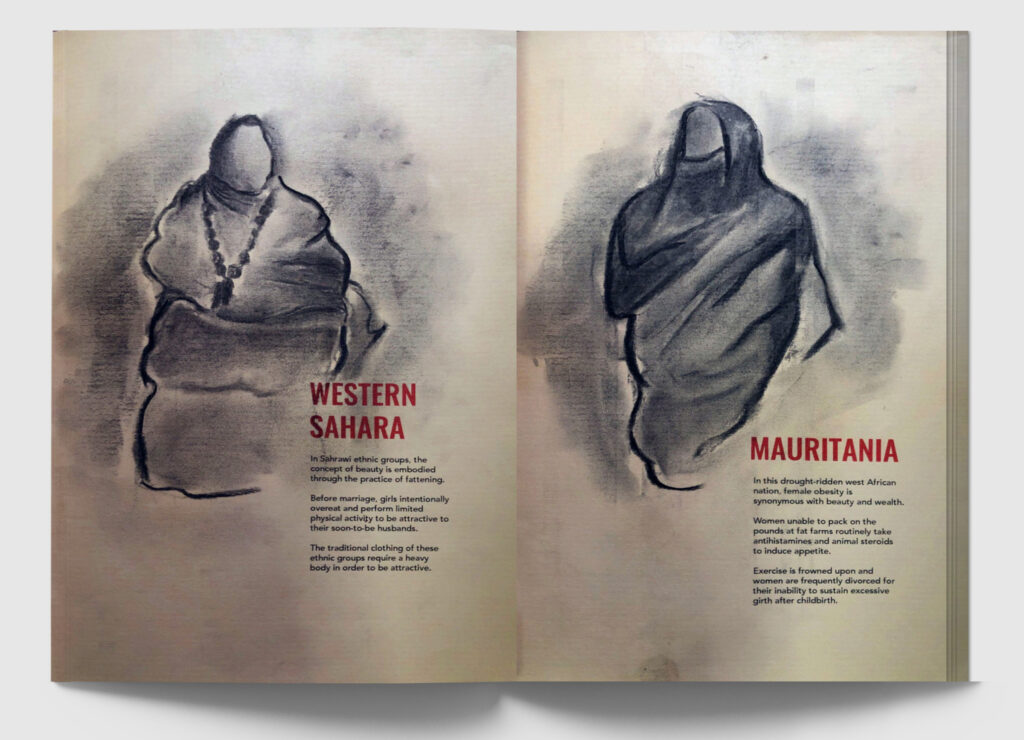
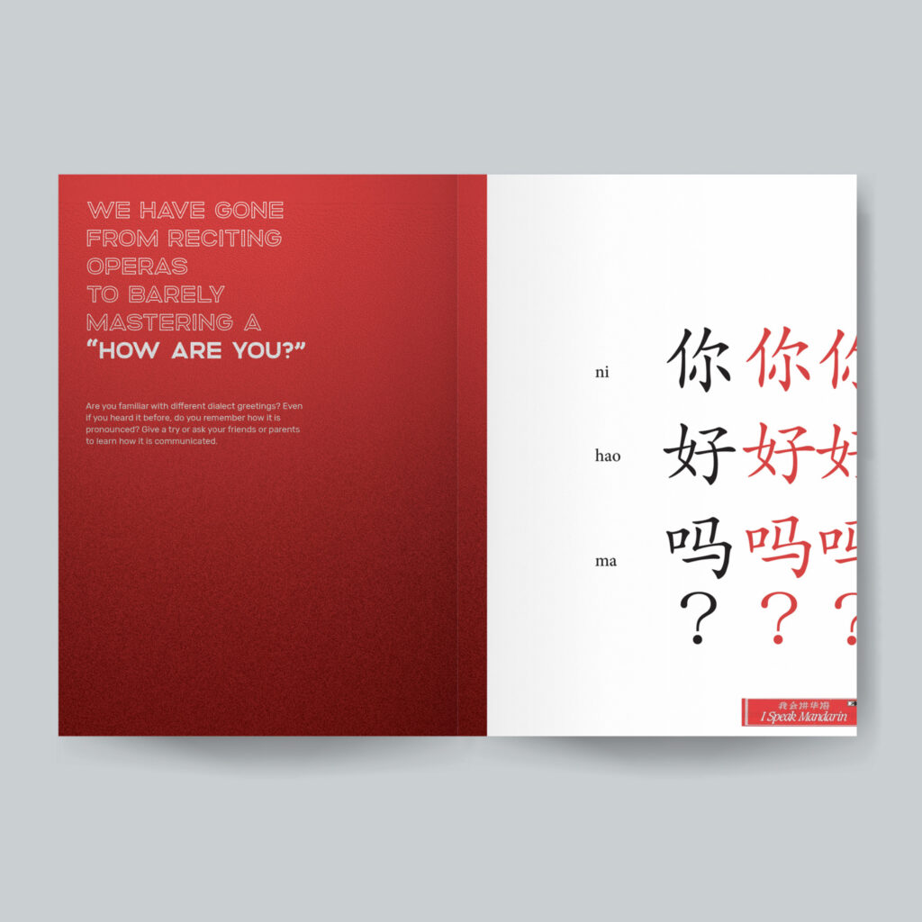
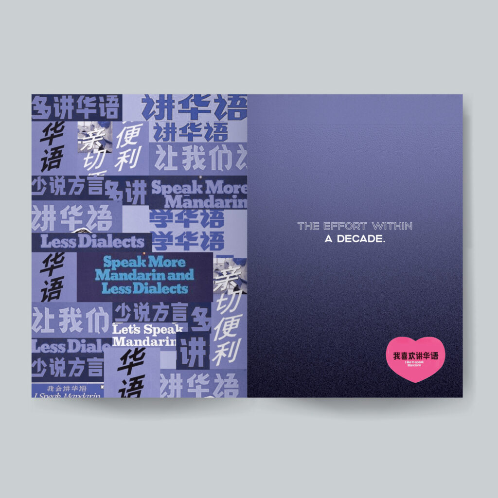
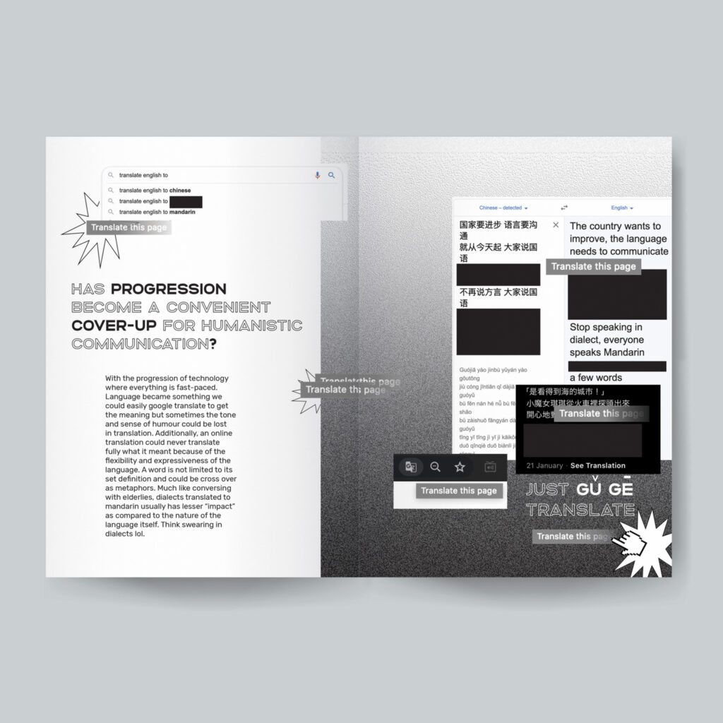
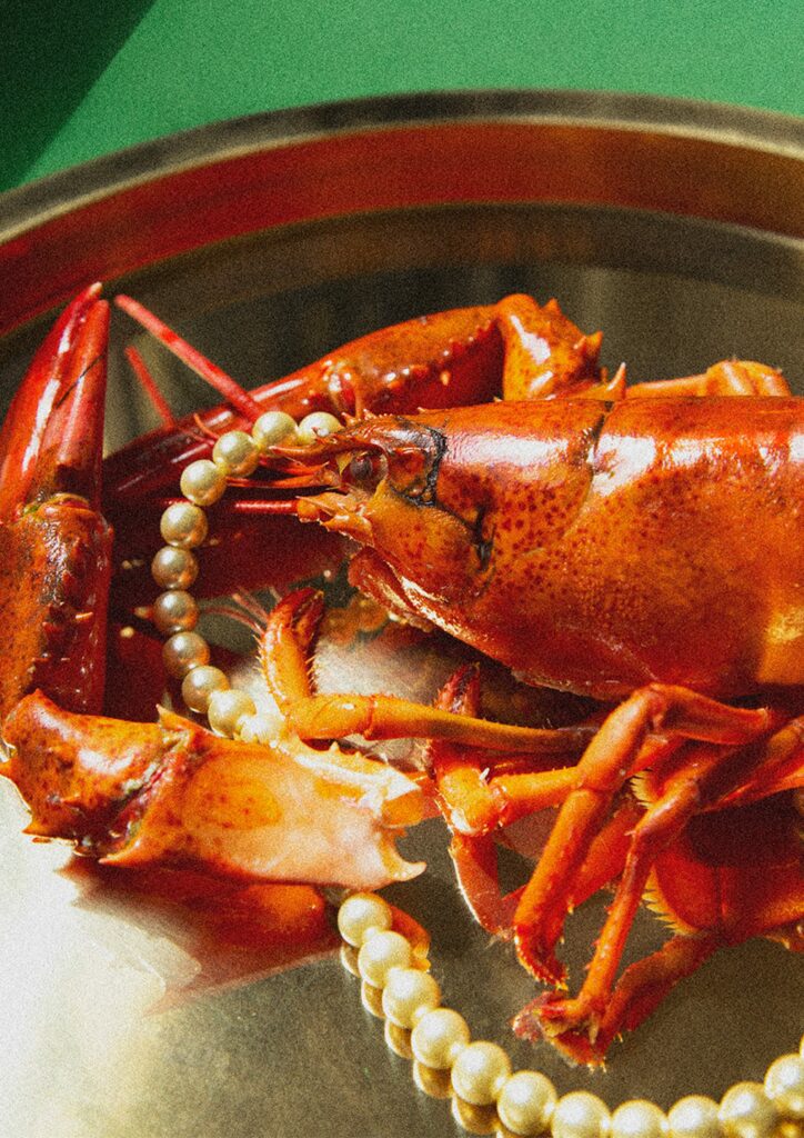
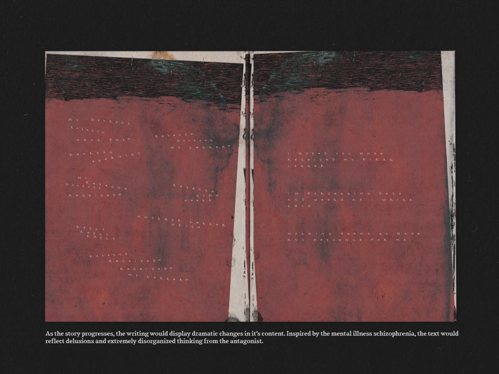
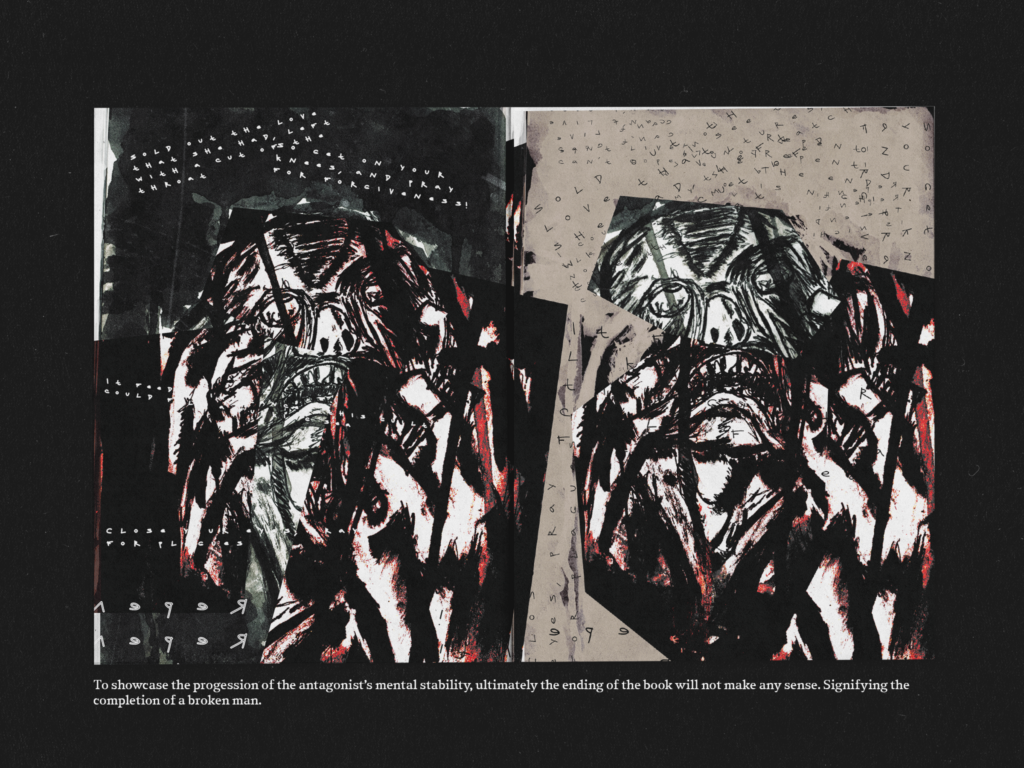
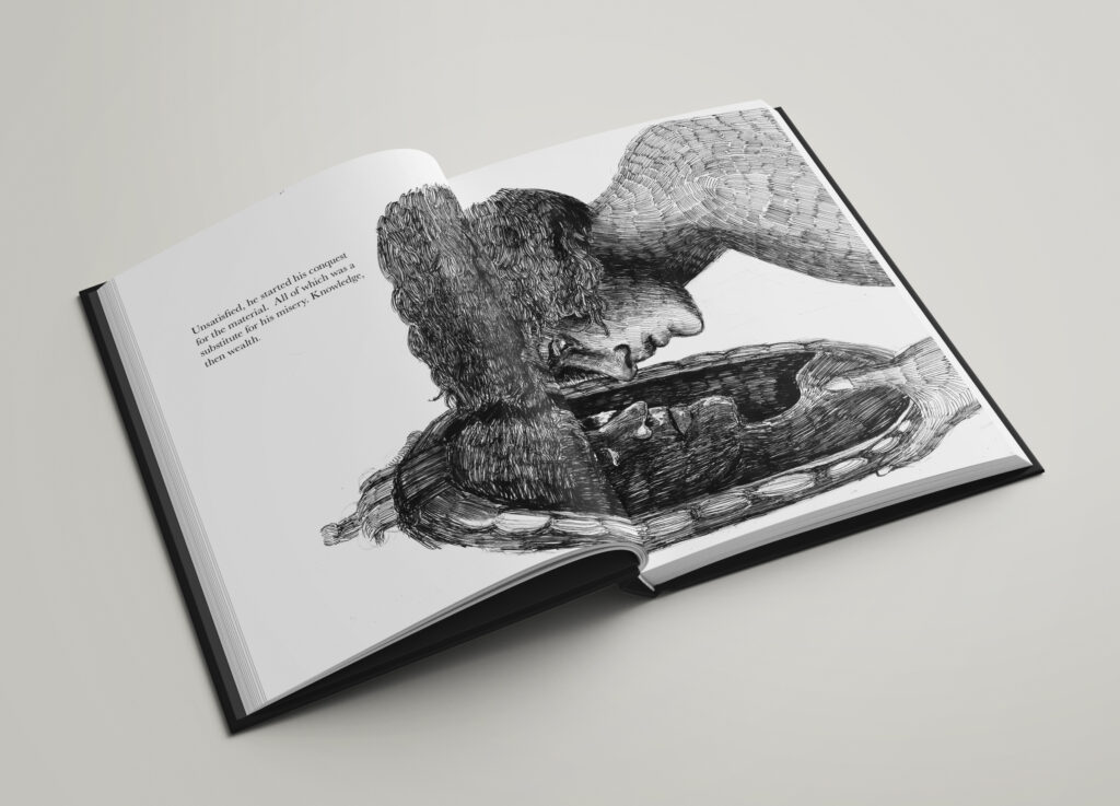
Perception of Peace
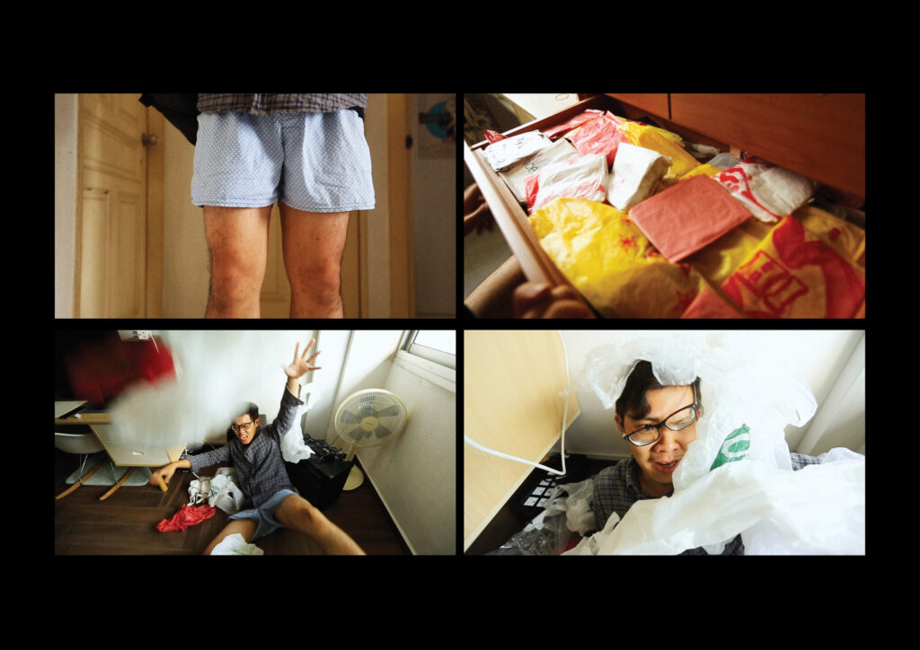
Several spreads of the publication
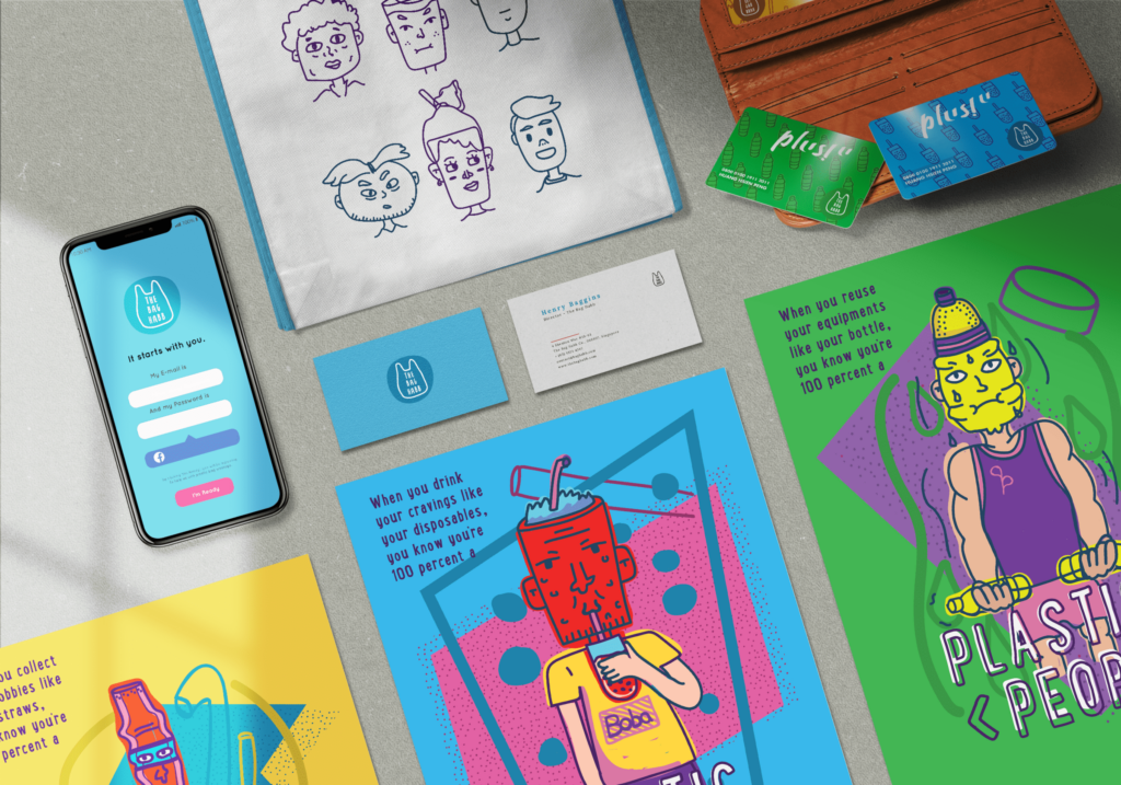
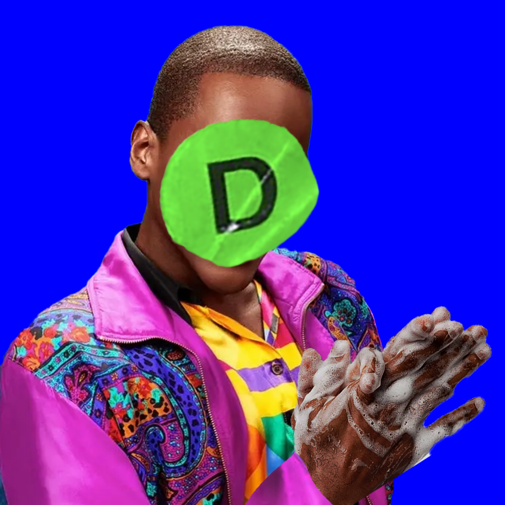
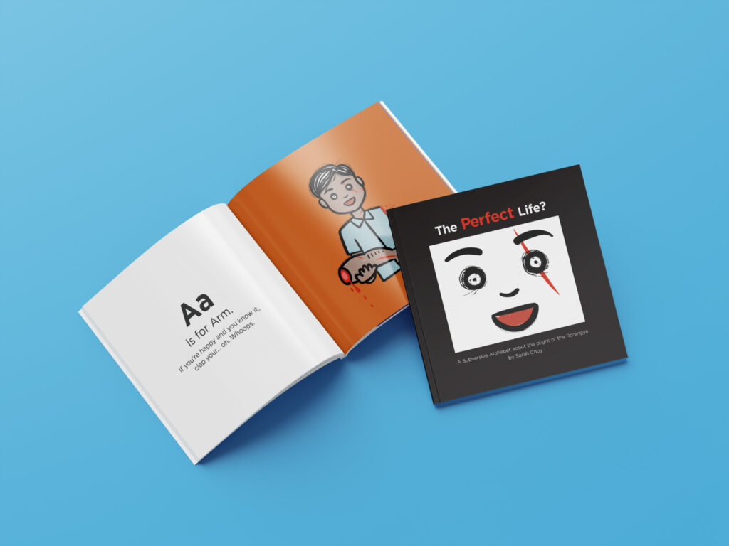
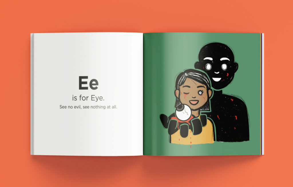
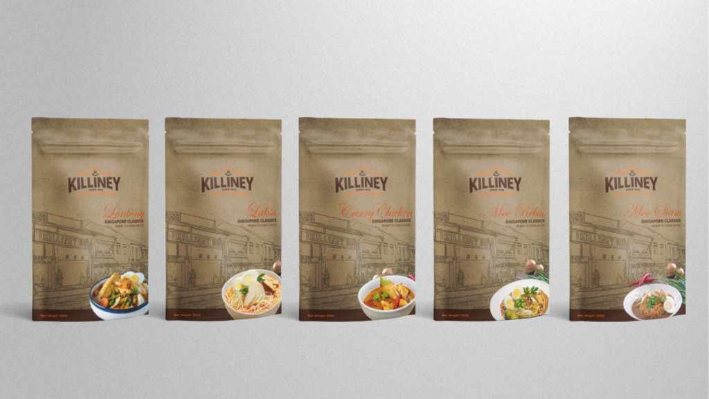
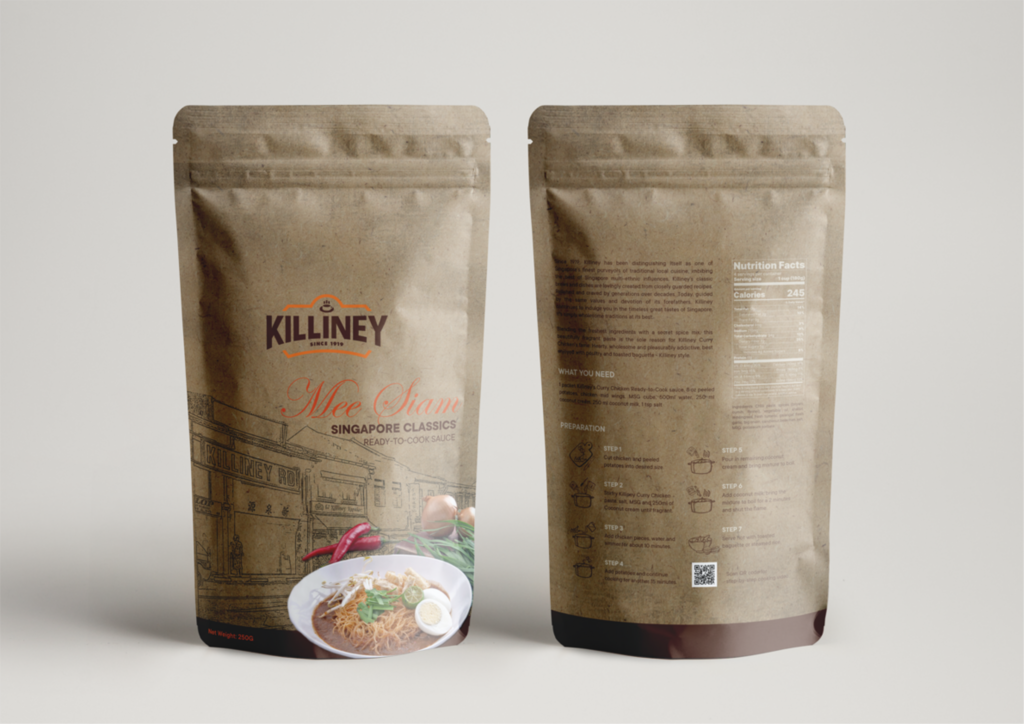
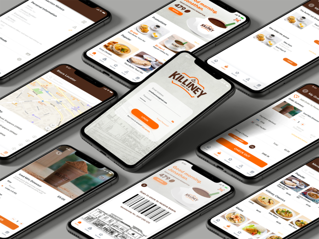
Lunching with Lunch-in'
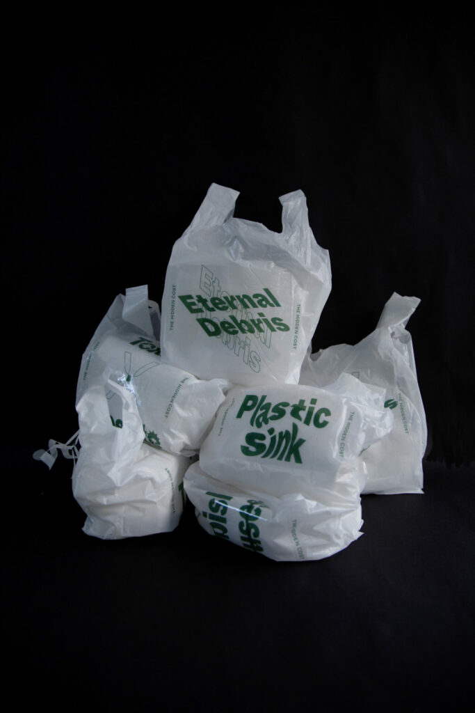
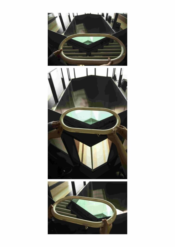
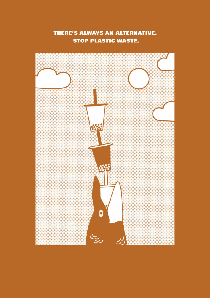
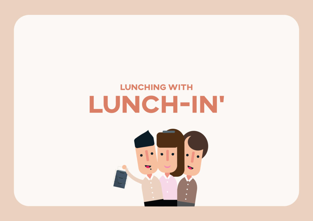
Facing the issue regarding our over usage of plastic, Lunching with Lunch-in’ aims to tackle a habit with a matter of convenience by pitching to companies in the Central Business District, an idea of creating a more bonded company culture through the usage of a more convenient and sustainable take away container amongst themselves during their lunchtime.
Lunching with Lunch-in'
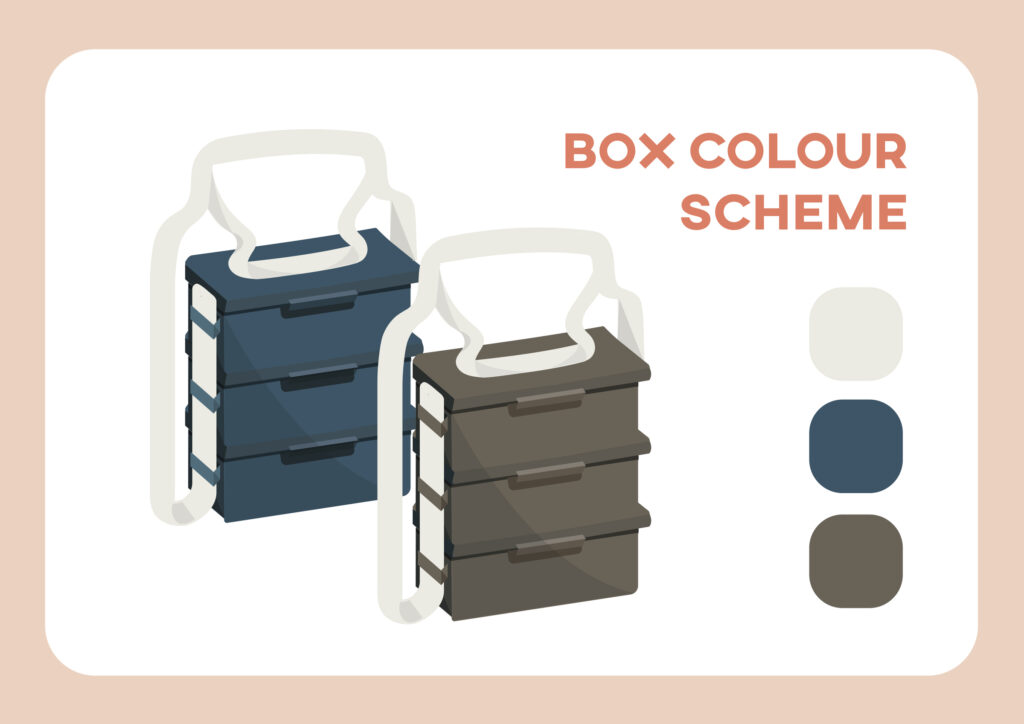
An improved version of the well known, Ting Kat! Not only does it have individual layer lids for separate take aways, one of these containers, can save 3 take away boxes! Leave the office with 1 container, come back with three meals!
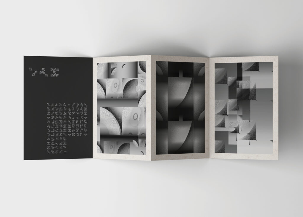
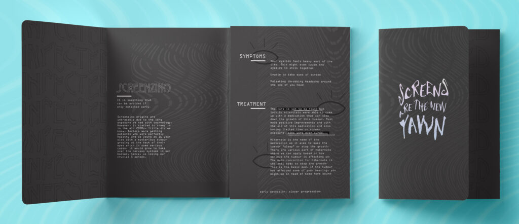
Lunching with Lunch-in'
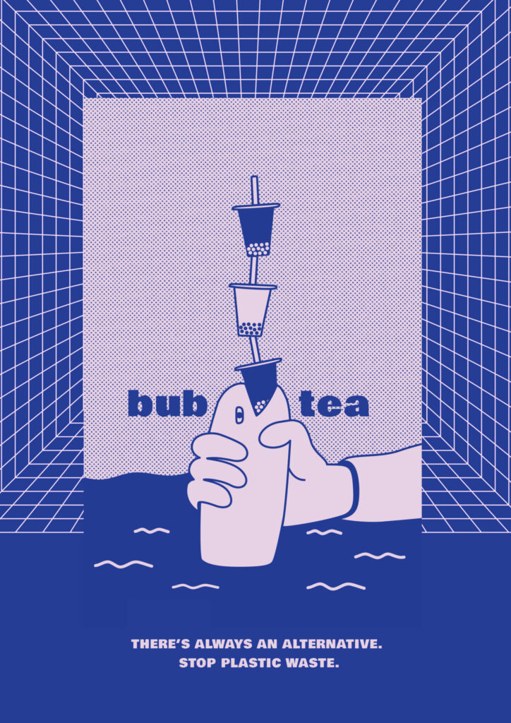
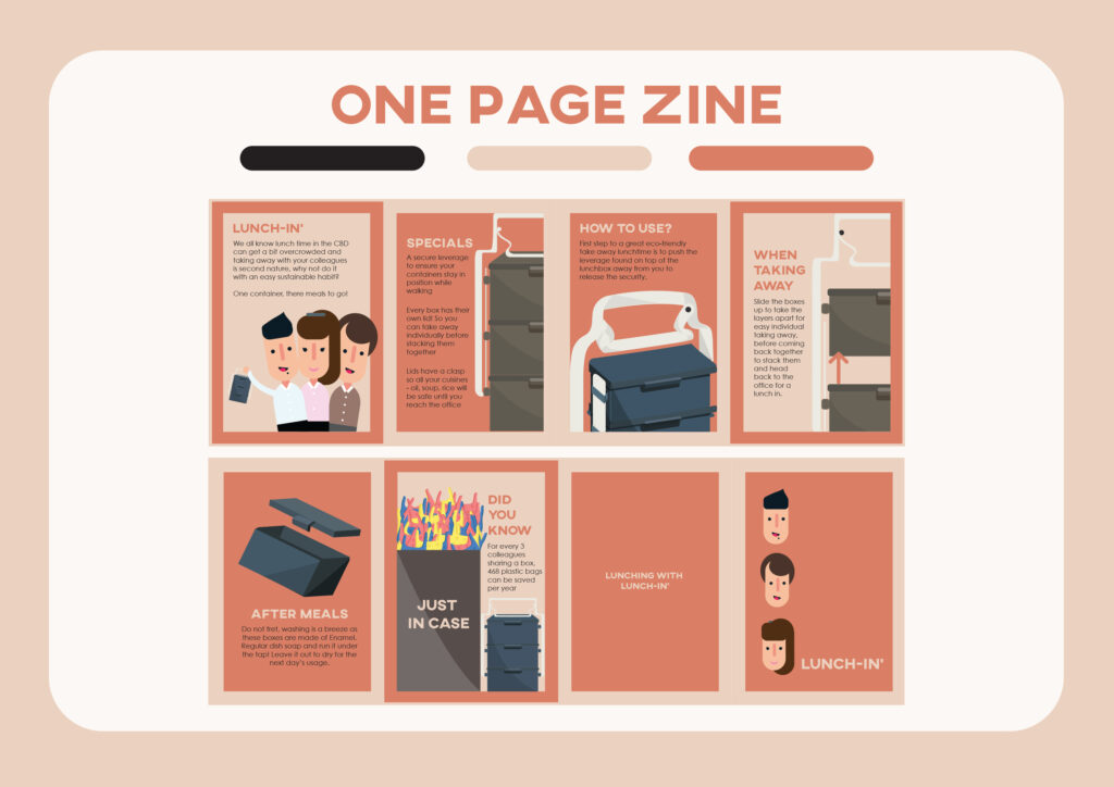
Every Lunch-in’ comes with a one page zine as an instruction manual and an informative sheet! Open it all up and turn it around to double it up as a poster to spice up your pantry as both a reminder to save the Earth and a decoration.
Lunching with Lunch-in'
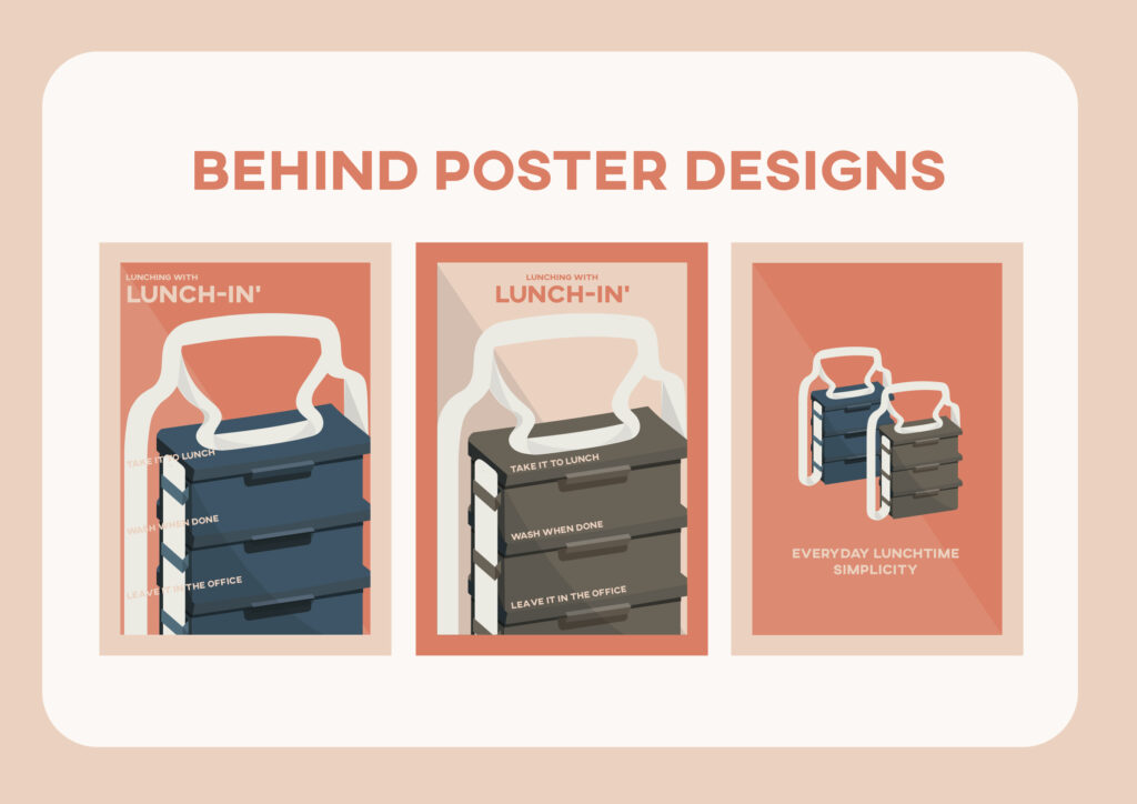
Three possible designs behind the zine.