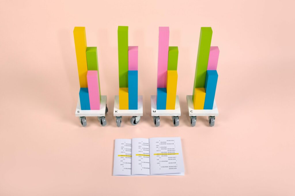
Throughout 2019, millions of young people took to the streets to protest for their right to a future. No other year has seen such a rise in awareness on the topic of climate change, with the issue being brought loudly to the foreground by public demand. From February 2019 to early 2020, I documented the climate strikes in Glasgow, Edinburgh, London, and Italy, working closely with the organizations as a volunteer photographer. I focused on the stories as much as on the photography, aiming to crystalize my personal experience of the events by writing in the same way I was doing with the images by shooting. The result is a detailed, firsthand reportage where images and words are tightly connected, currently waiting for a space to be published.
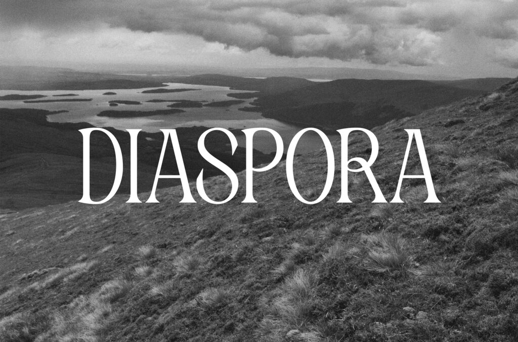
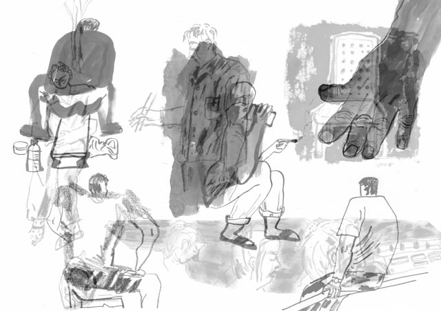
FRIDAYS FOR FUTURE - Turin, October 2019
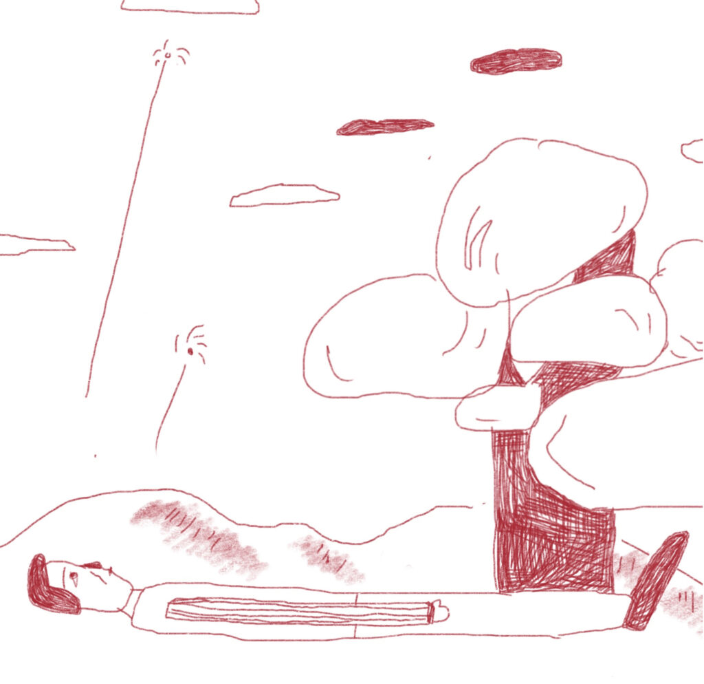
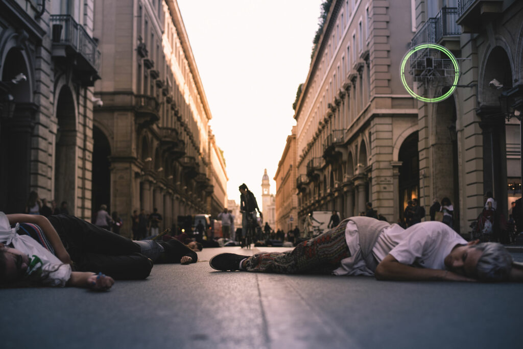
Die-in in Turin, Italy, October 2019. Young people lie on the ground of Via Roma, while a passerby cyclist stops among the bodies and tries to figure out what is happening. A young student walks back and forth in the street reading a Fridays For Future pamphlet with a megaphone. A mum is lying side by side with her two kids, the youngest being barely 3 years old. They check on their mum once every few seconds, then check the others. They’re excited, but they try to stay serious. ‘Like this?’, they ask. [Continues]
BLUE WAVE 2 / ARE WE NEXT? - Glasgow, March 2019 / February 2020
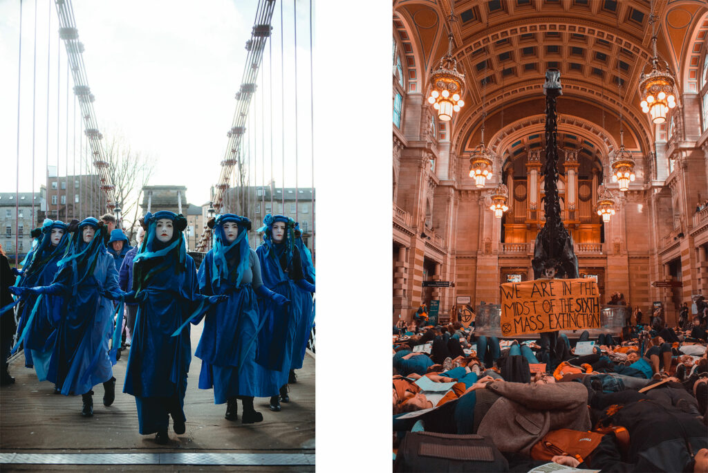
Left: On Leap Day 2020, XR Glasgow organized the secondo Blue Wave event of the city. Silent as the rising sea levels, step by step, centimeter by centimeter, just like water does, the Blue Brigade walked slowly from the bridge towards the people gathered in the Clyde Amphitheatre. Then proceeded leading the march through the city center of Glasgow, all the way until Buchanan Street steps. Right: Kelvingrove Museum, 3pm. Kids and parents together under the gigantic skeleton of Dippy the Dinosaur. Grandparents, too. To the sound of a violin, the signal, everybody lay on the floor. Under Dippy's skull, several kids turned around and around holding a sign reading: ‘We Are on the Midst of the Sixth Mass Extinction’. They were silent, the kids. Many were dressed as animals, or with animal masks. Some had dinosaur toys. They lay down for about twenty minutes, holding signs and banners on their chests. The banners were reading: ‘Are we next?’ [Published on The Guardian]
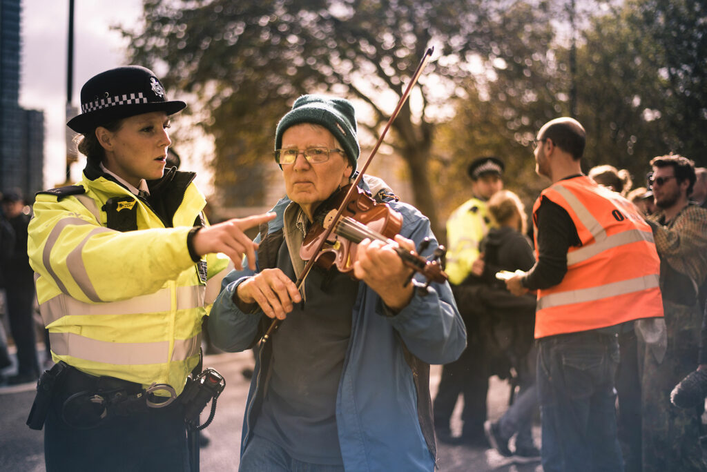
INTERNATIONAL REBELLION II - London, October 2019
“He had been playing since it all started when they began moving everyone out of the road. When the arrests began he didn't stop. One song after the other, he was accompanied to the sidewalk on one side just to turn back at the last moment and head to the opposite side, back and forth from where the people sitting on the road were waiting to be arrested. A bright sunny day in London, and in the middle of the road he was cheering everyone up, and making the police desperate because who wants a violin to stop playing? Back and forth, eyes fixed on something only he could see, and a rejuvenated smile every time he paused and people clapped for him beyond the police line. Making his difference, one tune at a time.” [Continues]
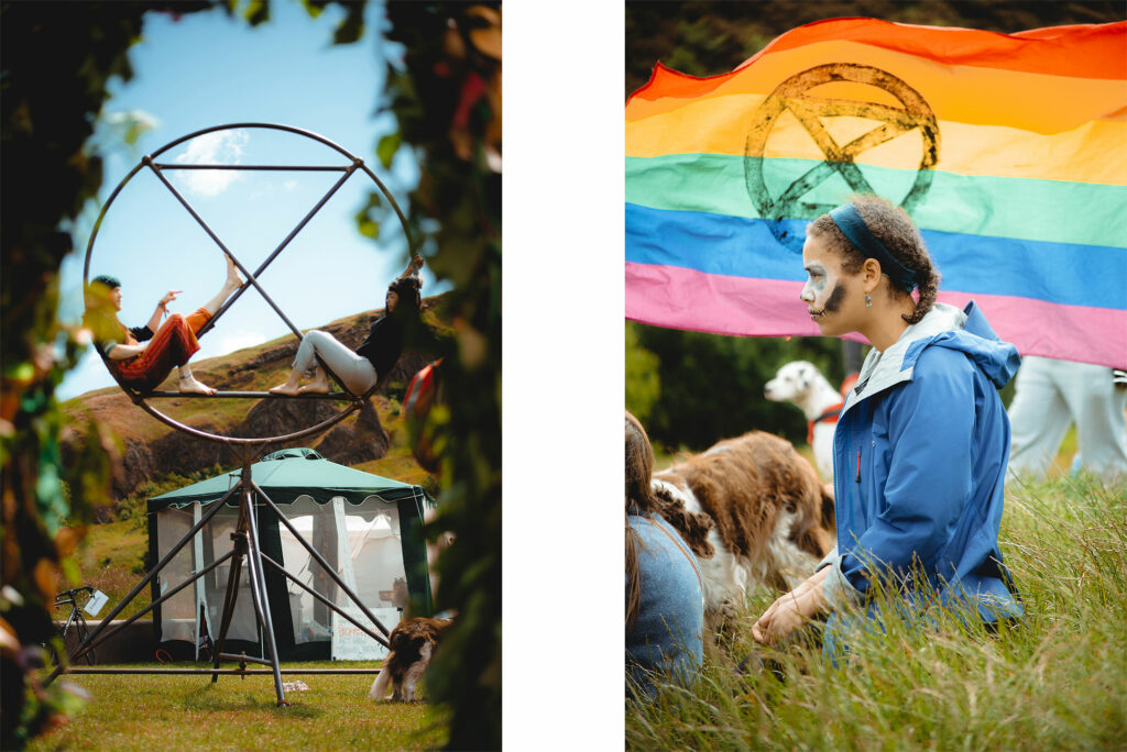
HOLYROOD REBEL CAMP - Edinburgh, June 2019
In June 2019, despite Scotland’s PM Nicola Sturgeon declaring the climate emergency, the Scottish Parliament set the country’s target date to become carbon neutral in 2045. According to the IPCC report, radical change is required before 2030 in order to avoid massive ecological disasters. I spent four days camping in front of the Scottish Parliament in Edinburgh with Extinction Rebellion, documenting the actions aimed to raise awareness about the inadequate climate bill and the climate crisis.
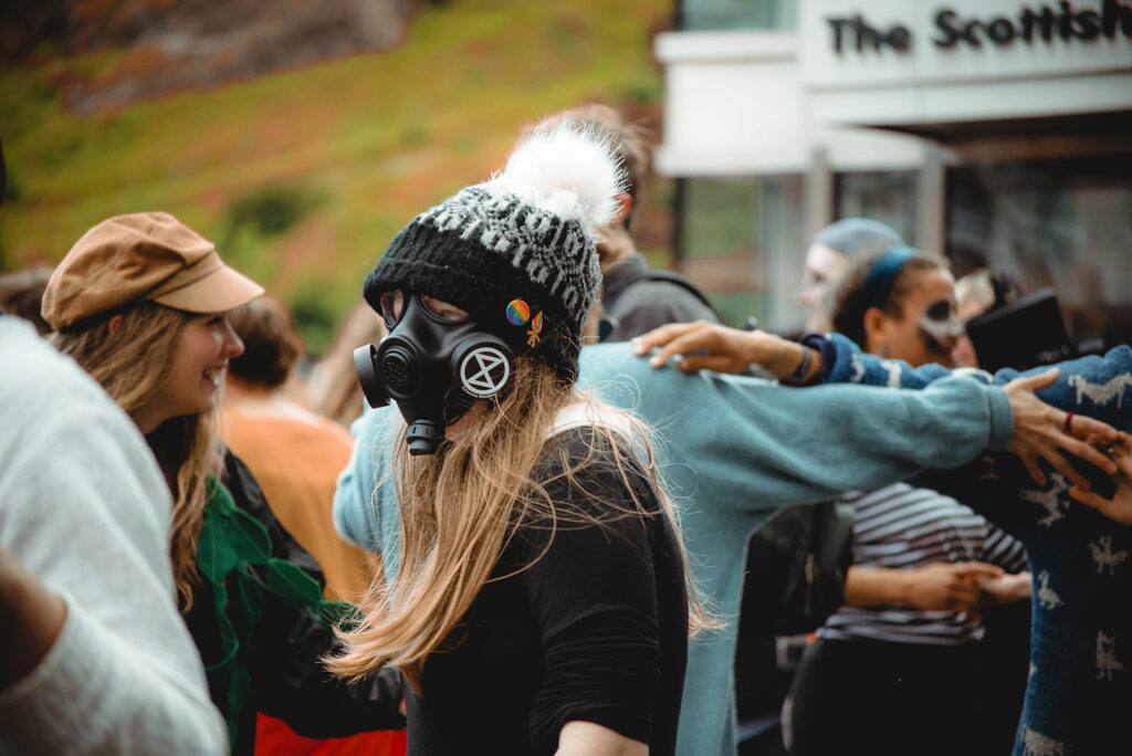
HOLYROOD REBEL CAMP - Edinburgh, June 2019
“The truth is, there's a new generation rising. It's a generation that is openly questioning the rules that have been set by culture and tradition because these things belong to borders, and they are questioning borders, too. A generation that recognizes its privilege in being born on the lucky side of the planet during the climate crisis, a generation that is willing to give up commodities for equality, and maybe it's not ready to do so, but it will. [...] A generation that understands the importance of saying no, that is often at least bilingual, that's given up trying to explain itself to the adults but has not given up the fight for the world they’re going to inherit from them. You'll find them in the streets, chanting. You'll try and make them feel stupid, to humiliate their naïve goodwill, you'll chatter about their hypocrisy. Game-changers, they are. Because they will listen instead of getting angry, and they'll be ready to correct their mistakes if you're right, and they'll do better. Then they'll look at you and ask: and you, how can you help us?”
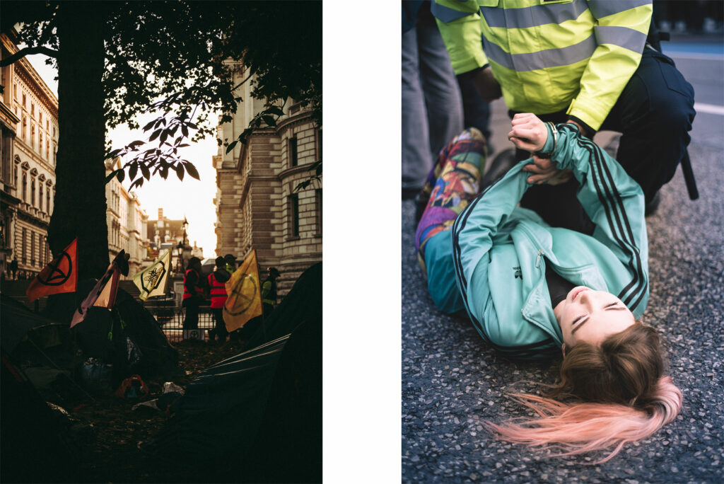
INTERNATIONAL REBELLION II - London, October 2019
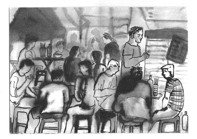
Left: Central London, 6am. As part of the strategy or peaceful disruption, XR activists occupied public parks and organised well-structured campsites, with an open kitchen, toilet area, regenerative zones, and assembly tents. Stewarding was coordinated by Extinction Rebellion, while additional police force was monitoring the camp. Right: A teenage girl in the process of being arrested during the protest in Millbank, central London. XR activists are educated on their rights, as well as in non-violent behaviour in case of arrest, before taking any kind of disruptive action. Refusing to move means having to be physically handled by police when carried away.
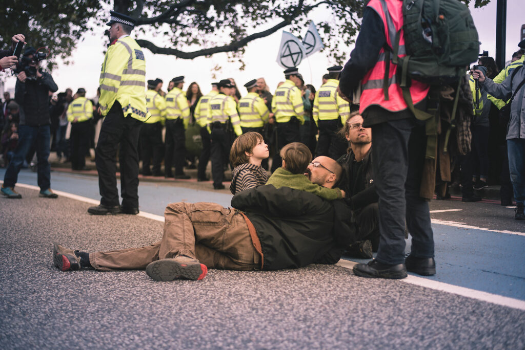
INTERNATIONAL REBELLION II - London, October 2019
“They already had everyone move from the road except for those who were staying knowing that they would get arrested. The crowd was singing from the bank of the Thames beyond the police line, when this mother with two children passed through and they run straight to him. Police were busy removing the locked on people from the caravan a few meters away. They had their moment there, in the middle of the road right in front of the tower. I thought about getting closer but I didn't want to listen. That was a private moment and all the press was already filming them from the front. So after this picture I put my camera away and just observed from afar. Eventually the mother came and took them away. As they were leaving, sun shining on the concrete, I see the younger one turn from his mother's arms. Slowly, silently, among all the noise and rush, he blew a kiss to his dad and waved. It was the first moment in five days I had to stop and find my balance again.” [Continues]
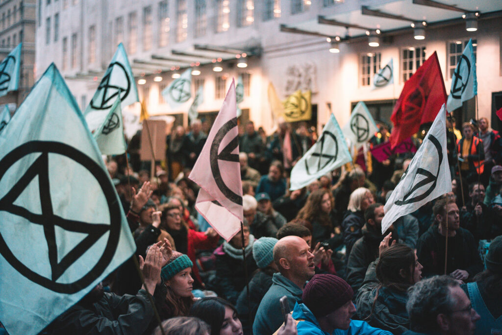
INTERNATIONAL REBELLION II - London, October 2019
Protesters gather in front of the BBC headquarters in central London. A spontaneous rebel assembly takes place, with people from the public taking the microphone and speaking to the crowd. Among the speakers, a former policeman introduces his thoughts with a candid assertion: ‘Some of you may think it is strange to have a police officer involved, but a big part of our job is protecting people’. Accustomed to my home country’s history with police brutality, XR’s relationship with police, regularly questioned within the movement itself, interested me deeply. [Continues]
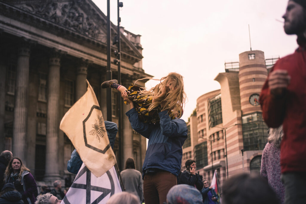
INTERNATIONAL REBELLION II - Bank Junction, London, October 2019
“It was just a little girl, playing. People watching her with a smile. I took this picture when she finally stopped running, laughing. Then you zoom out, and you see people sitting on the ground on tarpaulins, jackets, cardboard. Zoom out, and you see a roadblock, women and men standing up under the rain, holding banners. One reads, climate struggle = class struggle. There's some singing and someone passing home-baked biscuits around. Zoom out, and there's a city with some disruption going on. A few points where the stream is disturbed, there's honking and some shouting maybe, all these busy lives protesting because they're late, oh they're going to be late. And you zoom out and you see a country busy sorting out a mess that someone wanted and someone else didn't. Pick your year. It could be any, right? But you zoom out, and it's not something you've seen already. Outside the country, up north, ice melting and the oceans growing higher. Draught south and people fleeing, their feet on burning sand, hot air exasperating survival, as if famine and war didn't do their job anyway. You see a big white animal, thick skin and a horn on his nose and that breath he takes, that's the last. And after him a bird, then a swimming creature you don't know the name of, and another bird, and another, and another, and you're there, watching. Zoom out at last and you see a planet spinning and a mass of smoke covering south America because oh, you don't want to see. You really don't want to see. You stop. Maybe you panic. This is too big, right? Just too big. But then you zoom in. And when you zoom in, it's just a little girl, laughing. And you remember who you're doing this for. And you roll up your sleeves, take a picture, and get back to looking for solutions. Whatever it takes.”
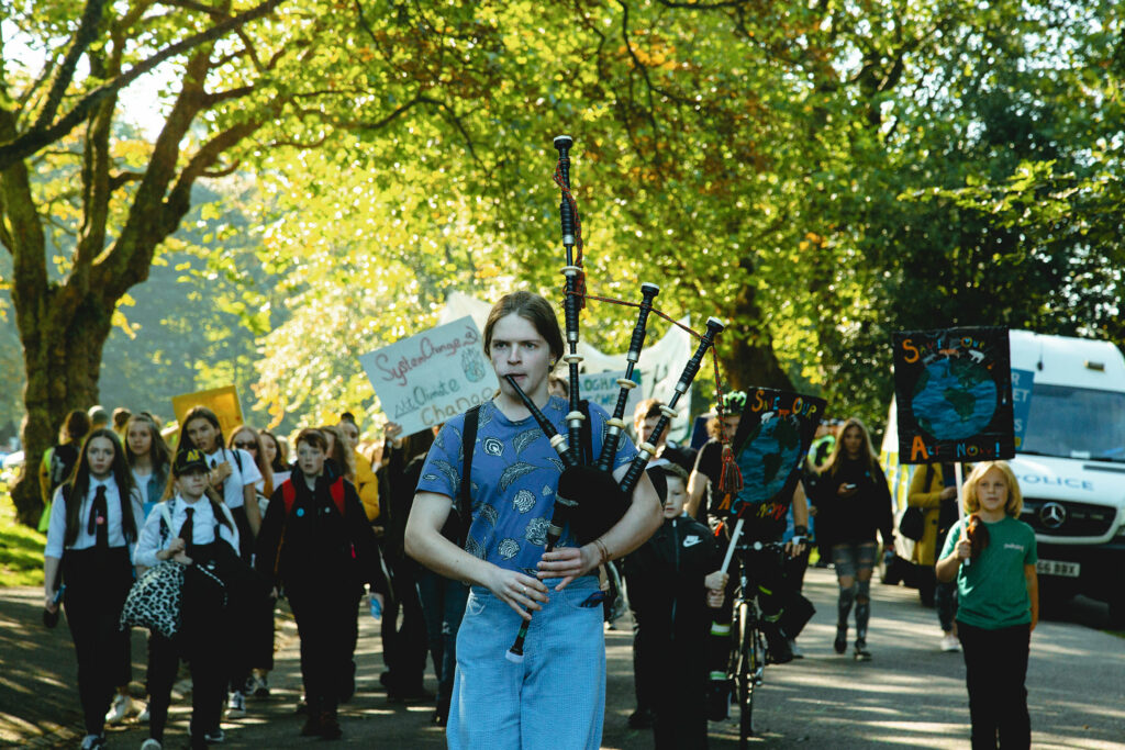
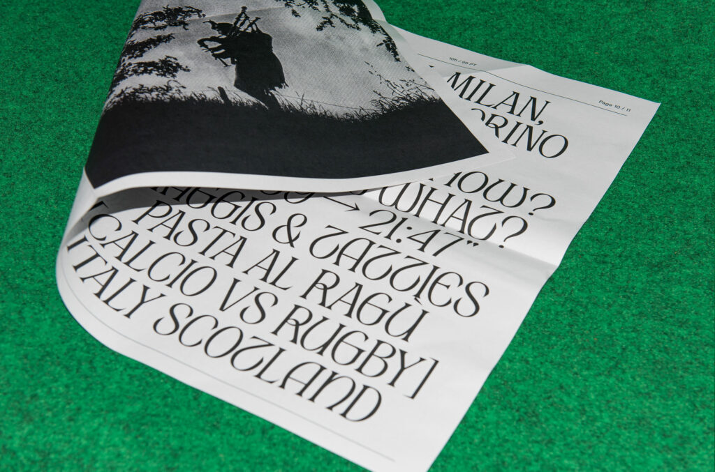
THIRD GLOBAL STRIKE - Glasgow, September 2019
A group of school students lead by a young student playing the bagpipe joins the crowd in Kelvingrove Park for the third Global Climate Strike. About 12,000 people participated in the strike, an impressive number if compared to the few hundred of the first strike in February. From Kelvingrove Park, strikers (families, students, elders, workers) marched through the West End and all the way to George Square, in front of the City Council. The youth strikes in Glasgow are autonomously organised by students under the age of 18, who plan the route, the actions, stewarding and police liaison, speeches, and so on.
SCHOOL STRIKE FOR CLIMATE - Glasgow, February 2019
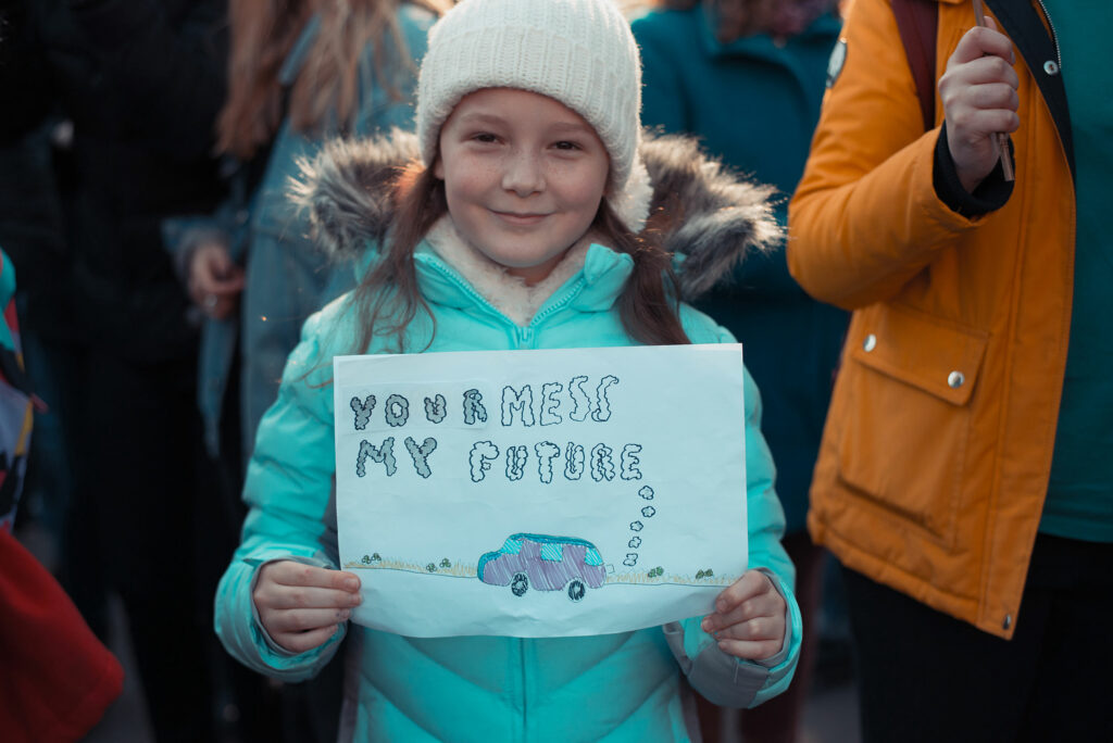
Since the very start - the now famous ‘Skolstrejk för klimatet’ banner - young people declined the use of a systematic set of visuals and started designing their own banners, placards, and wording. The results fascinated the whole world for their straight-forwardness, wit and very often clever sarcasm. Although the best examples of the strikers’ creativity can often be found in the most simple designs.

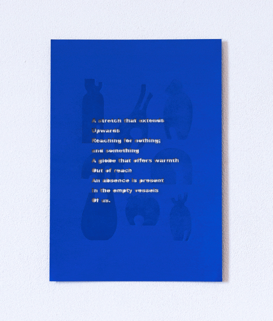
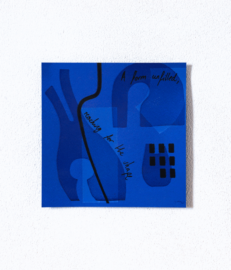
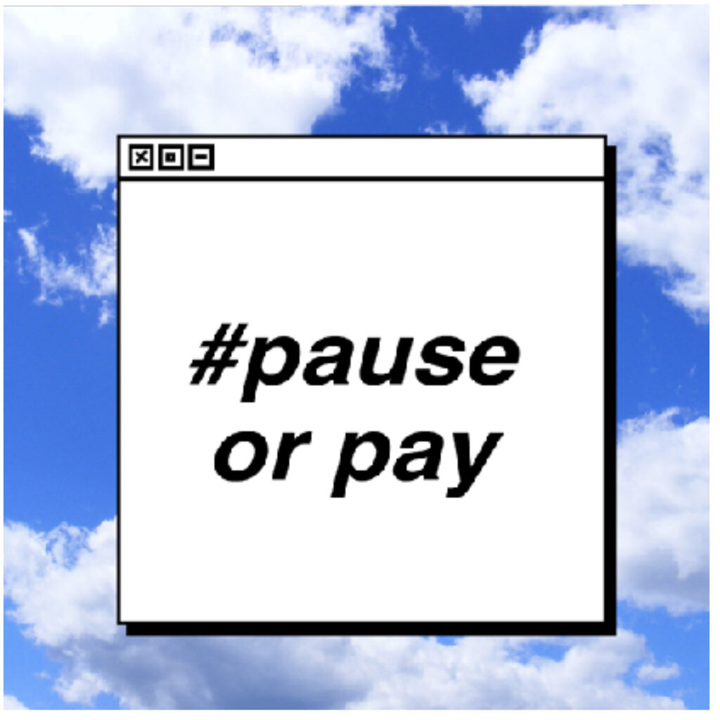
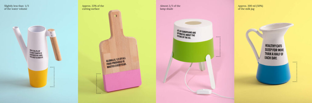
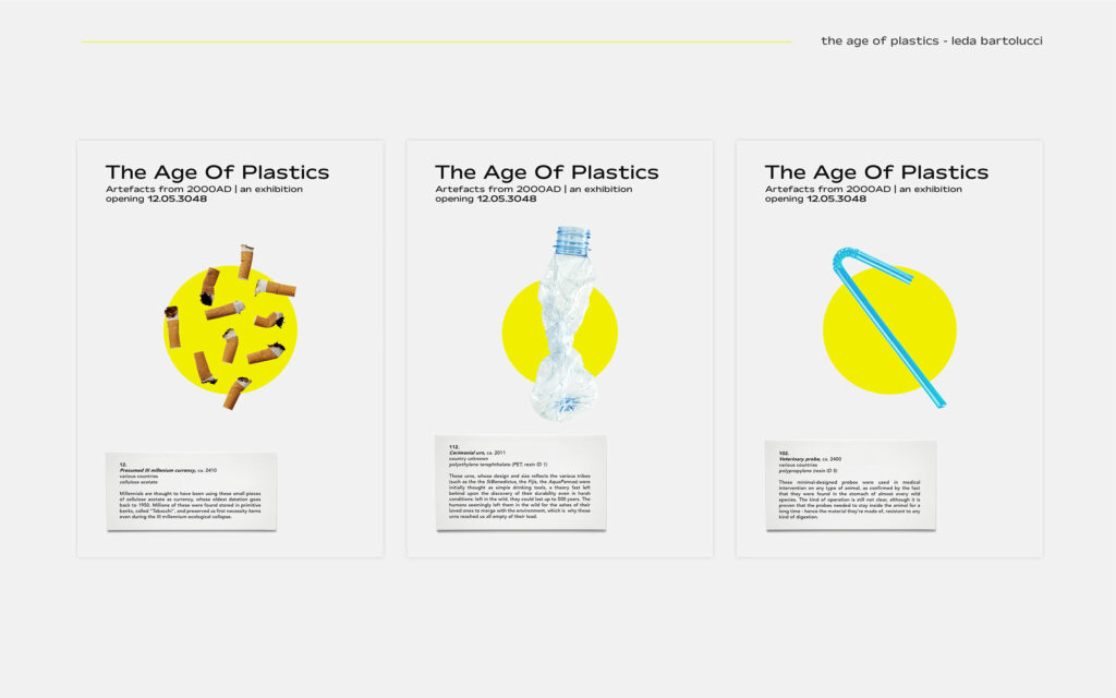
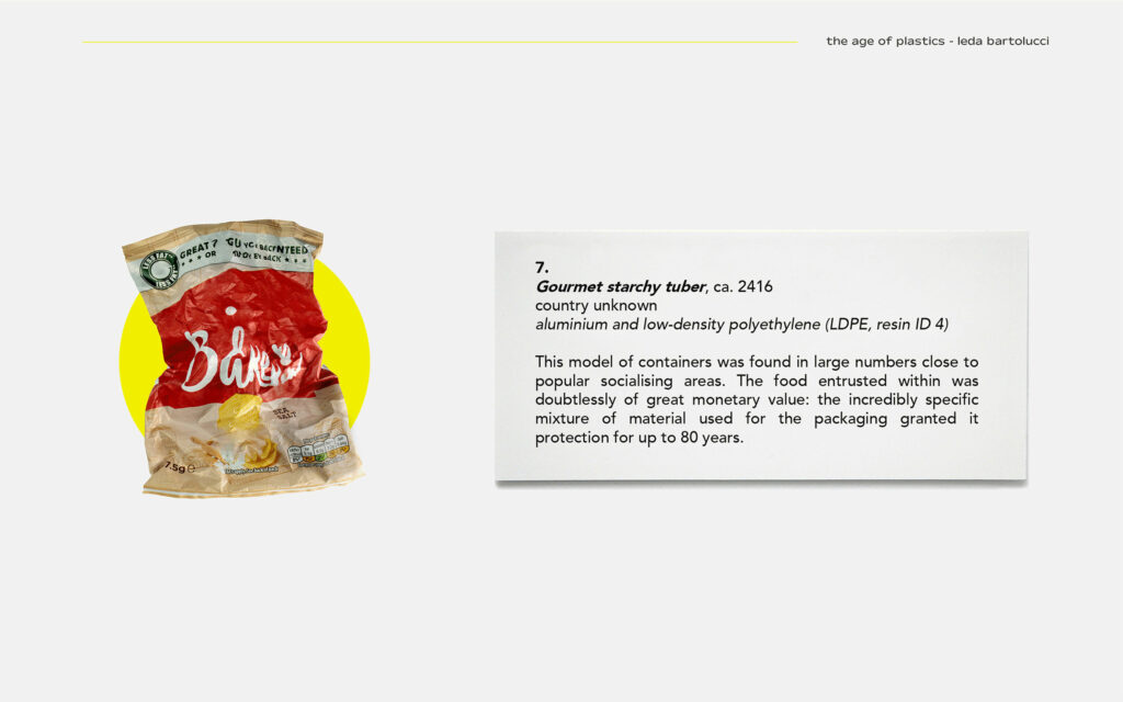
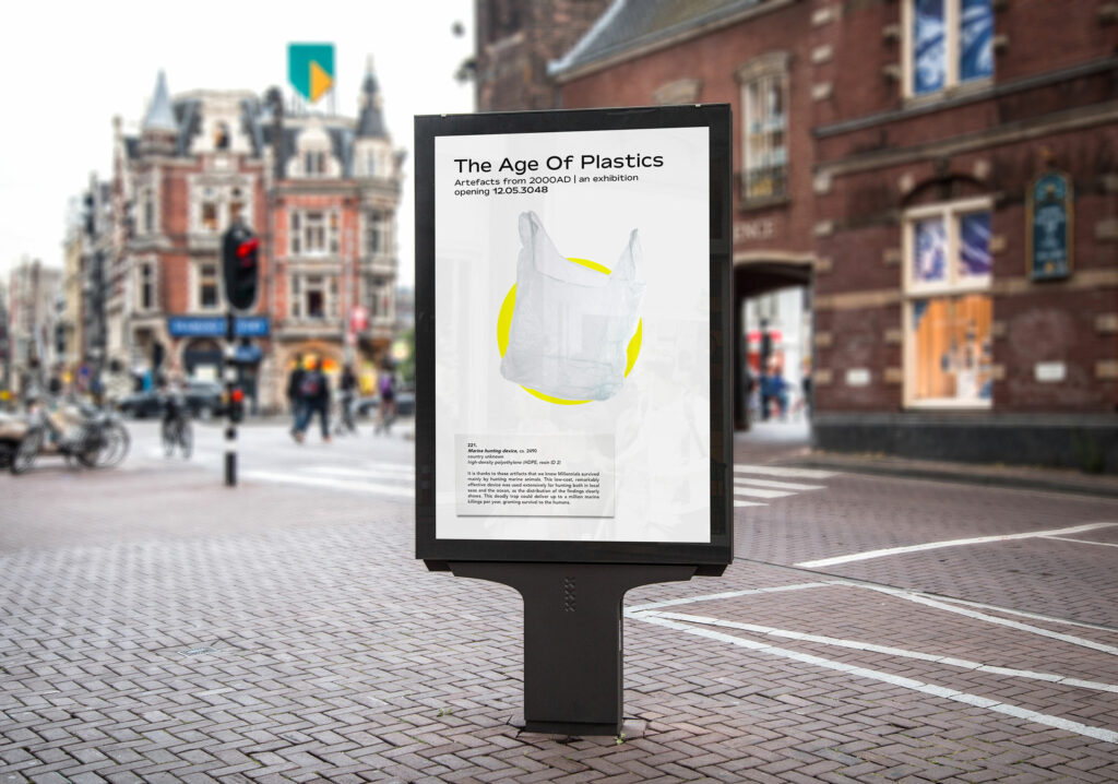
How to talk about plastic in a guiltless way? How to adamantly refuse it without being judgemental, how to expose our misusing it without the use of shame? ‘The Age of Plastics’ is a campaign for an imaginary exhibition held in 3048, in a world where plastic is part of a faraway past and its use has to be guessed.
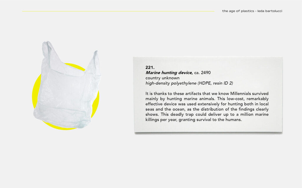
THE AGE OF PLASTICS - MARINE HUNTING DEVICE
The year is 3048. All plastic production was stopped on Saturday 22nd, February 2020. In 1028 years, the world has changed. Humans survived, but they have little knowledge of how society used to be. They have to guess from what remained. Mostly... plastic.
THE AGE OF PLASTICS - CAMPAIGN
An awareness campaign providing the context of an imaginary exhibition to show plastic under a different light. Giving up the way we are used to think, we are invited to have a second loot at it with the curious eyes of a plastic-less version of this same planet.
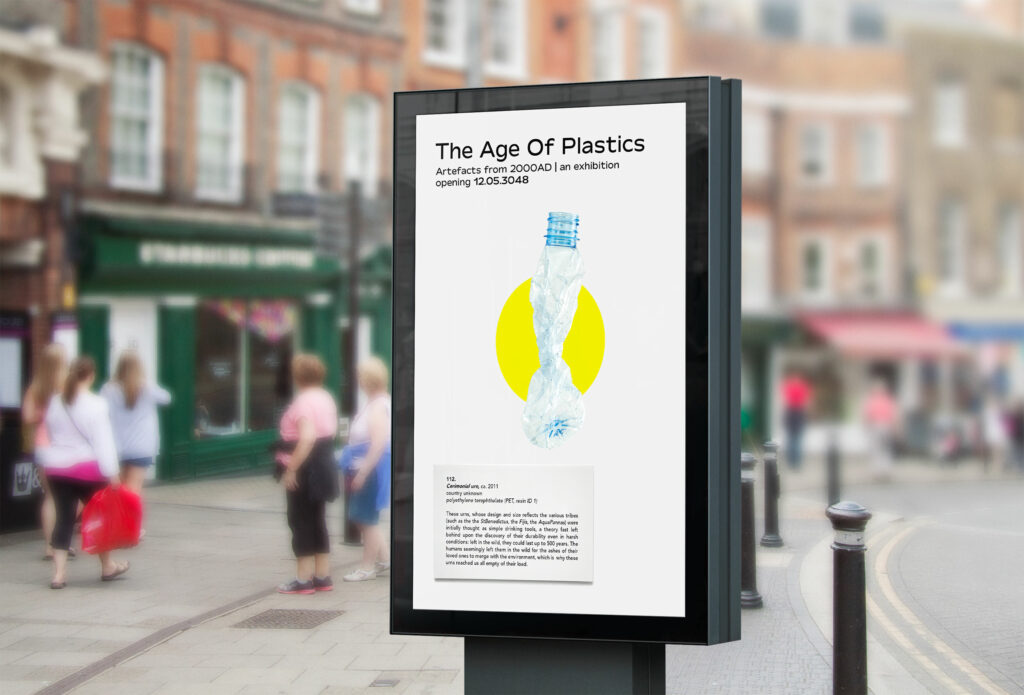
THE AGE OF PLASTICS - PLACEMENT
Placed where people have time to stop and read: bus stops, subway boards. Shared online as a form of storytelling, creating expectation, desire to discover the next common object as described by these unbiased people from the future. Exposing our irresponsible use of it, but without blame, without shame. Starting the conversation.
THE AGE OF PLASTICS - STORYTELLING
A campaign offering the audience a vision of the world where plastic is seen for its remarkable features and not only its terrifying quantity. Based on a solid research, all the objects chosen are classified for their real composition, and all the facts mentioned or suggested are taken from true statistics.
THE AGE OF PLASTICS - AIM
Telling a story: what’s the real value of the things we are used to throw away. Suggesting that common objects are used by common people. Thus, it is from common people that radical change can be ignited.

bartolucci-leda-19
As a graduating student at the Glasgow School of Art, I would like to state my support for the Pause or Pay Campaign. Pause or Pay was established to unite studio-based courses and highlight to our HEIs and the UK Governments that the mitigations for our issues due to the pandemic are not yet enough. Find more at www.pauseorpayuk.org / @pauseorpay