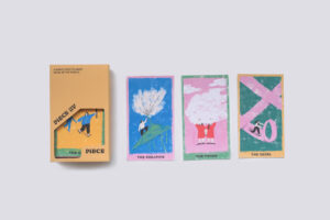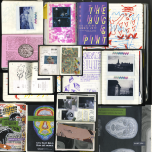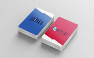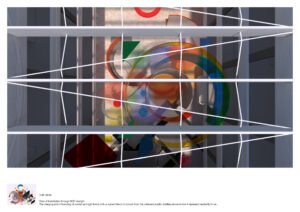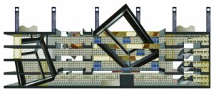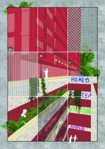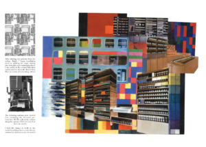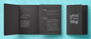
Screenzino
Screenzino is an imaginary illness where a new kind of tumour grows due to a lot of exposure to digital screens, in particularly our phones and desktops. The tumour would then cause us to lose our 5 humane senses. There is no definite cure but there are some medications which would slow down the growth and some people even cured themselves with the assistance of these cures. This is a pamphlet to raise awareness of this sickness.
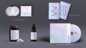
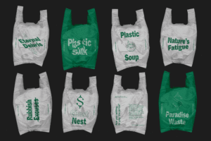
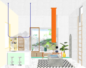
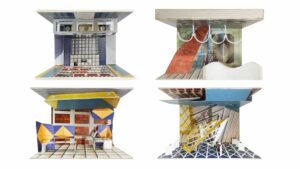
Screenzino
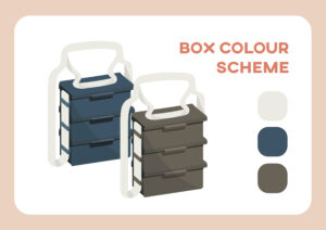
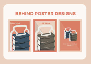
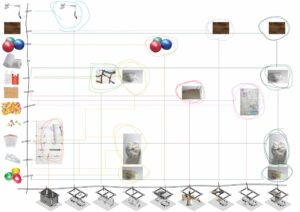
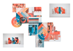
Following up with the awareness of the Screenzino, here is the collection of the medication to help aid the loses and antibodies. The pastels to counter the bright hypnotic lights from the screens as pastels are softer on the eyes. Each of the items are for specific senses.
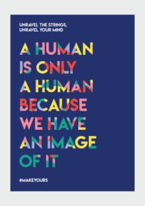
Let's Meet Halfway
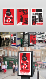
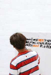
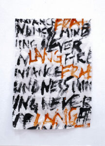
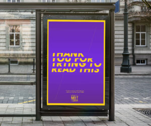
Let’s Meet Halfway is a social awareness campaign to encourage people to learn some basic sign language to make the society a more inclusive place. If some of the deaf people are learning to lip read to understand us, what is stopping us from learning a little bit of signing to understand them? The idea for this poster was to make the audience feel what it was similar to what a deaf would have to encounter when they rely on the visuals or lip reading. Hence I used the fact that most people could see and set them a challenge to try reading with half the typographies cut off. This is to further support the idea of trying to meet halfway.
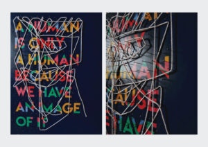
Let's Meet Halfway
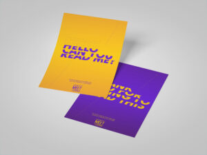
These are additional marketing flyers for the households and the Deaf Associations which could be used when there is an event or simply just to spread the awareness.
Let's Meet Halfway
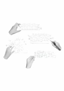
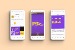
Part of the solution to encourage people to learn more sign language is to make interesting and eye catching visuals so that it looks more exciting and easy to learn. Faster as well since in the present time we have lesser attention span. The feed is designed to have one column for the finger spelling and the other two for short conversational tutorials and the some of the benefits and fun facts or even sharing the people's experiences.

Let's Meet Halfway
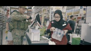
These are the screen captures of the video to promote the awareness of deaf and to encourage people to learn some basic sign language.
Let's Meet Halfway
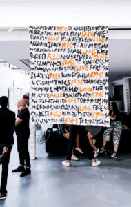
This was a marketing video to promote the idea of learning the basic sign languages to communicate with our deaf community. It was a "good to know" kind of design problem and the solution for myself was to help create some awareness with the blessing of the perspective of the hearing world.
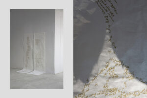
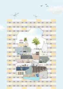
The Search for Immortality
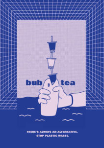
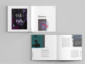
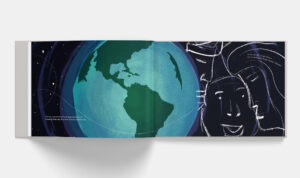
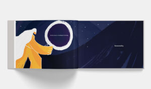
The Search for Immortality tells a story to raise awareness of our ignorant excessive usage of single use plastics and our human greed. The storybook is meant to be read to children by parents and hopefully they would realise that the morale of the story is about how plastics have conquered the world and one day it might possibly, and literally cause the end of humans if we do not stop this.